I am often faced with the problem of showing an “original image” and a “reconstructed image,” which may have completely different dynamic ranges. Namely, when working with ill-posed inverse problems, unsuccessful reconstructions sometimes amplify measurement noise a lot. However, it would be important to make reliable comparisons at a glance to see what is correct in the reconstruction. I will present below one possible way to do so using Matlab.
For example, we want to show an original function f1, an unsuccessful reconstruction f2 and a better reconstruction f3. Further, assume that each of the above functions are defined in the unit disc, leading to the additional complication of showing the background in the image area outside the unit disc.
Let us construct the original function f1 in Matlab as follows:
Nt = 128;
t = linspace(-1,1,Nt);
[x1,x2] = meshgrid(t);
z = x1+i*x2;
udisc = abs(z)<1;
f1 = ones(size(x1));
f1(x1<0) = 2;
f1(~udisc) = NaN;
Note that the last command inserts Not-a-Numbers outside the unit disc, indicating that the function is defined only inside the disc. Here is a plot of f1 using the command imagesc:
figure(1);clf
imagesc(f1)
axis equal
axis off

The background NaN values are automatically shown using the color of the minimum value of the non-NaN matrix elements, and therefore the right half of the image is confusing. We will correct this later.
Now form the “unsuccessful reconstruction” f2 by adding huge random noise, and “better reconstruction” f3 by adding only a little noise:
f2 = f1 + 6*(abs(z)).^4.*randn(size(f1));
f3 = f1 + .1*randn(size(f1));
Replacing f1 in the above plot command by f2 and f3, respectively, produces these images:
Now the problem with the three pictures above is that the colors do not correspond to the same function values. Matlab automatically uses the default colormap “jet” linearly adjusted between the minimum and maximum value appearing in the matrix.
Now take a look at the three functions side by side. This should make the colors directly comparable between the images.
figure(4);clf
imagesc([f1,f2,f3])
axis equal
axis off
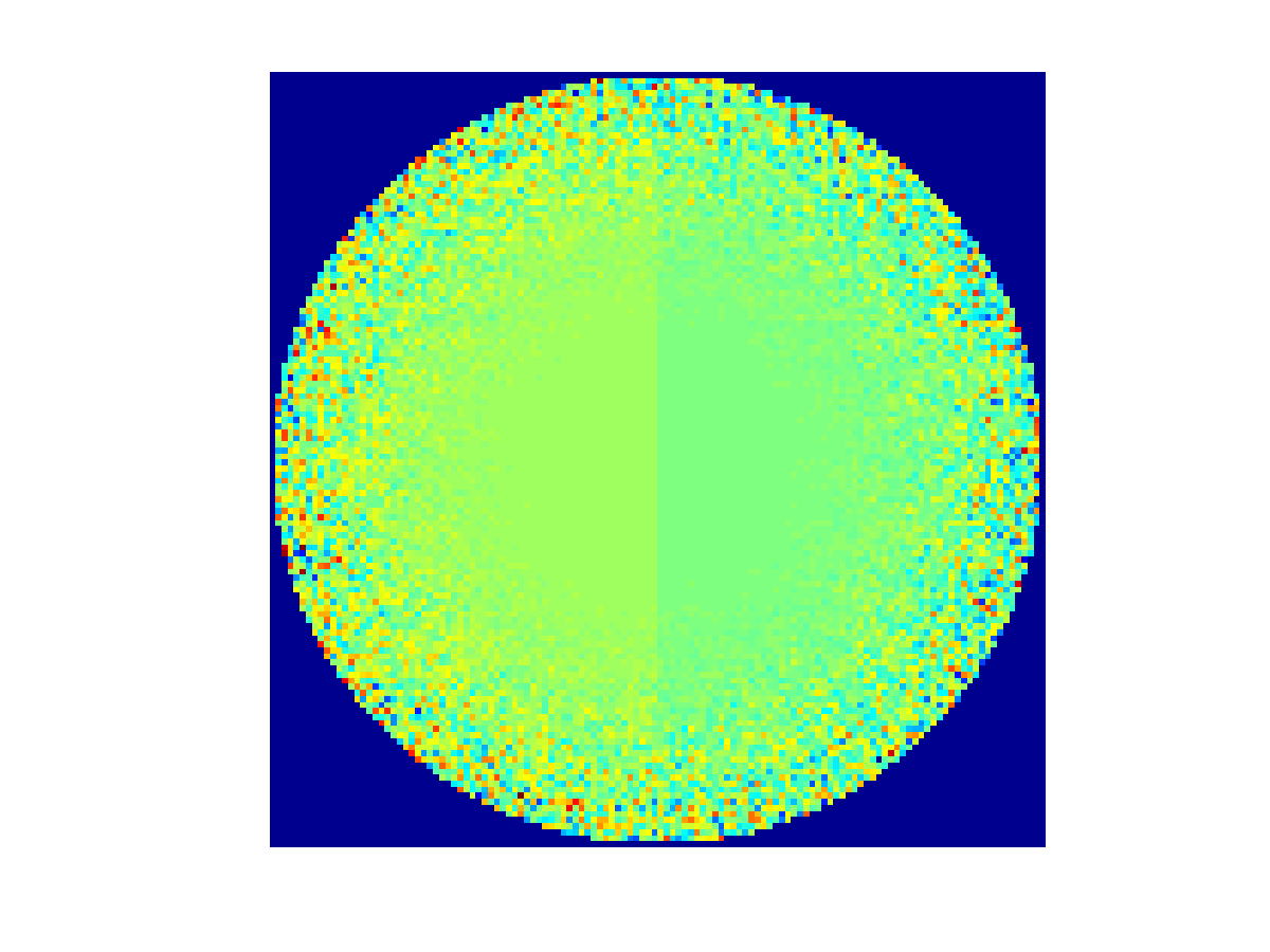
Now the colors are indeed comparable from one plot to another, but the result is not acceptable. The noise in the bad reconstruction (middle) ruins the colormap by stretching it to a too wide interval of values.
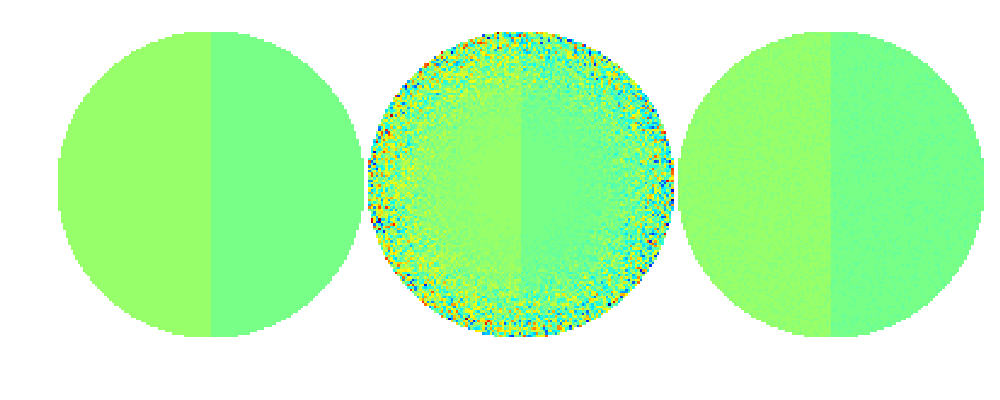
Before turning to the problem of comparing colors, let’s see how to change the background color to white. At this point we need to save our simulated data to a .mat file so that we can later load it fresh from disc.
save data z udisc f1 f2 f3
The trick to background coloring is based to adding pure white as an extra color to the bottom of the default colormap “jet” used above:
colormap jet
MAP = colormap;
M = size(MAP,1); % Number of rows in the colormap
bckgrnd = [1 1 1]; % Pure white color
MAP = [bckgrnd;MAP];
Now we insert a carefully chosen minimum value, instead of NaN, to the points outside the discs and repeat the above side-by-side plot command.
MIN = min(min([f1,f2,f3]));
MAX = max(max([f1,f2,f3]));
cstep = (MAX-MIN)/(M-1); % Step size in the colorscale from min to max
f1(~udisc) = MIN-cstep;
f2(~udisc) = MIN-cstep;
f3(~udisc) = MIN-cstep;
figure(5);clf
imagesc([f1,f2,f3])
axis equal
axis off
colormap(MAP)
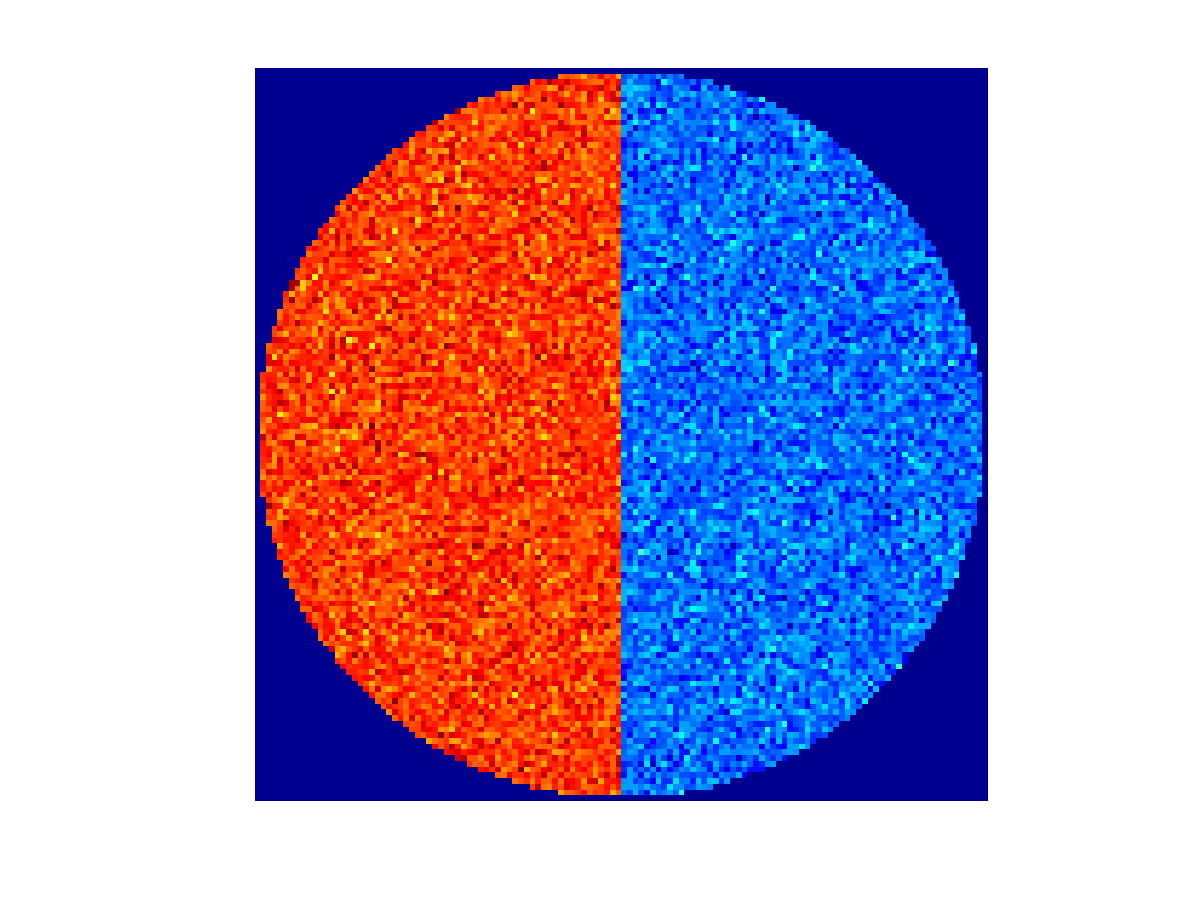
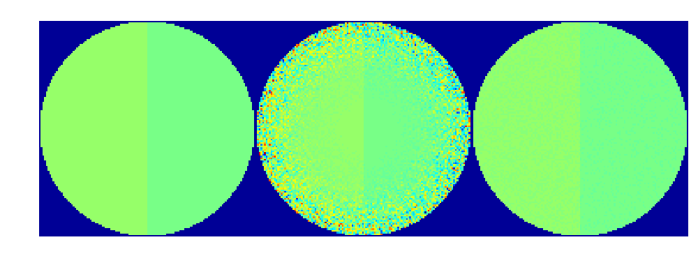
Now let’s turn to the problem of bad contrast in the above comparison image. Assume that we are happy with the better reconstruction shown on the right. Then we might want to set the color scale ranging from the minimum value in f3 to the maximum value in f3.
Also, we reload the functions afresh as they were modified above.
colormap jet
MAP = colormap;
M = size(MAP,1);
bckgrnd = [1 1 1];
MAP = [bckgrnd;MAP];
load data z udisc f1 f2 f3
MIN = min(min([f1,f3])); % Note that f2 is omitted!
MAX = max(max([f1,f3])); % Note that f2 is omitted!
cstep = (MAX-MIN)/(M-1);
f1(~udisc) = MIN-cstep;
f2(~udisc) = MIN-cstep;
f3(~udisc) = MIN-cstep;
f2(f2<MIN) = MIN-cstep;
f2(f2>MAX) = MIN-cstep;
figure(6);clf
imagesc([f1,f2,f3])
axis equal
axis off
colormap(MAP)
Now we have good contrast, comparable colors, and out-of-range-values in f2 indicated by the white background color.
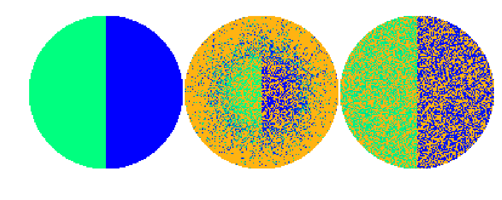
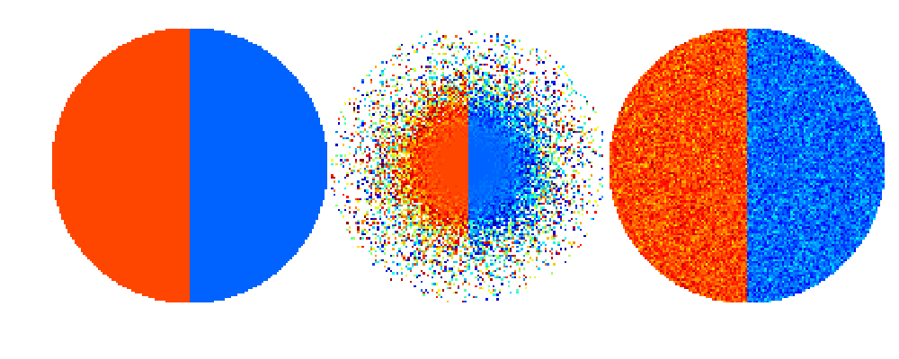
But assume that we want to see the errors, or out-of-range-values, clearly in both f2 and f3, and indicated by a different color than the background. This can be achieved by inserting two extra colors to the colormap as follows. For clarity, we use the “winter” colormap and indicate the errors as highly contrasting orange color.
colormap winter
MAP = colormap;
M = size(MAP,1); % Number of rows in the colormap
bckgrnd = [1 1 1]; % Pure white color
errcolor = [1 179/255 17/255]; % Error color is orange
load data z udisc f1 f2 f3
MIN = min(min(f1));
MAX = max(max(f1));
cstep = (MAX-MIN)/(M-1); % Step size in the colorscale from min to max
MAP = [errcolor;bckgrnd;MAP];
f2(f2<MIN) = MIN-2*cstep;
f2(f2>MAX) = MIN-2*cstep;
f3(f3<MIN) = MIN-2*cstep;
f3(f3>MAX) = MIN-2*cstep;
f1(~udisc) = MIN-cstep;
f2(~udisc) = MIN-cstep;
f3(~udisc) = MIN-cstep;
figure(7);clf
imagesc([f1,f2,f3])
axis equal
axis off
colormap(MAP)