Greetings,
This week I unfortunately had to skip the live lesson on Tuesday due to limited time. I was nervous about this “sacrifice” but had faith in managing with only the recorded lesson on my own. So the following day I sat down in my usual armchair, ready to tackle yesterday’s lesson. I had planned to have Arttu playing separately on my I pad, but for some reason the recording wouldn’t work on the tablet. This wasn’t however the biggest disadvantage as I was able to pause and alt-tab between the recording and Q-gis in peace and quiet. The rest of the lesson went smoothly as I just observed Arttu’s actions and repeated after him.
This week’s focus has been on map projections and their differences, as well as how one can go about portraying these differences visually. We also learned how to load data from a URL and not the local computer or a cloud service. Having done this, we went ahead measuring distances and areas, switching between projections to see how they differed. We mainly compared World Mercator’s projection and ETRS89 / TM35FIN. ETRS89 / TM35FIN is a projection that is specifically adjusted to project maps of Finland in the best way possible. World Mercator’s projection is a map that aims to project to entire world, which is much more challenging. Due to the way World Mercator’s projection is projected (along the equator) it leads to an increasing level of distortion of distances and area the further a location is from the equator. This could seem very impractical – and it is – but Mercator’s projection holds it’s strength in that it keeps all angles correct, making it the go to map for navigation.
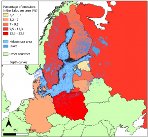
The vast differences in area and distances between ETRS89 / TM35FIN and Mercator’s projection makes it anyway abundantly clear that Mercator’s projection should strictly be used for navigating purposes and that other, locally adjusted, maps should be used in almost all other cases. Sanna Korpi clearly displays this in her blogpost on this same matter (Sanna Korpi 2021) comparing how numbers on child population density (0-14 year/km2) differ between Lambert’s projection and Mercator’s projection. Mercator’s projection displays lower density overall with the lowest interwall being from 0-0,54 and highest interwall being 44,44-80,96 compared to Lambert’s 0-2,4 on the low end and 179,4-326,2 on the high end. This clearly shows that it’s not only the visuals that will differ when using different map projection. The calculations and answers will be faulty and hence distort the entire analysis and all conclusions based on that analysis. Conclusion: One should choose one’s map projection with the uttermost care and consideration.
The main focus of this course lies however not on theoretical knowledge but on the practical skill of using Q-GIS. This week’s interactive exercise was to create a couple of maps and some tables. All of these was to display the differing levels of distortion between the projections. During the lesson Arttu goes through how to create a map that shows how many times bigger the area of Finland’s municipalities is on World Mercator’s projection compared to ETRS89 / TM35FIN. This process was clear enough and after having watched the recorded lesson I decided to play around with my map, trying to find the best way possible to communicate the phenomenon. I imagined it would be better to use World Mercator’s projection when displaying the distortion levels of that particular projection, so I chose to use it instead for my map. I also thought displaying the difference in area between the two projections in percent rather that “times bigger” would be better so I multiplied all values by 100. This was rather lucky as one of the homework assignments was to create a map displaying the differences in precent – two kebabs in one bite!
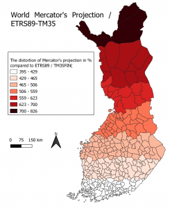
Picture 1. The map shows the levels of distortion on Mercator’s projection compared to ETRS89 / TM35FIN.
Something to note about this kind of map is that it visualizes the difference in distortion with a set of only a few colours (this case 7) and along municipality lines. The true case is that the level of distortion in Mercators projections slowly increase the further from the equator one looks. Since borders of municipalities seldom go in a strictly horizontal direction, we see some areas further south and north with in fact not ideal colours. A more realistic way to display the distortion would be to have a layer with small raster, gradually changing tone in colour.
The other parts of the home assignment we got was to do some measuring on a wider set of different projections. One set of measurement consisted of an area that makes up a “hat” on the head of “Suomen Neiti”, while the other part was measuring the width of Finland at about the latitude of the city of Vaasa. Here I also compare the different projections to an ellipsoid which truly gives accurate numbers on distances and areas. It’s not however possible to display the entire world in a 2D format on an ellipsoid projection. I display the following differences in distortion in the tables below (table 1 & 2).
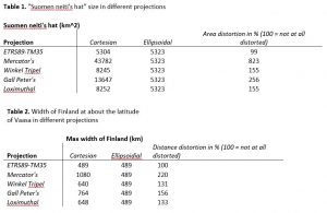
In both tables we see the same set up with the same projections. We can see that ETRS89 / TM35FIN is by far the least distorting. Mercator’s projection is by far the worst on both measures while the Winkel Tripel- and the Loximuthal projections fair decently well. Gall Peter’s projection is an interesting case as it distorts rather much (256%) when considering areas, but with much less (155%) when looking at pure distances. All projections however distort more when considering area because of the nature of the calculations.
This week continues to bring just the right amount of work, not so much that one feels overwhelmed, but enough to feel challenging and meaningful! Although I couldn’t participate in the live lesson I still find that I understood everything and got all exercises done. Next week I think I will look at Monday’s lesson before our live lesson at Tuesday so that I already know beforehand should any problems occur. Last week I mostly “copied” Arttu’s exact work hastily putting together the map during the lesson, but this week when I had proper time and felt no stress, I indulged in experimenting with and exploring new techniques and methods. So if the first week was a bit shaky, this week was much more steady. What will the future bring?
Alexander Engelhardt
Sources:
Korpi. S. (2021) sakorpi’s blog (27.1.2021)