Lesson 7. The End of the Beginning.

Here we are… the last lesson – what a journey it has been. It feels like I have learned so much during the past weeks and still I know that we have but scraped the mere surface of GIS. Still I think that we have covered a lot of basics and during this week I did feel quite comfortable combining bits of knowledge from earlier weeks as well as dipping into completely new functions and mechanics!

This week didn’t have as clear a theme as earlier weeks and was really free from. One was to choose a set of data and to visualize it to the best of one’s ability. I chose to make two maps focusing first on terrorism and refugees and secondly on piracy around the world. I chose these since I am really interested in geopolitics and the geographic distribution of various criminal activities. (I suggest reading two books: “Prisoners of Geography” and “McMafia”.)

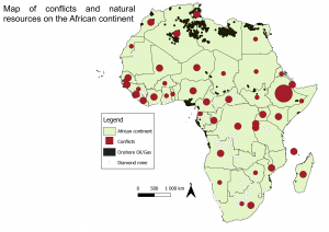
So firstly, I chose to look at terrorism and refugees specifically in the regions of Europe, The Middle East and parts of Africa. I also focused on the years of 2014 and 2015 to especially see how to outburst of civil war in Syria and the emergence of ISIS would be seen in the data. The results are twofold and mostly hang on the definition of terrorism. The Global Terrorism Database (source for my data about terrorism) defines terrorism as “The threatened or actual use of illegal force and violence by a non-state actor to attain a political, economic, religious, or social goal through fear, coercion, or intimidation”. Since this definition underlines that terrorism is tied explicitly to “non-state actors” the data may not mirror the reality very well. Especially in regions like Iraq or Afghanistan the line between state- and non-state actors can be quite blurred.  According to both The New York Times (2014) and The Independent (2015) the vast majority of the leaders within ISIS are former members of Saddam Hussein’s Ba’ath government. Twenty years ago, these members were so called “state actors” and now they would be called “terrorists”.  On the other hand (as can be seen on the map (picture 1.)) the number of fatalities due to terrorism in Syria is lower than Iraq although a bloody civil war has raged there as well amounting a death toll of about half a million lives. In a civil war as complex as Syria’s with over a dozen military groups cross fighting each other someone (usually the loser) is bound to end up being labeled a terrorist.

Anyhow, as I said the results of my map are twofold. On one hand you can se a correlation between the phenomena, but on the other hand there are certain regions that do not agree with this correlation. For example, we can see the correlation between terrorism and refugees quite clearly in countries like Afghanistan, Iraq, Ukraine and South Sudan. On the other hand, there are many African countries not having very many fatalities due to terrorism, but still holding a high percentage of the population as refugees. Here the reason for refuge might be something else like drought for example. An interesting observation is that all the countries of former Yugoslavia holds quite high numbers of refugees. I am unclear as to what is the reason behind this. It is to be made clear that this data tells about the proportion of each country’s population that are refugees and not how many refugees that country has given refuge to. This is why for example Turkey doesn’t hold very high numbers on this variable. Another interesting case is the case of France. Here we see quite many fatalities due to terrorism. This is of course due to the 13 November 2015 Paris attacks.

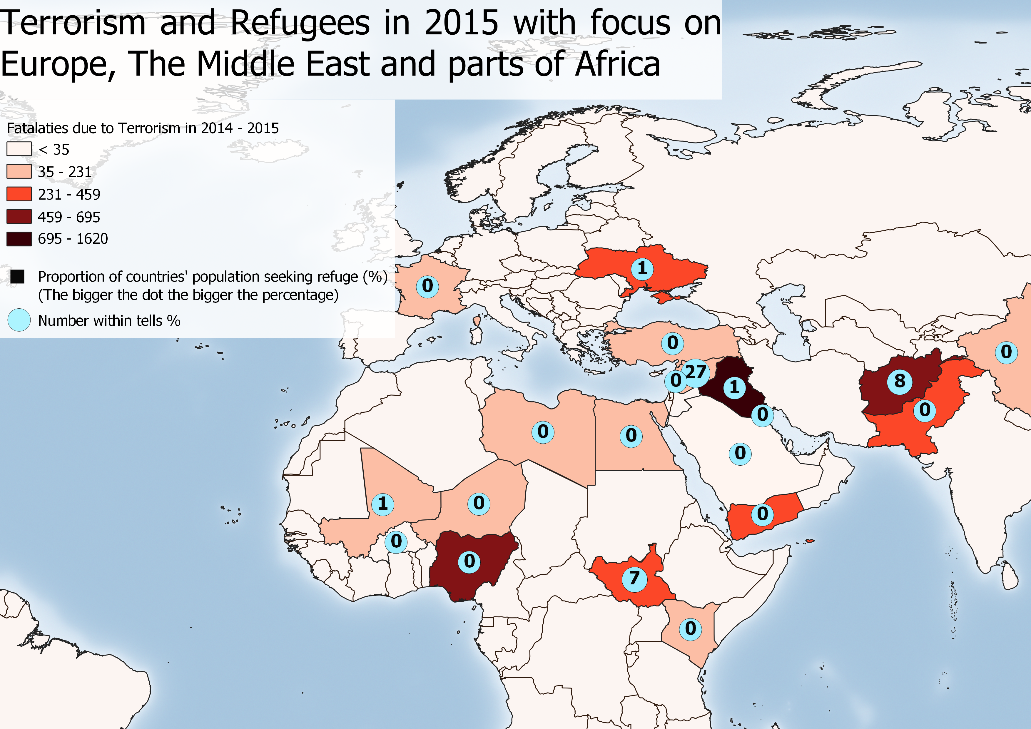
Picture 1. The map shows fatalities due to Terrorism in terrorist attacks with at least a 100 injured or killed and the proportion of the population that are refugees. Global Terrorism Database (2021), Gapminder (2021).

On creating this map I must say it was quite a task. Firstly the data wasn’t in the right format so I had to fix it using excel and so forth. I think Sara Korpi (Korpi 2021) would agree with me as she seems to have had similar struggles stating that “the handling of data has been the most challenging part of this course…” (“kaikista vaikein asia tällä kurssilla on ollut tilastotieteellinen puoli.” ) Another challenge was that I had forgot how to use certain tools within Q-GiS, layers didn’t work as they should and so on… Well I must say that although challenging it was very satisfying and meaningful as I had go back to earlier week’s exercise guidelines to look at how we did certain things. After doing this it really felt like I mastered these actions. The old saying is true; repetition is key! Reading Lotta Puodinketos blog (Puodinketo 2021) I got the idea of putting the percentage numbers within the dots displaying the phenomena of refugees much clearer.  Boy did I struggle with getting this one right!

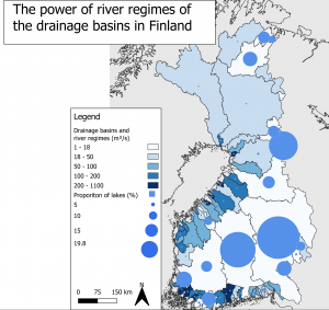
The other map I created displays piracy around the world has a temporal heatmap about piracy between the years of 1980 and 2021. I thought it would be cool to make a temporal map and it was easy enough to find the instructions on how to do this on the internet. It’s to be said that this is not about digital piracy, but good classic pirates! (“Arrr!” & “I am the captain now!”)

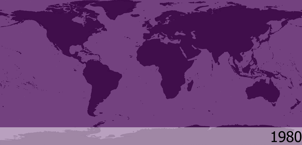
Picture 2. The map is a temporal heatmap displaying piracy around the world between 1980 and 2020.  NATIONAL GEOSPATIAL-INTELLIGENCE AGENCY (2021).

So what can we get from this map? It’s clear that piracy isn’t equally distributed around the world and that during this interwall spanning 40 years it’s more or less the same places popping up over and over again. Generally it can be said that acts of piracy are conducted manly in the waters around the equator and close to shore. The key regions in Asia are the South China Sea, the Indonesian Archipelago and the Bay of Bengal. In the Middle East piracy can be seen in the Persian Gulf. In Africa there are two main regions. The first can be found on the eastern coast around the Horn of Africa and the second can be found on along the shores of the former Slave Coast in West Africa. In the Western Hemisphere piracy can be found along both the entire eastern and western coast of South America excluding Chile and Argentina, as well as in the Caribbean. It is to be said that piracy, although to a much lesser degree can also be seen in the Mediterranean and even in the English channel one flare up can be seen in 1998.

As for looking at how the prevalence of piracy has developed since 1980 it can be said that it seems to come and go in waves of about five years. For example the reports of piracy in 1980 is quite low but in the latter half of the 80’s it increases to then again be seen less in the early 90’s. The absolute top of piracy during this period (1980-2021) can be seen in the latter half of the 90’s. Piracy seems to flare up around the world during 1996 to 1998 and then calm down in the early 2000. After this piracy seems to generally decrease significantly in the Western Hemisphere while it stays on the same level in Africa, The Middle East and South Asia. Since 2015 piracy has been especially prevalent at the shores of Nigera in West Central Africa.

It’s interesting to see that the prevalence of piracy seems to follow some kind of pattern with lows and highs in intervals of about five years. I don’t have data on this, but maybe it could have something to do with macro economic cycles that follow a similar pattern? Just a thought.

Finally I want to say some general words about this course. I think it has been by far the most fun and meaningful course I’ve had during this entire year and it really felt like you learned something new and useful. I really like studying GIS because it gives you a practical skill and not only theoretical knowledge. I think the format of this course worked splendidly as well, especially the recorded lessons were to much help. I also want to throw out a special shout out to all who’s blogs I’ve read, got inspired by and used as sources for my own blog! Here’s a shout out to you! And then I want to thank our Arttu Paarlahti for being a terrific teacher, being very flexible with his teaching and answering email very quickly! Thank you!

So that was it. I’m looking forward to future GIS-courses!

Till then… Cheers!

Alexander Engelhardt

Sources: 

Puodinketo L. (2021) 7. kurssikerta: Omaa työskentelyä. https://blogs.helsinki.fi/lottapuo/

Global Terrorism Database (2021): https://www.start.umd.edu/gtd/search/Results.aspx?chart=regions&casualties_type=b&casualties_max=&start_yearonly=2014&end_yearonly=2015&criterion1=yes&criterion2=yes&dtp2=some&success=no&region=10&count=100

Gapminder (2021) : https://www.gapminder.org/data/

NATIONAL GEOSPATIAL-INTELLIGENCE AGENCY (2021): https://msi.nga.mil/Piracy

Natural Earth (2021) :  https://www.naturalearthdata.com/

ArcGIS (2021): https://hub.arcgis.com/datasets/2b93b06dc0dc4e809d3c8db5cb96ba69_0/data

The Independent (2015):  https://www.independent.co.uk/news/world/middle-east/how-saddam-hussein-s-former-military-officers-and-spies-are-controlling-isis-10156610.html

The New York Times (2014): https://www.nytimes.com/2014/08/28/world/middleeast/army-know-how-seen-as-factor-in-isis-successes.html


Lesson 6. Interpolation, earthquakes and volcanoes. Fun.

This week I yet again skipped the lesson, but this time it really bugs me. Had I known that we were supposed to go outside to create our own data I would absolutely have participated, but since I learned about it only after the lesson I sadly didn’t. I had checked the news page “uutiset” on our moodle but there wasn’t anything there so I thought everything would run as normal. Anyways I think this week’s exercises have been by far the most interesting yet! We have used interpolation methods as well as looked at certain hazards.

To begin with I want to repeat my humblest apologies for not participating and contributing to the Epicollect-data. I thank you who provided us with it so that we all could use it for our own assignments. So, the idea was we were going to interpolate ordinal data about safety, attractiveness and pleasantness and to then layer traffic roads and buildings on that to see if there are any correlations. Interpolation is a method in which for example with raster data where some of the raster lacks data but surrounding raster all have data assigned to them the value of the raster within is filled with the mean value of the surrounding raster. This is a method that is very widely used across many different fields and is by no means specific for GIS. For example, if you want to make a picture sharper one can use interpolation to imitate a higher pixel count than the picture originally had.

As I was saying, we looked at correlations between settlement and safety, attractiveness and pleasantness. One thing that struck me about the data was that it was very clustered. There was about seven clusters where all observations had been made. Six of these where within the Greater Helsinki region and one could be found in Nummela. General correlations that I could see was that heavy traffic correlated with less attractiveness and less pleasantness while green areas where seen as more attractive and more pleasant. When it comes to safety there where some food for thought in my opinion. For example, a few places in the park between Northern Haaga and Maunala was generally seen as safer than a larger highway nearby. I wonder if the observations would say the same if it was nighttime?

For my interpolations assignment I chose to focus on the attractiveness of the Viiki area. This area had a good varied set of observations for an interesting analysis. There is one major highway in the north and northwest, Lahdenväylä and then larger and smaller roads intersecting within the selected area. The general picture is that the highway and the largest roads holds the most negative numbers for attractiveness while observations made further from these places posts generally positive reviews. However, there are anomalies in the observations and the results can’t be described in as a single correlation, nor do I have the proper insight into what it was about these certain places that made them divert from the general rule. For that an interview style set of data would need to be included explaining the anomalies. The results of the interpolation method can be seen below in picture 1. Blue colours display maximum attractiveness, while green displays a bit less of that. Yellow displays places that are rather neutral while orange displays rather unattractive places. Red is the colour for maximum unattractiveness.

Picture 1. The map shows interpolated data about the attractiveness of certain places.

The other part of this lessons theme was to look at some data about earthquakes, volcanoes and craters from meteoroids and to visualize this through maps. This is an interesting hazard to look at because there is an overload of quite specific data from decades past. I downloaded data and then reformatted it in Excel so that QGIS could make sense of it. This wasn’t to difficult as we have done similar things earlier in the course. That’s a good feeling; being able to use something previously learned to make some parts of the exercise much easier!

Firstly, I made two maps displaying earthquakes with different magnitudes. Picture 2. displays all earthquakes between 1980 and 2021 with a magnitude above 5 on the Richter scale. I chose to further display the magnitude of each earthquake with a colour gradient shifting from blue for the lightest earthquakes to green and yellow for earthquakes with a magnitude of 6-8. Earthquakes with a magnitude over 8 are displayed as orange and over 9 gets the colour red. A problem that I encountered here was that the absolute most common “blue” earthquakes totally eclipsed the other colours making the map not very intuitive as it would seem there are no heavier earthquakes. This would especially be a problem as it is often the heaviest earthquakes that make the greatest impact on human settlement while lighter earthquakes seldom post any risk at all. I couldn’t find a function that would select in which order the observations where supposed to be shown so to get around this I made a second layer only containing earthquakes with a magnitude of 8 and higher and assigned the appropriate classification and colours to these. This way one can see the orange and red dots much clearer. Reading Ilari Leino’s blog (Leino 2021) I saw a different approach to visualizing the difference in magnitude. Rather than colour he used size. In my opinion this was better and more intuitive way to display the phenomenon. This can be seen in picture 2. To put even greater focus on the earthquakes with the highest magnitude I chose to quickly assemble a map focusing on only earthquakes with a magnitude of 8 and higher. With this limitation the number of earthquakes is in the tens instead of 10 000. This can be seen in picture 3.

Picture 2. The map shows all earthquakes with a magnitude of 5 and up between 1980 and 2021.

Picture 3.  The map shows all earthquakes with a magnitude of 8  and up between 1980 and 2021.

Next up I looked at volcanoes. In a similar process I downloaded data about the location of volcanoes and then layered this onto my pre-existing project about earthquakes. Although I already new that volcanoes and earthquakes often appear in the same regions it was interesting to see this on a map of your own making. The reason to this is of course that both earthquakes and volcanoes appear in seismically active zones – that is zones between tectonic plates. In picture 4. you can see the map I created. It visualizes earthquakes as black dots and volcanoes as red diamonds. I noticed that Sanna Janttunen (Janttunen 2021) had made a similar map comparing the location of volcanoes and earthquakes but she zoomed in on region of Central America. This map was much prettier and I think it was a good idea to look at a smaller region for this exercise.

Picture 4. The picture shows earthquakes and volcanoes. As can be seen this mostly appear in the same regions.

So, by this time I thought I was pretty much done with the week’s exercises, but I decided to continue to play with the data. My idea was to somehow combine interpolation and earthquakes. After trying this I can say it isn’t advisable at the macro-scale we were at. Since earthquakes are largely concentrated to the border zones of tectonic plates there is really no point to looking at how interpolation affects this phenomenon. With this in mind I decided to instead make a clear example of how NOT to visualize something as this is also an important lesson to learn. Anyhow it was just interesting to examine how the interpolation tool functions and fun to look at the ridiculous results! Picture 5. displays interpolated data about the magnitude of earthquakes. This got me thinking though that surely there must be some use to interpolation conserning earthquakes and looking at a single earthquake the picture is very different. Often when measuring the impact of an earthquake there are certain specific stations at which the effect of the earthquake is measured. By using interpolation one can estimate the effect between the stations without actually measuring it for every single spot. It’s interesting to see that interpolation could be widely used at this scale while it is totally nonsensical at a global scale. Picture 6. shows a map which uses interpolation to estimate the impact of an earthquake in the different zones.

Picture 5.  Interpolation of earthquakes with magnitude taken into consideration. Totally useless really. Still one can see resemblances of the borders of the tectonic plates.

A. 3D interpolation of seismological magnitude data and location of... | Download Scientific Diagram

Picture 6. The map shows a 3D interpolated model of seismological magnitude data for the Baradighi Tea Garden in the Himalayas. (Source: Biswas, Mery & Paul, Ankita. (2020).)


Sources:

Leino I. (2021) Kuudes kurssikerta. < https://blogs.helsinki.fi/ilarilei/ > 01.03.2021

Janttunen S. (2021) Hasardihommia < https://blogs.helsinki.fi/smjantun/ > 01.03.2021

Biswas, Mery & Paul, Ankita. (2020). Application of geomorphic indices to Address the foreland Himalayan tectonics and landform deformation- Matiali-Chalsa- Baradighi recess, West Bengal, India. Quaternary International. 10.1016/j.quaint.2020.12.012.


Lesson 5. All alone a Dog with out a bone

Lesson 5. All alone a Dog with out a bone

This week was another adventure and this time I was truly left to fend for myself. As I had managed quite fairly only watching the recorded lessons, I thought I’d continue with the same strategy. Why change something that isn’t broken? To my horror however the recordings hadn’t been uploaded to moodle. No matter – I continued only using the written guide and low and behold it turned out okay! It wasn’t as interesting and comprehensive as the lessons, but it turned out just fine this as well.

So, this week’s theme has been mathematical analysis and especially using the buffer zone tool. The buffer tool is used to examine a phenomenon within a buffer zone, this be a radius from a point, road or place. I applied this method to various tasks, counting residents living near roads leading to the town centre of Pornainen, inhabitants near airports and train/metro stations and school related data about inhabitants near schools. The focus of this week has been more on analysing data than on visualising it through maps and hence I have produced a set of tables and diagrams instead of a plethora of interesting and nice-looking maps.

Table 1. The table describes the amount of people within various radiuses from either Vantaa-Helsinki- or Malm’s Airport. It also displays how many are affected by high decibel values as a result from air traffic.

Looking at Henrietta Nyström’s (Nyström 2021) and Sanna Janttunen’s (Janttunen 2021) blogs I noticed that our numbers differ somewhat. Nyström seems to have noticed the same thing and figures it has to do with the specific tools and preferences that one has selected. This might very well be true.

Table 2. The table describes the amount of people inside a 500m radius of train stations as well as looking at the proportion of working aged people within this radius.

As can be seen from table 2. the vast majority of people living within a 500m radius of the a station belongs to the working age group. This is probably due to the ease of transport when using the metro or train. This is something that is very attractive to this particular age group. One should note that 69% seems very high, but this is due to the vast majority of people overall belong to this age group and hence this isn’t truly that high of a number. It would be interesting to look at the difference between the proportion of people within the working age group within and outside of the buffer zone. This number would surely be much lower, but there would probably still be variations although not as high as 69%.

Picture 1. The Diagram displays some numbers on the population in Vantaa.


Table 3. The table shows the amount of people living in urban/rural areas in Vantaa

The next assignment concerns the population of Vantaa and if they live in urban or rural areas. The proportion of children in these areas is also looked at. As can be seen in the table the vast majority lives within urban areas and this counts for the children as well. The reason behind urban areas being so much more popular drives down to these having more services and better transport.

Picture 2. The diagram displays various numbers on the population of Vantaa.

For the last assignment this week wo got to choose between a set of exercises. I chose to use to buffer zone tool to look at amounts of children within a buffer zone of Helsinki Yhtenäiskoulu in Käpylä, Helsinki. To me this was by far the hardest of the exercises as I struggled both with data related parts as well as the technical side of things. Eventually I did succeed and below you can see in table 4. the new found data.

Table 4. The table shows residents and children within the

I couldn’t leave you without a weekly map now could I? so finally after completing these exercises I decided I wanted to visualize the last exercise as a map. I used a plug in called Quick map services to load the OSM Standard Map as the background map to load a preexisting map of Helsinki to my project and then layered upon in the borders of Helsinki Yhtenäiskoulu’s school district and dots for all households that have children within school age. The result is the following map:

Picture 3. The map shows the households with children within school age within the borders of the school district of Helsinki Yhtenäiskoulu.

Usually I have always had the recorded lessons as a detailed guide to the exercises, but this week was different. As I had missed the lesson and there was no recording I had to manage with only the written guide. In hopes of Arttu uploading the recorded lesson to moodle I procrastinated finishing this week’s exercises until today. Today though I had to make the executive decision of going forward on my own. It worked out fine. I still hope that the lessons will be recorded in the future. For it is the future or youtube will outperform universities in a few years. At least on flexibility and availability.

Cheers,

Alexander Engelhardt


Sources:
Janttunen S. (2021) Toisto on oppimisen äiti ja isä.
https://blogs.helsinki.fi/smjantun/
Nyström H. (2021) Kurssikerta 5: Buffereita ja tähänastisen osaamisen pohdintaa
https://blogs.helsinki.fi/nystrhen/

Lesson 4. Problems

My God! This was a troublesome week. The tasks themselves where simple enough but a whole lot of other problems arose. During the lesson I had the problem of not being able to correctly download the material. The large file with all the data would just read an error message. Fortunately I was able to download it on a different computer and then transfer it to my main computer through an external hard drive. An other even more enraging problem was that during the lesson I had saved all my projects separately so that I would be able to continue working on them after the lesson. However when opening them afterwards none of them were working properly! I had been very thorough with saving all scratch layers and everything, but somehow it had all disappeared. This left me unmotivated, but reading Annika Innanen’s blog (Innanen 2021) gave me the kick in the bum I needed. I would no longer sit and feel sorry for my self as she had struggled with the same issue and managed to come out on top. So would I.

So this week’s focus has been on raster material. Due to the nature of raster there are certain benefits as well as downsides compared to the earlier used vector format. Compared to the vector format raster is rather rigid only presenting data in a clear grid fashion. This makes everything kind of stale and not very natural. If you would try to counter this through upping the resolution (making the raster smaller) it leads to the data being very heavy and unwieldy. The benefits lie in that all raster (in the same grid) are all of equal size which opens up options not available in a vector based map. For example visualizing data absolutely and relatively simultaneously is not using vector maps but on a raster map this is completely possible due to all raster being of equal size. This is very helpful when wanting to convey as much information as densely as possible. An other clear benefit would be visualizing a gradually shifting phenomenon. As vector maps are founded on clearly defined points, lines and polygons it is hard to visualize this kind of phenomenon. On the other hand with raster, this is easy by just binding the data to the raster and assigning a set of colours.

During the lesson we visualized the amount of Swedish speaking Finns in the Greater Helsinki area through creating a grid covering the municipalities.  When redoing this I instead chose to look at “Other languages”, that is other than Finnish or Swedish. This was a very similar process and the result looks familiar to other maps displaying the same information. As can be seen on picture 1. the map shows that most “Other languages” speakers can be found Helsinki and especially in eastern Helsinki. According to Venla Brenelius (Maa-106 2020) this is due to the area having comparatively large yet affordable housing which is often the go to option for the often larger and poorer immigrant families.


Picture 1. Map showing the amount of people speaking a language other than Finnish or Swedish in the Greater Helsinki area.

This kind of map still lacks in that it only tells us relative number relative to area. It doesn’t tell us about in this caseabout the relative amount of “other language”-speakers compared to the majority language speakers. Another problem with raster is that when dealing with the geographical distribution of a societal phenomena like language it’s often more intuitive to set the data along some preestablished lines; like administrative lines. This is because people already know these which makes it easier to grasp than a rigid raster grid.

Raster can though be used very widely and one example of that is how we used raster data to create a topographical map of Pornainen. I compared the map to other preexisting topographical maps of the same area and in my mind they were similar enough. Some small differences but nothing ground breaking. The preexisting maps where generally more detailed and reading Lotta Mattila’s blog (Mattila 2021) she seems to have come to a similar conclusion noting that the maps had differences in elevation curves but that the maps where different in other ways as well (“kartat ovat muutenkin erilaiset.”)

Picture 2. Topographical map of Pornainen.

I noted that one key thing to make the map look tidier was to make the lines displaying elevation really thin. There was a problem with this however. When zooming in the lines would then be too thin. Surely there is a function to relate the thickness or size of symbols to the level of detail?

At the end of the lesson we started to do some familiar digitalizing, this was in preparation for next weeks lesson. I wonder what may come?!

Till next week…

Alexander Engelhardt


Sources:

Innan A. (2021) Harjoitus 4: Väestöteemakartta ruutuaineistosta https://blogs.helsinki.fi/anninnan/

Mattila L. (2021) Ruututeemakartta https://blogs.helsinki.fi/lottmatt/2021/02/09/rasterikartat/


Lesson 3. Blood Diamonds and River regimes

This week I continued with last weeks strategy of not participating in the live lesson. I enacted this plan with certainty, but my confidence turned into despair as couldn’t find the recording of this week’s lesson! Horrified I looked everywhere, reloading pages over and over again. Certain I had scoured everything, I thought that maybe Arttu hadn’t recorded this week’s lessons. I decided to ask the man himself and wrote him an email asking about the matter. In the mail I also gave some general feedback about distance learning and why I prefer certain aspects of it compared to traditional learning. I was prepared to wait at least a day for a reply but Arttu surprised me with an answer within minutes telling me that the recordings would be up soon enough. God bless the man! Rejoiced and rejuvenated I started working.

This week we moved outside the borders of our beloved homeland (Finland). The lesson focused on the African continent, looking at the areas of countries, internet use, natural resources and regional conflicts. We used a whole lot of new tools, ordering around data according to our need. Compared to the weeks before this week had some rather challenging tasks to complete and I must admit I didn’t understand all of my own actions at the moment of doing them. It was only after the lesson when I played around with the material that I got a better idea of what all the functions actually did. Combining, calculating and changing visuals I created a map of the African continent showing some natural resources and conflicts (see picture 1). I produced most of this map just following Arttu but examining the data further I find some irregularities. This must be of my own doing and I can’t seem to figure it out. For example, in the attribute table for the unique conflicts it says there has been 42 unique conflicts in Angola but as can be seen on the map there is only one dot. There where other problems as well. However, since I couldn’t solve the problem and this course is manly about the technique of map making I have decided to go forth anyways, demonstrating my idea rather than actual meaningful data.

Picture 1. The map shows natural resources and conflicts. All conflicts of one year per country is shown as one dot. Additionally, the size of the dots is based on the total amounts of recorded conflicts during that year. (This is what the map should show according to the data, but it doesn’t).

On the map we can see diamond mines, onshore oil/gas drilling and the amount of conflicts in different countries. During the lesson we made a map that showed conflicts in different countries, combining all conflicts during the same year in to one dot. I thought this was a little too much generalization, so I decided to also take in to account the total numbers of conflicts as well. To do this I made the data “combining yearly conflicts” display the place and amount of the dots (It doesn’t work however) but the size of the dots were however decided by the total amount of conflicts in each country. To visualize it even better I decided to square all numbers so that there would be greater size differences between smaller and bigger conflicts.

The story of the African continent is a tragic one. Gaining independence from European powers hasn’t brought the desired outcome. Africa, probably the most resource dense of all continents hasn’t meant wealth for African people, rather it has brought continuous war and conflict. The term blood diamond describes a diamond or the diamond trade where the mining operations has been defined by military groups fighting for control over these mines and where the profits has been used to fuel further violence. The term conflict resource is a broader term for any resource that can be found in similar context. War over resources is however not the only reason behind the conflicts, rather ethnic and religious violence is common as well. This violence has often also been fueled by global superpowers like the USA and the Soviet Union during the cold war and.

Still to this day the USA continues to have a presence in many parts of Africa, both through direct military personal and through backing various local factions. This is according to Pentagon officials (Politco 2017). This so called “shadow war” has gone much under the radar and is based on the 2001 declaration of war against “terrorism”. The French also have a strong presence in former French African colonies basically maintaining their empire unofficially. This happens through both direct military presence but even more through economic soft power. Much of west- and central African nations have their currencies bound to the French central bank which gives Paris control to a large extent over the African economies. All the blame can’t be put on geopolitics and neocolonialism as most of the violence can be seen in civil war and civil unrest. Much has to do with resources and as Rasmus Sohlman states “kilpailu resursseista korreloi konfliktien sijainnin kanssa” conflicts correlates spatially with natural resources.

For homework we got to make a map over the drainage basins and river regimes in Finland (see picture 2). My end product turned out okay, but I found the process rather tedious and messy. As I hadn’t understood all of my own actions during the lesson, I hadn’t really learned them and had to go back many times to really understand what to do.

Picture 2. The map shows river regimes in the drainage basins of Finland and the proportion of lakes covering the land in Finland in each drainage basin.

I made this map mostly according to the instructions except for putting a little more emphasizing the portion of lakes by making the biggest dots even bigger. I did this through the same method which I used to make the dots for conflicts bigger on the map of Africa. It’s interesting to see that the strongest regimes can be found where there aren’t many lakes and vice versa where there are many (or larger) lakes the river regimes are generally weaker. The strongest regimes can be found at the coast in southern Finland and in the region of Ostrobothnia. This is probably due to these basins being much smaller, concentrating the amounts of water into fewer, bigger rivers.  Looking at other people’s blogs I found that Sanna Janttunen made an interesting find in that the drainage basin of Jänisjoki overlaps with the geometry of Ladoga (Russia) (Janttunen 2021).

This week’s focus on Africa interested me to a much greater degree than the continuous focus on only Finland. I find geopolitics, conflicts and natural resources much more engaging than the river regimes of Finnish drainage basins. The tools we learned to use this week were harder to use, but also felt more useful and skillful than tools earlier in the course. I feel I need to have a further look on them to really grasp all the functions before next weeks lesson. The problems with visualizing the data bugs me as well and I need to examine that as well. Due to time constraints I had to except defeat on that front and write my blog about the incorrect map. I hope you can see past the obvious problems and focus on the idea rather than the actual data. When I have time, I will have an other look at it and update it to a correct version.


Alexander Engelhardt


Sources:

Janttunen. S. (2021) Sannan blogi. (06.02.2021)

https://blogs.helsinki.fi/smjantun/2021/02/03/veritimantteja-ja-keskivirtaamia/

Sohlman. R. (2021) RASMUKSEN GEM-KURSSIBLOGI. (06.02.2021)

https://blogs.helsinki.fi/sohlrasm/

Politico (2017) America’s shadow war in Africa (06.02.2021)

https://www.politico.com/story/2017/10/12/niger-shadow-war-africa-243695

Kaspian report (2019) How France maintains it’s grip on Africa – (06.02.2021)

https://www.youtube.com/watch?v=42_-ALNwpUo&t=617s&ab_channel=CaspianReport

Lesson 2. When a sacrifice pays off

Greetings,

This week I unfortunately had to skip the live lesson on Tuesday due to limited time. I was nervous about this “sacrifice” but had faith in managing with only the recorded lesson on my own. So the following day I sat down in my usual armchair, ready to tackle yesterday’s lesson. I had planned to have Arttu playing separately on my I pad, but for some reason the recording wouldn’t work on the tablet. This wasn’t however the biggest disadvantage as I was able to pause and alt-tab between the recording and Q-gis in peace and quiet. The rest of the lesson went smoothly as I just observed Arttu’s actions and repeated after him.

This week’s focus has been on map projections and their differences, as well as how one can go about portraying these differences visually. We also learned how to load data from a URL and not the local computer or a cloud service. Having done this, we went ahead measuring distances and areas, switching between projections to see how they differed. We mainly compared World Mercator’s projection and ETRS89 / TM35FIN. ETRS89 / TM35FIN is a projection that is specifically adjusted to project maps of Finland in the best way possible. World Mercator’s projection is a map that aims to project to entire world, which is much more challenging. Due to the way World Mercator’s projection is projected (along the equator) it leads to an increasing level of distortion of distances and area the further a location is from the equator. This could seem very impractical – and it is – but Mercator’s projection holds it’s strength in that it keeps all angles correct, making it the go to map for navigation.

The vast differences in area and distances between ETRS89 / TM35FIN and Mercator’s projection makes it anyway abundantly clear that Mercator’s projection should strictly be used for navigating purposes and that other, locally adjusted, maps should be used in almost all other cases. Sanna Korpi clearly displays this in her blogpost on this same matter (Sanna Korpi 2021) comparing how numbers on child population density (0-14 year/km2) differ between Lambert’s projection and Mercator’s projection. Mercator’s projection displays lower density overall with the lowest interwall being from 0-0,54 and highest interwall being 44,44-80,96 compared to Lambert’s 0-2,4 on the low end and 179,4-326,2 on the high end. This clearly shows that it’s not only the visuals that will differ when using different map projection. The calculations and answers will be faulty and hence distort the entire analysis and all conclusions based on that analysis. Conclusion: One should choose one’s  map projection with the uttermost care and consideration.

The main focus of this course lies however not on theoretical knowledge but on the practical skill of using Q-GIS. This week’s interactive exercise was to create a couple of maps and some tables. All of these was to display the differing levels of distortion between the projections. During the lesson Arttu goes through how to create a map that shows how many times bigger the area of Finland’s municipalities is on World Mercator’s projection compared to ETRS89 / TM35FIN. This process was clear enough and after having watched the recorded lesson I decided to play around with my map, trying to find the best way possible to communicate the phenomenon. I imagined it would be better to use World Mercator’s projection when displaying the distortion levels of that particular projection, so I chose to use it instead for my map. I also thought displaying the difference in area between the two projections in percent rather that “times bigger” would be better so I multiplied all values by 100. This was rather lucky as one of the homework assignments was to create a map displaying the differences in precent – two kebabs in one bite!

Picture 1. The map shows the levels of distortion on Mercator’s projection compared to ETRS89 / TM35FIN.

Something to note about this kind of map is that it visualizes the difference in distortion with a set of only a few colours (this case 7) and along municipality lines. The true case is that the level of distortion in Mercators projections slowly increase the further from the equator one looks. Since borders of municipalities seldom go in a strictly horizontal direction, we see some areas further south and north with in fact not ideal colours. A more realistic way to display the distortion would be to have a layer with small raster, gradually changing tone in colour.

The other parts of the home assignment we got was to do some measuring on a wider set of different projections. One set of measurement consisted of an area that makes up a “hat” on the head of “Suomen Neiti”, while the other part was measuring the width of Finland at about the latitude of the city of Vaasa. Here I also compare the different projections to an ellipsoid which truly gives accurate numbers on distances and areas. It’s not however possible to display the entire world in a 2D format on an ellipsoid projection. I display the following differences in distortion in the tables below (table 1 & 2).

In both tables we see the same set up with the same projections. We can see that ETRS89 / TM35FIN is by far the least distorting. Mercator’s projection is by far the worst on both measures while the Winkel Tripel- and the Loximuthal projections fair decently well. Gall Peter’s projection is an interesting case as it distorts rather much (256%) when considering areas, but with much less (155%) when looking at pure distances. All projections however distort more when considering area because of the nature of the calculations.

This week continues to bring just the right amount of work, not so much that one feels overwhelmed, but enough to feel challenging and meaningful! Although I couldn’t participate in the live lesson I still find that I understood everything and got all exercises done. Next week I think I will look at Monday’s lesson before our live lesson at Tuesday so that I already know beforehand should any problems occur. Last week I mostly “copied” Arttu’s exact work hastily putting together the map during the lesson, but this week when I had proper time and felt no stress, I indulged in experimenting with and exploring new techniques and methods. So if the first week was a bit shaky, this week was much more steady. What will the future bring?

Alexander Engelhardt


Sources:


Korpi. S. (2021) sakorpi’s blog (27.1.2021)


Lesson 1. Confusion and clarity.

Hi!
I have chosen to write this blog in English although my mother tongue is Swedish and I understand Finnish as well, so that it would be useful to as wide an audience as possible. 

So, this course is something I have been waiting for ever since I heard about it from a friend who had it last year. There is something about maps that have always intrigued me and the thought of interactive maps filled with data ready to be played and tinkered with made me ecstatic!

The main focus of this course is to learn how to operate the software application Q-GIS which is an application with which one can produce and interact with data driven maps. During our first lesson we went through some key things about Q-GIS with our teacher Arttu Paarlahti continuously throwing in titbits of extra information here and there. At first we learned about the general set up and UI (user interface) in Q-GIS, but then Arttu made the important remark about any data management software paraphrasing  – …it’s not very possible to learn how to use Q-GIS by just looking at it, you need to use it in practice to actually learn how to use it…

Naturally following we imported a set of data consisting of a map of northern and central Europe and the amounts of pollutive nitrogen in  the Baltic Sea for each country. First we just played around with the data; ordering around layers, changing colours, looking at data.

Then came the first actually interactive part of using Q-GIS. We were supposed to visualize the data about pollutive nitrogen in the Baltic Sea for each country by creating a choropleth map based on the available data. To achieve this we had to turn the absolute numbers into relative numbers which luckily was easy enough within Q-GIS itself. To complete the task we still needed to add a legend explaining colours and specifying numbers, add a scale bar and add an arrow pointing north. The map is shown below (Picture 1.).

Picture 1. The picture shows a map visualizing the relative amounts of pollutive nitrogen in The Baltic Sea for each country.

In my mind the map turned out quite decent and the procedure was clear enough as I just followed what Arttu did and asked questions when needed. Reading Sanna Jantunen’s blog (Jantunen 2021) lessened my like for the map as she pointed out some rather good points about her own map. She made a remark about the depth lines being redundant, only stealing attention from what is truly important. This I absolutely agree with!

For homework we got to produce a similar choropleth map on our own. This time I struggled quite hard as I had forgotten how to execute some of the actions which we used during the lesson. We were supposed to choose one section of the imported data about Finnish municipalities to visualize differences and similarities between the municipalities. This was pretty much the same exercise as we did during the lesson, but soon enough I got stuck. I tried and tried, but couldn’t find the function where you change the visuals of the map. At last I looked at the recording of the lesson and found the answer. What a relief! I really hope that these kinds of recordings don’t disappear when the distance learning is not the case anymore. What would be even better would be pre recorded theory lessons which the teacher would post on Moodle for students to look at before each live-lesson so that the live-lesson would then be as efficient and smooth as possible. This would save time for the teachers in the long run as well as demonstrating the dedication of The University of Helsinki to the wonderful possibilities that technology could add to education. 

The map which I created visualizes the geographical distribution of Swedish speaking Finns in Finland. As can be seen on the map (picture 2.) the Swedish speaking population is concentrated to the coastal areas in the south, to the region of Ostrobothnia and to the Finnish archipelago. To reflect the harsh lingual divide in Finland I chose to use a rather polarized range of red-ish colours to emphasize the differences between municipalities and different regions in Finland.

Picture 2. The Picture shows the relative amounts of Swedish speaking Finns in the municipalities of Finland.

Martta Huttunen made a similar map which she put in her blog (Huttunen 2021), but concerning the distribution of Saame speakers in Finland. Saame speakers are predominantly found in the northern parts of Finland, but interestingly  a small minority (1-4%) can also be found in Helsinki. Huttunen continues to explain the reasons behind this, a key factor being The University of Helsinki being the only university south of Oulu where one can study Saame. 

I have found the content of this first week quite motivating. Although the data we analyzed and visualized was rather dry and not highly interesting the exercises were challenging and I felt like I actually learned something new and important compared to many of the earlier courses I have had. I look forward to the weeks to come as we get to delve deeper into the world of Q-GIS and geoinformatics; failing and succeeding, struggling and overcoming, but foremost – learning and preparing us for a road to masters.


Alexander Engelhardt