In this exercise i analyzed the distribution of daycare centers within poor air quality zones. I used multiple data sources to do the analysis. The traffic volume data was a table created by the Helsinki urban environment division. Daycare center data was created by Information technology unit, the file format was .KML. The road network data we used was the Digiroad data made by Finnish transport agency and the air quality table was created by HSY.
After the initial planning and CRS transformations it was time to start building the models. I made the first model with QGIS. It took some time to understand how the QGIS model builder works, but once I got the hang of it, it turned out to be an easy and understandable method for modelbuilding. I already had some experience with the ArcMap model builder, so it didn’t require much thinking. The main difference between the ArcMap and QGIS models is that the QGIS model is “reusable” in the sense that it can be applied for a different set of data whereas the ArcMap model is made for a specific dataset. For example, you could use the model made with QGIS to do the same analysis for another city. In practice, however, the data would have to be very specifically refined in order to work similarly to the data used in this exercise. The straight-forward approach of the ArcMap model builder is probably more suitable for the PPDAC (Problem, Plan, Data, Analysis, Conclusions) framework. However, I think it’s mostly about personal preference and for me, the QGIS model builder worked better.
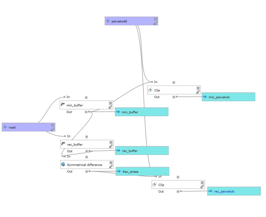
In the bonus task an additional buffer zone was created based on the recommended distances from roads. The first step was to create a new column for the distance variable. I used a basic IF- “chain” (if(”2016_1″<=5000,20,if(”2016_1”>5000 AND ”2016_1″<=10000,40…) etc.) to classify the recommended distances based on traffic amounts. After the classification the same variable distance buffer was created for the roads, but this time based on the recommended distances. To avoid overlapping of the daycare centers within the minimum and recommended distances, the overlap of the two buffer zones had to be erased. Rather amusingly, the QGIS difference-function did not work on the version that I used for this exercise, so I had to use the SAGA-version of the same function. Lastly the model extracted the daycare centers within the min-rec -difference buffer. (Figure 1)
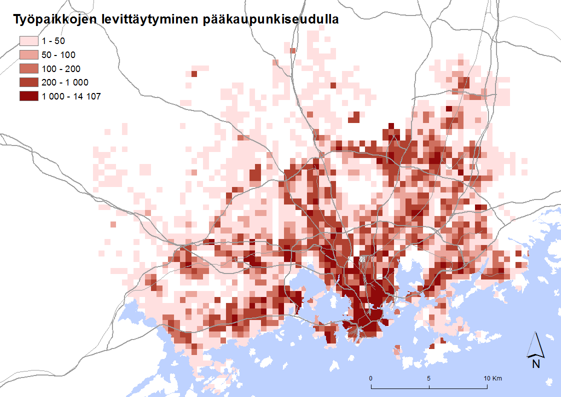
Now we finally had the results (Figure 2): 20 daycare centers within the minimum distance and 33 within the recommended distance. So in total 53 daycare centers are at risk and 964 are not. As the PPDAC model suggests, this leads to further questions: How is this possible? Were the daycare centers established before or after these air-quality zone classifications were published?