by Riikka Väänänen, Vilma Kangasaho, Stephany B. Mazon, Sofia Emmanouela Theodorou, Filippo Xausa
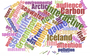 Scientists love graphs and charts and read them as a second language, but the complicated pictures you find in scientific journals can look like gibberish for the general public. One of our group’s task during the #ArcticCourse was to find new ways to visualize climate and environmental data from Arctic. We brainstormed what kind of data would give new insights and how to present it in modern way. Here we tell about some of these ideas.
One inspiration for our work was the Carbon Tree, which is a tool to visualize the measurements of carbon exchange between atmosphere and a single pine, a typical tree in the boreal zone. The Carbon Tree uses real-time measurements performed in Hyytiälä, southern Central-Finland. The result is a combination of an artist’s vision and hard science measurements. The core of the Carbon Tree is an interactive webpage for wide public, but the framework has been applied also to other platforms, such as school visits and exhibitions.
During the course, we have heard a lot about the societal and environmental changes that Greenland and Iceland have undergone. The area deserves special attention because climate change is forecasted to be enhanced in the Arctic, and a changing environment will affect directly the living conditions of both humans and nature.
At first, we tried to think what kind of information would be interesting and useful. Fishery is an important industry in both Iceland and Greenland. The lecture by Olafur S. Astthorsson from Marine Research Institute, Iceland, inspired us to think about an interactive map that would illustrate how the stocks of different fishes, fish catches, seawater temperature, and sea currents had changed during the past decades on the coasts of Iceland and Greenland. For example, the mackerel is now the new hot fish to catch for Greenland. A map is an already familiar platform for general audience to read data. Interactive webpages could offer a possibility for the users to concentrate on the history of catching one fish species or find out how the warmer seawater had moved species to new living areas in general.
We also discussed other datasets that could be shown using interactive maps such as seawater temperature, sea ice extent, air temperature. However, most of these visualizations were already made and available by different scientific organizations.
In the world of various interests, getting attention to scientific results is not easy. We thought of ways not only to inform the audience, but also to include them in the exploring and understanding of the data. We discussed citizen science, such as the Zooniverse, which allows citizen to participate in data collection or initial data analysis. Gamification is a rising idea to apply elements from games to catch users. It makes the learning and progress visible. It could be applied for example to an interactive website.
One step further from gamification would be the actual games that use actual scientific data. The data could be from natural or social sciences. The data could be used either as a background material of the game, or for example the engine behind the game could use real physical models to simulate the environment in the game. Although nowadays the word ‘game’ brings usually to our minds mostly computer or mobile games, the platform could also be the traditional board game.
In addition, very simple ideas can get a huge attention, like was the case when WWF Finland installed a web-camera on the shore of a Lake, and people could check if a Saimaa ringed seal was just lying on a rock. In the Pigeon Patrol project some pigeons in the London city carried tiny backpacks with air pollution sensors. People could tweet to birds and get as a reply the current air pollution situation at their location. This gave us the last idea to bring science data from Arctic available to general audience. A whale would be equipped for example with some basic meteorological sensors. The whale, Whal-e as we started to call it, could also tweet or otherwise share its recent measurements if asked. However, we have not still figured out how whales could wear backpacks!
Very good discussion on the knowledge outreach. Looking forward for your ideas to develop further!