
1. Problem
The goal of the first exercise was to find out how many daycare units in Helsinki are located within areas of bad air quality. In this exercise bad air quality was linked with air pollution caused by road traffic, so areas with the most traffic would also be the ones with the worst quality of air.
2. Plan
I approached the problem with the PPDAC (problem, plan, data, analysis, conclusion) model. The first step in my plan was to create buffers for the roads within the target area. The buffers would have to differ in size depending on the traffic amount of a given road, so examining the attribute table of the road data would be essential. After forming the buffers an overlay analysis could be performed: Clipping the daycare unit data with the buffer polygons would result in a desirable outcome, where only the units in risk areas are shown.
3. Data
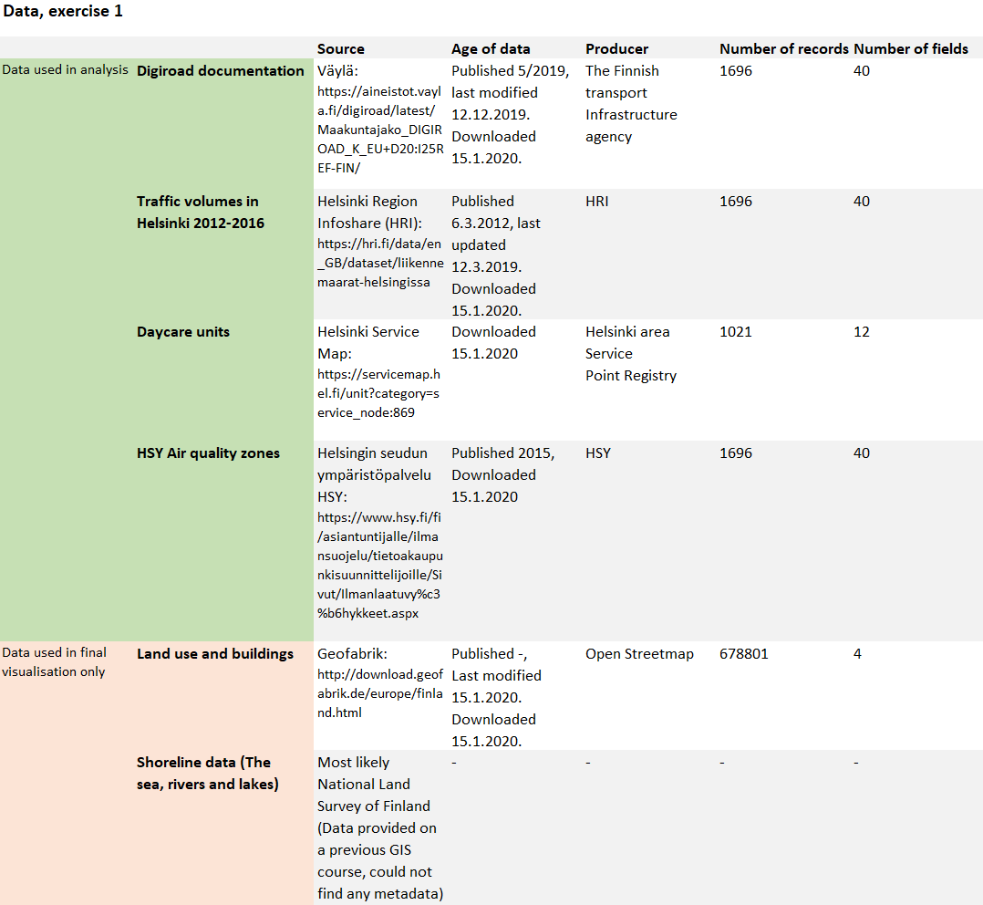
The data used in the exercise is presented in table 1. The road, traffic and air quality datasets were joined together, so their numbers of records and fields appear the same in the table. When downloading the daycare unit data, I specified my query only to include daycare centres, the total number of which was 1021.
For visualising the final map, I also used building and land use data from Open Streetmap (downloaded via geofabrik) and shoreline data from a previous GIS course.
Table 1. The data used in exercise 1.
4. Analysis
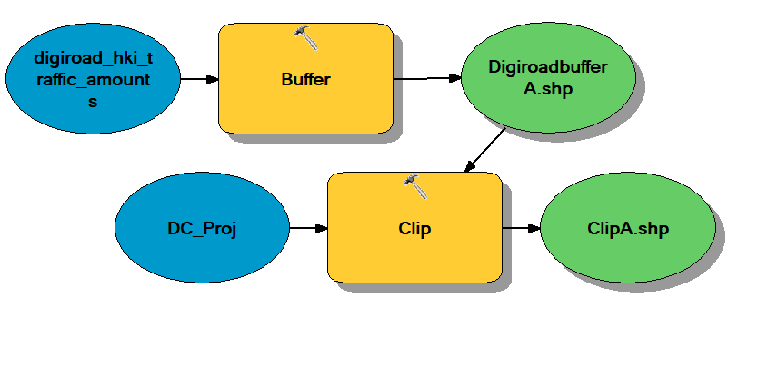
The main goal of the exercise was to automate the analysis process, so instead of doing every step manually, a model would have to be built (pictures 2, 3 and 4).
Picture 2. The basic idea of the model used in the exercise.
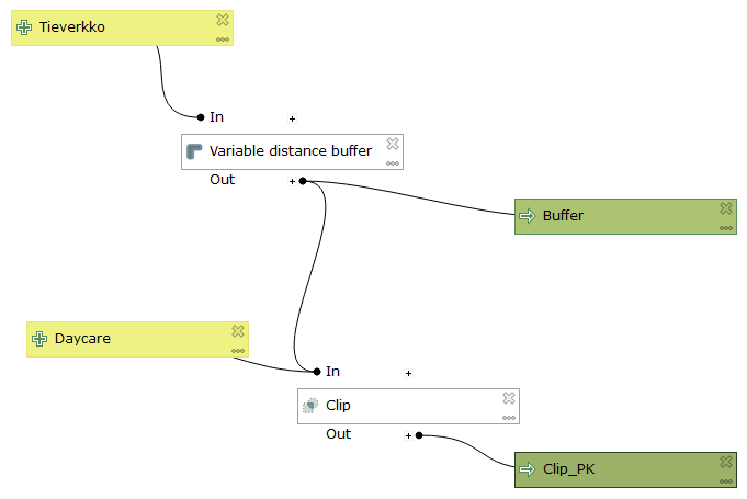
Pictures 3 and 4. The finished models from QGIS (top) and ArcGIS (bottom).
I composed the first model (picture 3) using the model builder in QGIS. I had previously built models using ArcGIS only, so the operating principles of the Q-alternative took some getting used to at first. The main difference to ArcGIS was that the model is built before any data is added. Once I got used to the idea, I actually preferred this approach: the model is built separate from the data, so it can easily be used with many different datasets.
I also think the model builder in QGIS fits the PPDAC model better than the one in ArcGIS. We have a problem to which the model should act as a solution, or as a plan. In PPDAC the problem and the plan are the first two steps before the data, so it is only natural that when building a model, data is not added in the beginning stages, but rather after the plan, or in this case the model, is completely formed.
Both models have 2 steps (Pictures 2, 3 and 4). First they form a variable distance buffer for the digiroad dataset based on the Min_dist field (HSY:s air quality zones), and then clip the daycare dataset with the resulting buffer polygons. Both models output only the daycare centres located in the areas of risk (map 1).
5. Conclusion
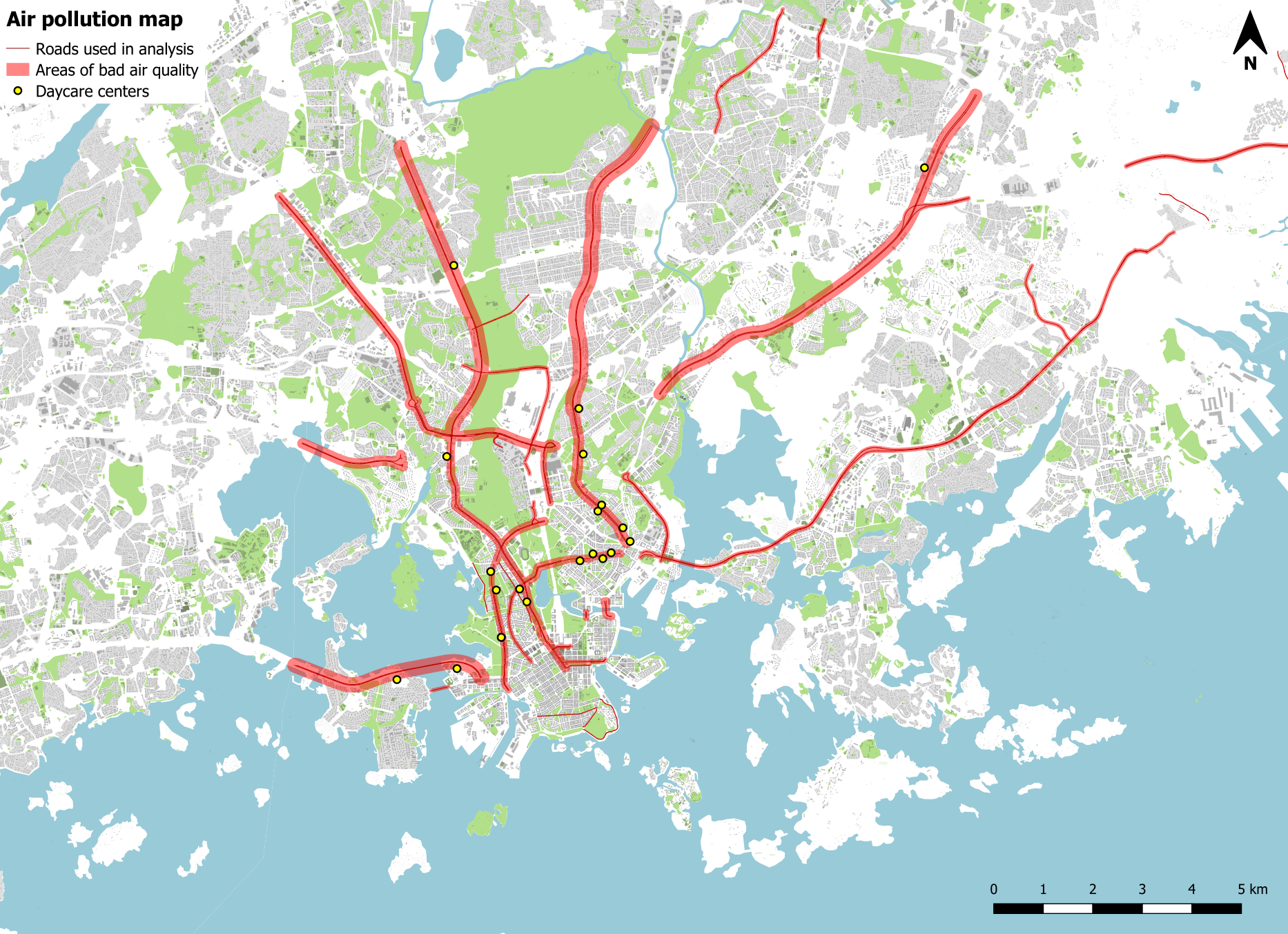
Picture 5. The air pollution map shows the areas of harmful air quality and the daycare centres located within those areas.
The finished analysis tells us that there are 21 daycare centres located in areas of bad air quality and a 1000 located elsewhere. The original dataset contained 1021 daycares in total, so that means about 2% of all daycare centres in Helsinki suffer from a bad quality of outside air.
Overall the exercise was not too difficult. Even though on previous GIS courses I had gotten used to the security of readily available and precise instructions for every step of every analysis, I didn’t have too much trouble with this more independent working style. working with other students proved to be extremely helpful too. Over all I’d rate the difficulty of this exercise as a 2,5/5.
The main thing I learned from the exercise was implementing the PPDAC model from theory into practice. I also learned more about model building with GIS software: I had never used QGIS for building models, and the ArcGIS side of things was a bit rusty for me as well.