1. Basic statistics
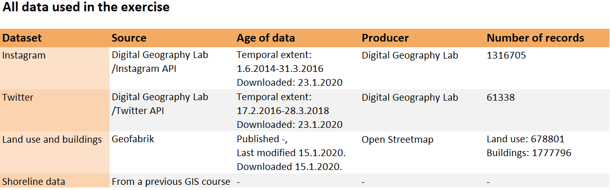
The focus of this exercise is on big data from social media. The first section of the report briefly goes over all data used in the exercise (table 1), while taking a closer look at one of the provided social media datasets (table 2).
Table 1. Data used in exercise 2.
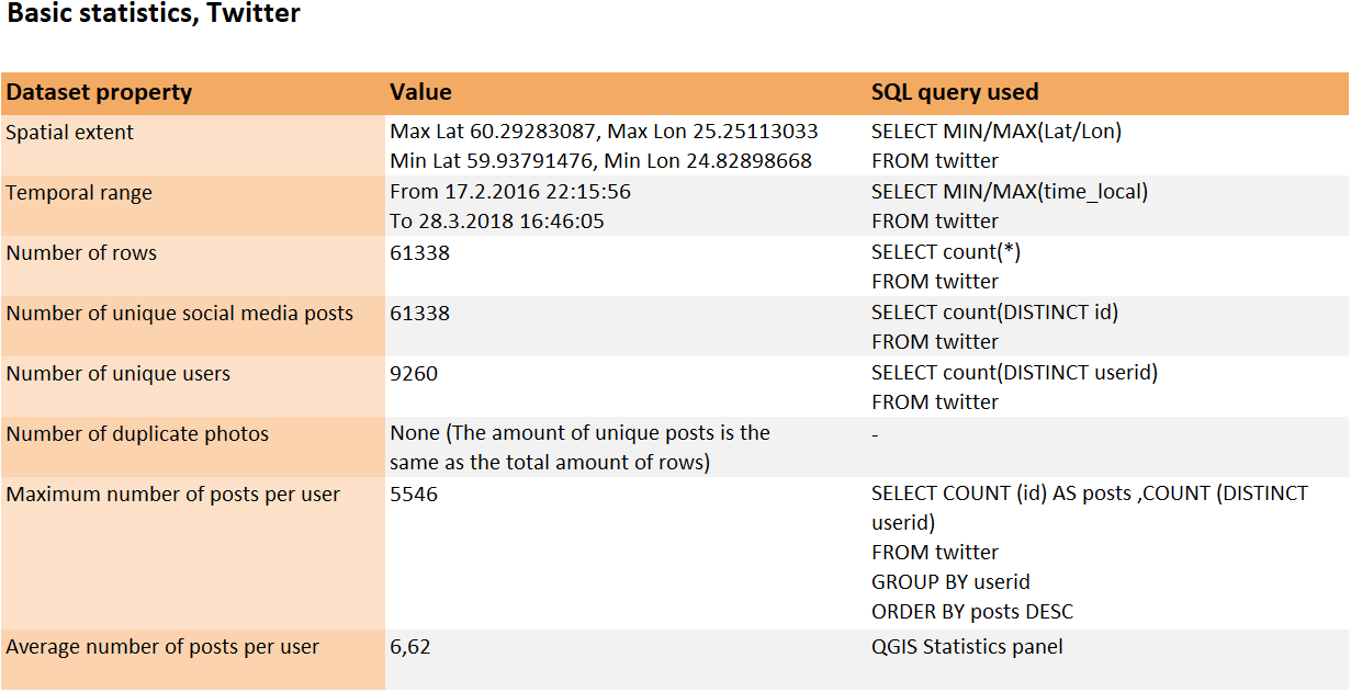
I used the twitter data for most of the analysis in this exercise. The same dataset was also the target of a more detailed analysis using an assortment of different SQL queries. The basic statistics of the dataset are presented below in table 2.
Table 2. The basic statistics of the twitter dataset presented with their respective SQL queries. The categories for most and average likes per post have been excluded as the data had no records about likes.
2. Visual inspection
After getting somewhat acquainted with the data through SQL, it was time for visualisations. First, I made a basic map showcasing the locations of tweets with just single-coloured dots (map 1).
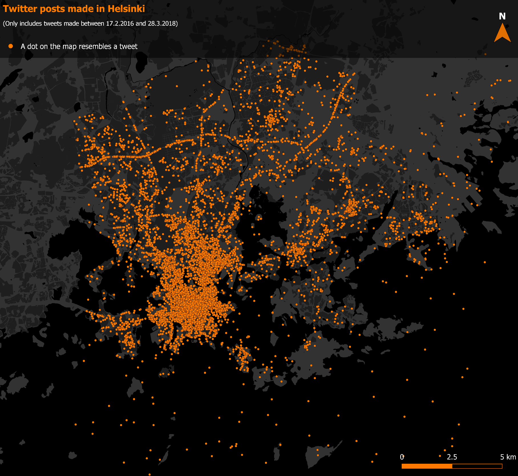
Picture 1. A simple map showcasing the twitter dataset. This map functions well for getting an overall idea of the structure and especially the spatial extent of the data.
However, the first map falls short when any more complex information is required. The dataset is way too dense to be analysed with every tweet being visualised the same way. To this problem a heatmap acts as an excellent solution (map 2).
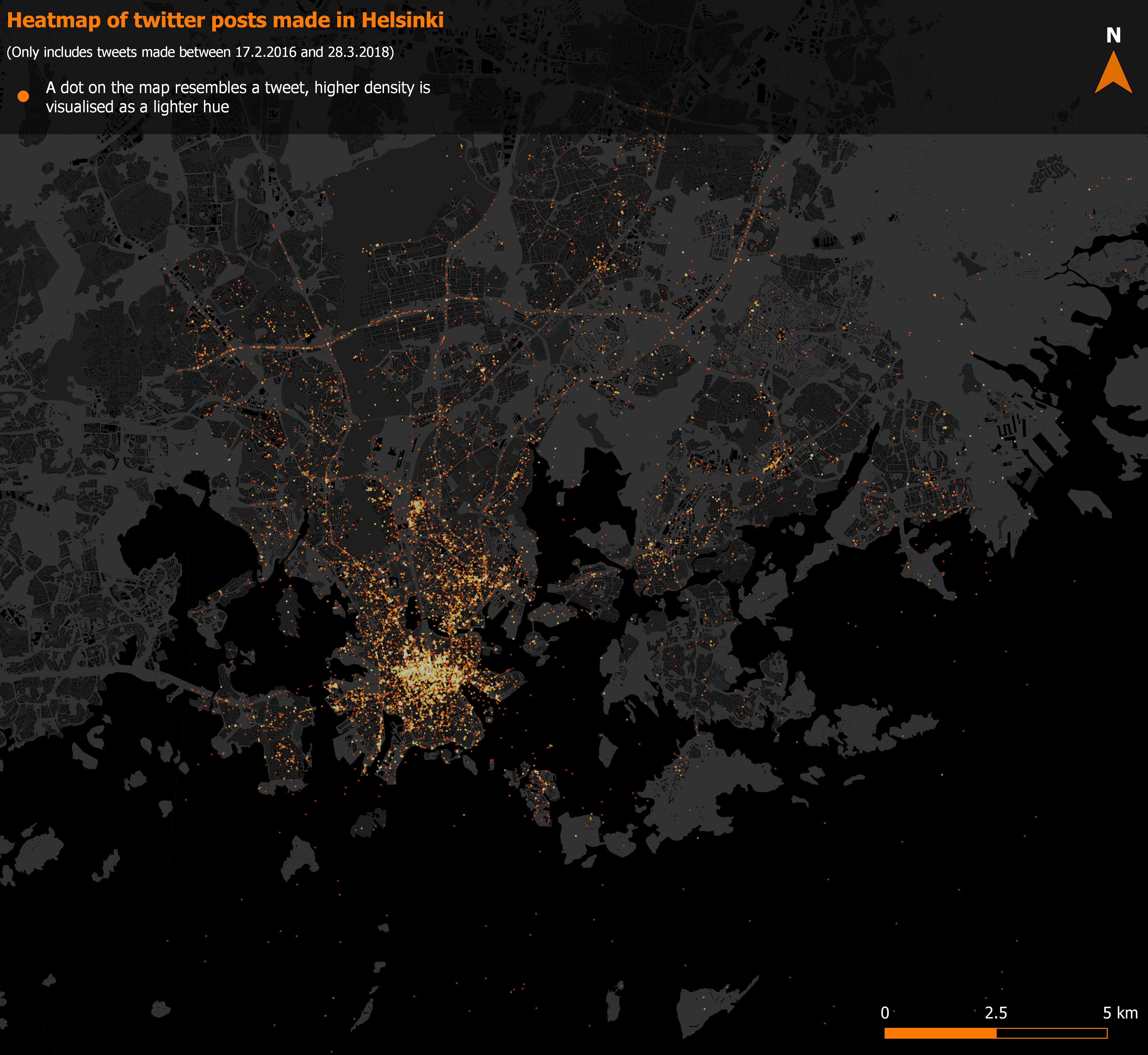
Picture 2. A heatmap brings along a more detail-oriented outlook.
A heatmap allows for a more in-depth analysis of the data. For example, areas that were completely cluttered on the first map, such as the downtown of Helsinki, are now bursting with variety and new information. On the flipside, the outlier tweets are noticeably dimmer and harder to see. Defining the spatial extent of the data would be a lot more difficult with this map, for example.
3. Data aggregation
The next step was to transform the point-structured data into a grid. The task seemed simple at first: just form a grid and count the number of tweets within each square. However, instead of a simple “count points in polygon” -analysis, the method was predefined to be SQL. After quite some time and frustration I finally managed to aggregate the data correctly using the following query (pictures 3 and 4):
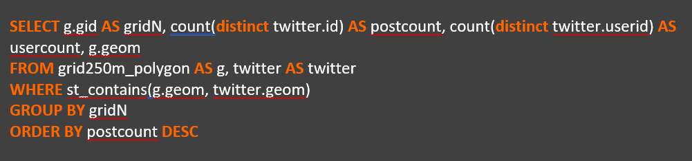
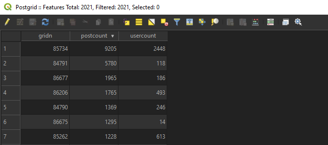
Pictures 3 (top) and 4 (bottom). The completed query imports the number of unique users and tweets per square into a 250x250m grid, while also conserving the location data. The resulting attribute table can be seen in picture 4.
What had caused me so much trouble was forgetting to include the geometry field. That of course made it impossible to bring the data into QGIS in a form that could be mapped.
Content with my small triumph over SQL, I loaded the resulting grid into QGIS and visualised it into a map (picture 5). I decided that only presenting the amount of tweets per square would be sufficient, as the map depicting the user counts turned out nearly identical in appearance.

Picture 5. The number of tweets portrayed on a 250x250m grid.
The finished grid map is, in my opinion, the most visually efficient way of communicating information of the twitter dataset. Acting as sort of a hybrid between the point- and heatmaps, it shows the different densities of tweets cleanly, while still maintaining a clear sense of the spatial extent of the data. As a negative though, the grid covers everything underneath, so any extra information would be difficult to fit here. This is also why I opted for a minimalistic visual look when it comes to the background map: adding land use data or buildings would bring no extra value here.
4. Location Accuracy
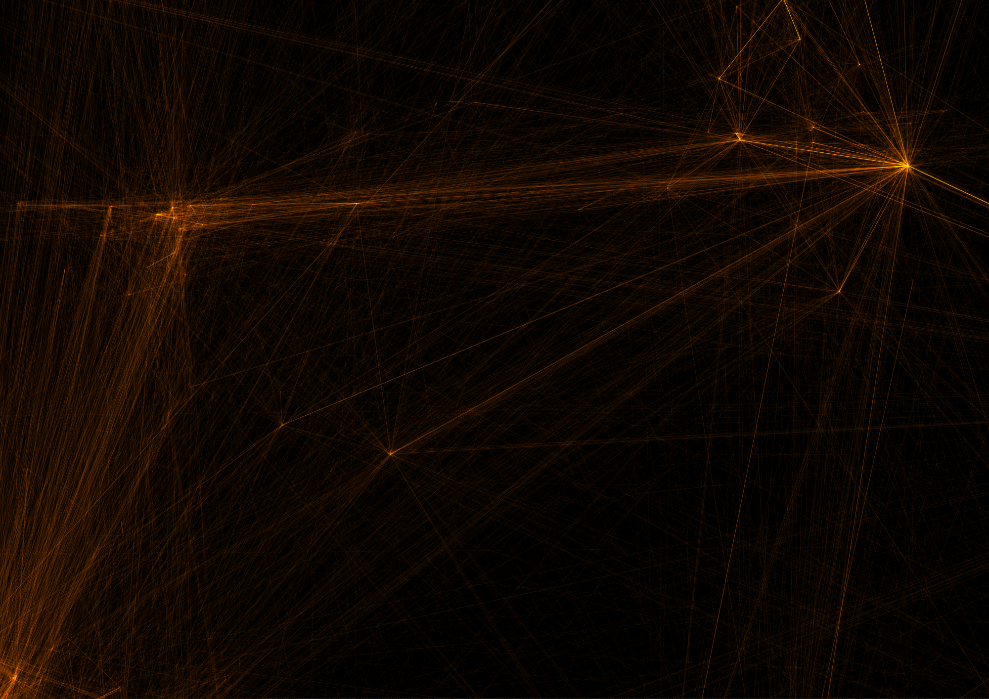
In the final section of the exercise the goal was to find out if social media posts that mention a given place are also posted from that same place. In practice this happened by selecting any named location found within in the study area and then searching the social media datasets for all the posts mentioning it. The search was, once again, carried out with an SQL query (picture 6). I chose Suomenlinna for my study since the place is a very popular destination. This should guarantee a reasonably sized population of posts for the analysis.

Picture 6. When forming the query, I made sure to expand my results by also including the Swedish option for Suomenlinna.
At this point I also deviated from the twitter dataset for the first time: part of the analysis was to compare 2 different social media platforms to each other. I chose Instagram for the comparison, as I knew the dataset was the largest of the three provided. searching both datasets with the query shown above yielded 554 results from Twitter and 12660 from Instagram.
After loading both resulting tables into QGIS and digitizing a new point layer depicting Suomenlinna, I used the MMQGIS plugin for calculating the distances between the social media posts and the physical location (picture 7). The plugin calculated the distances into a new field as meters (picure 8). Based on these distances I also calculated basic statistics for both social media platforms using the statistics panel in QGIS (table 3).
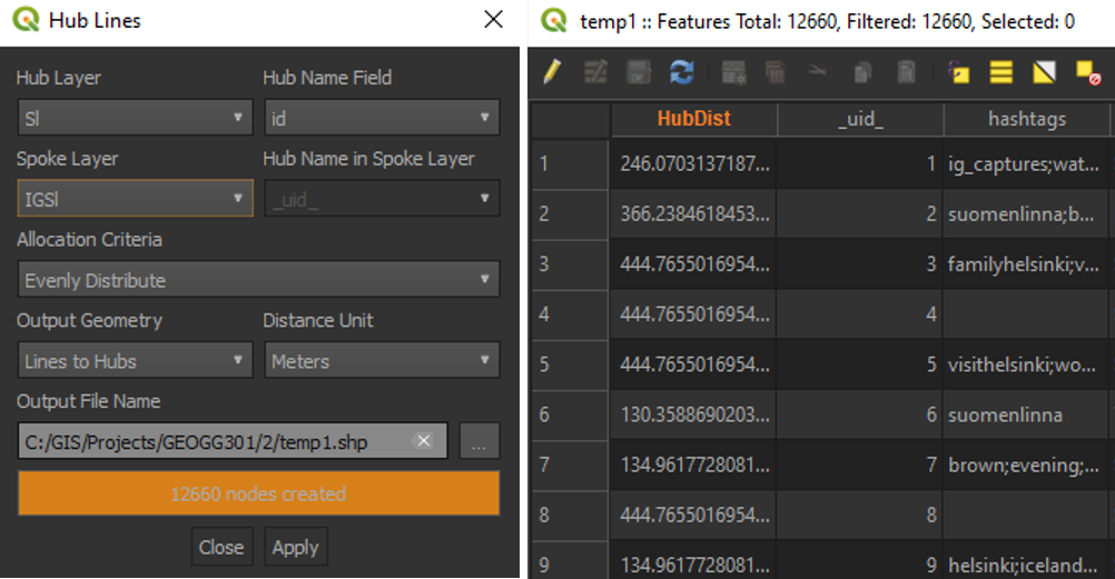
Pictures 7 (left) and 8 (right). The plugin and its result.
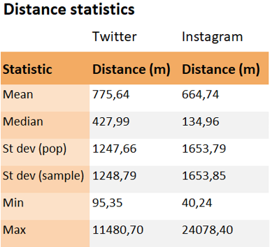
Table 3. The basic distance statistics for both Twitter and Instagram. Overall Instagram posts seem to be posted from closer to Suomenlinna than their Twitter counterparts.
In the final maps I visualised the social media posts as a heatmap with the distance lines drawn by MMQGIS transparent underneath (pictures 9 and 10).
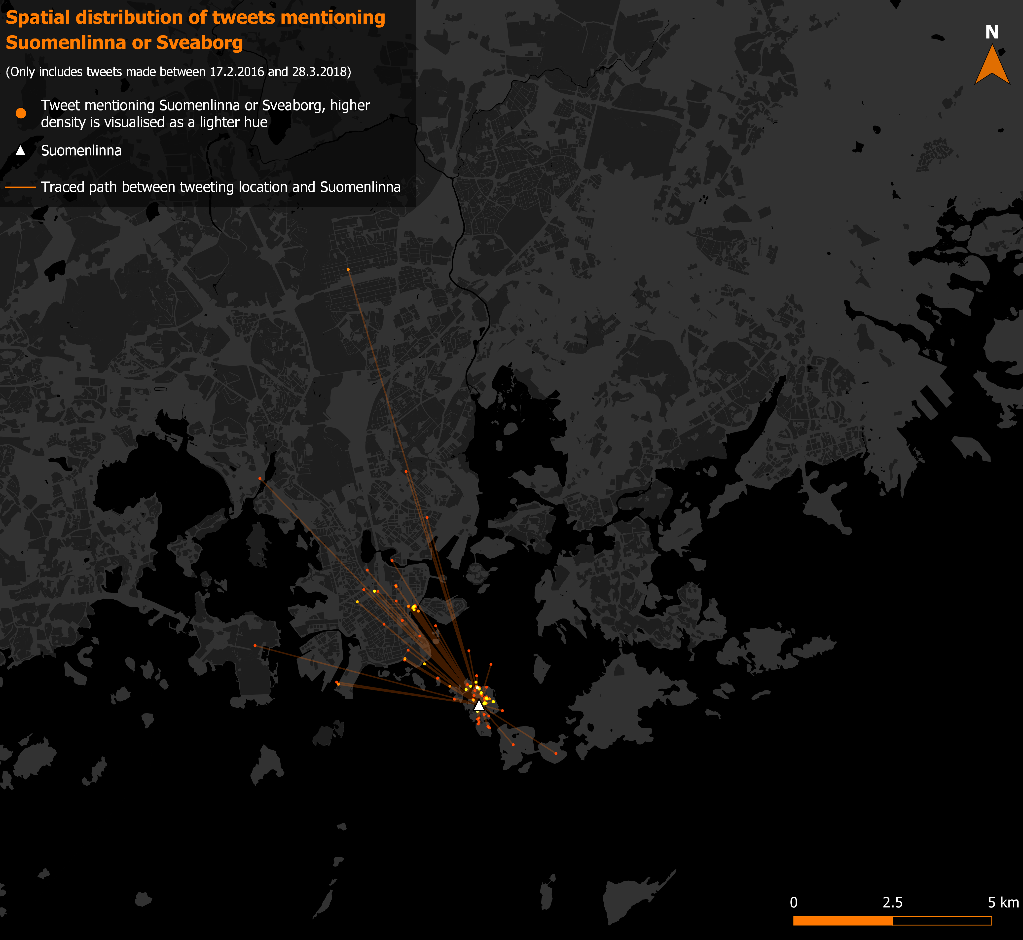
Picture 9. The tweets mentioning Suomenlinna with their distance vectors.

Picture 10. The larger size of the Instagram dataset shows both in the spatial extent and in the number of posts.
5. Conclusion
This exercise was a lot more difficult for me than last week’s. This was mainly due to SQL: I had no previous experience or knowledge of the query language, which made getting started a bit slow to say the least. Overall, I’d rate the difficulty of the exercise at a 4.5/5.
On the other hand, I also learned a lot this week. All of the SQL knowledge was completely fresh to me, and I hope some of it sticks as well. I also learned new things about visualisations: Creating heatmaps, for example.