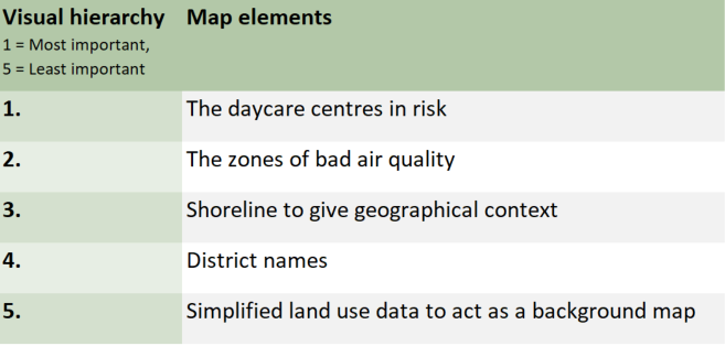
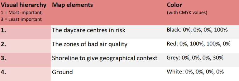
1. A4 sized map for an expert report
The first map (picture 1) in the exercise was designed for an expert report. This means that the audience it is aimed at already has some knowledge of the topic being mapped after reading the article leading up to the map, or hopefully at least the abstract. The visual elements used are presented below in table 1.
Table 1. The map elements used in the expert map
When designing the map, I decided that the result of the analysis (the daycare centres) should be the priority. In the finished map I chose a bright yellow dot with a thick black outline to represent the daycare units in risk. There are no other yellow elements on the map so they should stand out. Also, they are the only feature with an outline.
The areas of bad air quality are also vital to understanding the analysis. They are visualized with a bright red color with just a hint of transparency. These are the only red elements, and, combined with the daycare centres, the only features with bright colors. As a result, the two most important map elements are what catches the eye of the map viewer first.
The ultimate purpose of a map is to tell where things are located. To help give geographical context for the phenomena being mapped, the shoreline data provided on the course is being used. All major water bodies are visualized as a dark grey, which contrasts nicely with the much lighter land areas. To avoid stealing any focus from the more important map elements, and to minimize the amount of different colors on the map, I did not use a typical blue to indicate water.
To furher define the locations of the daycare centres, I added district names to the map. This is done to facilitate cohesion between the article and the map: If, for example, the article mentions a high density of threatened daycare centres in the area near Kallio, Vallila and Sörnäinen, a person without beforehand knowledge of Helsinki would have no idea what is being discussed without these labels. To reduce clutter on the map, I only included the labels for districts that have resulting daycare centres located within them. I do think that visually the map looks a lot better without these labels, but keeping in mind the purpose of the map, I decided to include them.
To provide a background map I used a combination of the land use data provided on the course and vector data from OpenStreetmap. The OpenStreetmap data was downloaded from geofabrik.de (same data I used in exercise 1). For the background map I used light grey for residential areas, green for parks and white for everything else. All the colors are very muted so that the background stays as a backround. Only the residential areas and parks are found in the legend, as I think these two categories communicate a lot about the urban environment depicted here. Visualizing natural conservation sites or industrial areas for example would bring no additional value in my opinion. I also decided to leave the original roads that were used in the analysis out of the final map, since by reading the article the viewer should already know how the areas of bad air quality were produced.
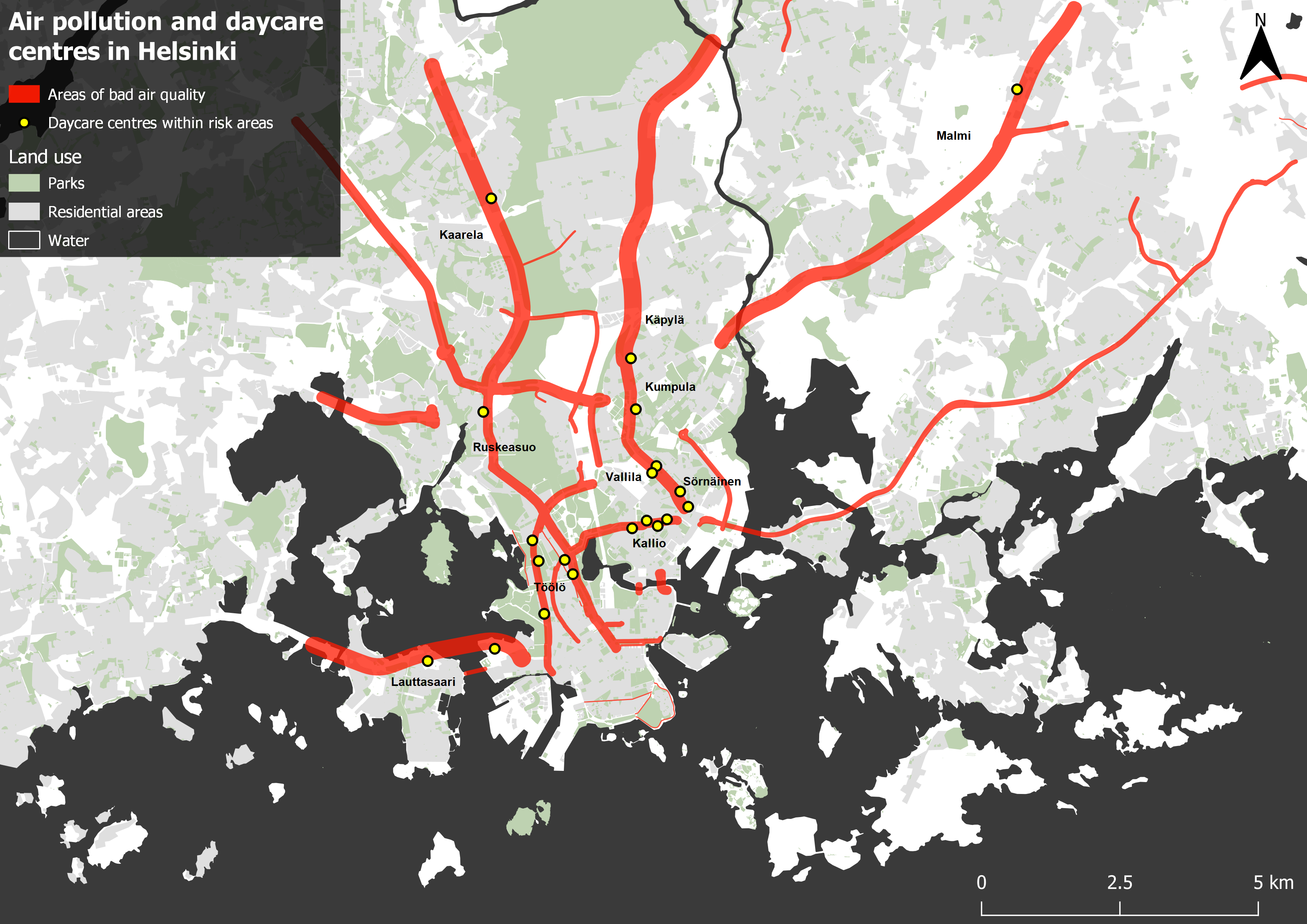
Picture 1. The areas of harmful air quality caused by motor traffic and the 21 Daycare centers located within those areas.
2. 7x7cm sized map for a newspaper article
The second map (picture 2) was made for a newspaper article. Unlike the expert map, resources are very limited here: The space reserved for the map was determined to only be 7x7cm and a maximum of 5 colors could be used. Also, since the map is to be published in a newspaper, the target audience is extremely varied. The visual hierarchy of the map elements can be seen in table 2.
Table 2. The visual elements used in the newspaper map.
Much like the first map, the focus is yet again on the daycare centers. I decided to visualize them with black dots outlined with white. This way they can be separated from the lighter background. I did not go for bright colors as they would not transfer well onto a printed paper, especially if the print quality is not the best. Fitting the entire data into the map was difficult, but even harder was finding the appropriate symbol size: Too small a dot would be practically invisible on such a tiny map while large circles would clutter the more dense areas completely.
The zones of bad air quality are the only feature with color. I decided to use a darker shade of red to create contrast with the light backround, but still stand out from the black dots as well. On this map I did not mess with transparency or other layer rendering options at all. To give a geographical reference for the data, I simply used the polygons of water bodies colored with light grey to keep the backround as simple as possible.
I did not even try to create a more elaborate backround map for this visualization, as it would most likely have been a complete disaster on a canvas this small. This allows for a more simplistic legend as well, since there are only 2 features explained. I also left out the district labels since they would never have fit the map.
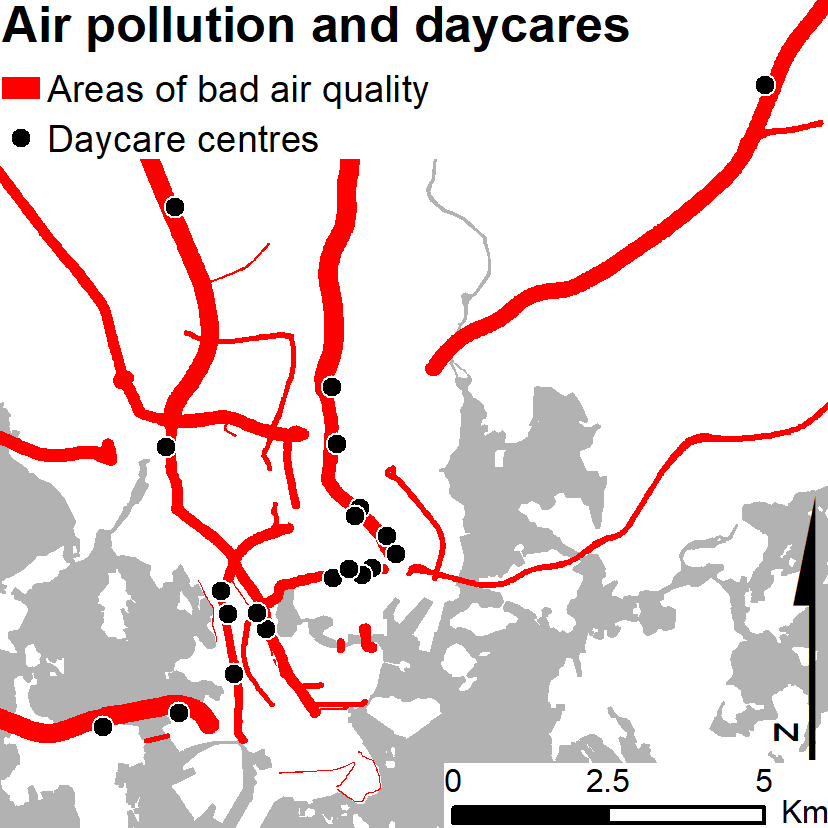
Picture 2. The areas suffering of air pollution caused by motor traffic have been visualized on this map with a red color while the black dots symbolize daycare centres located within those areas. Based on the analysis, there are 21 daycare centres within these risk zones.
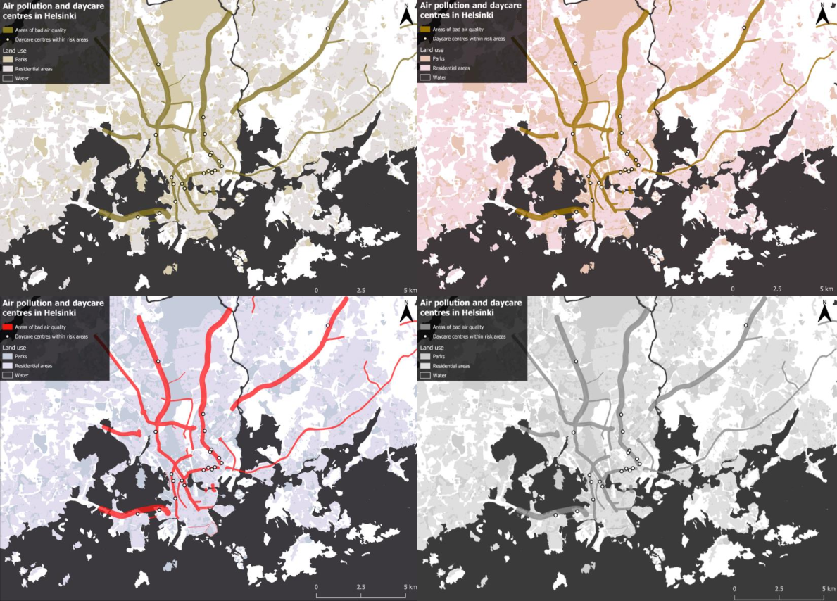
3. Colorblind maps
Below are presented four versions of the expert map: From top left clockwise, Red-Blind, Green-Blind, complete black and white and Blue-Blind. I was actully surprised by how the map is still pretty sensible, even with complete lack of color. Even the land use layers are distinguihable, but the legend icons become a lot harder to interpret.