1. Introduction – How different places make us feel?
The goal of this final work is to, like the title suggests, try to map out how different places make people feel. The emphasis is on the word “try”, as emotions are far from quantitative data. The basis for all the analyses in this report is the already familiar Instagram dataset from the exercises of week 2.
In an effort to make the abstract a bit more measurable, lots of compromises have been made. Here are some of the questions and problems I considered before beginning the analysis itself. Firstly, what emotions or feelings am I even trying to map? At least as important of a question is how does one detect emotion from a social media post? And what about the reliability of the data? Can any at least remotely trustworthy conclusions be made based on just Instagram posts, or, on the contrary, such an ambiguous research question?
To try and simplify the elusive concept of emotion as much as possible, I narrowed the vast spectrum of different feelings into two main categories: positive and negative. This ties directly into the second, and probably the hardest question of how to detect the poster’s sentiments. With a slightly clearer vision of what I was trying to detect, I decided the best course of action would be to just focus on the written content of the social media posts. By querying the text fields in the data with sets of different positive and negative keywords, pinpointing the positive and negative posts would be possible. This, combined with the location data stored with every post, would allow for both the positive and negative posts to be placed on a map.
By this point, the research question should also be redefined, or at least expressed more accurately. Rather than asking how different places make us feel, the more correct option would thus be: What places make us feel positive emotions and what places make us feel negative ones?
In the analysis the first stage was to see if spatial patterns emerge within the positive and negative posts. This was done with grid maps, and in further detail with Global and local Moran’s I statistics and maps in order to examine the possible clustering in the data. To find out more about the kinds of places that spark different responses I also analysed how the distance to the Helsinki city centre affects the results, and how the percentages of positive and negative posts change depending on land use type.
In addition to a more in-depth method description, all of the different stages in each of the analysis are also documented in a workflow chart at the end of section 2. Finished maps and statistics are all presented in section 3.
2. Data and methods
2.1. Overview of the data
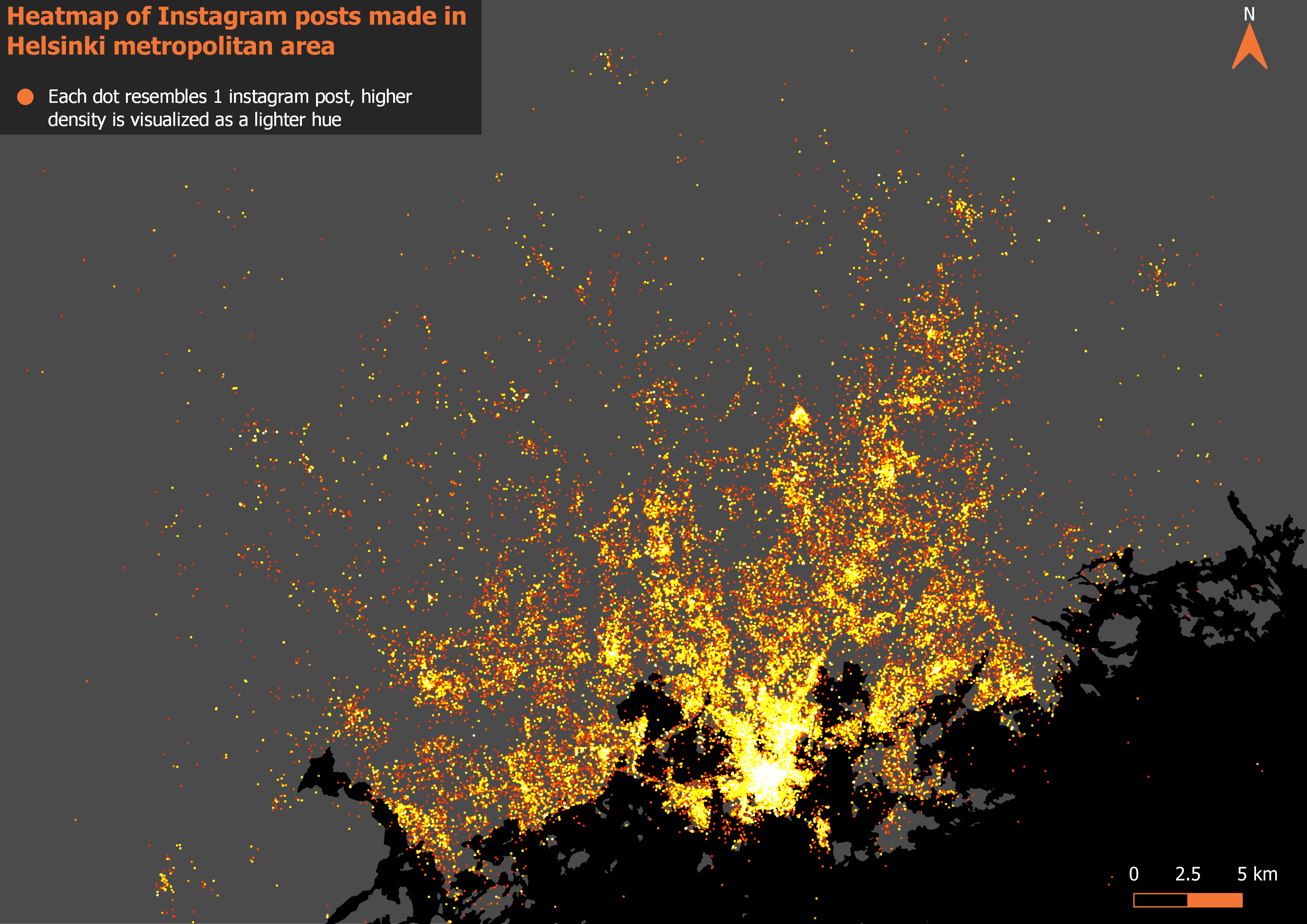
All of the analyses in this report are based on the Instagram dataset (Instagram API) accessed via PostGIS. The data contains Instagram posts from 1.6.2014 to 31.3.2016 and extends over the entire Helsinki metropolitan area covering Espoo, Helsinki and Vantaa (picture 1). This dataset was selected, as it had the highest number of posts as well as good spatial coverage.
In addition to the social media data, vector- based map layers depicting the landcover are utilized as background maps and as a key part of the analysis in the Land use analysis section. These are the same layers that were provided earlier on the course, on week 5.
Picture 1. The entire instagram dataset visualized as a heatmap showing both the density and the spatial extent of the data.
2.2. Defining positive and negative
Central to the whole report is the detection of positive and negative social media posts. To find inspiration for the intimidating task I searched for already existing examples of social media users’ experiences or emotions being used as a source of data in a GIS context. It was at this point that the complexity of my research question started to actually dawn on me: One of the example studies I found used an advanced text mining algorithm to detect depressed twitter users and their locations (Park, Kim & Ok 2018) while one used a similar method to link user emotions to different places in Disneyland (Yang & Mu 2015).
Summed up, text mining is a very advanced approach that automatically extracts information from different written resources (Hearst 2003). While probably the best fit my analysis, something like this would have been way too complicated for this report.
Therefore, this is where my analysis takes its biggest shortcut: I searched for the positive and negative Instagram posts simply with two SQL queries. The basic idea of these queries was to find posts that include positive or negative keywords, one query for each category. The keywords in both of the queries are simply some of the first positive and negative Finnish words to come to my mind. The complete queries can be seen below.
The query used to search for positive Instagram posts:
SELECT *
FROM instagram
WHERE lower(text) LIKE ‘%kaunis%’ OR lower(text) LIKE ‘%hieno%’ OR lower(text) LIKE ‘%hyvä%’ OR lower(text) LIKE ‘%mahtava%’ OR lower(text) LIKE ‘%loistava%’ OR lower(text) LIKE ‘%onnellinen%’ OR lower(text) LIKE ‘%onni%’ OR lower(text) LIKE ‘%onnekas%’ OR lower(text) LIKE ‘%iloinen%’ OR lower(text) LIKE ‘%kiitollinen%’
The query used to search for negative Instagram posts:
SELECT *
FROM instagram
WHERE lower(text) LIKE ‘%ruma%’ OR lower(text) LIKE ‘%huono%’ OR lower(text) LIKE ‘%paha%’ OR lower(text) LIKE ‘%kurja%’ OR lower(text) LIKE ‘%surkea%’ OR lower(text) LIKE ‘%suru%’ OR lower(text) LIKE ‘%pelottava%’ OR lower(text) LIKE ‘%pelko%’ OR lower(text) LIKE ‘%pilalla%’ OR lower(text) LIKE ‘%ilkeä%’
These queries resulted in 49830 positive posts and 4029 negative posts. It does seem like overall positive words are much more commonly used as the queries resulted in nearly 10 times more positive results than negative ones.
Of course, the biggest downfall of this keyword method is that it ignores all context of the post. In addition, some words can have different conjugations as well: for example, “hyvä” could be found in a post that actually says “hyvästi”. Still, this method was the best I could come up with and considering the main focus of the report is on GIS, not text mining or machine learning, I think it should be sufficient.
2.3. Grid analysis
In the first part of the analysis the Dataset was examined in grid format. This was mainly done to get an overall picture of the data. I first aggregated all unique Instagram posts into a 500x500m grid with the following SQL query:
SELECT g.gid AS gridN, count(distinct instagram.id) AS postcount, count(distinct instagram.userid) AS usercount, g.geom
FROM grid500m_polygon AS g, instagram AS instagram
WHERE st_contains(g.geom, twitter.geom)
GROUP BY gridN
ORDER BY postcount DESC
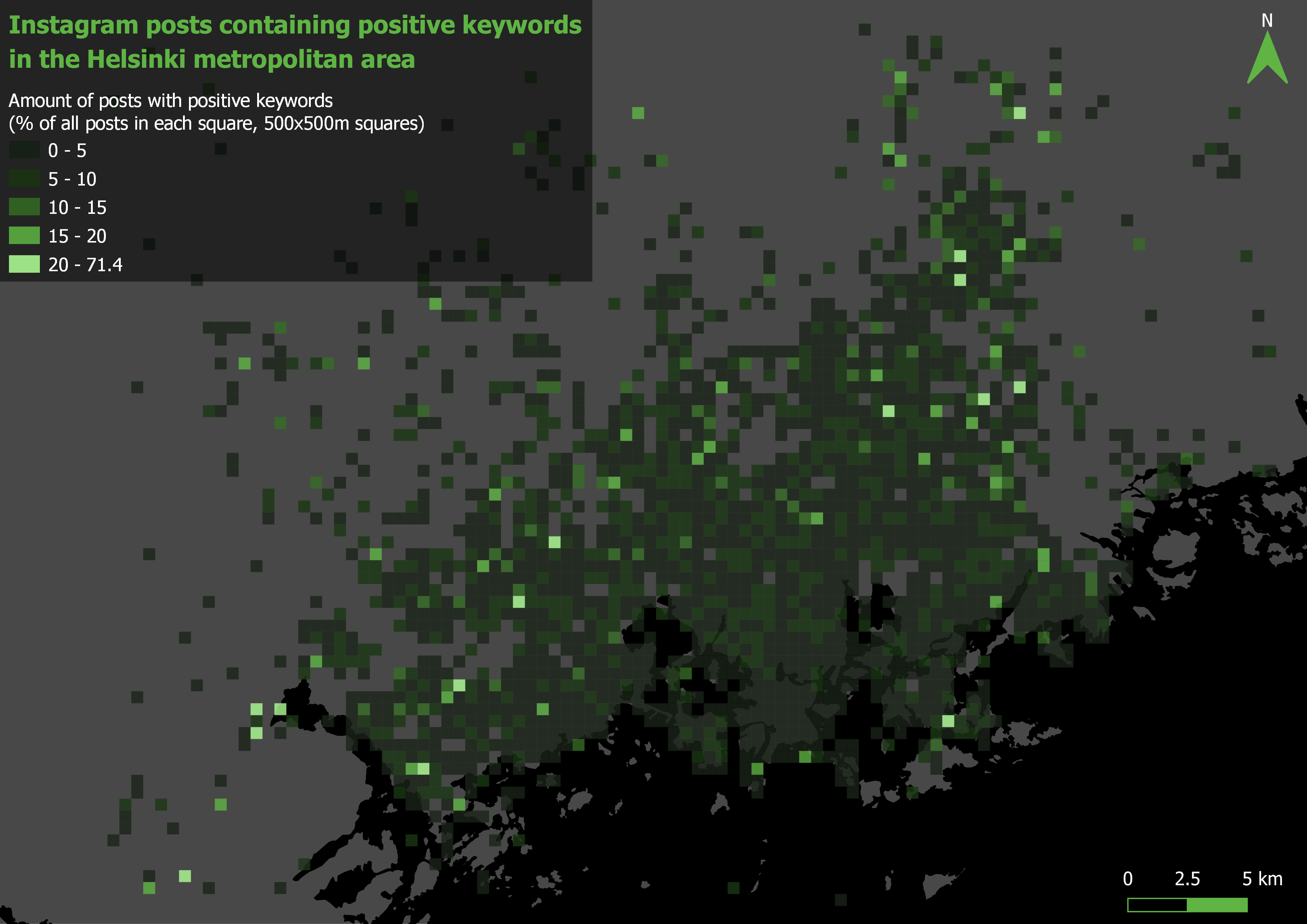
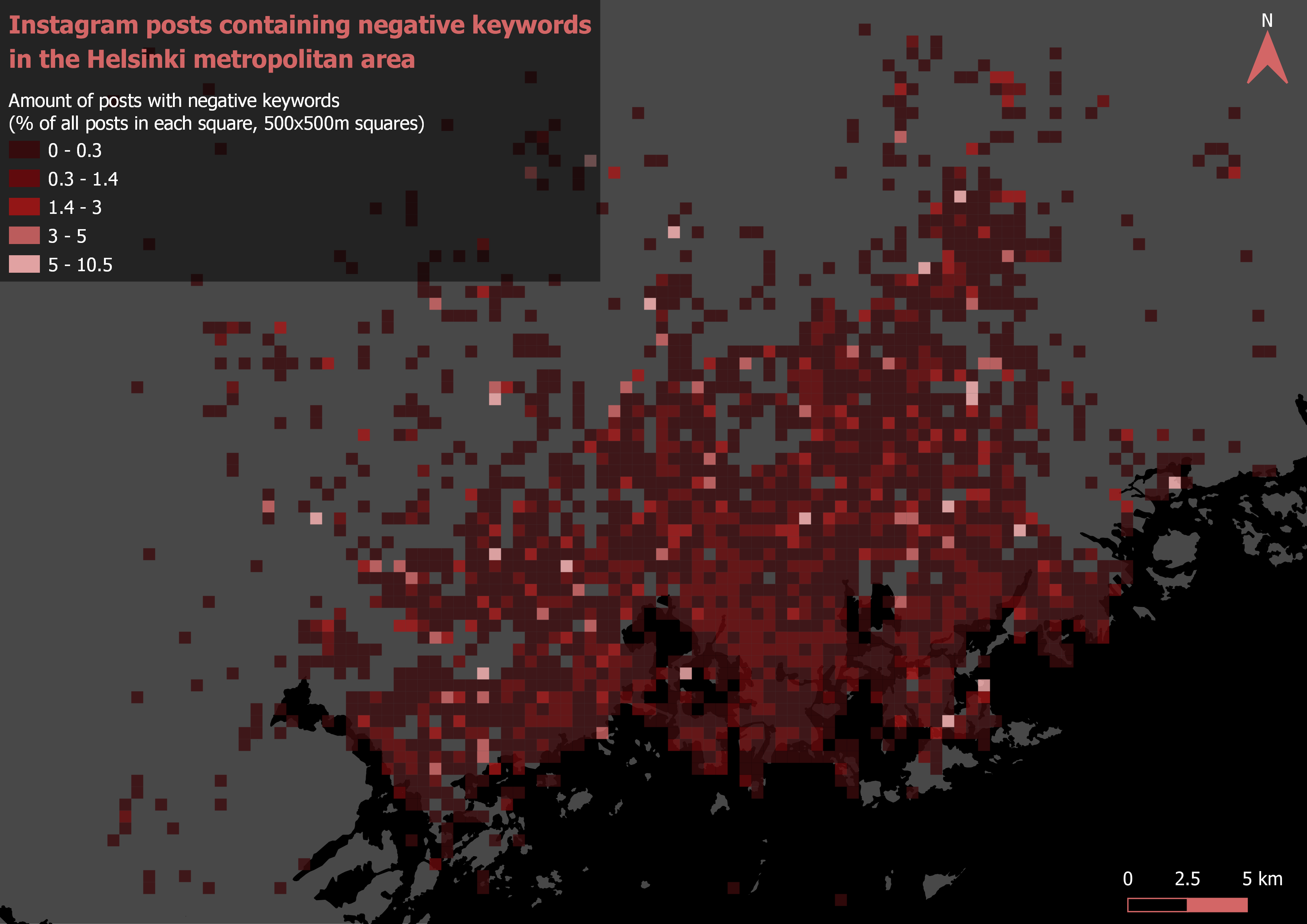
After this I trimmed the resulting grid so that no cells with less than 10 total posts were left. Next I added both the positive and negative posts into the grid as their own fields by counting points in polygon. Then I just calculated the percentages of both the positive and negative posts in every cell with field calculator and visualized the grid into 2 finished maps (pictures 3 and 4).
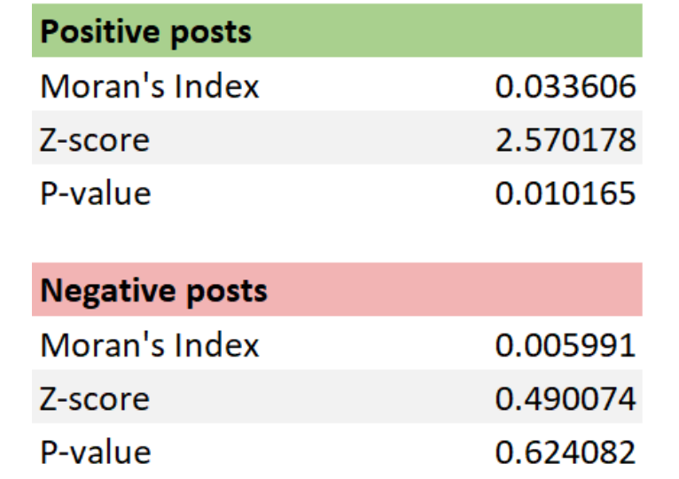
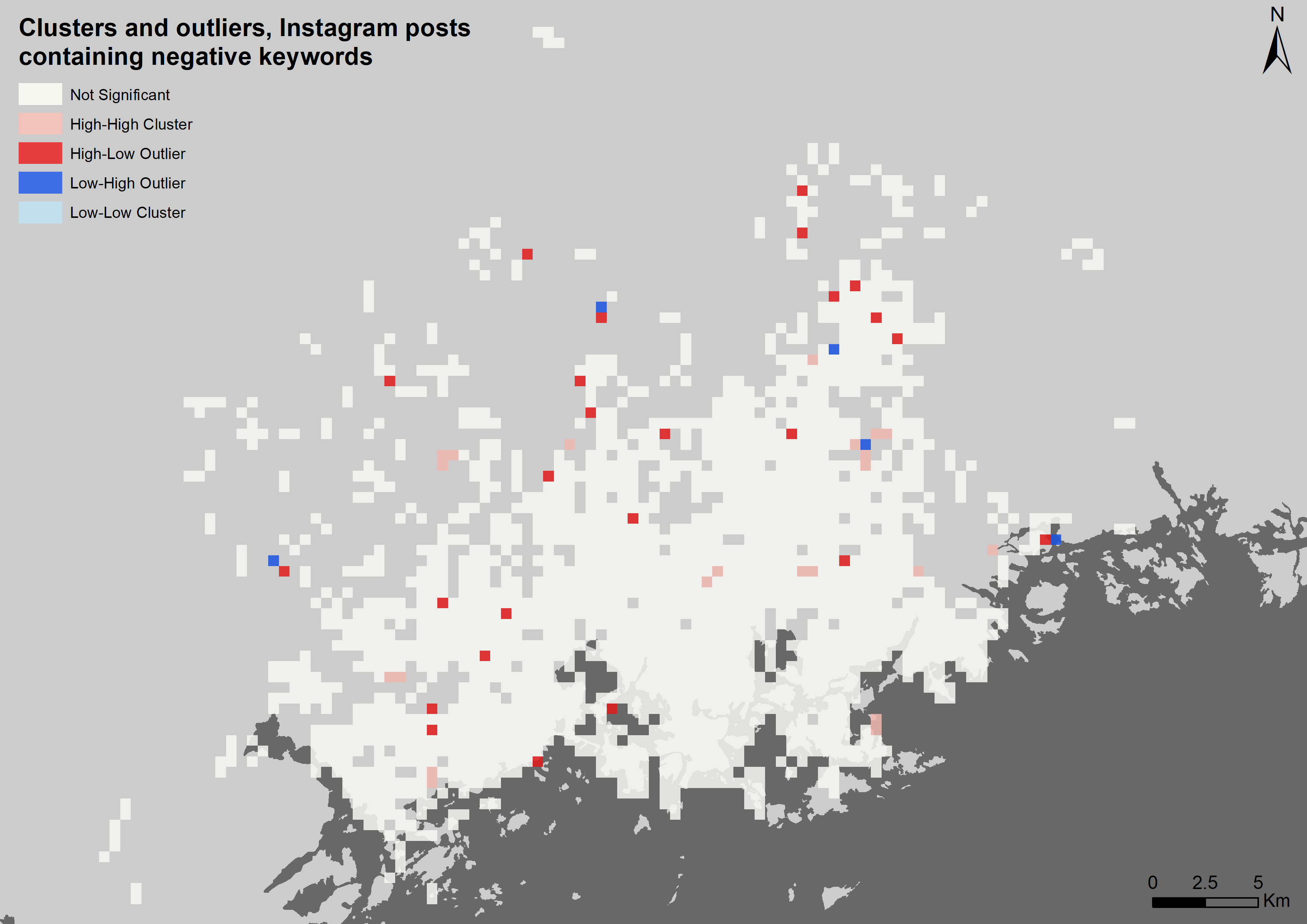
To further analyse the spatial patterns in the data, I brought the finished grid with the percentage values into ArcMap for global 4 (tables 1 and 2) and local (maps 5 and 6) Moran’s I analysis. For these analyses, every cell without neighboring cells was removed in order for the neighbourhood- based analyses to work as intended.
2.4. Distance analysis
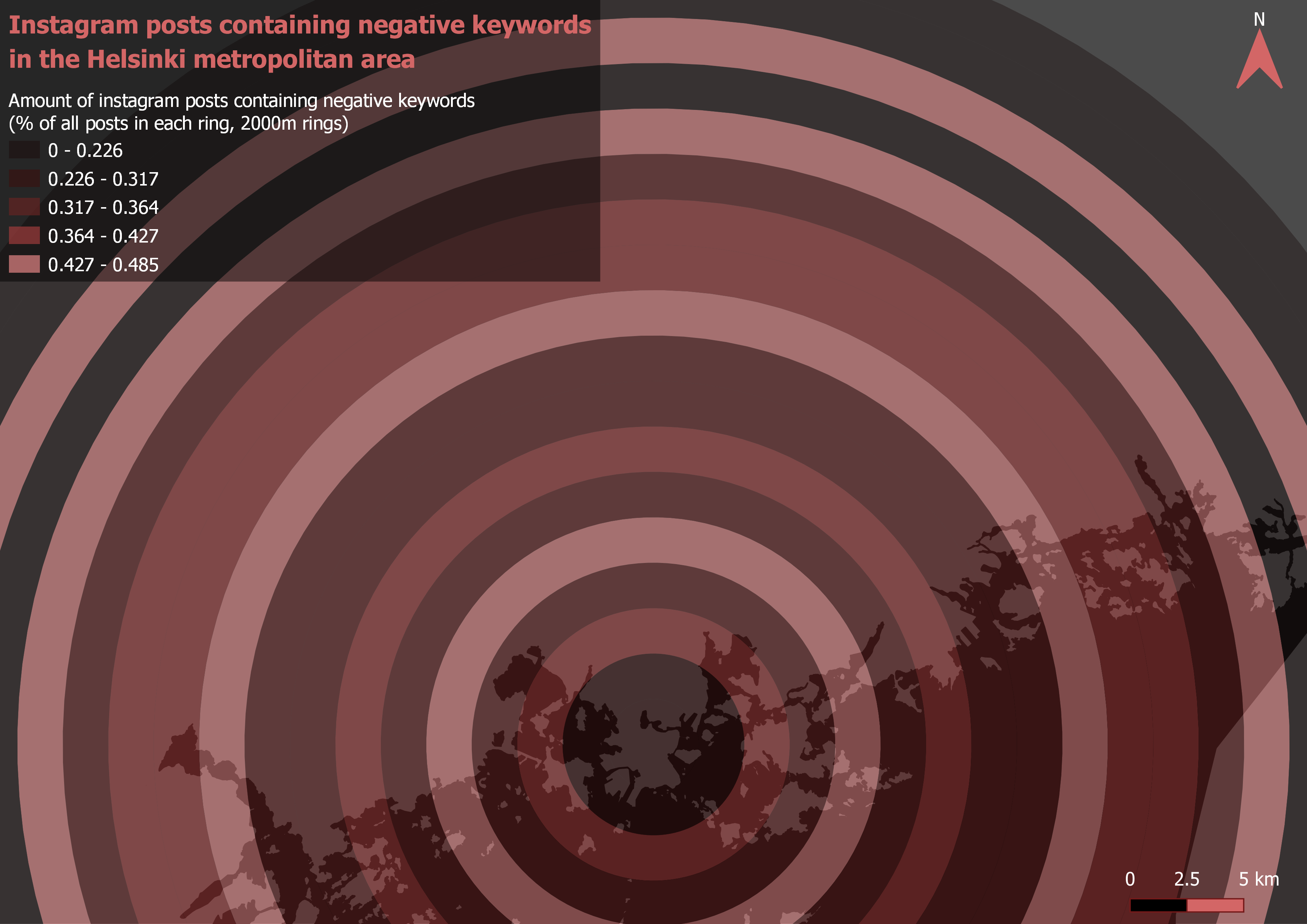
To analyse how distance from city centre affects the percentages of the positive and negative posts I formed a multiple distance buffer centred on the Helsinki railway station. Each ring is 2 kilometers wide. Then I counted the amount of the positive, negative and total posts in each ring with count points in polygon and again calculated the percentages with field calculator. The finished buffers can be seen visualized in maps 7 and 8.
2.5. Land use analysis
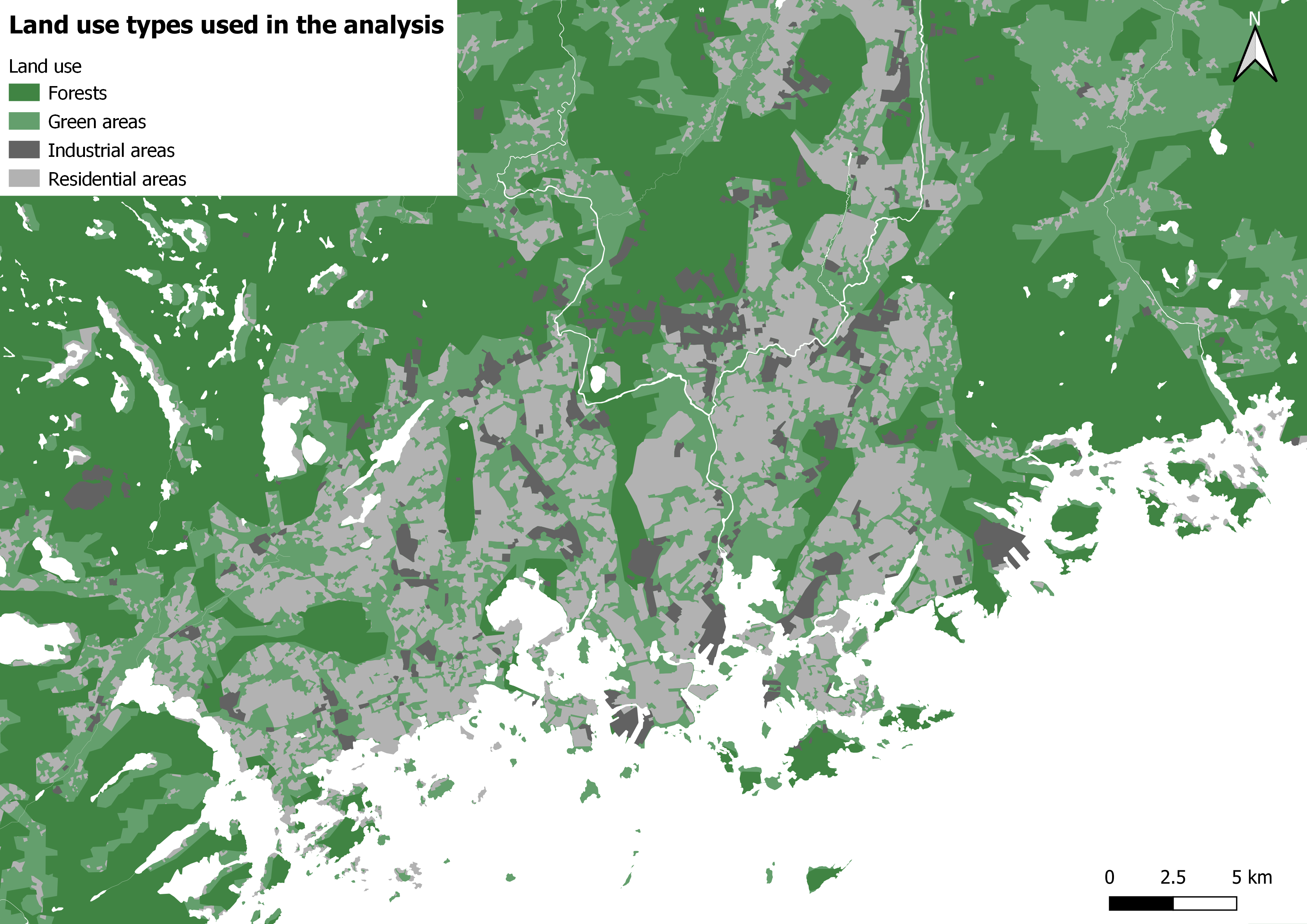
In the land use analysis I first merged 4 different landcover layers into 1 (picture 2). The layers merged were selected so as the resulting land over layer will have complete coverage of the study area. The layers used were: 1. Forests, 2. Other green areas (mostly parks), 3. Residential areas and 4. industrial areas.
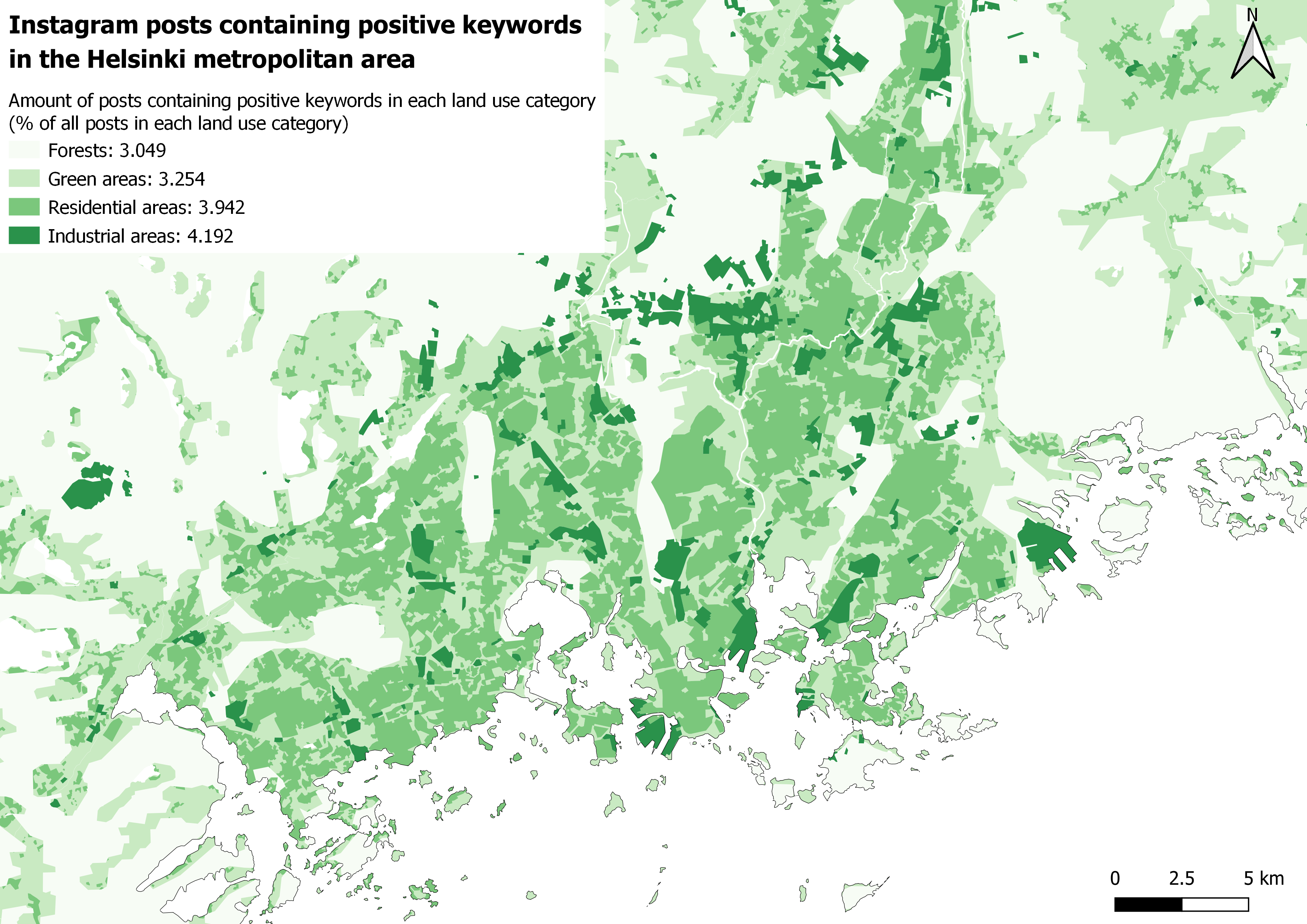
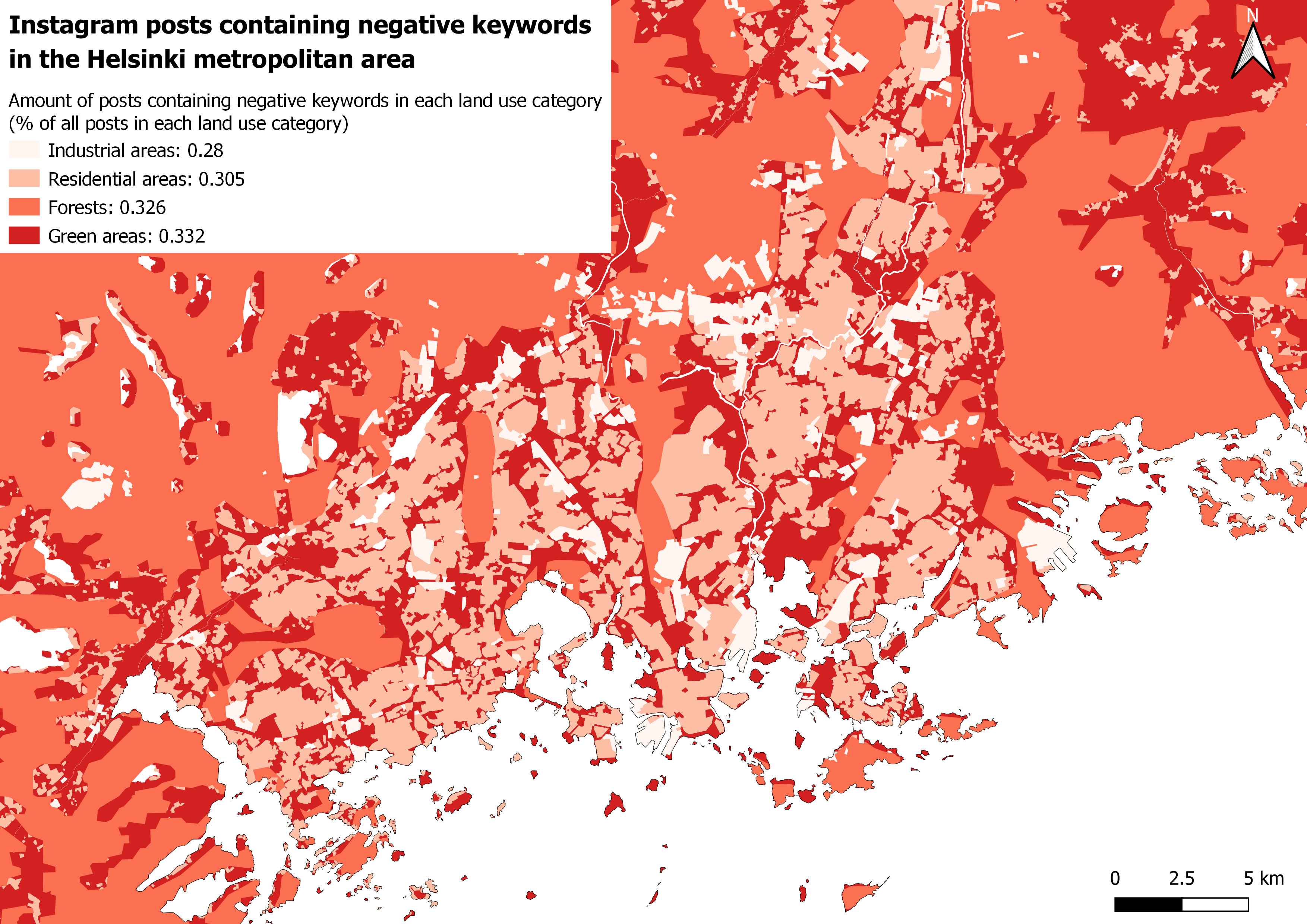
After merging the layers, I dissolved the polygons based on the layer name field. Now with a layer that has complete land coverage and one row for each land cover type representing all the polygons of its respective category, I ran once again the count points in polygon analysis. Then with field calculator I proportioned the positive and negative posts in relation to total posts in each lancover type. Finished land use analyses are presented in pictures 9 and 10.
Picture 2. The reference landcover map used for the land use analysis. This merged layer achieves complete coverage of the whole area of interest.
2.6. Workflow chart
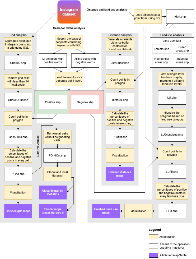
All of the different stages of the analysis are presented here as a process. The chart follows an input → output logic, where both the operations and their results are shown.
3. Results
3.1. Grid analysis
After visualizing the grid for both the positive (picture 3) and the negative (picture 4) Instagram posts, I instantly noticed one similaritiy: The highest percentages of both the positive and negative posts seem to occur away from the downtown area of Helsinki. The grid depicting the positive posts also seems a bit more clustered while the pattern of the negative grid looks to be more of a dispersed or a random one.
Pictures 3 and 4. Grid analysis.
To get a better understanding of the data, I ran both Global (tables 1 and 2) and local (pictures 5 and 6) Moran’s I for both variants of the grids. The global Moran’s I statistics confirm that, as I had suspected, the positive posts are clustered while the negative posts occur in a random manner. The local spatial autocorrelation analysis support this as well: There are more clusters within the grid of positive posts (picture 5) than there are on the negative one (picture 6).
Table 1 and table 2. Global Moran’s I statistics.
Looking at the above tables the differences in the datasets become a lot clearer than with just visual inspection. With a z-score of 2.570178, there is a less than 5% likelihood that the pattern of the percentages of posts containing positive keywords could be the result of random chance. Given the z-score of 0.490074, its negative counterpart does not appear to be significantly different than random (ESRI, What is a z-score? What is a p-value?).
On the cluster maps two different types of clusters are presented: those of high values (High-High) and those of low values (Low- Low). Interestingly, there are no Low-Low clusters in either of the datasets. There are also two types of outliers: ones where a high value is surrounded by low values (High- Low) and ones where a low value is surrounded by high values (Low-High). (ESRI, How Cluster and Outlier Analysis works)
Pictures 5 and 6. Local spatial autocorrelation. The clustering is more prominent when it comes to posts that contain positive keywords.
3.2. Distance analysis
Since on the grid maps it seemed that the highest percentages of both the positive and negative posts occurred away from the downtown area of Helsinki, I decided to analyse the data based on distance from the Helsinki city centre.
The map depicting the positive posts (picture 7) does somewhat confirm this hypothesis as positive posts seem to be more common away from the downtown area. On the other hand, the negative posts do not seem to correlate as well with distance (picture 8). This is most likely caused by the fact that the pattern of the negative posts is more random.
Pictures 7 and 8. Distance analysis.
3.3. Landcover Analysis
The results of the landcover analysis were the most surprising for me. On maps 9 and 10 the percentages of posts containing positive and negative keywords are visualized as colours on the original landcover map’s polygons and as their respective percentile values on the legend.
Looking at both the maps, industrial areas seem to be the ones with the most positive posts and the least negative ones. Next up, Residential areas are second when it comes to positivity. Nature is the place where the positive keywords were posted the least.
When analysing the maps, especially the one with the negative posts, it should be noted that the differences of the percentages are extremely small. This further confirms that the negative posts are spread more evenly.
Pictures 9 and 10. Landcover analysis.
4. Conclusion
Based on the analysis, positive tweets are much more common than negative ones. The posts containing positive keywords are also clustered, while the pattern produced by the negative posts is much more random. Positivity seems to be more common away from the city centre while negativity doesn’t significantly correlate with changes in the distance. The percentage of negative posts does not change much depending on the land use type either, while the positive posts seem to be a bit more dependant on the land use type. Judging by the landcover analysis, people really like industrial areas, while the dislike of nature seems to be a unifying factor among Instagrammers.
In all seriousness though, the analysis is far from perfect. Of course, the keyword method for detecting the positive and negative posts is already a major pitfall for the whole analysis, as the actual meaning of the poster cannot be interpreted in any way based on just single words. Also, when analysing social media data, it must be noted that the places that the posts are about do not always correlate with the actual locations where the posting itself happens. In the context of Instagram, for example, a picture might be taken in location a with a caption that is also about location a, and be then posted in a completely different place b. This further complicates the analysis.
Overall the final work went quite well considering I had no idea of how to even approach my research idea at the beginning. And, even though I would not call my results the most reliable, I still think the methods used were interesting enough to justify this report.
5. References
ESRI. How Cluster and Outlier Analysis works. Available online: https://pro.arcgis.com/en/pro-app/tool-reference/spatial-statistics/h-how-cluster-and- outlier-analysis-anselin-local-m.htm
ESRI. What is a z-score? What is a p-value? Available online: http://resources.esri.com/help/9.3/arcgisdesktop/com/gp_toolref/spatial_statistics_to olbox/what_is_a_z_score_what_is_a_p_value.htm
Hearst, M. (2003). What is text mining. SIMS, UC Berkeley, 5. Available online: http://people.ischool.berkeley.edu/~hearst/text-mining.html
Park, S. B., Kim, H. J., & Ok, C. M. (2018). Linking emotion and place on Twitter at Disneyland. Journal of Travel & Tourism Marketing, 35(5), 664-677. Available online: https://www.tandfonline.com/doi/full/10.1080/10548408.2017.1401508
Yang, W., & Mu, L. (2015). GIS analysis of depression among Twitter users. Applied Geography, 60, 217-223. Available online: https://www.sciencedirect.com/science/article/abs/pii/S0143622814002537
