About the blog


In this blog I share some of my GIS-related thoughts from years and courses past. I wouldn’t call this site a straight out portfolio as the point of this blog is not to strictly showcase the highlights or the absolutely most polished bits I’ve produced. Rather, I’d describe it as just a slice of some of my studies related to GIS. It should also be noted that every post is a product of its time, so a post that is from an early GIS-course will probably look like it as well.

Geo-python & Automating GIS processes


Two of my latest GIS courses have been focused on programming. On these courses the main aim was to get familiar with writing GIS analyses as python code. This approach enables a completely new level of control over the analysis parameters and workflows, and, as everything is written in code, an opportunity to automate analyses into tools that can easily be ran for multiple different files and even large datasets. All this combined opened my eyes to completely new kinds of GIS analyses.

Quite a few cool scripts and visualizations (for example the banner image of this page) were created on these courses. However, as the courses were carried out with coding exercises, openly sharing the exact solutions I’ve written for the course wouldn’t be fair for the course teachers or the future attendees. This is why I decided to only share the code for my final work which is, instead of a pre-determined exercise, a workflow made from start to finish by me. The code and more details about the topic can be found in this GitHub repository.

Final work – Social media data analyses

1. Introduction – How different places make us feel?

The goal of this final work is to, like the title suggests, try to map out how different places make people feel. The emphasis is on the word “try”, as emotions are far from quantitative data. The basis for all the analyses in this report is the already familiar Instagram dataset from the exercises of week 2.

In an effort to make the abstract a bit more measurable, lots of compromises have been made. Here are some of the questions and problems I considered before beginning the analysis itself. Firstly, what emotions or feelings am I even trying to map? At least as important of a question is how does one detect emotion from a social media post? And what about the reliability of the data? Can any at least remotely trustworthy conclusions be made based on just Instagram posts, or, on the contrary, such an ambiguous research question?

To try and simplify the elusive concept of emotion as much as possible, I narrowed the vast spectrum of different feelings into two main categories: positive and negative. This ties directly into the second, and probably the hardest question of how to detect the poster’s sentiments. With a slightly clearer vision of what I was trying to detect, I decided the best course of action would be to just focus on the written content of the social media posts. By querying the text fields in the data with sets of different positive and negative keywords, pinpointing the positive and negative posts would be possible. This, combined with the location data stored with every post, would allow for both the positive and negative posts to be placed on a map.

By this point, the research question should also be redefined, or at least expressed more accurately. Rather than asking how different places make us feel, the more correct option would thus be: What places make us feel positive emotions and what places make us feel negative ones?

In the analysis the first stage was to see if spatial patterns emerge within the positive and negative posts. This was done with grid maps, and in further detail with Global and local Moran’s I statistics and maps in order to examine the possible clustering in the data. To find out more about the kinds of places that spark different responses I also analysed how the distance to the Helsinki city centre affects the results, and how the percentages of positive and negative posts change depending on land use type.

In addition to a more in-depth method description, all of the different stages in each of the analysis are also documented in a workflow chart at the end of section 2. Finished maps and statistics are all presented in section 3.

2. Data and methods

2.1. Overview of the data

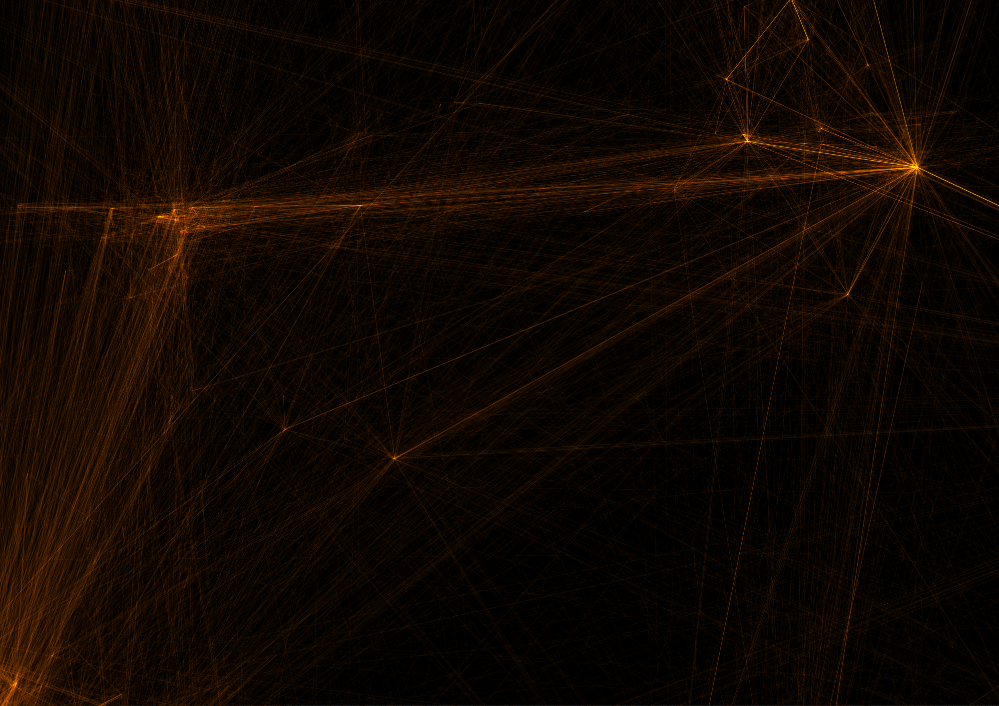
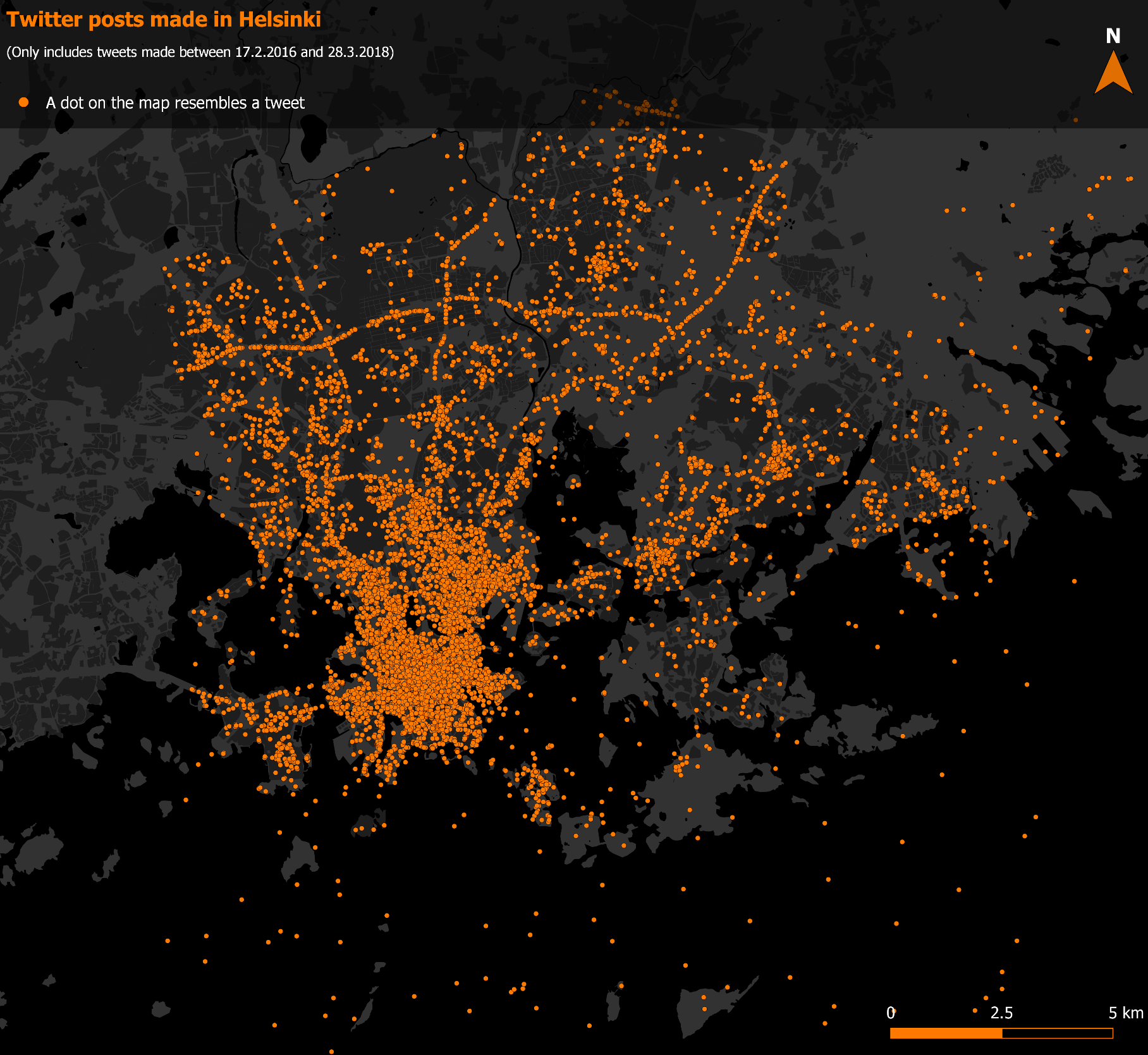
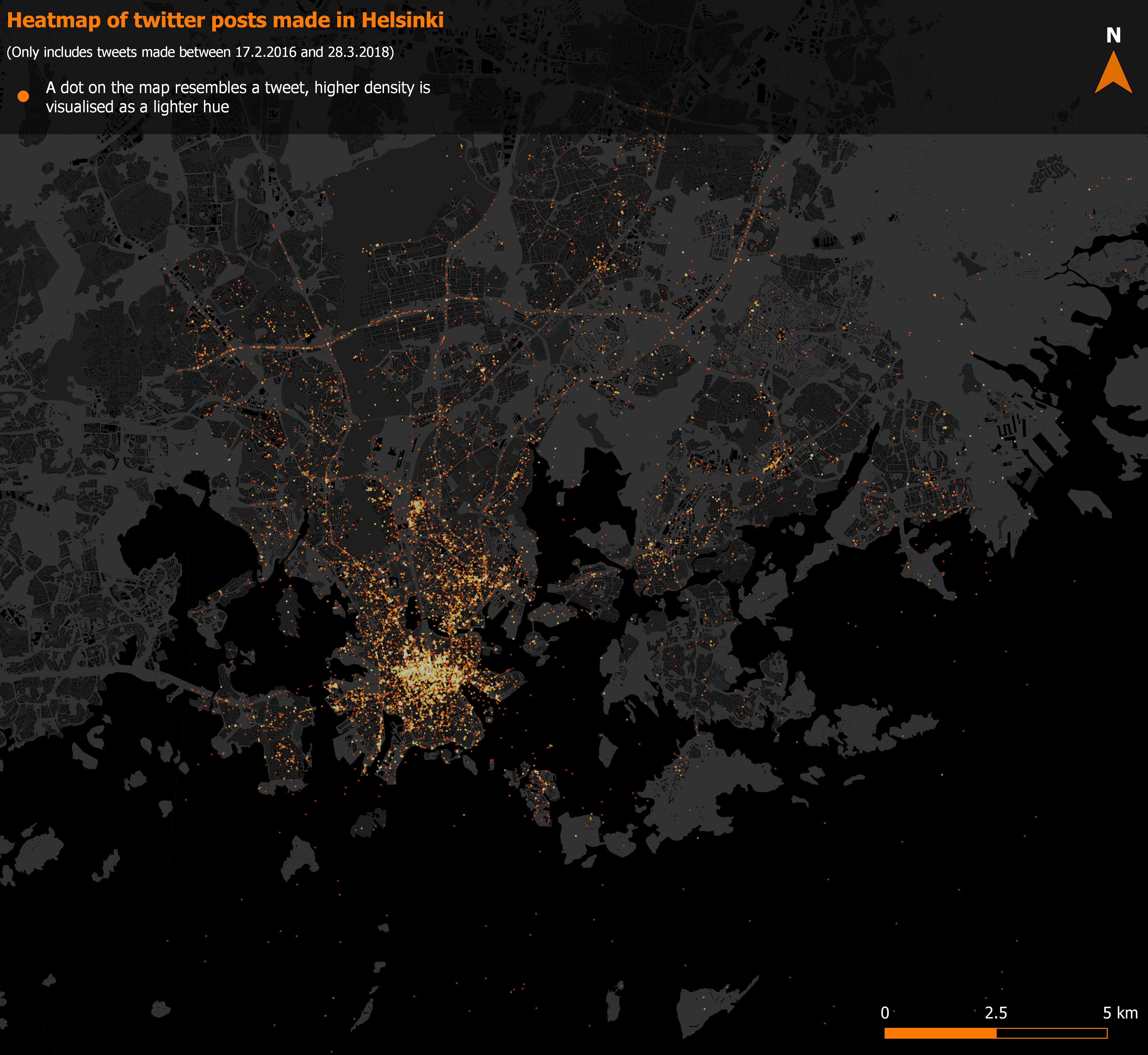
All of the analyses in this report are based on the Instagram dataset (Instagram API) accessed via PostGIS. The data contains Instagram posts from 1.6.2014 to 31.3.2016 and extends over the entire Helsinki metropolitan area covering Espoo, Helsinki and Vantaa (picture 1). This dataset was selected, as it had the highest number of posts as well as good spatial coverage.

In addition to the social media data, vector- based map layers depicting the landcover are utilized as background maps and as a key part of the analysis in the Land use analysis section. These are the same layers that were provided earlier on the course, on week 5.

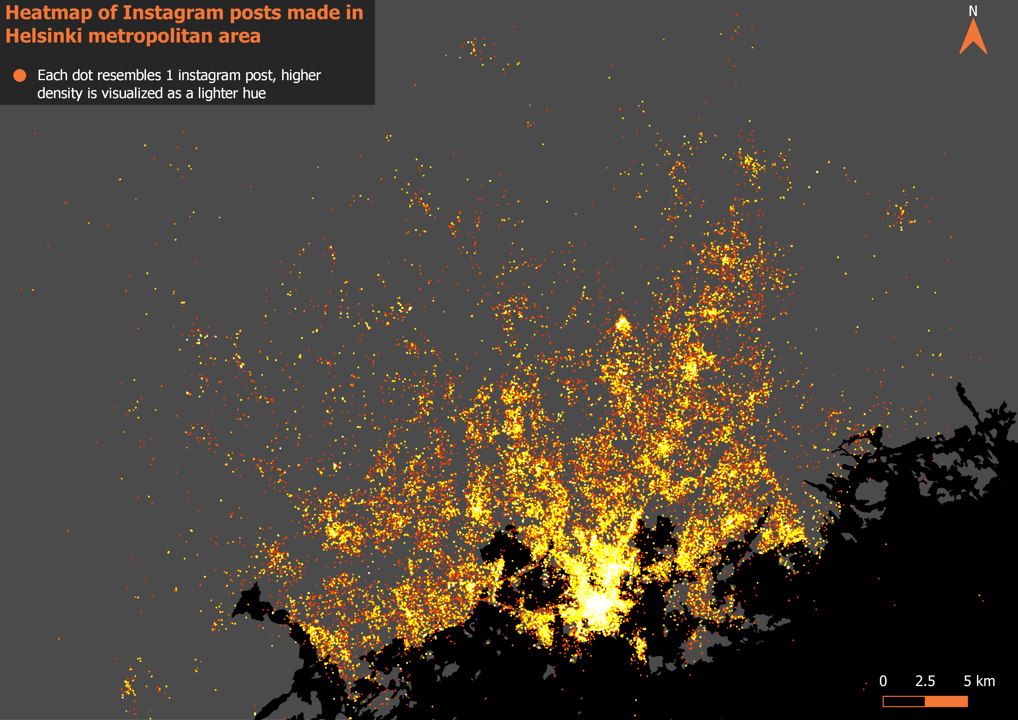
Picture 1. The entire instagram dataset visualized as a heatmap showing both the density and the spatial extent of the data.

2.2. Defining positive and negative

Central to the whole report is the detection of positive and negative social media posts. To find inspiration for the intimidating task I searched for already existing examples of social media users’ experiences or emotions being used as a source of data in a GIS context. It was at this point that the complexity of my research question started to actually dawn on me: One of the example studies I found used an advanced text mining algorithm to detect depressed twitter users and their locations (Park, Kim & Ok 2018) while one used a similar method to link user emotions to different places in Disneyland (Yang & Mu 2015).

Summed up, text mining is a very advanced approach that automatically extracts information from different written resources (Hearst 2003). While probably the best fit my analysis, something like this would have been way too complicated for this report.

Therefore, this is where my analysis takes its biggest shortcut: I searched for the positive and negative Instagram posts simply with two SQL queries. The basic idea of these queries was to find posts that include positive or negative keywords, one query for each category. The keywords in both of the queries are simply some of the first positive and negative Finnish words to come to my mind. The complete queries can be seen below.

The query used to search for positive Instagram posts:

SELECT *

FROM instagram

WHERE lower(text) LIKE ‘%kaunis%’ OR lower(text) LIKE ‘%hieno%’ OR lower(text) LIKE ‘%hyvä%’ OR lower(text) LIKE ‘%mahtava%’ OR lower(text) LIKE ‘%loistava%’ OR lower(text) LIKE ‘%onnellinen%’ OR lower(text) LIKE ‘%onni%’ OR lower(text) LIKE ‘%onnekas%’ OR lower(text) LIKE ‘%iloinen%’ OR lower(text) LIKE ‘%kiitollinen%’

The query used to search for negative Instagram posts:

SELECT *

FROM instagram

WHERE lower(text) LIKE ‘%ruma%’ OR lower(text) LIKE ‘%huono%’ OR lower(text) LIKE ‘%paha%’ OR lower(text) LIKE ‘%kurja%’ OR lower(text) LIKE ‘%surkea%’ OR lower(text) LIKE ‘%suru%’ OR lower(text) LIKE ‘%pelottava%’ OR lower(text) LIKE ‘%pelko%’ OR lower(text) LIKE ‘%pilalla%’ OR lower(text) LIKE ‘%ilkeä%’

These queries resulted in 49830 positive posts and 4029 negative posts. It does seem like overall positive words are much more commonly used as the queries resulted in nearly 10 times more positive results than negative ones.

Of course, the biggest downfall of this keyword method is that it ignores all context of the post. In addition, some words can have different conjugations as well: for example, “hyvä” could be found in a post that actually says “hyvästi”. Still, this method was the best I could come up with and considering the main focus of the report is on GIS, not text mining or machine learning, I think it should be sufficient.

2.3. Grid analysis

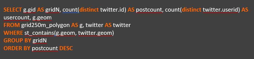
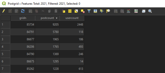
In the first part of the analysis the Dataset was examined in grid format. This was mainly done to get an overall picture of the data. I first aggregated all unique Instagram posts into a 500x500m grid with the following SQL query:

SELECT g.gid AS gridN, count(distinct instagram.id) AS postcount, count(distinct instagram.userid) AS usercount, g.geom

FROM grid500m_polygon AS g, instagram AS instagram

WHERE st_contains(g.geom, twitter.geom)

GROUP BY gridN

ORDER BY postcount DESC

After this I trimmed the resulting grid so that no cells with less than 10 total posts were left. Next I added both the positive and negative posts into the grid as their own fields by counting points in polygon. Then I just calculated the percentages of both the positive and negative posts in every cell with field calculator and visualized the grid into 2 finished maps (pictures 3 and 4).

To further analyse the spatial patterns in the data, I brought the finished grid with the percentage values into ArcMap for global 4 (tables 1 and 2) and local (maps 5 and 6) Moran’s I analysis. For these analyses, every cell without neighboring cells was removed in order for the neighbourhood- based analyses to work as intended.

2.4. Distance analysis

To analyse how distance from city centre affects the percentages of the positive and negative posts I formed a multiple distance buffer centred on the Helsinki railway station. Each ring is 2 kilometers wide. Then I counted the amount of the positive, negative and total posts in each ring with count points in polygon and again calculated the percentages with field calculator. The finished buffers can be seen visualized in maps 7 and 8.

2.5. Land use analysis

In the land use analysis I first merged 4 different landcover layers into 1 (picture 2). The layers merged were selected so as the resulting land over layer will have complete coverage of the study area. The layers used were: 1. Forests, 2. Other green areas (mostly parks), 3. Residential areas and 4. industrial areas.

After merging the layers, I dissolved the polygons based on the layer name field. Now with a layer that has complete land coverage and one row for each land cover type representing all the polygons of its respective category, I ran once again the count points in polygon analysis. Then with field calculator I proportioned the positive and negative posts in relation to total posts in each lancover type. Finished land use analyses are presented in pictures 9 and 10.

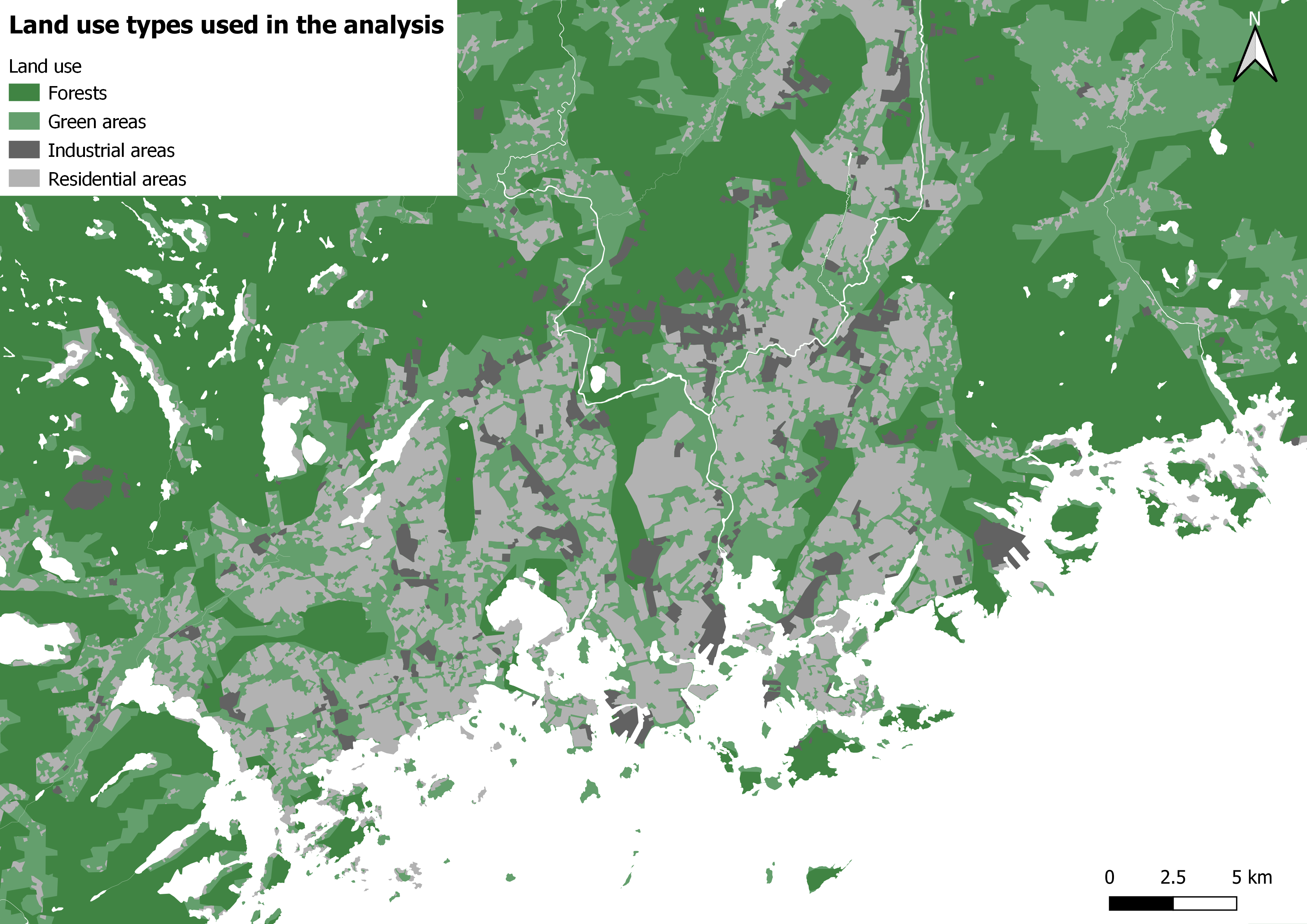
Picture 2. The reference landcover map used for the land use analysis. This merged layer achieves complete coverage of the whole area of interest.
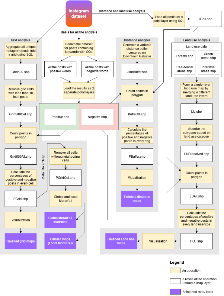
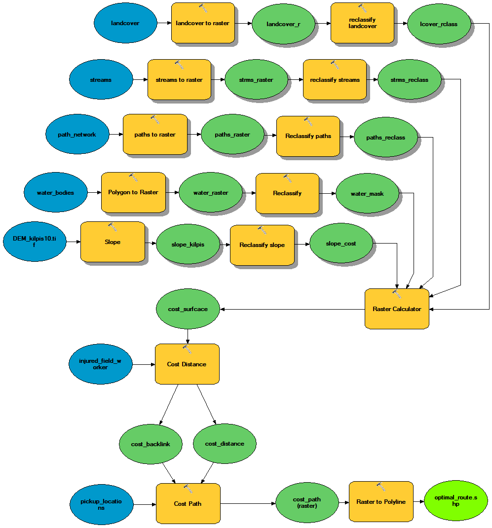
2.6. Workflow chart

All of the different stages of the analysis are presented here as a process. The chart follows an input → output logic, where both the operations and their results are shown.

3. Results

3.1. Grid analysis

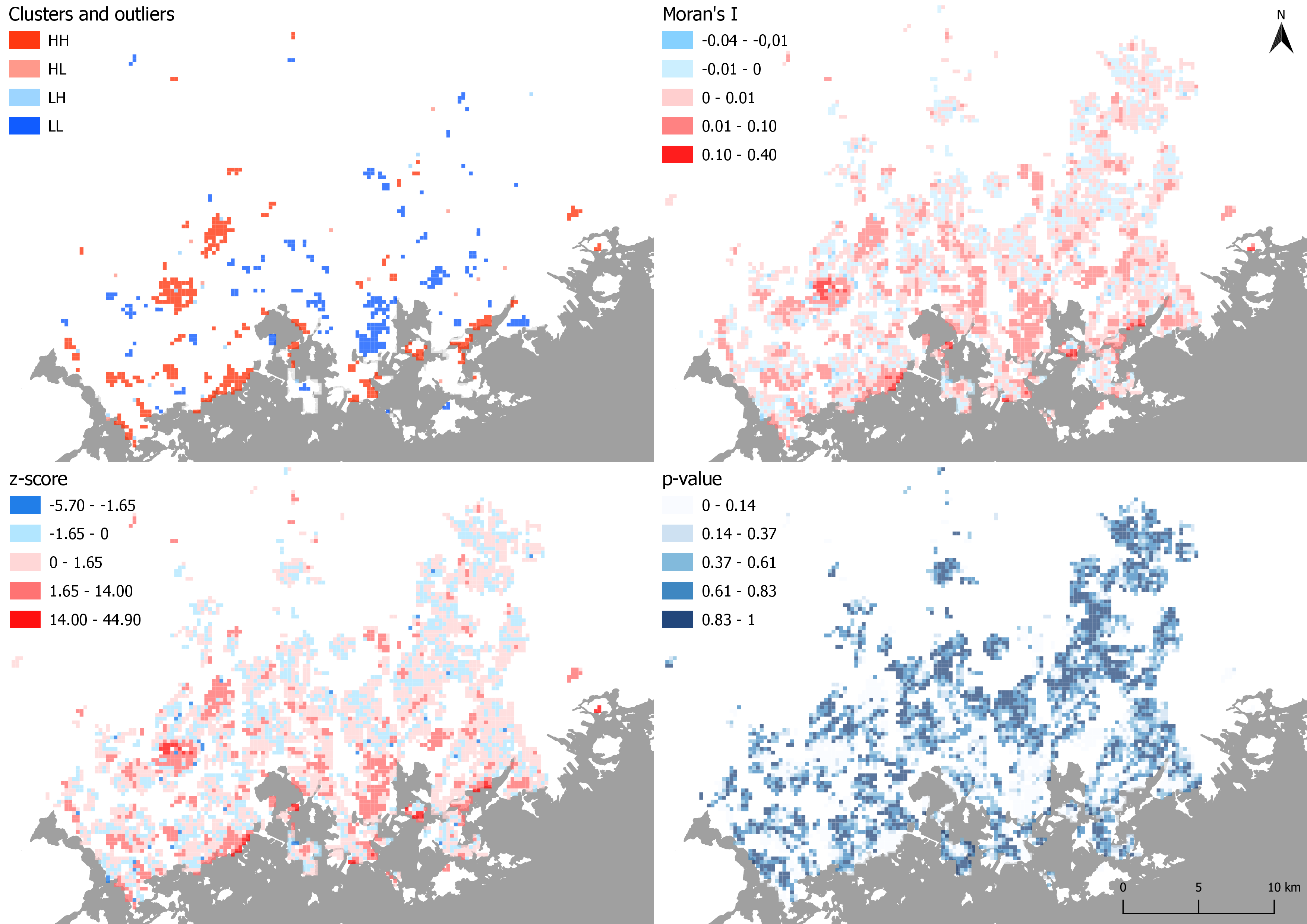
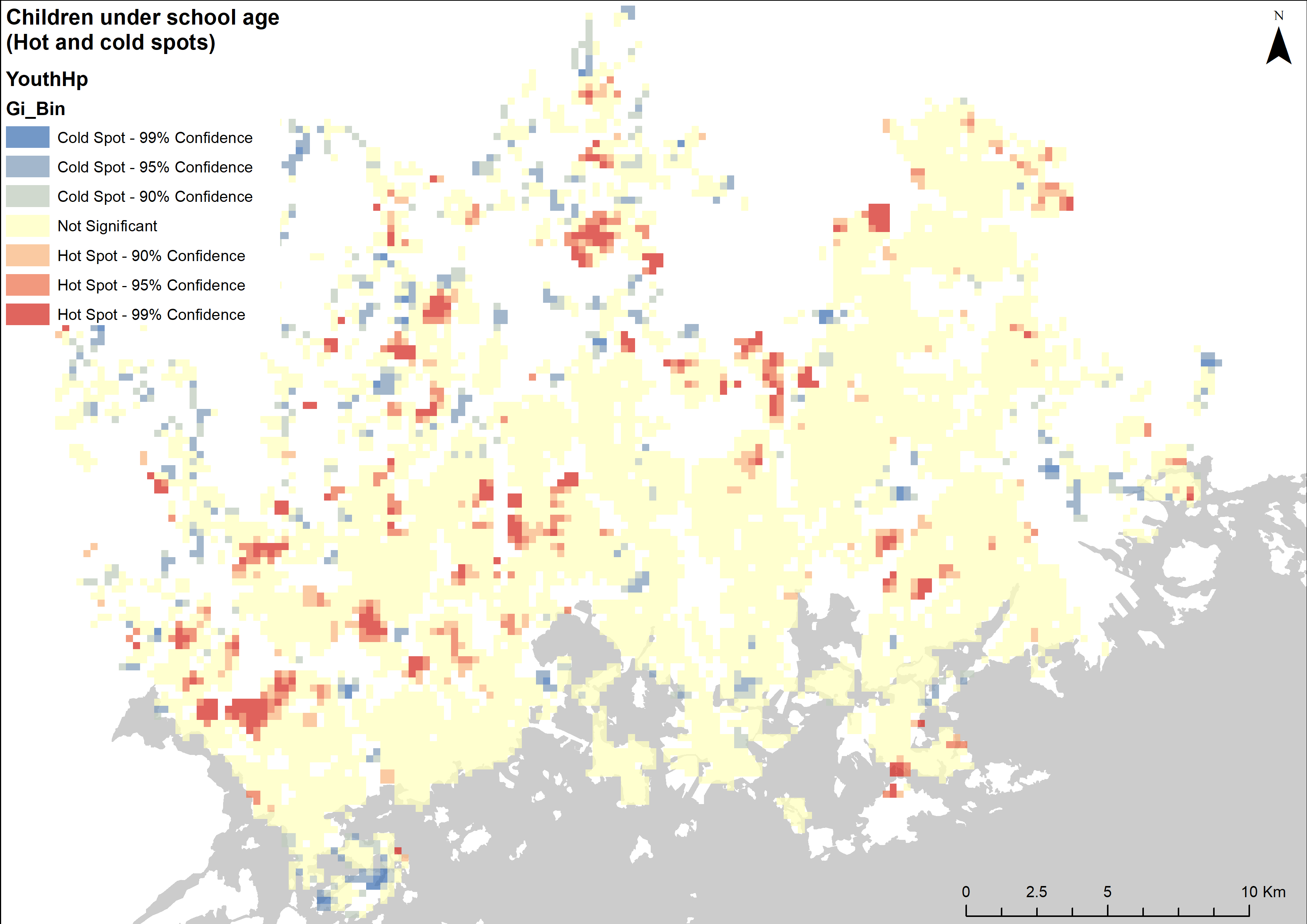
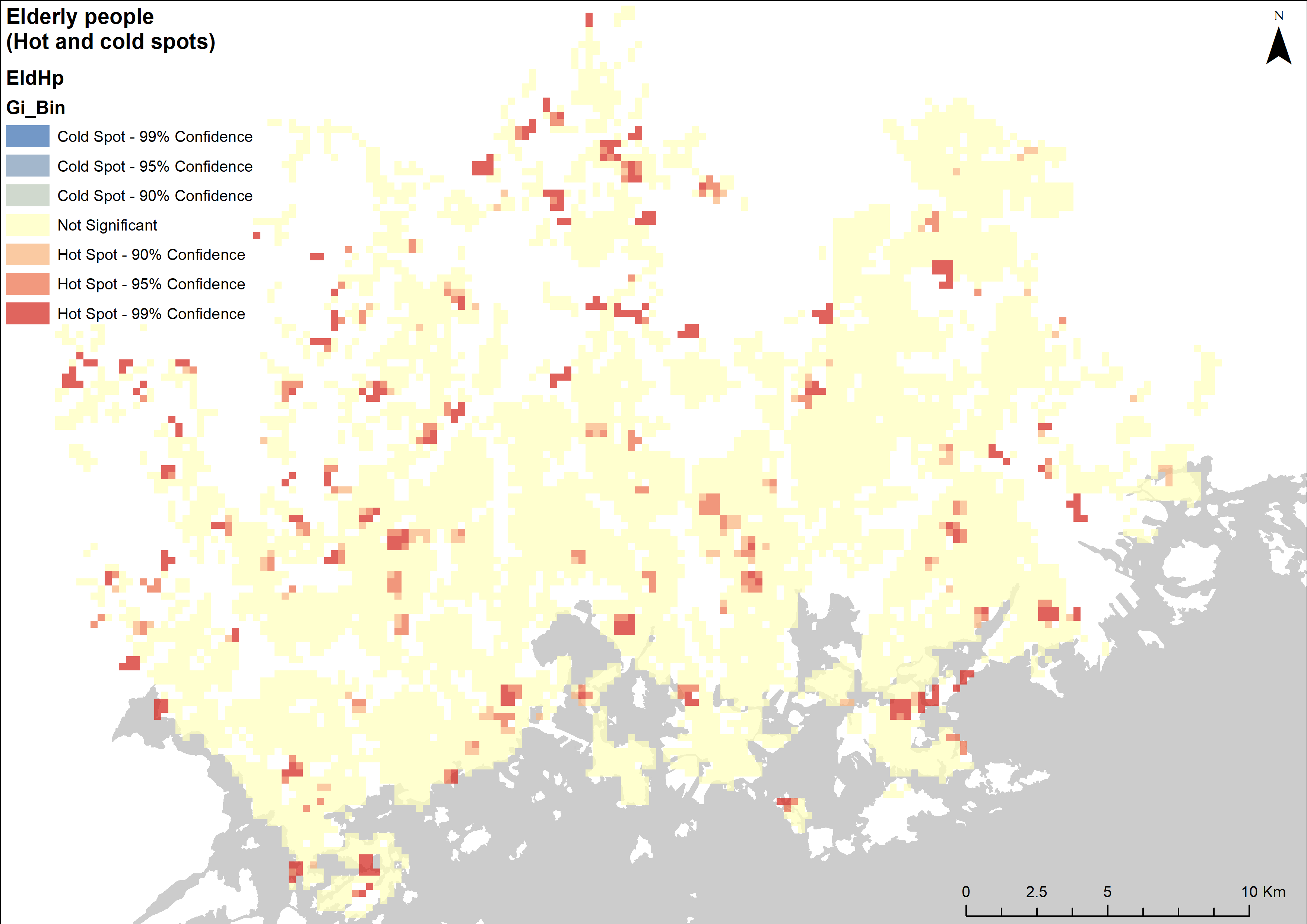
After visualizing the grid for both the positive (picture 3) and the negative (picture 4) Instagram posts, I instantly noticed one similaritiy: The highest percentages of both the positive and negative posts seem to occur away from the downtown area of Helsinki. The grid depicting the positive posts also seems a bit more clustered while the pattern of the negative grid looks to be more of a dispersed or a random one.

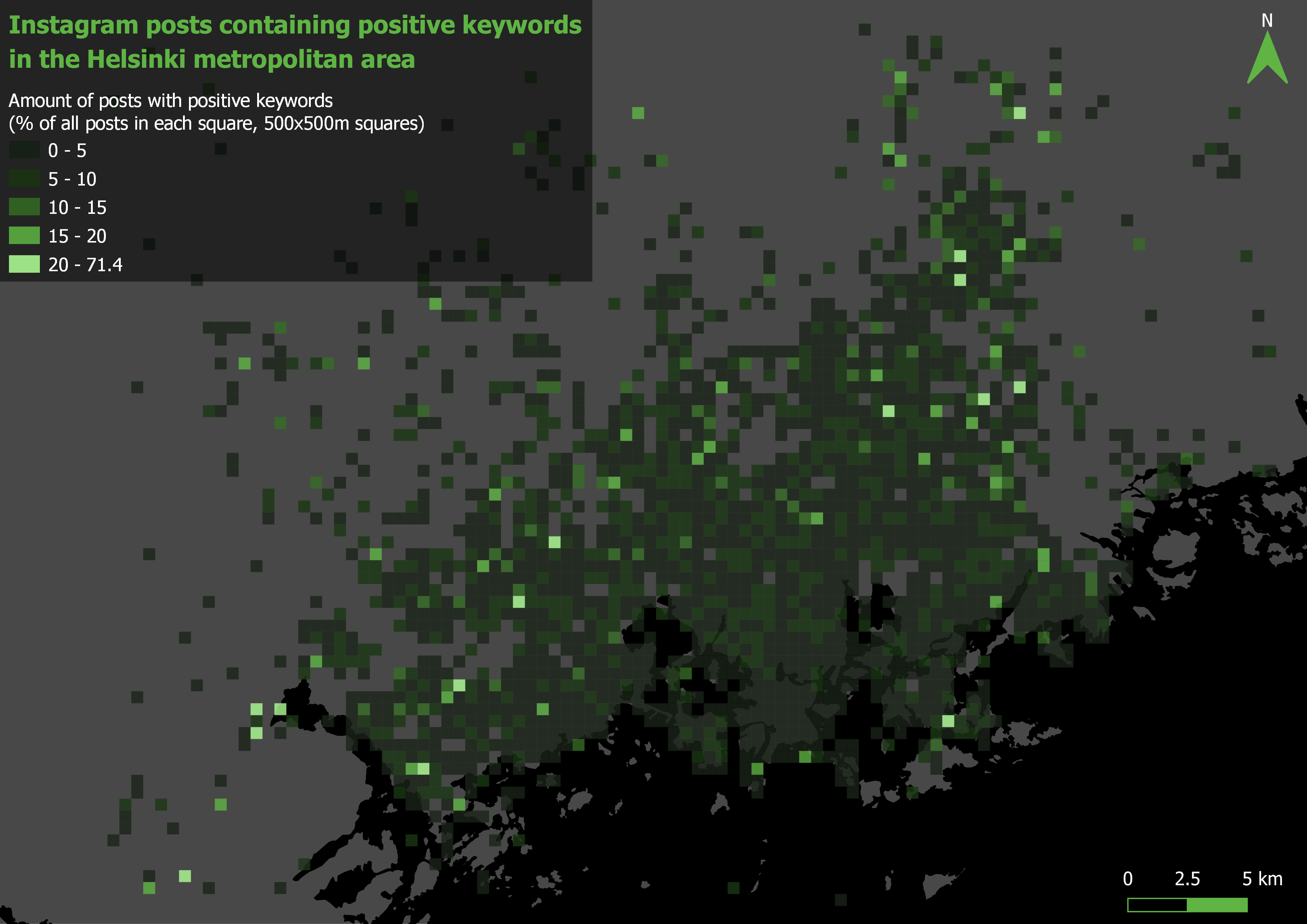
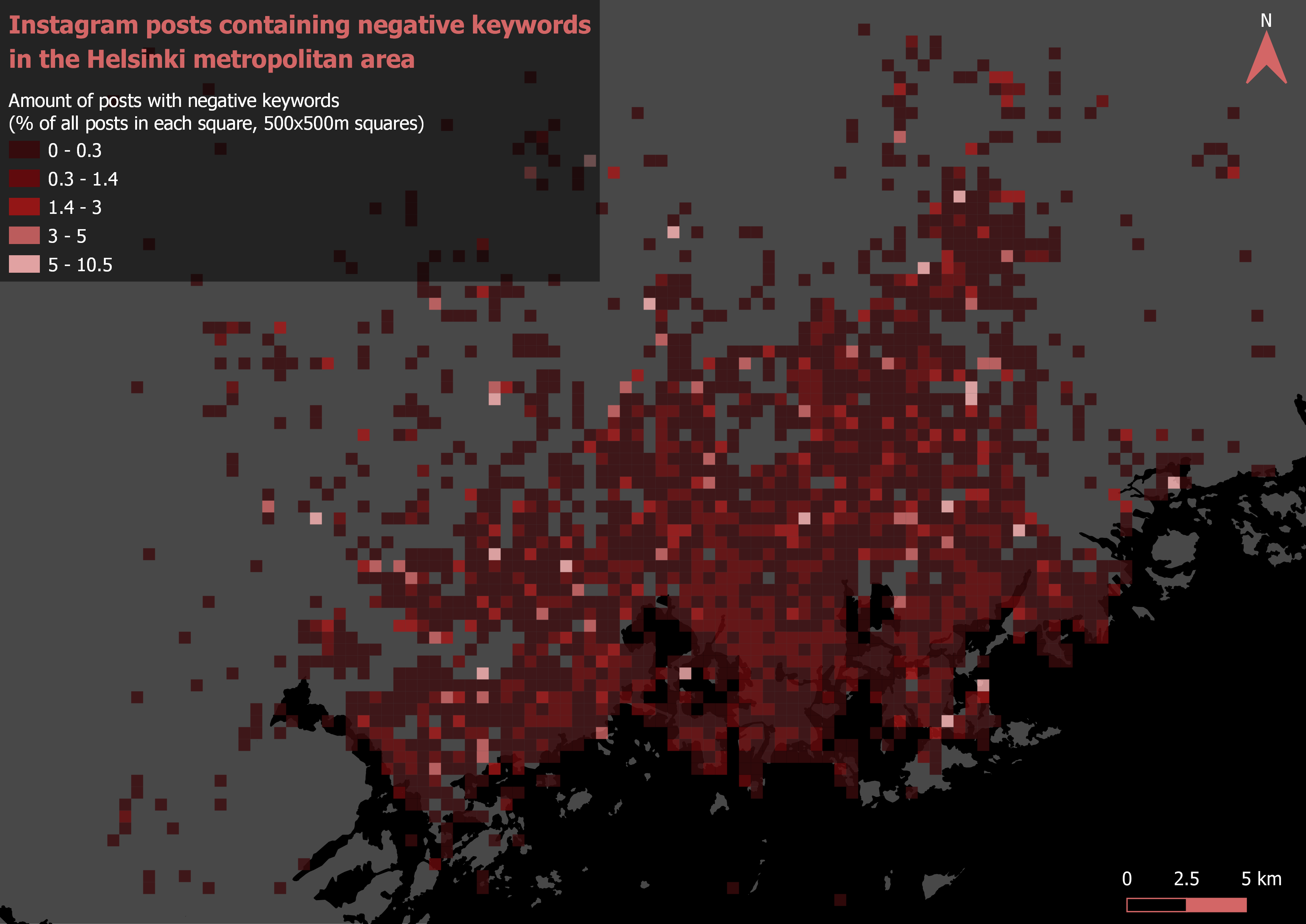
Pictures 3 and 4. Grid analysis.

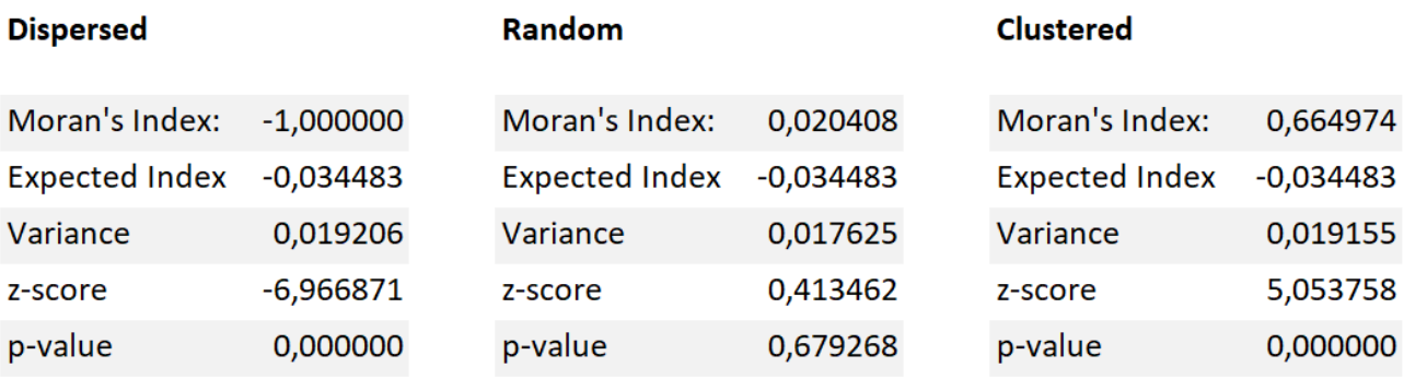
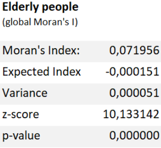
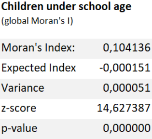
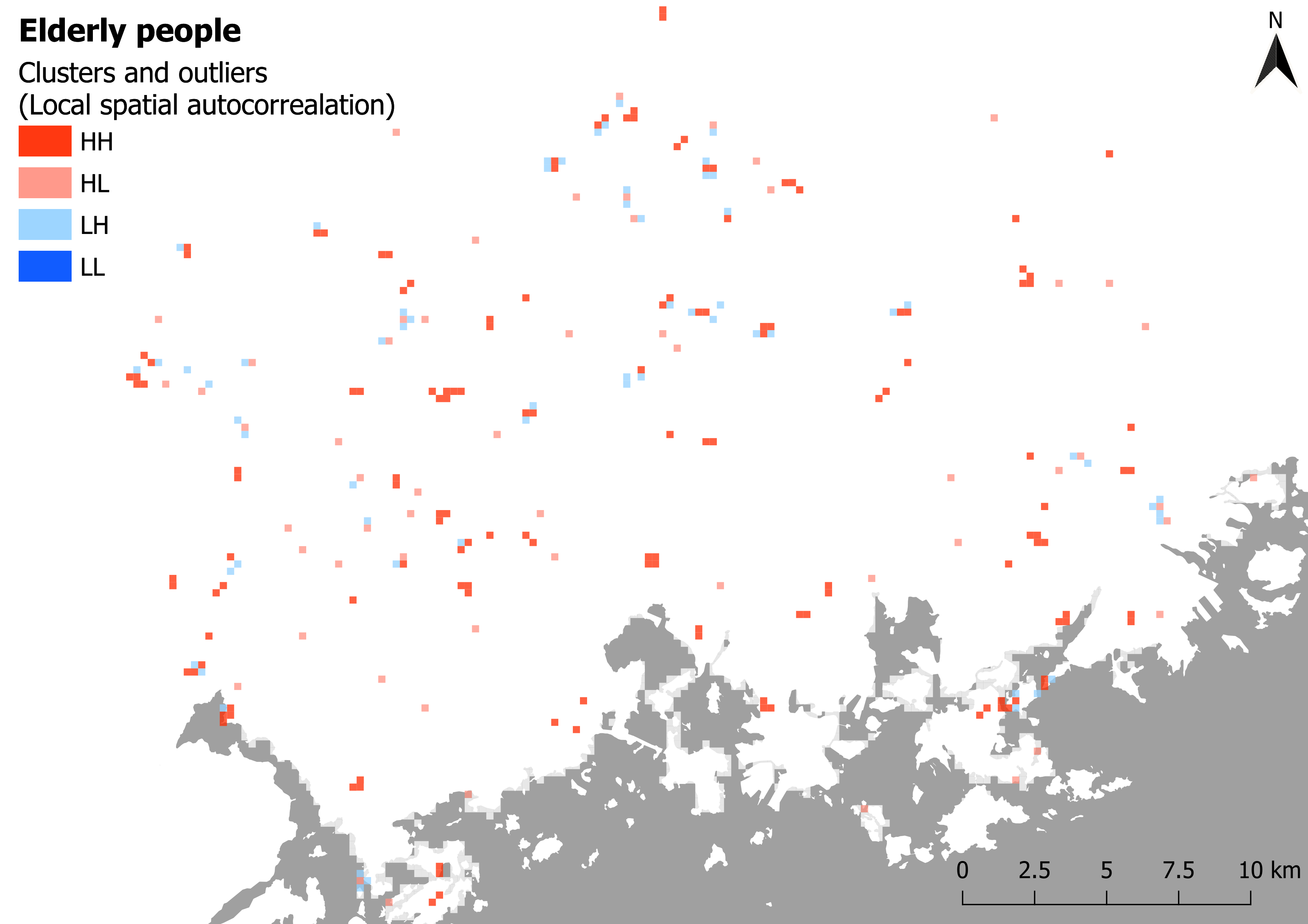
To get a better understanding of the data, I ran both Global (tables 1 and 2) and local (pictures 5 and 6) Moran’s I for both variants of the grids. The global Moran’s I statistics confirm that, as I had suspected, the positive posts are clustered while the negative posts occur in a random manner. The local spatial autocorrelation analysis support this as well: There are more clusters within the grid of positive posts (picture 5) than there are on the negative one (picture 6).

Table 1 and table 2. Global Moran’s I statistics.


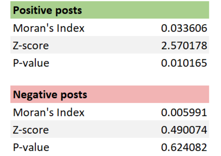
Looking at the above tables the differences in the datasets become a lot clearer than with just visual inspection. With a z-score of 2.570178, there is a less than 5% likelihood that the pattern of the percentages of posts containing positive keywords could be the result of random chance. Given the z-score of 0.490074, its negative counterpart does not appear to be significantly different than random (ESRI, What is a z-score? What is a p-value?).

On the cluster maps two different types of clusters are presented: those of high values (High-High) and those of low values (Low- Low). Interestingly, there are no Low-Low clusters in either of the datasets. There are also two types of outliers: ones where a high value is surrounded by low values (High- Low) and ones where a low value is surrounded by high values (Low-High). (ESRI, How Cluster and Outlier Analysis works)

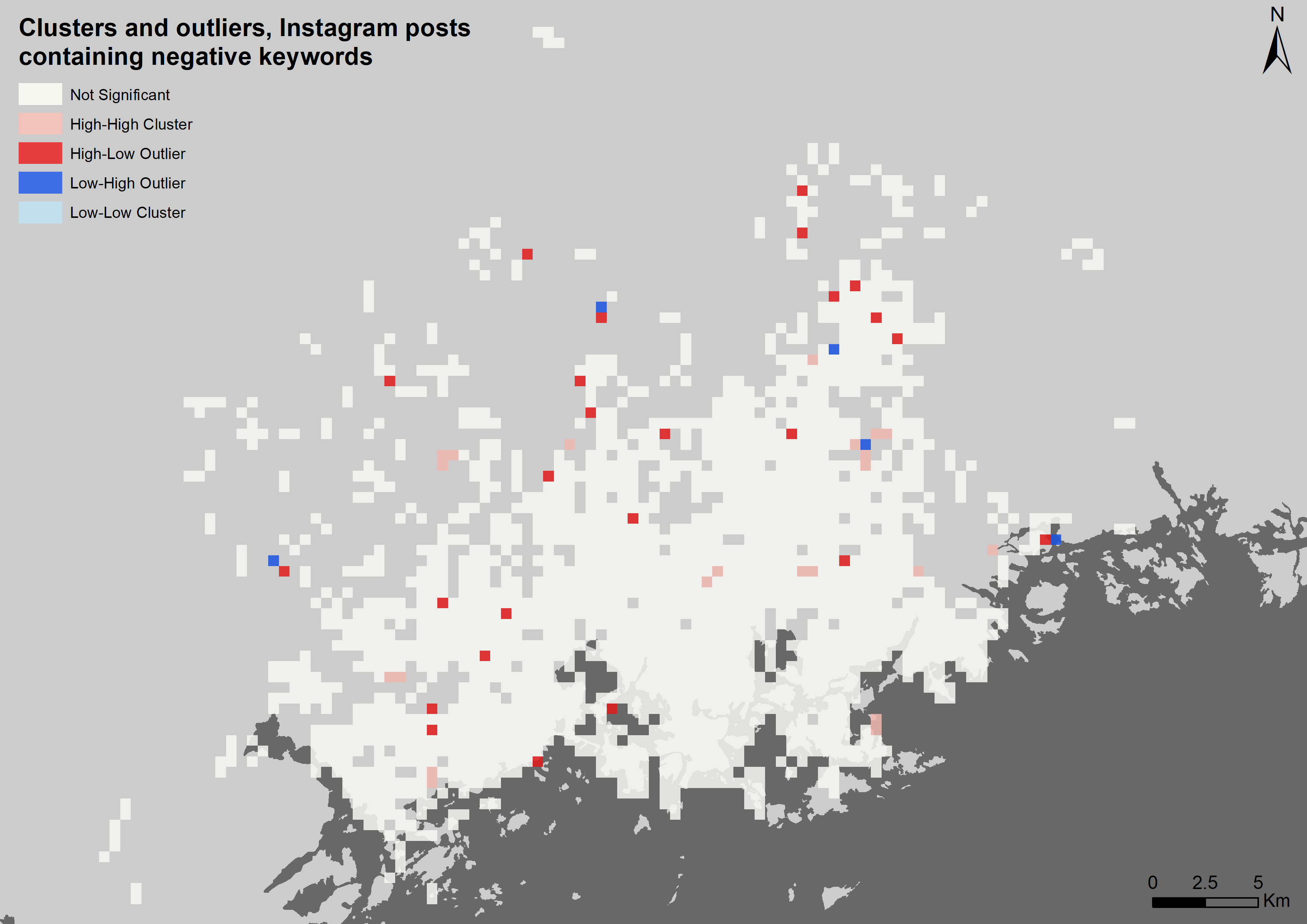
Pictures 5 and 6. Local spatial autocorrelation. The clustering is more prominent when it comes to posts that contain positive keywords.

3.2. Distance analysis

Since on the grid maps it seemed that the highest percentages of both the positive and negative posts occurred away from the downtown area of Helsinki, I decided to analyse the data based on distance from the Helsinki city centre.

The map depicting the positive posts (picture 7) does somewhat confirm this hypothesis as positive posts seem to be more common away from the downtown area. On the other hand, the negative posts do not seem to correlate as well with distance (picture 8). This is most likely caused by the fact that the pattern of the negative posts is more random.

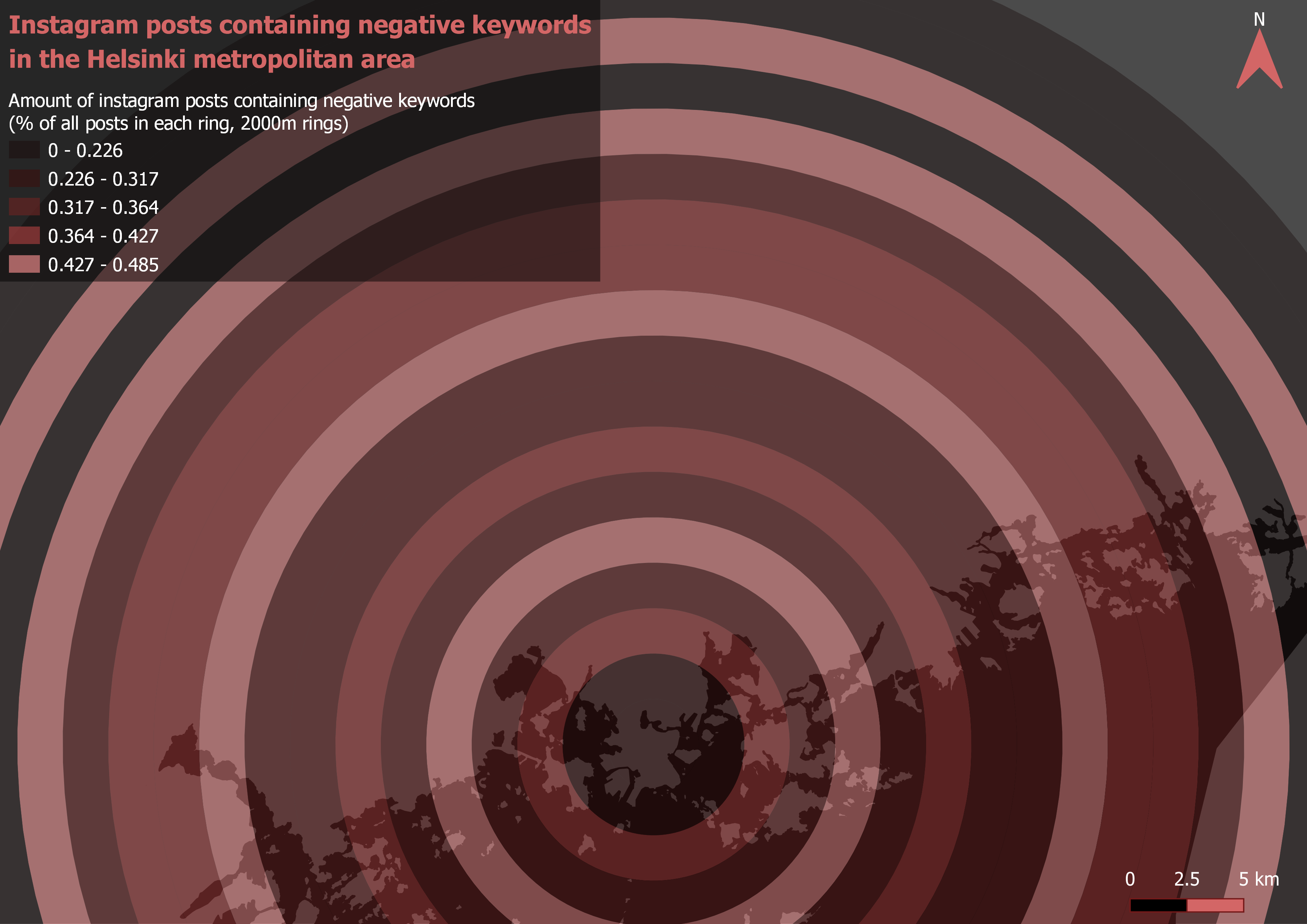
Pictures 7 and 8. Distance analysis.

3.3. Landcover Analysis

The results of the landcover analysis were the most surprising for me. On maps 9 and 10 the percentages of posts containing positive and negative keywords are visualized as colours on the original landcover map’s polygons and as their respective percentile values on the legend.

Looking at both the maps, industrial areas seem to be the ones with the most positive posts and the least negative ones. Next up, Residential areas are second when it comes to positivity. Nature is the place where the positive keywords were posted the least.

When analysing the maps, especially the one with the negative posts, it should be noted that the differences of the percentages are extremely small. This further confirms that the negative posts are spread more evenly.

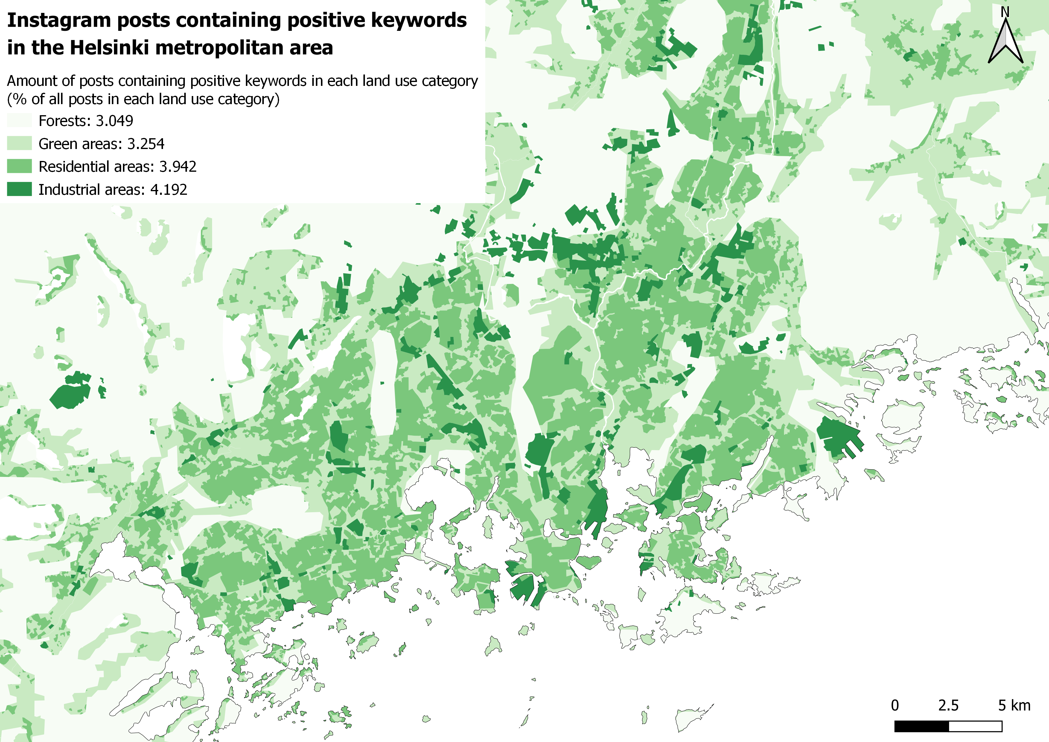
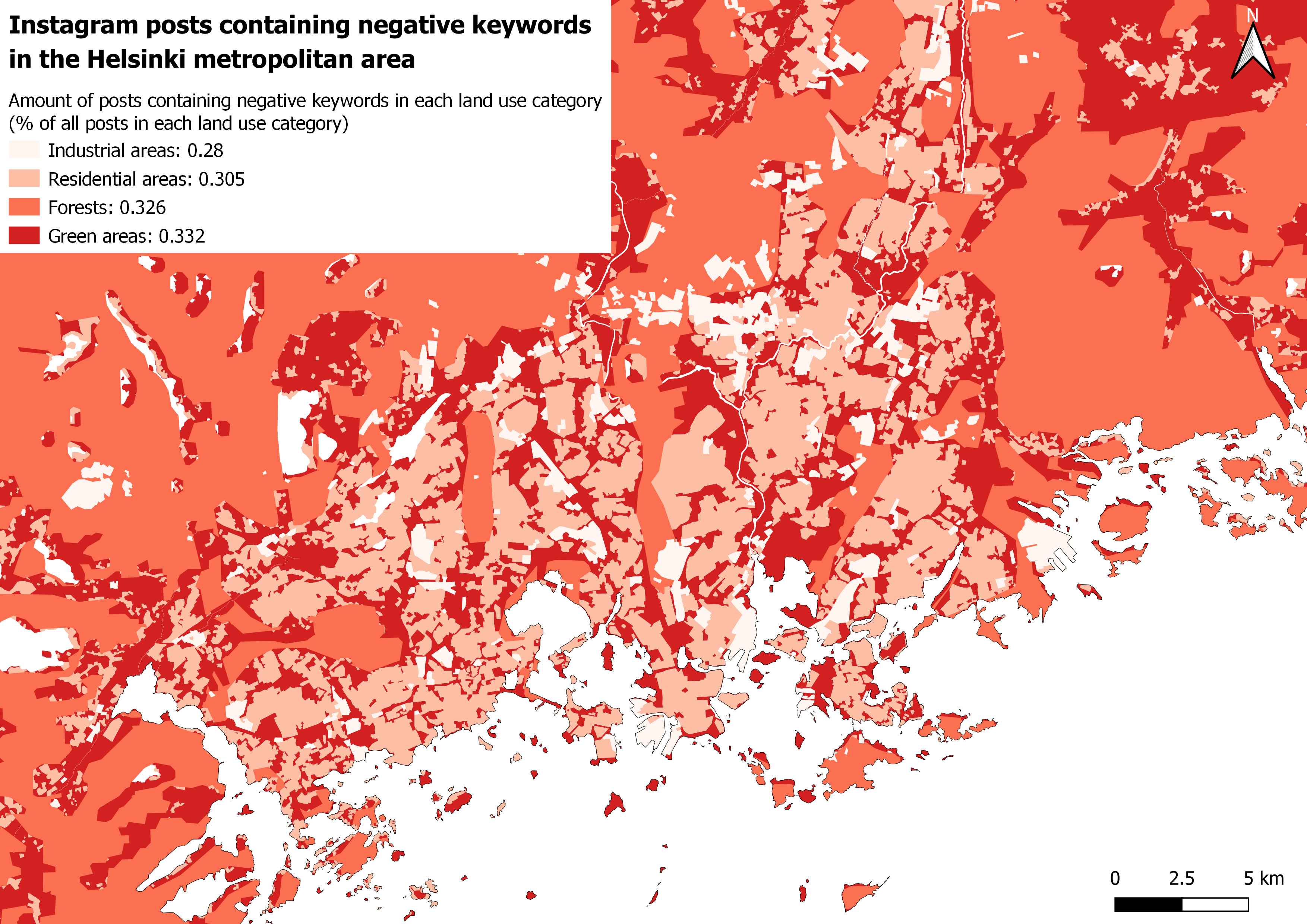
Pictures 9 and 10. Landcover analysis.

4. Conclusion

Based on the analysis, positive tweets are much more common than negative ones. The posts containing positive keywords are also clustered, while the pattern produced by the negative posts is much more random. Positivity seems to be more common away from the city centre while negativity doesn’t significantly correlate with changes in the distance. The percentage of negative posts does not change much depending on the land use type either, while the positive posts seem to be a bit more dependant on the land use type. Judging by the landcover analysis, people really like industrial areas, while the dislike of nature seems to be a unifying factor among Instagrammers.

In all seriousness though, the analysis is far from perfect. Of course, the keyword method for detecting the positive and negative posts is already a major pitfall for the whole analysis, as the actual meaning of the poster cannot be interpreted in any way based on just single words. Also, when analysing social media data, it must be noted that the places that the posts are about do not always correlate with the actual locations where the posting itself happens. In the context of Instagram, for example, a picture might be taken in location a with a caption that is also about location a, and be then posted in a completely different place b. This further complicates the analysis.

Overall the final work went quite well considering I had no idea of how to even approach my research idea at the beginning. And, even though I would not call my results the most reliable, I still think the methods used were interesting enough to justify this report.

5. References

ESRI. How Cluster and Outlier Analysis works. Available online: https://pro.arcgis.com/en/pro-app/tool-reference/spatial-statistics/h-how-cluster-and- outlier-analysis-anselin-local-m.htm

ESRI. What is a z-score? What is a p-value? Available online: http://resources.esri.com/help/9.3/arcgisdesktop/com/gp_toolref/spatial_statistics_to olbox/what_is_a_z_score_what_is_a_p_value.htm

Hearst, M. (2003). What is text mining. SIMS, UC Berkeley, 5. Available online: http://people.ischool.berkeley.edu/~hearst/text-mining.html

Park, S. B., Kim, H. J., & Ok, C. M. (2018). Linking emotion and place on Twitter at Disneyland. Journal of Travel & Tourism Marketing, 35(5), 664-677. Available online: https://www.tandfonline.com/doi/full/10.1080/10548408.2017.1401508

Yang, W., & Mu, L. (2015). GIS analysis of depression among Twitter users. Applied Geography, 60, 217-223. Available online: https://www.sciencedirect.com/science/article/abs/pii/S0143622814002537

Exercise 6 – Spatial statistics

1. Global Moran’s I

In the first section of the exercise the focus was on Global Moran’s I. Global Moran’s I is an index value that expresses spatial autocorrelation on a scale from -1 to 1. By taking into account both the feature locations and their values Global Moran’s I evaluates whether the pattern being analysed is clustered, dispersed or random. A positive value indicates clustering and a negative value indicates dispersion. The closer the value is to zero, the more random the pattern is.

Crucial to understanding spatial autocorrelation and Moran’s I are also p-value and z-score. The p value is the probablility that the pattern being analysed is a result of some random process (in other words, the null hypothesis being valid). Smaller p-values indicate lower probability of randomness. Z-scores are standard deviations: both positive and negative extremes (1,65 < x < -1,65) coupled with low p-values mean that randomness is unlikely.

To test these concepts in practice, three different practice grids were constructed: One dispersed, one random and one clustered. Each one of these grids was then analysed with ArcMap’s Spatial autocorrelation tool resulting in all the beforehand described values for every grid. The results are documented in tables 1-3.

Tables 1-3 (from left to right). Global Moran’s I statistics for all three test grids.

The resulting values are as expected. On both the clustered and dispersed datasets the p-values and z-scores connote that randomness is highly improbable. The Moran’s I index confirms this as well: the -1 of the dispersed grid stands for perfect dispersion, while on the clustered dataset the value is positive indicating clustering. Taking a look at the random set, the z-score is noticeably lower and the p-value indicates a nearly 0,7 chance of the pattern being random. The Moran’s I index is, as expected, close to zero.

2. Local spatial autocorrelation

Next, the already familiar statistics were calculated with a larger dataset. The data used was an YKR grid featuring lots of information about the Helsinki metropolitan area. In this section all of the analysis were done on the amount of living space available per person.

Unlike the first section, this time the focus was on local spatial autocorrelation. This means that, after the data was trimmed and analysis were done, the values can now be displayed as a map series rather than just tables (pictures 1-4). In addition to the statistics already explained in the fisrst section, the local analysis also yields a map layer identifying the clusters and outliers found in the data. Two different types of clusters are presented: ones of high values (HH) and ones of low values (LL). There are also two types of outliers: ones where a high value is surrounded by low values (HL) and ones where a low value is surrounded by high values (LH).

Maps 1-4. The results of the local spatial autocorrelation analysis.

In the map depicting clusters and outliers, a few notable clusters can be seen. For example in Espoo there are mostly HH clusters meaning that the living space per person is high in these areas (Westend for example). Clusters of low living spaces (LL) can be found in Kallio for example.

The Moran’s I map shows higher values in the same areas where the clusters are found, while in the blue areas of negative values (dispersion), clusters cannnot be seen. Same goes for z-scores. For the Moran’s I and the z-score maps I adjusted the break values so that negative values are always a shade of blue while red indicates positive values. The p-value map behaves as expected as well: high probability of randomness means no clusters.

3. Age groups

Problem

In the third section of the exercise, age groups were the focus. The goal was to:

  1. see where children under school age (under the age of seven) and the elderly (over the age of 74) are located in the Helsinki metropolitan area.
  2. See which age group is more clustered.

Plan

First, the data would have to be trimmed. This means all of the grid cells with no population need to be removed. From the resulting grid the cells with no neighboring cells should also be removed in order to make the later local analysis work properly.

The age groups would have to be then gathered into new fields by summing values from the already existing fields. The values should be proportional to the total population of the grid cell, otherwise high amounts of both the young and the old would be just found in areas of high population density.

Once there are new fields in the data displaying percentages of the age groups, both global Moran’s I and Local spatial autocorrelation analysis can be done with the dataset

Data

The same YKR grid dataset from section 2.

Analysis

The trimming of the data was done by selecting all cells without any population (he_vakiy = 0) and removing them. Then by visual selection all the cells without neighboring cells were removed. The percentage-shares of both the age groups were calculated into their respective fields with field calculator.

Global Moran’s I and Local spatial autocorrelation analysis were done for both these new fields. The results of the Global analysis are presented in tables 4-5, while the local spatial autocorrelation results are visualized as maps (pictures 5-6). Hotspots of both grids were also analyzed (pictures 7-8).


Tables 4 and 5. Global Moran’s I statistics.

Pictures 5 and 6. Local spatial autocorrelation.

Pictures 7 and 8. Hot- and cold-spot analysis.

Conclusion

According to the global Moran’s I statistics (tables 4-5) both the children and the elderly datasets are clustered. However, the Moran’s I index and z-scores indicate that the clustering is stronger when it comes to children under school age. The local spatial autocorrelation maps confirm this as well: There is notably more clustering going on in the map depicting the distribution of the children.

To get an even better understanding of where these age groups are located, a hotspot analysis was done as well (maps 7-8). The children seem to be found mostly in neighbourhoods away from the city centre, while the elderly are more evenly spread across the region. One curious detail that can be seen in both the hotspot maps and the Local spatial autocorrelation maps is that there seem to be no areas that completely lack elderly people: There are no LL clusters or Cold spots to be seen in the dataset.

Exercise 5 – cartographic visualization

1. A4 sized map for an expert report

The first map (picture 1) in the exercise was designed for an expert report. This means that the audience it is aimed at already has some knowledge of the topic being mapped after reading the article leading up to the map, or hopefully at least the abstract. The visual elements used are presented below in table 1.

Table 1. The map elements used in the expert map

When designing the map, I decided that the result of the analysis (the daycare centres) should be the priority. In the finished map I chose a bright yellow dot with a thick black outline to represent the daycare units in risk. There are no other yellow elements on the map so they should stand out. Also, they are the only feature with an outline.

The areas of bad air quality are also vital to understanding the analysis. They are visualized with a bright red color with just a hint of transparency. These are the only red elements, and, combined with the daycare centres, the only features with bright colors. As a result, the two most important map elements are what catches the eye of the map viewer first.

The ultimate purpose of a map is to tell where things are located. To help give geographical context for the phenomena being mapped, the shoreline data provided on the course is being used. All major water bodies are visualized as a dark grey, which contrasts nicely with the much lighter land areas. To avoid stealing any focus from the more important map elements, and to minimize the amount of different colors on the map, I did not use a typical blue to indicate water.

To furher define the locations of the daycare centres, I added district names to the map. This is done to facilitate cohesion between the article and the map: If, for example, the article mentions a high density of threatened daycare centres in the area near Kallio, Vallila and Sörnäinen, a person without beforehand knowledge of Helsinki would have no idea what is being discussed without these labels. To reduce clutter on the map, I only included the labels for districts that have resulting daycare centres located within them. I do think that visually the map looks a lot better without these labels, but keeping in mind the purpose of the map, I decided to include them.

To provide a background map I used a combination of the land use data provided on the course and vector data from OpenStreetmap. The OpenStreetmap data was downloaded from geofabrik.de (same data I used in exercise 1).  For the background map I used light grey for residential areas, green for parks and white for everything else. All the colors are very muted so that the background stays as a backround. Only the residential areas and parks are found in the legend, as I think these two categories communicate a lot about the urban environment depicted here. Visualizing natural conservation sites or industrial areas for example would bring no additional value in my opinion. I also decided to leave the original roads that were used in the analysis out of the final map, since by reading the article the viewer should already know how the areas of bad air quality were produced.

Picture 1. The areas of harmful air quality caused by motor traffic and the 21 Daycare centers located within those areas.

2. 7x7cm sized map for a newspaper article

The second map (picture 2) was made for a newspaper article. Unlike the expert map, resources are very limited here: The space reserved for the map was determined to only be 7x7cm and a maximum of 5 colors could be used. Also, since the map is to be published in a newspaper, the target audience is extremely varied. The visual hierarchy of the map elements can be seen in table 2.

Table 2. The visual elements used in the newspaper map.

Much like the first map, the focus is yet again on the daycare centers. I decided to visualize them with black dots outlined with white. This way they can be separated from the lighter background. I did not go for bright colors as they would not transfer well onto a printed paper, especially if the print quality is not the best. Fitting the entire data into the map was difficult, but even harder was finding the appropriate symbol size: Too small a dot would be practically invisible on such a tiny map while large circles would clutter the more dense areas completely.

The zones of bad air quality are the only feature with color. I decided to use a darker shade of red to create contrast with the light backround, but still stand out from the black dots as well. On this map I did not mess with transparency or other layer rendering options at all. To give a geographical reference for the data, I simply used the polygons of water bodies colored with light grey to keep the backround as simple as possible.

I did not even try to create a more elaborate backround map for this visualization, as it would most likely have been a complete disaster on a canvas this small. This allows for a more simplistic legend as well, since there are only 2 features explained. I also left out the district labels since they would never have fit the map.

Picture 2. The areas suffering of air pollution caused by motor traffic have been visualized on this map with a red color while the black dots symbolize daycare centres located within those areas. Based on the analysis, there are 21 daycare centres within these risk zones.

3. Colorblind maps

Below are presented four versions of the expert map: From top left clockwise, Red-Blind, Green-Blind, complete black and white and Blue-Blind. I was actully surprised by how the map is still pretty sensible, even with complete lack of color. Even the land use layers are distinguihable, but the legend icons become a lot harder to interpret.

Exercise 4 – Raster analyses

1. Topography of the research area

All the analyses in exercise 4 are focused on Kilpisjärvi and its surrounding area in northern Lapland. The topography analyses were done with digital elevation models (DEMs) of the area. Four different spatial resolutions were used, with pixel sizes ranging from 1 to 10 meters. Both the topography maps (pictures 1-2) are produced with the most precise dataset (DEM1), while the SWI map (picture 4) is, due to long processing times, done with a coarser spatial resolution of 5 meters (DEM5).

1.1. Topographic maps

I visualized two different maps portraying the research area. First, I visualized just the slopes of the area with a simple white to black color gradient (picture 1), and after that tried to form a hillshade map of the area (picture 2). I did not get very representative results with the standard hillshade option, so, instead, I used a custom color gradient (picture 3) on the aspect-analyzed DEM to achieve a do-it-yourself hillshade effect.

Picture 1. The slopes of Saana. The steeper the slope, the darker the color.

Pictures 2 and 3. The Hillshade map was produced using a custom color gradient. I found out that by moving the light and dark areas on the gradient I could simulate different illumination directions. With this final color gradient variant I tried to simulate the light coming from north-west.

1.2. SWI

Next, the wetness of the soil was calculated using SWI (SAGA Wetness Index).

SWI is a GIS tool that allows the calculation of soil moisture. The operation requires only an elevation model depicting the research area in order to work. The tool is quite reminiscent of the Topographic Wetness Index tool (TWI), but it calculates catchment areas differently: Unlike TWI, SWI does not think of the flow as a very thin film. As a result, it predicts for valley floor pixels that have small vertical distance differences to channels a more realistic, higher soil moisture compared to TWI (SAGA-GIS.org). Below is presented a soil moisture map of the research area, calculated using SWI (picture 4).

Picture 4. The soil moisture of Saana and its surroundings. Darker pixel color indicates higher moisture percentage.

1.3. Comparison of the SWI and field data

The results of the SWI map were sampled with point sampling plugin and compared to real life samples collected from the same locations. The moisture percentages were also compared to all the topography variables (elevation (DEM1), slope, aspect and general curvature). The correlations between these variables are shown in the below scatter plot matrix (picture 5). It seems that general curvature has the strongest correlation with soil moisture, which is reasonable, as the more curved a surface is, the faster water flows away from that surface point. This is also why the correlation is negative.

Picture 5. The real-life moisture percentages have a strong negative correlation with general curvature. The next strongest correlation is with the SWI data.

2. Cost surface raster & least cost path

In the second half of the exercise an imaginary rescue operation was planned. An injured fieldworker (called Sakke) is stranded in the Kilpisjärvi research area and the goal is to plan the most efficient rescue route, along which sake can be carried to safety.

The route was constructed with different rasters and ArcGIS’s modelbuilder. The basic work-flow of the route constructing process (picture 6) is to first determine how different terrain types affect carrying a wounded field worker. After this is done, the different layers included in the analysis are changed from vector polygons and polylines to raster format. Once a layer is rasterized, a cost value can be assigned to each pixel based on the type of terrain by reclassifying the layer. Combining the different layers into a single cost surface and then calculating a minimum cost path between Sakke’s location and the location of the rescue points results in three different routes (picture 7).

Picture 6. The final model used in constructing the optimal routes. Rock fields, streams and rivers, paths and roads, water bodies and the steepness of slopes are all taken into account in the final paths.

Picture 7. The three rescue routes to save Sakke. The optimal path is drawn as a solid line, while the two other options are dashed lines.

On the finished map, the optimal path ended up leading to the farthest rescue point measuring just by distance (the lengths of the routes are from top to bottom: 5071 m 5729 m and 6708 m). This is the result of the costs I assigned to the pixels: while the path is long, it does not include steep slopes, it goes around the rock fields, and every time it crosses water, it does so along a path. Even the shoes of the commendable rescuers carrying Sakke stay dry!

Exercise 2 – Data exploration, data quality and SQL

 1. Basic statistics

The focus of this exercise is on big data from social media. The first section of the report briefly goes over all data used in the exercise (table 1), while taking a closer look at one of the provided social media datasets (table 2).

Table 1. Data used in exercise 2.

I used the twitter data for most of the analysis in this exercise. The same dataset was also the target of a more detailed analysis using an assortment of different SQL queries. The basic statistics of the dataset are presented below in table 2.

Table 2. The basic statistics of the twitter dataset presented with their respective SQL queries. The categories for most and average likes per post have been excluded as the data had no records about likes.

2. Visual inspection

After getting somewhat acquainted with the data through SQL, it was time for visualisations. First, I made a basic map showcasing the locations of tweets with just single-coloured dots (map 1).

Picture 1. A simple map showcasing the twitter dataset. This map functions well for getting an overall idea of the structure and especially the spatial extent of the data.

However, the first map falls short when any more complex information is required. The dataset is way too dense to be analysed with every tweet being visualised the same way. To this problem a heatmap acts as an excellent solution (map 2).

Picture 2. A heatmap brings along a more detail-oriented outlook.

A heatmap allows for a more in-depth analysis of the data. For example, areas that were completely cluttered on the first map, such as the downtown of Helsinki, are now bursting with variety and new information. On the flipside, the outlier tweets are noticeably dimmer and harder to see. Defining the spatial extent of the data would be a lot more difficult with this map, for example.

3. Data aggregation

The next step was to transform the point-structured data into a grid. The task seemed simple at first: just form a grid and count the number of tweets within each square. However, instead of a simple “count points in polygon” -analysis, the method was predefined to be SQL. After quite some time and frustration I finally managed to aggregate the data correctly using the following query (pictures 3 and 4):

Pictures 3 (top) and 4 (bottom). The completed query imports the number of unique users and tweets per square into a 250x250m grid, while also conserving the location data. The resulting attribute table can be seen in picture 4.

What had caused me so much trouble was forgetting to include the geometry field. That of course made it impossible to bring the data into QGIS in a form that could be mapped.

Content with my small triumph over SQL, I loaded the resulting grid into QGIS and visualised it into a map (picture 5). I decided that only presenting the amount of tweets per square would be sufficient, as the map depicting the user counts turned out nearly identical in appearance.

Picture 5. The number of tweets portrayed on a 250x250m grid.

The finished grid map is, in my opinion, the most visually efficient way of communicating information of the twitter dataset. Acting as sort of a hybrid between the point- and heatmaps, it shows the different densities of tweets cleanly, while still maintaining a clear sense of the spatial extent of the data. As a negative though, the grid covers everything underneath, so any extra information would be difficult to fit here. This is also why I opted for a minimalistic visual look when it comes to the background map: adding land use data or buildings would bring no extra value here.

4. Location Accuracy

In the final section of the exercise the goal was to find out if social media posts that mention a given place are also posted from that same place. In practice this happened by selecting any named location found within in the study area and then searching the social media datasets for all the posts mentioning it. The search was, once again, carried out with an SQL query (picture 6). I chose Suomenlinna for my study since the place is a very popular destination. This should guarantee a reasonably sized population of posts for the analysis.

Picture 6. When forming the query, I made sure to expand my results by also including the Swedish option for Suomenlinna.

At this point I also deviated from the twitter dataset for the first time: part of the analysis was to compare 2 different social media platforms to each other. I chose Instagram for the comparison, as I knew the dataset was the largest of the three provided. searching both datasets with the query shown above yielded 554 results from Twitter and 12660 from Instagram.

After loading both resulting tables into QGIS and digitizing a new point layer depicting Suomenlinna, I used the MMQGIS plugin for calculating the distances between the social media posts and the physical location (picture 7). The plugin calculated the distances into a new field as meters (picure 8). Based on these distances I also calculated basic statistics for both social media platforms using the statistics panel in QGIS (table 3).

Pictures 7 (left) and 8 (right). The plugin and its result.


Table 3. The basic distance statistics for both Twitter and Instagram. Overall Instagram posts seem to be posted from closer to Suomenlinna than their Twitter counterparts.


In the final maps I visualised the social media posts as a heatmap with the distance lines drawn by MMQGIS transparent underneath (pictures 9 and 10).

Picture 9. The tweets mentioning Suomenlinna with their distance vectors.

Picture 10. The larger size of the Instagram dataset shows both in the spatial extent and in the number of posts.

5. Conclusion

This exercise was a lot more difficult for me than last week’s. This was mainly due to SQL: I had no previous experience or knowledge of the query language, which made getting started a bit slow to say the least. Overall, I’d rate the difficulty of the exercise at a 4.5/5.

On the other hand, I also learned a lot this week. All of the SQL knowledge was completely fresh to me, and I hope some of it sticks as well. I also learned new things about visualisations: Creating heatmaps, for example.

Exercise 1 – Spatial analysis as a process

1. Problem

The goal of the first exercise was to find out how many daycare units in Helsinki are located within areas of bad air quality. In this exercise bad air quality was linked with air pollution caused by road traffic, so areas with the most traffic would also be the ones with the worst quality of air.

2. Plan

I approached the problem with the PPDAC (problem, plan, data, analysis, conclusion) model. The first step in my plan was to create buffers for the roads within the target area. The buffers would have to differ in size depending on the traffic amount of a given road, so examining the attribute table of the road data would be essential. After forming the buffers an overlay analysis could be performed: Clipping the daycare unit data with the buffer polygons would result in a desirable outcome, where only the units in risk areas are shown.

3. Data

The data used in the exercise is presented in table 1. The road, traffic and air quality datasets were joined together, so their numbers of records and fields appear the same in the table. When downloading the daycare unit data, I specified my query only to include daycare centres, the total number of which was 1021.

For visualising the final map, I also used building and land use data from Open Streetmap (downloaded via geofabrik) and shoreline data from a previous GIS course.

Table 1. The data used in exercise 1.

4. Analysis

The main goal of the exercise was to automate the analysis process, so instead of doing every step manually, a model would have to be built (pictures 2, 3 and 4).

Picture 2. The basic idea of the model used in the exercise.

Pictures 3 and 4. The finished models from QGIS (top) and ArcGIS (bottom).

I composed the first model (picture 3) using the model builder in QGIS. I had previously built models using ArcGIS only, so the operating principles of the Q-alternative took some getting used to at first. The main difference to ArcGIS was that the model is built before any data is added. Once I got used to the idea, I actually preferred this approach: the model is built separate from the data, so it can easily be used with many different datasets.

I also think the model builder in QGIS fits the PPDAC model better than the one in ArcGIS. We have a problem to which the model should act as a solution, or as a plan. In PPDAC the problem and the plan are the first two steps before the data, so it is only natural that when building a model, data is not added in the beginning stages, but rather after the plan, or in this case the model, is completely formed.

Both models have 2 steps (Pictures 2, 3 and 4). First they form a variable distance buffer for the digiroad dataset based on the Min_dist field (HSY:s air quality zones), and then clip the daycare dataset with the resulting buffer polygons. Both models output only the daycare centres located in the areas of risk (map 1).

5. Conclusion

Picture 5. The air pollution map shows the areas of harmful air quality and the daycare centres located within those areas.

The finished analysis tells us that there are 21 daycare centres located in areas of bad air quality and a 1000 located elsewhere. The original dataset contained 1021 daycares in total, so that means about 2% of all daycare centres in Helsinki suffer from a bad quality of outside air.

Overall the exercise was not too difficult. Even though on previous GIS courses I had gotten used to the security of readily available and precise instructions for every step of every analysis, I didn’t have too much trouble with this more independent working style. working with other students proved to be extremely helpful too. Over all I’d rate the difficulty of this exercise as a 2,5/5.

The main thing I learned from the exercise was implementing the PPDAC model from theory into practice. I also learned more about model building with GIS software: I had never used QGIS for building models, and the ArcGIS side of things was a bit rusty for me as well.

Kurssikerta 7 – Kansalaisvaikuttamista globaalilla tasolla

Viimeisellä kurssikerralla sekä aihe että toteteutustapa olivat täysin vapaita. Toivotuksi lopputulokseksi oli kuitenkin määritelty yksi tai useampi kappale karttoja, joissa eri muuttujia tarkasteltaisiin alueittain.

Kotimaassakin ajankohtaisen vaaliteeman innoittamana päätin tarkastella äänestämistä globaalina ilmiönä. Väestön innostus demokraattista kansalaisvaikuttamista kohtaan on suhteutettu kartoilla valtioiden koettuun hyvinvointiin, sekä jokseenkin epädemokraatiisempaan vaikutustapaan, aseellisiin konflikteihin. Karttojen tavoite onkin näin ollen havainnollistaa syitä ja olosuhteita, jotka saavat ihmiset aktivoitumaan tai toisaalta passivoitumaan vaaleissa.

Kartta 1

Ensimmäinen kartta kuvaa äänestysprosenttia valtioittain. Kartassa on käytetty dataa kunkin valtion viimeisimmistä parlamenttivaaleja vastaavista vaaleista (Suomessa eduskuntavaalit, Ruotsissa valtiopäivät jne). Kartan perusteella äänestysprosentti näyttäisi ainakin jossain määrin seurailevan valtioiden kehittyneisyyttä, menestyneempien maiden erottuessa edukseen. Poikkeuksia on kuitenkin todella paljon, eikä kovin kattavia yleistyksiä voida ainakaan vielä tehdä: Esimerkiksi USA ja Filippiinit edustavat huomattavan toisenlaista tulosta.

Kartan poliittisesta luonteesta johtuen pitäisi sitä myös tulkita tietynlaisella varauksella. Esimerkiksi Turkin sijoittuminen korkeimman äänestysprosentin viidennekseen tuo väkisinkin mieleen viimekesäisen uutisoinnin kyseisten vaalien jokseenkin epädemokraattisesta toteutuksesta, valeäänillä täytetyine uurnineen.

Kartta 2

Toisella kartalla tarkastellaan eri valtioiden asukkaiden kokemaa hyvinvointia. Lähteenä on käytetty globaalia Happy Planet Index -hyvinvointitietokantaa, josta kartan mittariksi on tarkoituksella valittu vain hyvinvoinnin objektiivinen osa-alue. Kuten oletettua, vauraat länsimaat näkyvät vihreinä, kun taas kehittyvät valtiot erottuvat usein keltaisen ja punaisen sävyinä.

Hieman mielenkiintoisempia tuloksia saadaan verratessa koettua hyvinvointia edellisen kartan äänestysprosentteihin. Joissain tapauksissa tietty valtio edustaa molemmilla kartoilla samaa ääripäätä, mikä osaltaan kertoo kansalaisia osallistavan demokrtaian tärkeydestä. Kartoilta löytyy kuitenkin myös paljon maita, joissa suhde on käänteinen tai valtioiden välinen äänestysprosentti sama hyvinvointieroista riippumatta. Syyt esimerkiksi Suomen ja Intian samantasoisen äänestysaktiivisuuden taustalla ovat mitä todennäköisimmin täysin erilaisia: Koetun hyvinvoinnin kärkimaita edustavassa Suomessa kansalaisten tyytyväisyys voi osaltaan selittää matalampaa äänestysaktiivisuutta, sillä äänestäminen saattaa jäädä toteutumatta jos kansalainen ei tunne akuuttia tarvetta muuttaa mitään elämäänsä tai yhteiskuntaansa liittyen. Intian kohdalla hyvinvointi on huomattavasti huonommalla tolalla, mutta jo pelkän väkimäärän ja äänestysinfrastruktuurin heikkouden muodostaman yhtälön seurauksena monelta vaikutushalukkaaltakin jäävät vaalit väliin.

Kartta 3

Viimeinen kartta kuvaa konfliktien määrää valtioittain. Suhteellisen suuri konfliktitietokanta on rajattu viimeisten yhdeksän vuoden ajalle, jotta aineisto olisi vertailukelpoisempaa edellisten, nykytilanteeseen tai lähimenneisyyteen keskittyvien karttojen kanssa.

Konfliktien suuri määrä kertoo paljon valtion poliittisesta ilmapiiristä. Luotto demokratian toimivuuteen tai päättäjiin ei voi olla kovin korkealla tasolla, jos äänestämisen sijasta vaikuttaminen tapahtuu yhä useammin epädemokraattisin keinoin. Kyseistä tulkintaa tukien konfliktien määrä korreloikin koettua hyvinvointia paremmin valtioiden äänestysprosenttien kanssa. Oma hyvinvointi tai sen puute ovat siis toki varteenotettavia tekijöitä äänestysprosentin muodostumisessa, mutta äänestämisinnokkuuden kannalta ehkäpä vielä tärkeämmäksi tekijäksi muodostuu alueen demokratian tason kautta syntyvä äänestäjän usko siihen, että äänestäminen todella vaikuttaa johonkin.

Lähteet:

Vektorikartat: Natural Earth Data, https://www.naturalearthdata.com/downloads/110m-cultural-vectors/

Äänestysprosentit: IDEA Institute for Democratic And Equal Assistance, https://www.idea.int/data-tools/data/voter-turnout

Koettu hyvinvointi: Happy planet index, http://happyplanetindex.org/resources/

Konfliktidata: Uppsala Conflict Data Program: https://ucdp.uu.se/downloads/


Kurssikerta 6 – Interpolointi, uhka vai mahdollisuus?

Kuudes kurrsikerta oli luonteeltaan entistäkin toiminnallisempi. Totutusta poiketen aineistoa ei enää kerättykään pelkästään latauslinkkien takaa, vaan ennen kaikkea nousevan talviauringon värjäämästä Helsingistä, kenttätöiden merkeissä. Aineistosta harjoiteltiin kurssikerralla tekemään visualisointeja interpoloimalla eri sijainneissa keräämäämme pistemuotoista dataa. Totutusta poikkeavaa oli myös se, että interpolointi saatiin jopa onnistumaan, ja tulokseksi kartta Kumpulan alueen koetusta turvallisuudesta.

Myös kuudes blogitehtävä keskittyi pistemuotoiseen aineistoon. Aiheena olivat luonnonriskit (rajattuna tulivuoriin, maanjäristyksiin ja meteoriitteihin), sekä niiden jakautuminen eri puolille maailmaa.

Pisteaineistoa etsittiin itse internetistä, minkä johdosta tehtävän toteutukseen olikin kohtuullisen vapaat kädet. Lopputavoitteena oli kolmen kartan sarja, jonka ehkäpä tärkeimpänä yksityiskohtana oli kartoille määritelty käyttötarkoitus: Ideana oli astua hetkeksi opettajan saappaisiin ja tuottaa karttoja, joista voisi oppia jotain niiden kuvaamien ilmiöiden toimintaperiaatteista.

Päädyin tarkastelemaan karttasarjallani tuliperäistä toimintaa ja maanjäristyksiä. Ajatuksenani oli, opettamisen näkökulma mielessä pitäen, havainnollistaa ennen kaikkea ilmiöiden syntyedellytyksiä. Niinpä otin myös mannerlaattojen rajat osaksi tarkastelua, jotta voitaisiin huomata niiden selkeä yhteys tuliperäisiin hasardeihin. Kahdella ensimmäisellä kartalla tarkastellaan vulkanismia ja maanjäristyksiä erikseen, kun taas kolmas kartta tuo mukaan aiheen riskinäkökulman, ottamalla huomioon globaalin väestön jakautumisen suhteessa hasardialttiisiin alueisiin.

Kartta 1.

Ensimmäinen kartta suhteuttaa tuliperäisen toiminnan mannerlaattojen rajoihin. Kuten oletettua, korrelaatio on ilmiselvää. Valitsin myös kartalle erikseen tuhoisimpia tulivuorenpurkauksia painottamaan juuri ilmiön riskinäkökulmaa. Kartan opettavaisuuden kannalta vaihdoin viimeistelyvaiheessa myös karttaprojektion ainakin omasta mielestäni hieman kuvaavampaan (Eckert III, epsg 54013). Itsekritiikkinä tietokantaa olisi voitu hieman karsia: riskinäkökulman kannalta olisi ehkä parempi kuvata vain aktiiviset vulkaaniset alueet.

Kartta 2.

Toinen kartta tuo hyvin samaan tyyliin maanjäristykset mukaan tarkasteluun. Ensimmäisestä kartasta oppineena karsin tietokantaa, ja päädyin poistamaan alle 7 magnitudin maanjäristykset. Heikompien järistysten kuvaaminen olisi tukkinut karttaa, eikä juurikaan toisi lisäarvoa riskinäkökulmaan. Päätin myös kuvata järistysten määrää valtioittain. jälkeenpäin ajateltuna absoluuttisten arvojen kuvaamisen sijasta olisi maanjäristysten määrät voinut suhteuttaa vaikkapa maiden pinta-aloihin: Tässä versiossa suuret valtiot, kuten Venäjä ja USA, antavat hieman epätarkaa vaikutelmaa ilmiön todellisesta jakautumisesta.

Kartta 3.

Kolmas kartta näyttää huomattavan erilaiselta edletäjiinsä nähden. Päätin havainnollistaa riskinäkökulmaa ihmisten kannalta, tarkastelemalla globaalien asutuskeskittymien sijaintia jo edellisissä kartoissa riskialttiiksi todettuihin mannerlaattojen reuna-alueisiin nähden.

Ensiajatuksenani oli tuttuun ja turvalliseen tapaan laskea vain maiden asukastiheydet ja ilmaista ne koropleettikarttana. Edellisen kartan itsekritiikki tuoreena mielessä päätin kuitenkin ottaa hieman yksityiskohtaisemman näkökulman ihmisten jakautumiseen, ja samalla hyödyntää kurssin viimeisimpiä oppeja. Niinpä toteutin kartan interpoloimalla suhteellisen kookkaan, yli 7000:nen kaupungin pisteaineiston asukasmäärien perusteella. Prosessi oli oletetustikin hyvin raskas, mutta piinaavan odottelun ja usean toivonmenetyksen jälkeen lopputuloksena oli kuin olikin yllättävän selkeä esitys. Kuten oletettua voidaan kartalta huomata lukuisia väestönkeskittymiä riskialttiilta alueilta, merkittävimpänä tietysti Kaakkois-Aasia.

Jo omaakin epävarmuutta lievittääkseni piti tulosta kuitenkin vielä verrata muihin aihetta kuvaaviin karttoihin. Oheisen linkin takaa löytämäni verrokin perusteella interpolointi esittää tiedon kuitenkin yllättävän todenmukaisesti.

Kuva 1. Oman jäljen vertailua samasta aiheesta eri menetelmin tehtyyn esitykseen. Linkki kuvaan: https://www.joyofdata.de/blog/interactive-heatmaps-with-google-maps-api/

Ainoa omaan silmään pistävä yksityiskohta on itse karttaprojektio: työskentelyvaiheen WGS84 oli ainut vaihtoehto, jonka kanssa interpoloinnin tuloksena syntynyt rasteri suostui kunnolla yhteistyöhön.

Kuudes blogitehtävä oli kokonaisuutena ehkäpä mielenkiintoisin tähän mennessä. Hieman itsenäisempi työskentely on toki haasteellista, mutta myös palkitsevuus on aivan eri tasolla kuin ohjeiden noudattamisessa. Lopputuloksena olen karttasarjaani tyytyväinen, toki pieniä parannuksia olisi aina mahdollista tehdä.

Lähteet:

Kaikkien karttojen pohjakartat, valtiorajat sekä viimeisen kartan kaupunkitietokanta: https://www.naturalearthdata.com/downloads/

Tuliperäinen toiminta: https://www.ngdc.noaa.gov/nndc/struts/form?t=102557&s=5&d=5

Maanjäristykset: https://earthquake.usgs.gov/earthquakes/search/