
1. Global Moran’s I
In the first section of the exercise the focus was on Global Moran’s I. Global Moran’s I is an index value that expresses spatial autocorrelation on a scale from -1 to 1. By taking into account both the feature locations and their values Global Moran’s I evaluates whether the pattern being analysed is clustered, dispersed or random. A positive value indicates clustering and a negative value indicates dispersion. The closer the value is to zero, the more random the pattern is.
Crucial to understanding spatial autocorrelation and Moran’s I are also p-value and z-score. The p value is the probablility that the pattern being analysed is a result of some random process (in other words, the null hypothesis being valid). Smaller p-values indicate lower probability of randomness. Z-scores are standard deviations: both positive and negative extremes (1,65 < x < -1,65) coupled with low p-values mean that randomness is unlikely.
To test these concepts in practice, three different practice grids were constructed: One dispersed, one random and one clustered. Each one of these grids was then analysed with ArcMap’s Spatial autocorrelation tool resulting in all the beforehand described values for every grid. The results are documented in tables 1-3.
Tables 1-3 (from left to right). Global Moran’s I statistics for all three test grids.
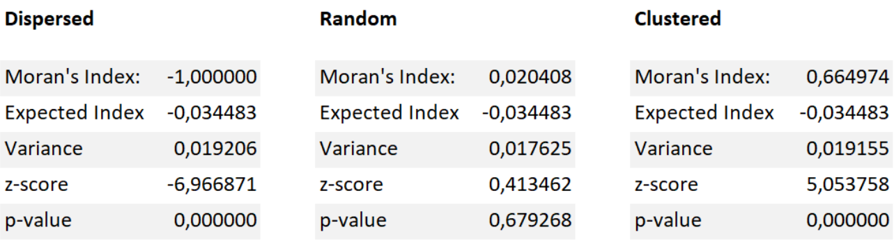
The resulting values are as expected. On both the clustered and dispersed datasets the p-values and z-scores connote that randomness is highly improbable. The Moran’s I index confirms this as well: the -1 of the dispersed grid stands for perfect dispersion, while on the clustered dataset the value is positive indicating clustering. Taking a look at the random set, the z-score is noticeably lower and the p-value indicates a nearly 0,7 chance of the pattern being random. The Moran’s I index is, as expected, close to zero.
2. Local spatial autocorrelation
Next, the already familiar statistics were calculated with a larger dataset. The data used was an YKR grid featuring lots of information about the Helsinki metropolitan area. In this section all of the analysis were done on the amount of living space available per person.
Unlike the first section, this time the focus was on local spatial autocorrelation. This means that, after the data was trimmed and analysis were done, the values can now be displayed as a map series rather than just tables (pictures 1-4). In addition to the statistics already explained in the fisrst section, the local analysis also yields a map layer identifying the clusters and outliers found in the data. Two different types of clusters are presented: ones of high values (HH) and ones of low values (LL). There are also two types of outliers: ones where a high value is surrounded by low values (HL) and ones where a low value is surrounded by high values (LH).
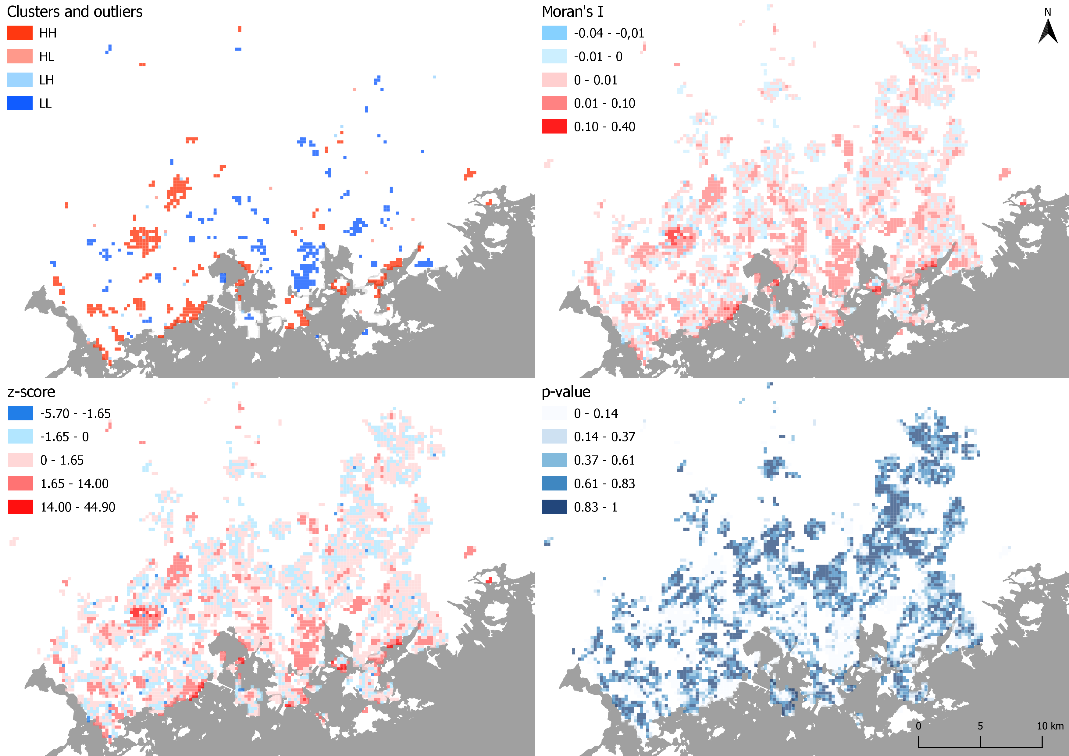
Maps 1-4. The results of the local spatial autocorrelation analysis.
In the map depicting clusters and outliers, a few notable clusters can be seen. For example in Espoo there are mostly HH clusters meaning that the living space per person is high in these areas (Westend for example). Clusters of low living spaces (LL) can be found in Kallio for example.
The Moran’s I map shows higher values in the same areas where the clusters are found, while in the blue areas of negative values (dispersion), clusters cannnot be seen. Same goes for z-scores. For the Moran’s I and the z-score maps I adjusted the break values so that negative values are always a shade of blue while red indicates positive values. The p-value map behaves as expected as well: high probability of randomness means no clusters.
3. Age groups
Problem
In the third section of the exercise, age groups were the focus. The goal was to:
- see where children under school age (under the age of seven) and the elderly (over the age of 74) are located in the Helsinki metropolitan area.
- See which age group is more clustered.
Plan
First, the data would have to be trimmed. This means all of the grid cells with no population need to be removed. From the resulting grid the cells with no neighboring cells should also be removed in order to make the later local analysis work properly.
The age groups would have to be then gathered into new fields by summing values from the already existing fields. The values should be proportional to the total population of the grid cell, otherwise high amounts of both the young and the old would be just found in areas of high population density.
Once there are new fields in the data displaying percentages of the age groups, both global Moran’s I and Local spatial autocorrelation analysis can be done with the dataset
Data
The same YKR grid dataset from section 2.
Analysis
The trimming of the data was done by selecting all cells without any population (he_vakiy = 0) and removing them. Then by visual selection all the cells without neighboring cells were removed. The percentage-shares of both the age groups were calculated into their respective fields with field calculator.
Global Moran’s I and Local spatial autocorrelation analysis were done for both these new fields. The results of the Global analysis are presented in tables 4-5, while the local spatial autocorrelation results are visualized as maps (pictures 5-6). Hotspots of both grids were also analyzed (pictures 7-8).
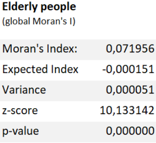

Tables 4 and 5. Global Moran’s I statistics.

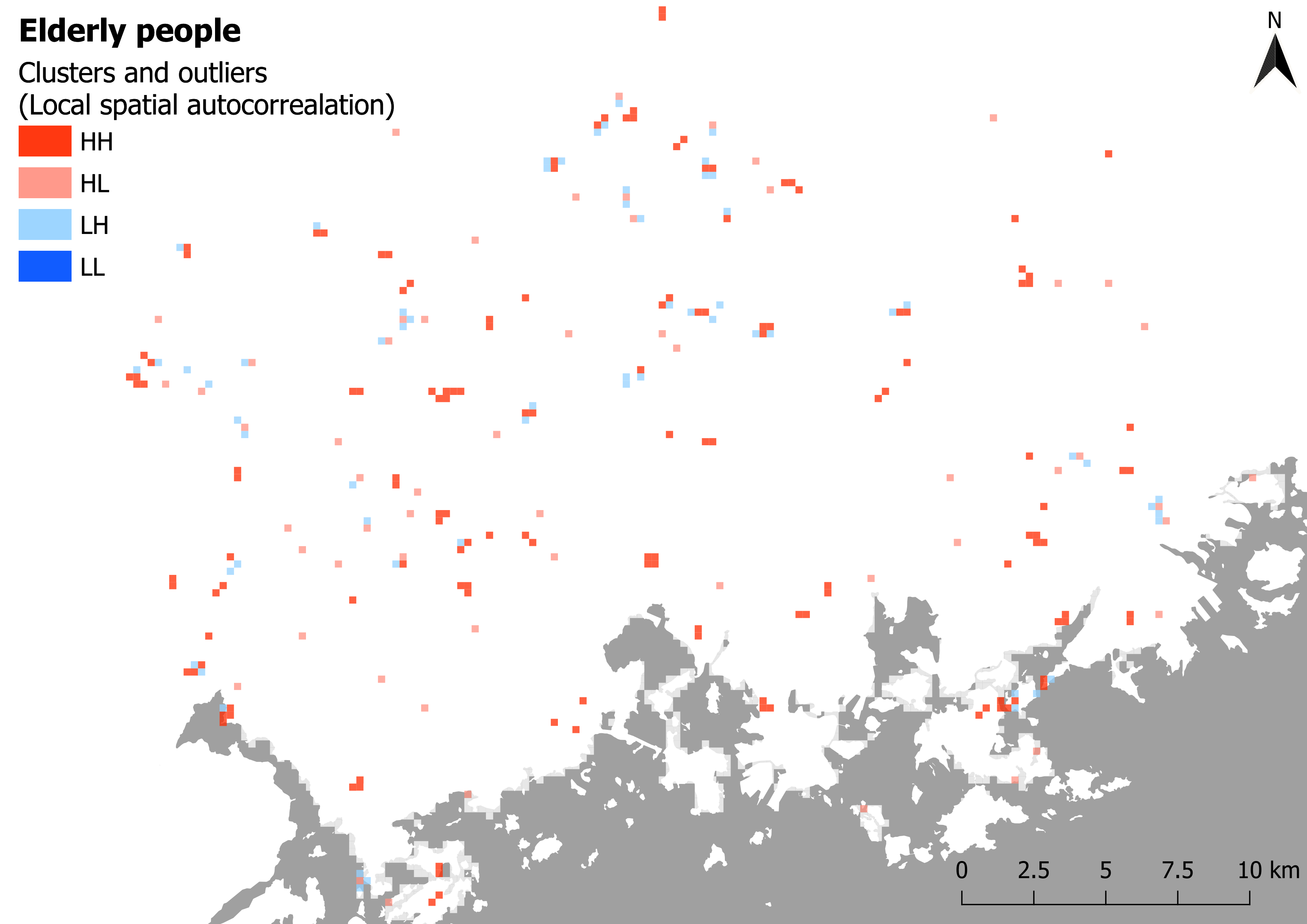
Pictures 5 and 6. Local spatial autocorrelation.
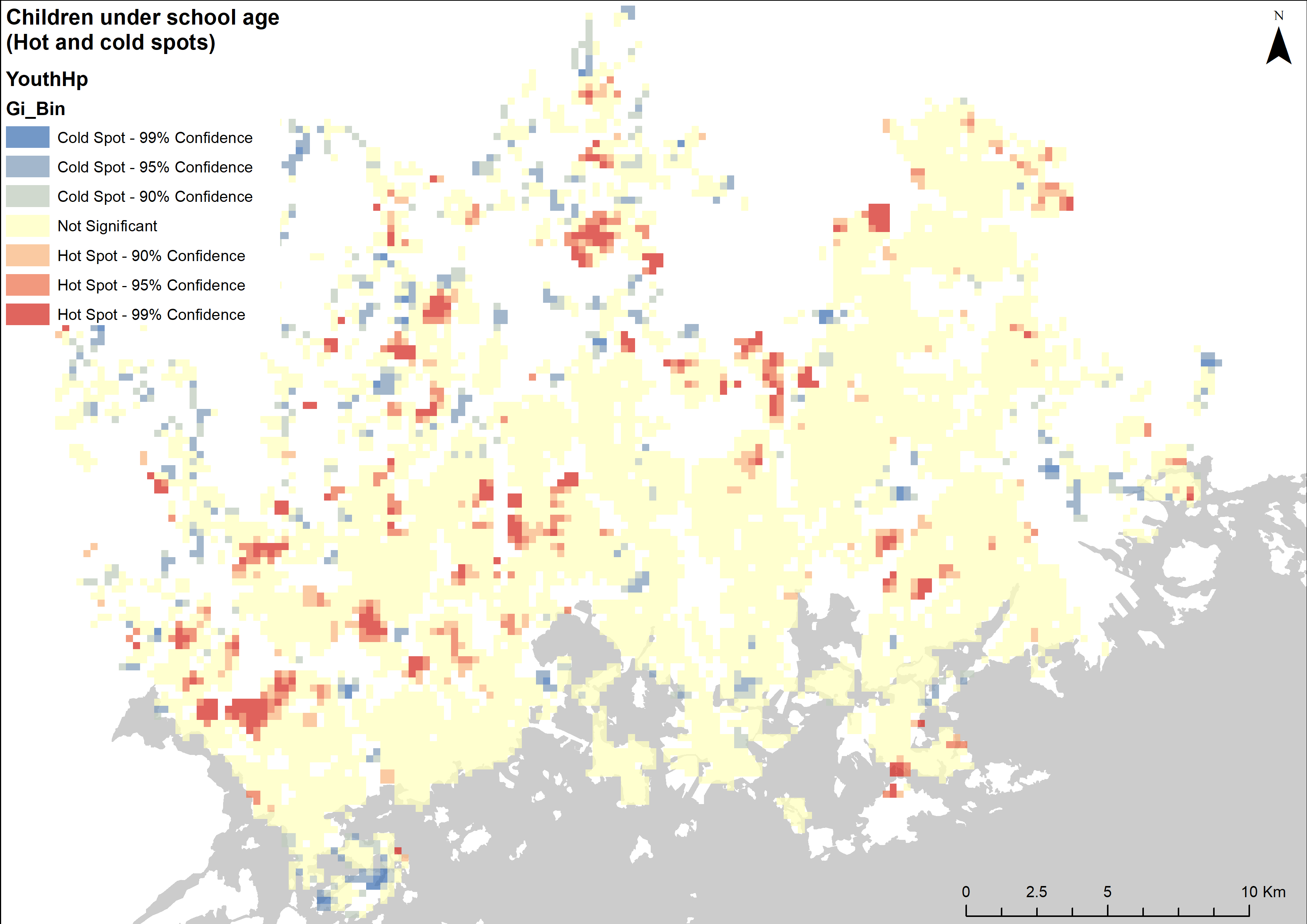
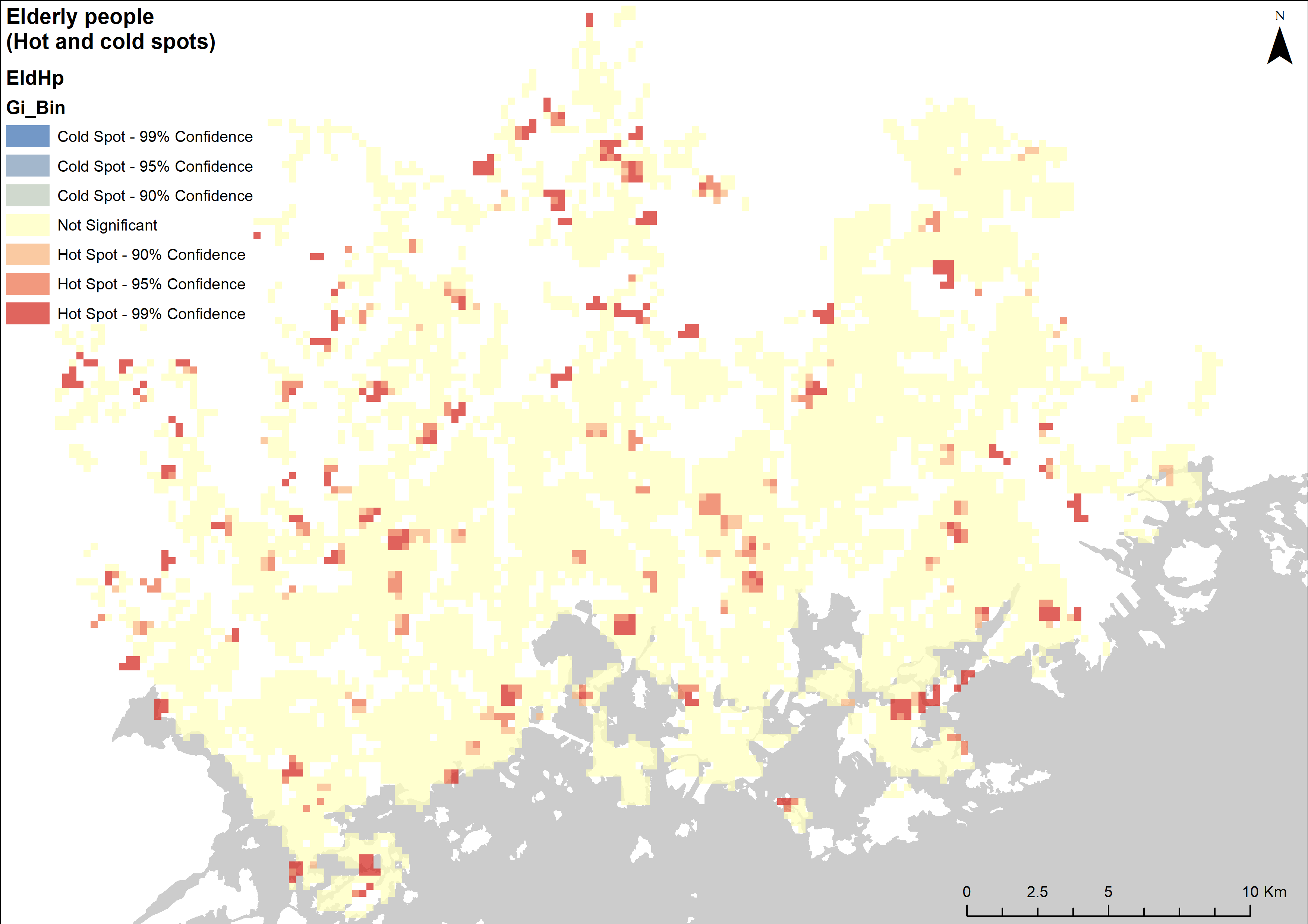
Pictures 7 and 8. Hot- and cold-spot analysis.
Conclusion
According to the global Moran’s I statistics (tables 4-5) both the children and the elderly datasets are clustered. However, the Moran’s I index and z-scores indicate that the clustering is stronger when it comes to children under school age. The local spatial autocorrelation maps confirm this as well: There is notably more clustering going on in the map depicting the distribution of the children.
To get an even better understanding of where these age groups are located, a hotspot analysis was done as well (maps 7-8). The children seem to be found mostly in neighbourhoods away from the city centre, while the elderly are more evenly spread across the region. One curious detail that can be seen in both the hotspot maps and the Local spatial autocorrelation maps is that there seem to be no areas that completely lack elderly people: There are no LL clusters or Cold spots to be seen in the dataset.