
Table of contents
- Introduction
- Printers
- Methods & Materials
- Case Studies
- Visualisations
- Reflection
- Conclusion
- Division of Labour and Reflection on Learning
- References
Visualisations: DIs through genres and graphs
Dataset Overview
Our dataset includes publications ranging from 1708 to 1780, with a mean publication year around 1734. It includes 65 unique DI clusters. This range enables a robust analysis of typographic styles and their broader impacts. The dataset contains a total of 67 distinct superclasses and 24 distinct letters. When considering entries with printers, there are 41 distinct superclasses and 18 distinct letters. For entries without printers, there are 26 distinct superclasses and 13 distinct letters.
Module-Based Typographic Trends
Starting from the very basics, the exploration of the relationship between DI and Genre begins at ranking the diversity of DIs used in each module.
| Rank | Module | Unique Superclasses | Unique Letters |
| 1 | Literature and Language | 49 | 19 |
| 2 | Religion and Philosophy | 42 | 15 |
| 3 | History and Geography | 35 | 16 |
| 4 | Social Sciences | 30 | 13 |
| 5 | Medicine, Science and Technology | 29 | 11 |
| 6 | Fine Arts | 13 | 9 |
| 7 | General Reference | 12 | 11 |
| 8 | Law | 6 | 4 |
Table 1. The modules range from most diverse to least diverse in terms of typographic elements (superclasses) and letters used, Literature and Language showing the highest diversity and Law the least. Therefore, for the following analyses we continue to sort based on the DI usage in the module of Literature and Language.
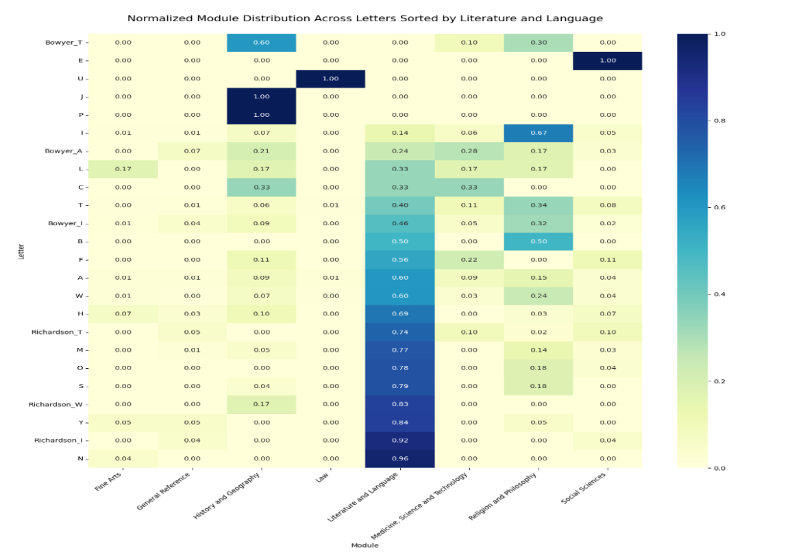
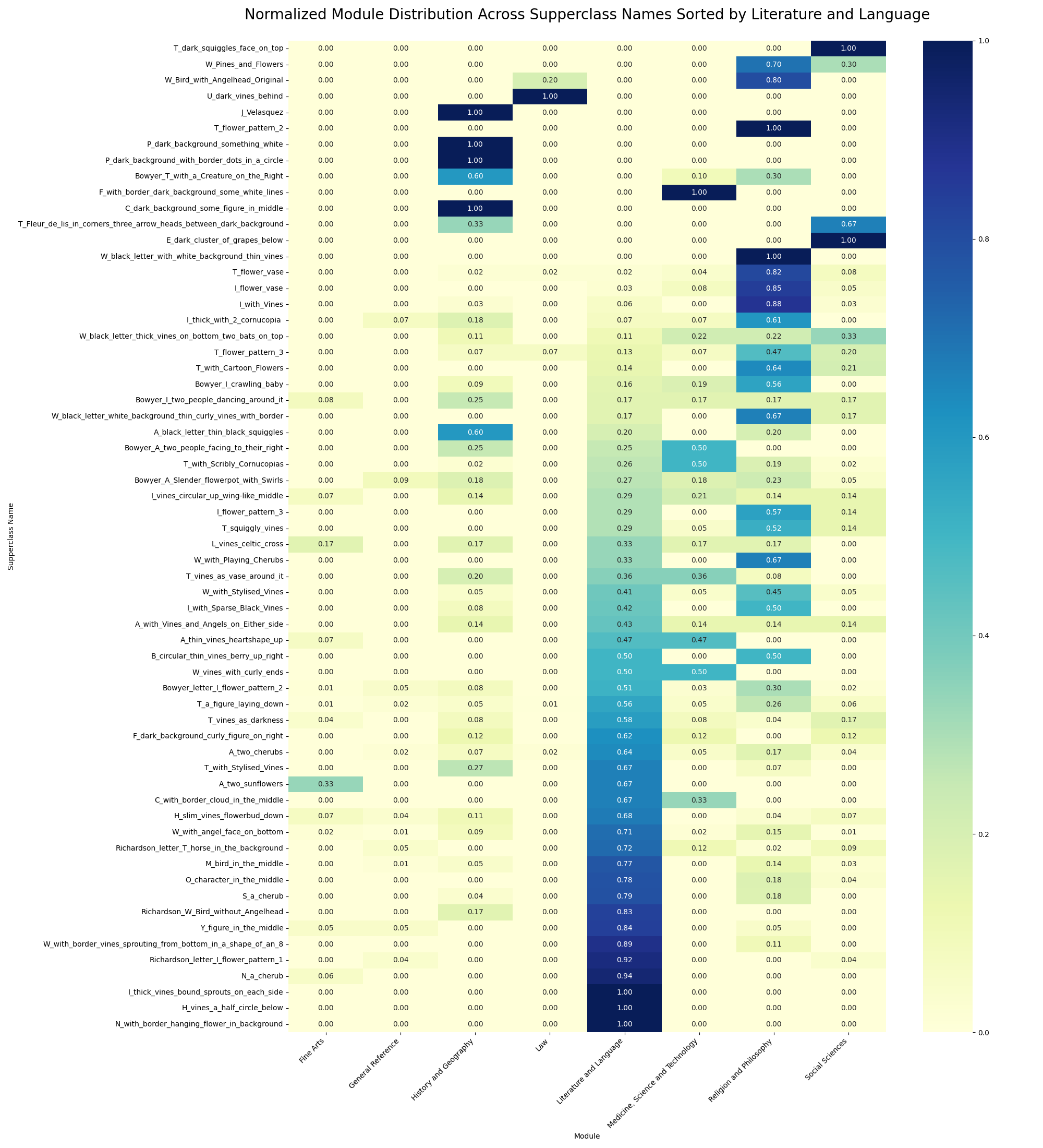
The heatmaps were leveraged to illustrate the specialisation. Darker colours denote heavy concentration of certain superclasses in particular modules, and a gradient effect in the distribution of letters indicates their varying association with different content types.
The letter N is predominantly used in the Literature and Language module (95.65%), while Richardson_I shows similar specialisation with minor versatility, appearing slightly in General Reference and Social Sciences. Letter Y enjoys broader utilisation, notably in Literature and Language and modestly in Fine Arts and General Reference. Superclasses such as “H_vines_a_half_circle_below” and “N_with_border_hanging_flower_in_background” are exclusively used in literary contexts. The typographic elements across different modules showed distinctive usage patterns of specific letters and superclasses, shedding light on the preferences of printers’ ornament usage.
Temporal Trends Across Modules
We introduced the time dimension to further analyse how the use of decorative initials in various modules has evolved over time. The aim of temporal trend analysis is to track changes in printing styles over time within different modules, potentially identifying shifts in cultural or academic focus.
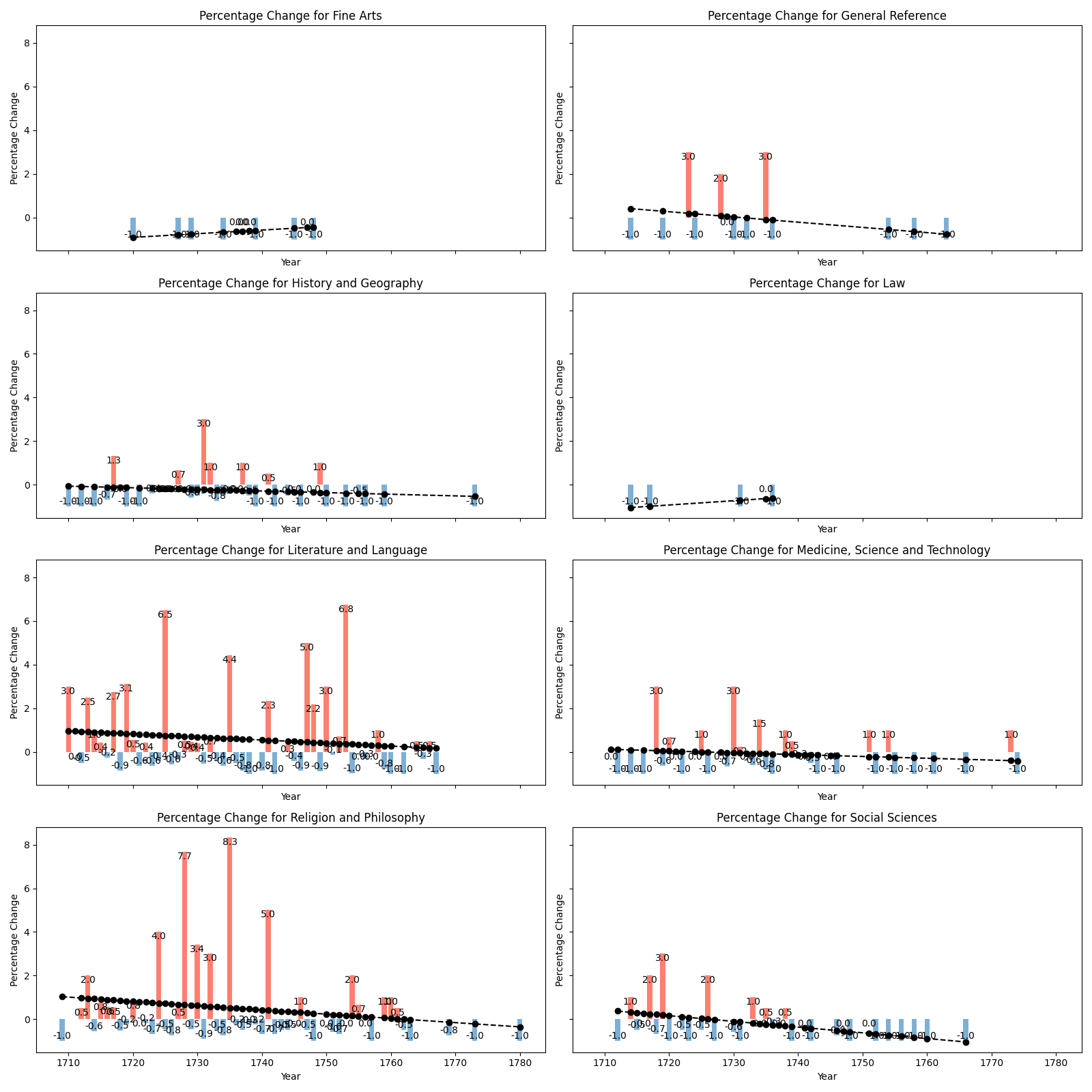
The observation was that most of the modules appear to show a decreasing trend in the percentage changes of decorative initial usage, possibly influenced by printing technology advancements or aesthetic trends towards simpler designs, an assumption which would benefit from more supportive evidence.
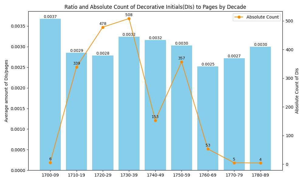
The trend of both the ratio of DIs to pages and the absolute count of DIs across different decades are presented on the dual axis. There was a clear peak in both the ratio and absolute count of DIs in the 1720s and 1730s, which then began to decline steeply in subsequent decades. The decline from the mid-18th century onwards. The relatively higher ratio in the latter decades despite the low absolute counts could indicate that while DIs were becoming less common, the pages they were on became fewer as well.
Next, we explore if printers had a preference for certain types of content that could influence typographic decisions.
Printer Diversity and Specialization by Module
Harmonizing Printers’ Names: Interconnected Relationships in the ECCO Printing Circle
Harmonising printers across different group names presents several challenges due to the diverse range of family names associated with each group. Some relationships can be found, for example, John Watts, James Bettenham, and William Bowyer were key figures in the ECCO printing circle, with interlinking professional and personal relationships. Watts, who once employed Benjamin Franklin, had connections to Bettenham, who was related by marriage to a Bowyer’s relative (Haden, 1974). This suggests a tight network among these printers Bowyer also maintained a significant professional relationship with Jacob Tonson, a leading bookseller and publisher. The Bowyer ledgers reveal collaborations on various literary works, showing a broader involvement with figures like Elizabeth and Miles Flesher, Thomas Newcomb, Henry Hills, and others in the printing community (Bowyer et al., 1991; Hamm, 2004). But other connections need to be dug deeper, and that takes more time. In this issue of the blog, we are using the DIs that printers used to share as proxies for their groupings.
The printers were grouped into 11 distinct groups. These groupings reflected their family ties and co-operation by sharing the usage of DI clusters or overlap in their typographical styles. It is worth noting that only 127 books in the data have printers, and 800 books have no printer-related records. The steps for grouping are as follows:
- Extract the family name from the printers
- Map family names to groups based on shared DI cluster usage and connections.
- Define the group name by most occurring or famous members, the table below showing which family names are associated with each group name.
| Group Name | Family Names |
| Baskett | Baskett |
| Bowyer, Tonson and Watts | A, Aris, B, Bettenham, Boreham, Bowyer, Cave, Collins, Grierson, Hume, Parker, Tonson, Watts |
| Downing | Downing |
| Faulkner | Faulkner, Waters |
| Walthoe | Walthoe, Warner |
| Mount | Mount, Strahan |
| Owen | Owen |
| Richardson | Richardson, Woodfall |
| Rivington | Rivington |
| White | White |
| Whitridge | Dodd, Noon, Whitridge |
The heatmaps displayed the normalised usage of DI clusters and letters across printers, sorted by the diversity score. Printer groups at the left of the heatmap tend to use a wider variety of DI clusters and letters. In contrast, those who are lower in the ranking might specialise in a smaller set of clusters and letters. Some printer groups showed a high concentration in specific clusters, indicated by brighter colours.
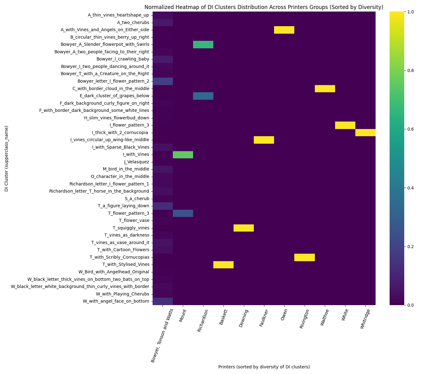
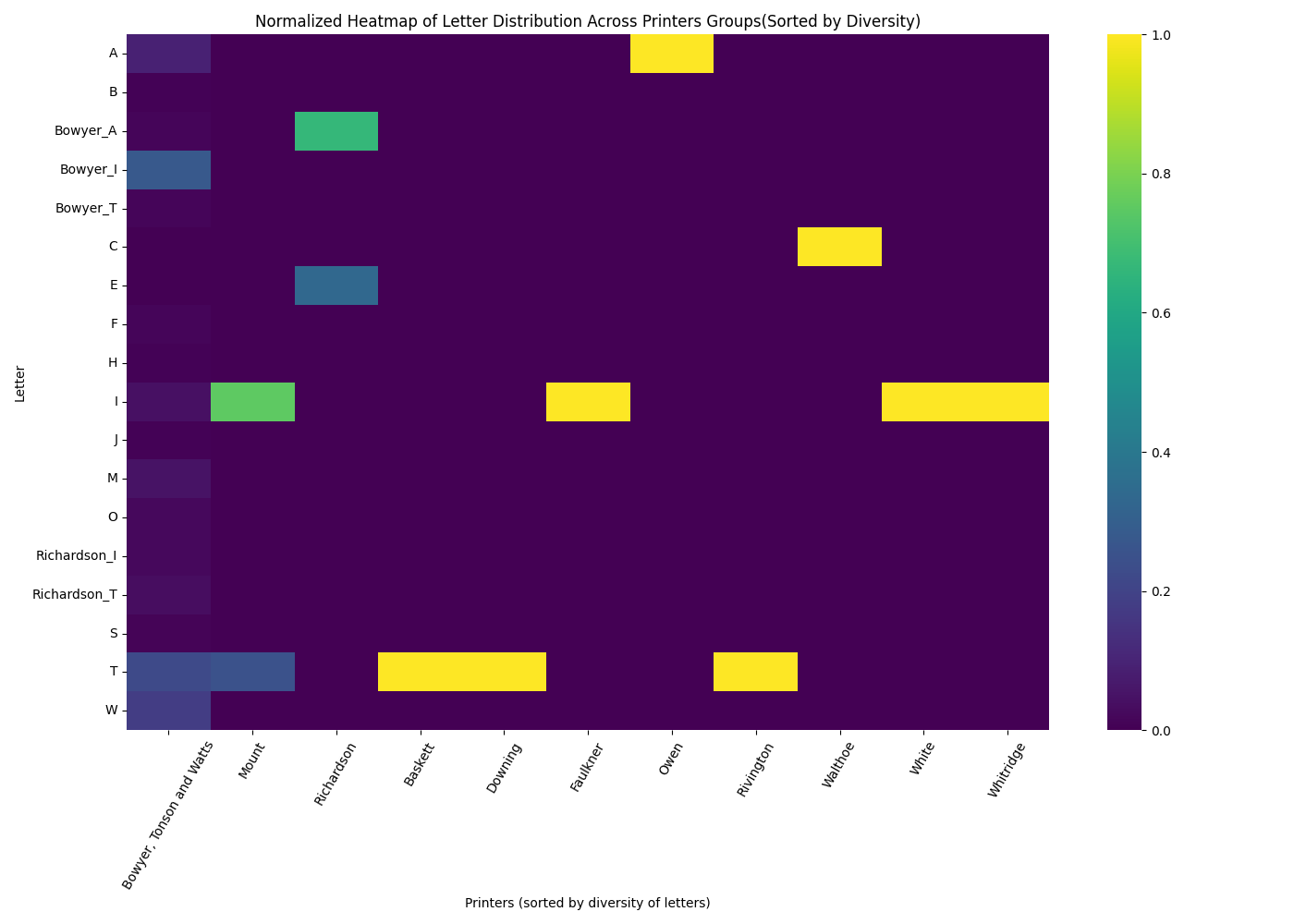
Highlighting the Bowyer, Tonson and Watts group as a prominent figure with the highest diversity score, stands out with the maximum diversity of 28 DI clusters (68% of DI clusters with printer recorded, and 41% of all DI clusters) and 16 letters (89% of letters with printers, and 67% of all letter types). In contrast, printers like Baskett group exhibit minimal diversity.
High diversity in printing could suggest a successful adaptation to a broad range of printing demands, indicating a robust and versatile operation. In contrast, the specialisation of other printers could reflect a strategic positioning within specific market segments, which could be equally successful within their contexts.
Further, we will deepen the investigation by linking the printed works directly to the choice of typographic elements.
Relationships Between Module and Typographic Complexity
If certain modules tend to feature more complex or elaborate typographic styles, would correlation reflect the perceived value or complexity of the content?
Below the data is grouped by printers and modules, and then analysed by the proportion of works and the diversity of typographic elements used by each printer. This identifies the correlation coefficients between the diversity of typographic elements per work and the specialisation of printers in different modules. They are thus ranked from the negative to the positive correlation:
- Religion and Philosophy: Moderate negative correlation (-0.256)
- General Reference: Very weak negative correlation (-0.015)
- History and Geography: Very weak positive correlation (0.015)
- Medicine, Science, and Technology: Weak positive correlation (0.062)
- Fine Arts: Weak positive correlation (0.100)
- Literature and Language: Weak positive correlation (0.111)
- Social Sciences: Moderate positive correlation (0.159)
Printers specialising in Social Sciences tend to have a higher diversity of typographic elements per work. Conversely, printers focusing on Religion and Philosophy show a tendency towards less typographic diversity.
Another measurement of variability or diversity within the superclasses for each module category employed was information entropy.
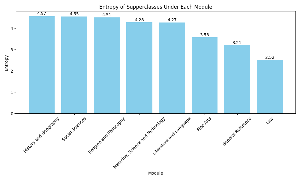
The entropy analysis of DIs across modules reveals varying levels of diversity in their usage. History and Geography and Social Sciences exhibit the highest entropy, indicating a broad range of typographic styles and topics, followed by Religion and Philosophy and Medicine, Science, and Technology, which also show significant diversity but to a lesser extent. Literature and Language presents moderate diversity, while Fine Arts and General Reference show lower entropy, suggesting more standardised content. Law has the lowest entropy.
The results of differences in entropy values compared to correlation might arise due to entropy measures diversity within each module independently, using normalised counts and a logarithmic scale that emphasises the impact of rarer categories. This makes entropy a measure of variability within a module, while correlation analysis examines relationships between variables like module specialisation and typographic diversity across different printers. These different analytical approaches provide separate insights, with entropy focusing on the internal diversity of modules and correlation exploring how external factors like market demands or printer strategies influence typographic choices.
A Comparison of Bowyer and Richardson
This part sheds light on the comparison between the typographic practices of Bowyer and Richardson, focusing on their use of letters across various modules. The comparison offered a detailed view of how typographic elements were adapted to suit different modules. By associating the usage of letters with specific modules, we can identify typographic trends specific to different genres or fields.
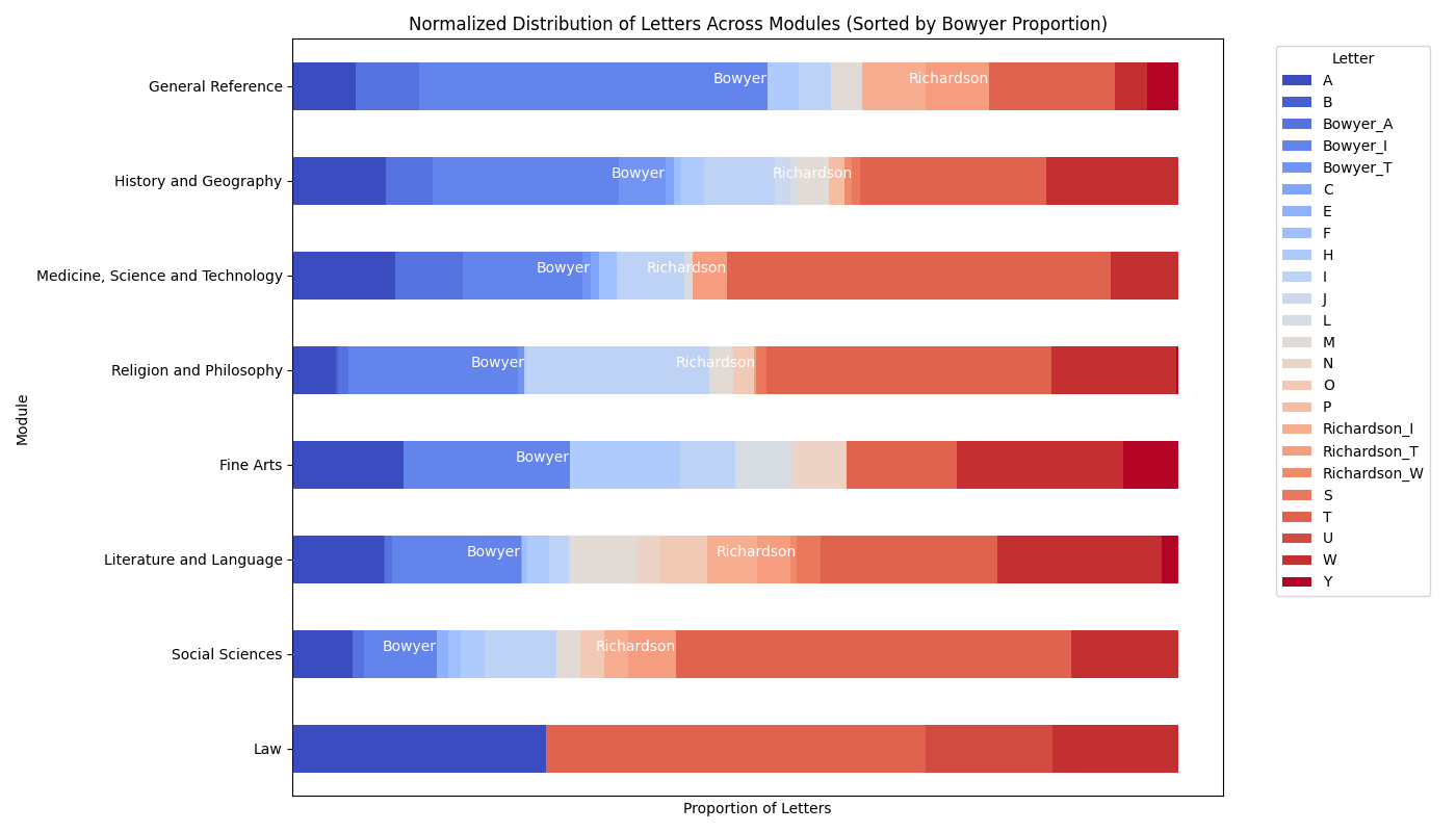
Bowyer letters reached a peak usage of 46.43% in the General Reference module, with a significant variability indicated by a standard deviation of 13.99%. In contrast, Bowyer showed 0% usage in the Law module.
Richardson letters displayed a more consistent usage with a lower average of 4.67% and a standard deviation of 5.49%. The highest usage was also in the General Reference module but only reached 14.29%, showing less variability and a more focused use across modules.