Broadly speaking there are two types of research strategies: exploratory and confirmatory (see: Theory and models). In statistical data analysis, the descriptive part of the analysis can be seen as a kind of exploration. Its purpose is to get a general view of the data and the distributions of the variables by diagrams, tables, and basic statistics, such as mean and standard deviation. The descriptive analysis is a necessary part of the research and is always conducted before doing any statistical tests or more complicated modeling. This part presents some common techniques for descriptive data analysis, while the next section Inferential statistics focuses on statistical testing and modeling.
Statistics for single variables
Visual presentations are indispensable means for exploring the distributions of different variables. A variable’s distribution is basically a set of all the different values that the variable can take and their observed frequencies. For visualizing the distribution of a numerical variable a histogram is the usual choice.
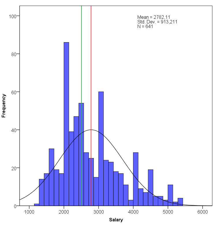
The histogram in the figure above shows the frequencies of the observed salaries.Salaries lower than 1238€ representing the minimum wage, and bigger than 5300€, representing the top 10% of the observed values, are cut off for making the variable’s distribution easier to analyze for the purposes of these examples. On the horizontal line are salaries and on the vertical line the corresponding frequencies (how many times a certain value has been observed). Not all observed values are shown in a histogram, but adjacent values are grouped together into several bins that are represented as the bars in the histogram. The important thing to consider is how symmetrical the distribution is. The more symmetrical it is, the easier it will be to describe using simple statistics. The distribution of salaries is clearly skewed to the right, as there are relatively very few people who earn a lot (the tail of the distribution goes right) and the bulk of the observations are located near to the mean (red vertical line) and the median (yellow vertical line) a litle bit left from the center of the distribution.
Among the simplest possible descriptive statistics are the measures of central tendency and dispersion. The measurement scale (see Data and variables) and distribution of the variable generally determine which statistics would best describe the variable. For numerical variables we can calculate an arithmetic mean. The symbol for population mean is (the Greek letter “mu”) and for the sample mean
. The sample mean is what we can calculate on the basis of our data, and it serves as an estimate for the population mean, which is a theoretical “real” value in the population. The sample mean is calculated by summing all the individual values together and dividing that sum by the number of observations:
.
For the distribution of salaries above the mean is about 2782, which is located slightly to the right of the peak of the frequencies, since the distribution is skewed to the right (the extreme values “attract” the mean). It is easy to see that the mean value does not capture the skewness of the distribution. Actually, the mean best describes the central tendency of a variable when the variable is fully symmetrical. However, if it is not, we can use the median (Md), which is the middle value of the all values ranked on a scale from minimum to maximum (or a mean of the two middle values in case of an even number of different values). In this case, the median is 2505 and probably a better measure of central tendency, since it is robust to the effect of extreme values.
The most basic measure for dispersion is called standard deviation. The symbol for population standard deviation is (the Greek letter “sigma”) and for sample it is
. Standard deviation describes how far the values are on average from their mean value. The standard deviation of the salaries is 913, meaning that the values are dispersed on average 913 euros away from the mean value.
Symmetrical distributions are useful, because if we know the mean and the standard deviation, we know quite a lot of other things about the distribution as well. In the case of a symmetrical distribution about 68% of the all values are within one standard deviation from the mean, and almost 95 % of all the values are two standard deviations away from the mean.

For describing the distribution of a categorical variable a bar chart is used instead of a histogram. The bar chart below displays different categories of a variable measuring how often people say they use the Internet for personal matters. The variable varies from non-users to those who spend time on the Internet daily. The measurement scale is ordinal, since categories can be meaningfully ordered, but the intervals are not necessarily equal. The first category “no access” is different from the other categories in the way that it could be omitted from the analysis or handled independently.
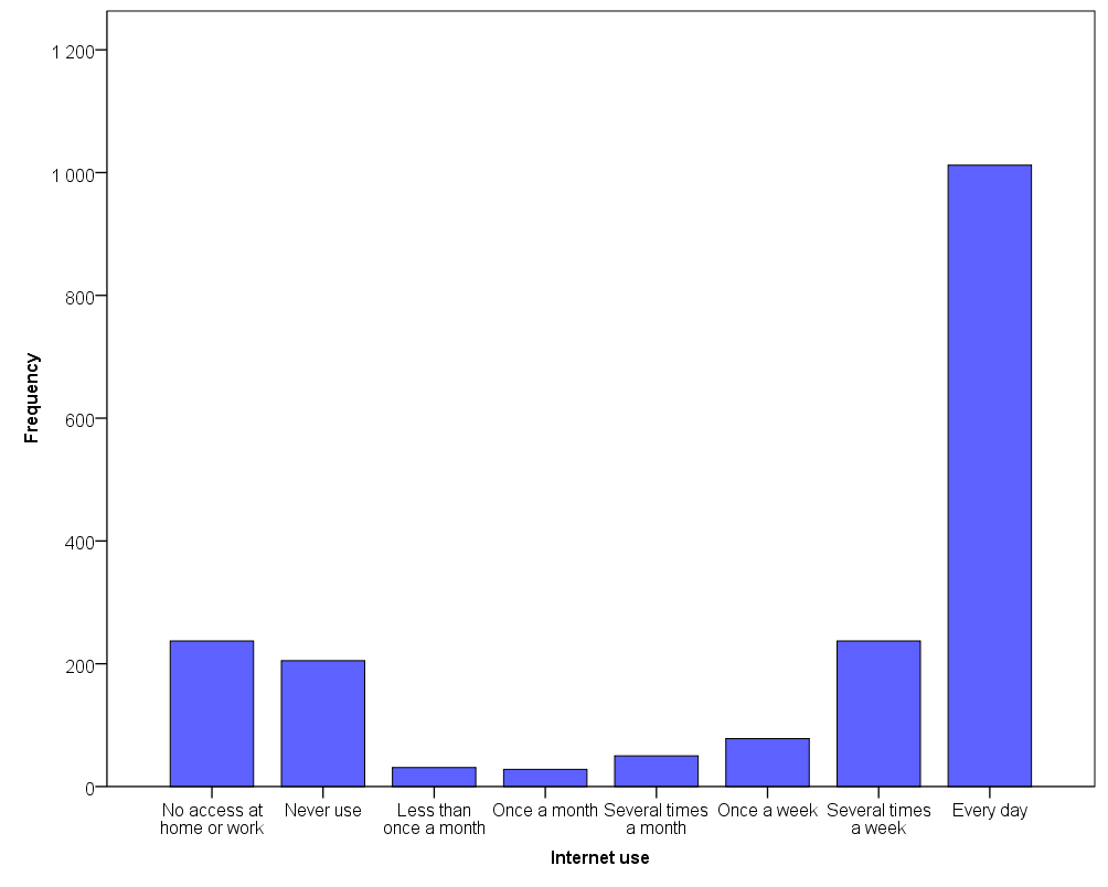
For categorical variables central tendency measurements are not usually calculated, except mode (Mo). Mode gives us the frequency of the biggest category. In this case it is the category “Every day”, which has 1012 observations in it. The bar chart could also be drawn with relative frequencies on the vertical axis, in which case each category would have a value in percentages instead of absolute frequencies. If the distribution is fully symmetrical, all the measures of central tendency – mean, median and mode – are situated in the middle of the distribution where the peak of the frequencies are.
Statistics for two variables
When describing distributions of more than one variable at the same time, the interest is usually in the relationship between the two variables. For example, one could be interested to find out if age and salary are somehow related. Do the values of age get higher, for example, as salary increases? In the case of two continuous variables we can draw a scatterplot figure and study how the values of the two variables vary together, i.e. whether there is any recognizable pattern. However, it is important to note that no causal claims (such as X causes Y: ) should be made on the basis of this kind analysis.
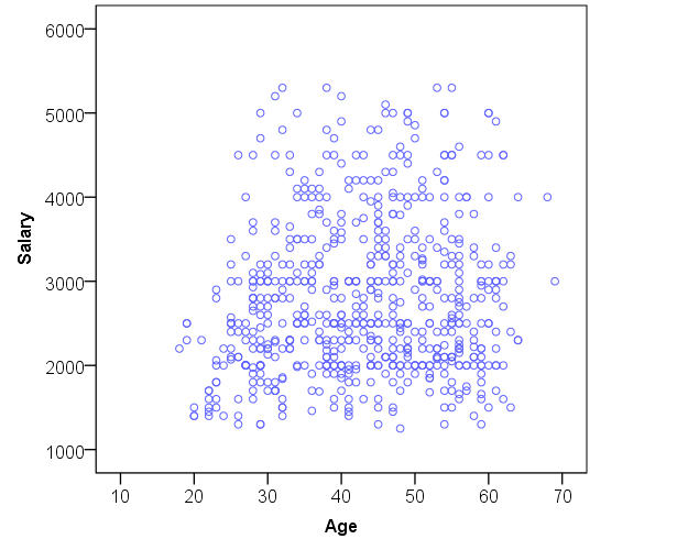
In the scatterplot above, the association seems to be relatively weak over the different ages. Salary hovers around its median value (2505) for all the ages from 25 onwards. Some higher salaries can be seen across all ages. These exceptional observations are grouped together in the tail that was pointing right in the histogram above. A very slight ascending pattern could be observed.
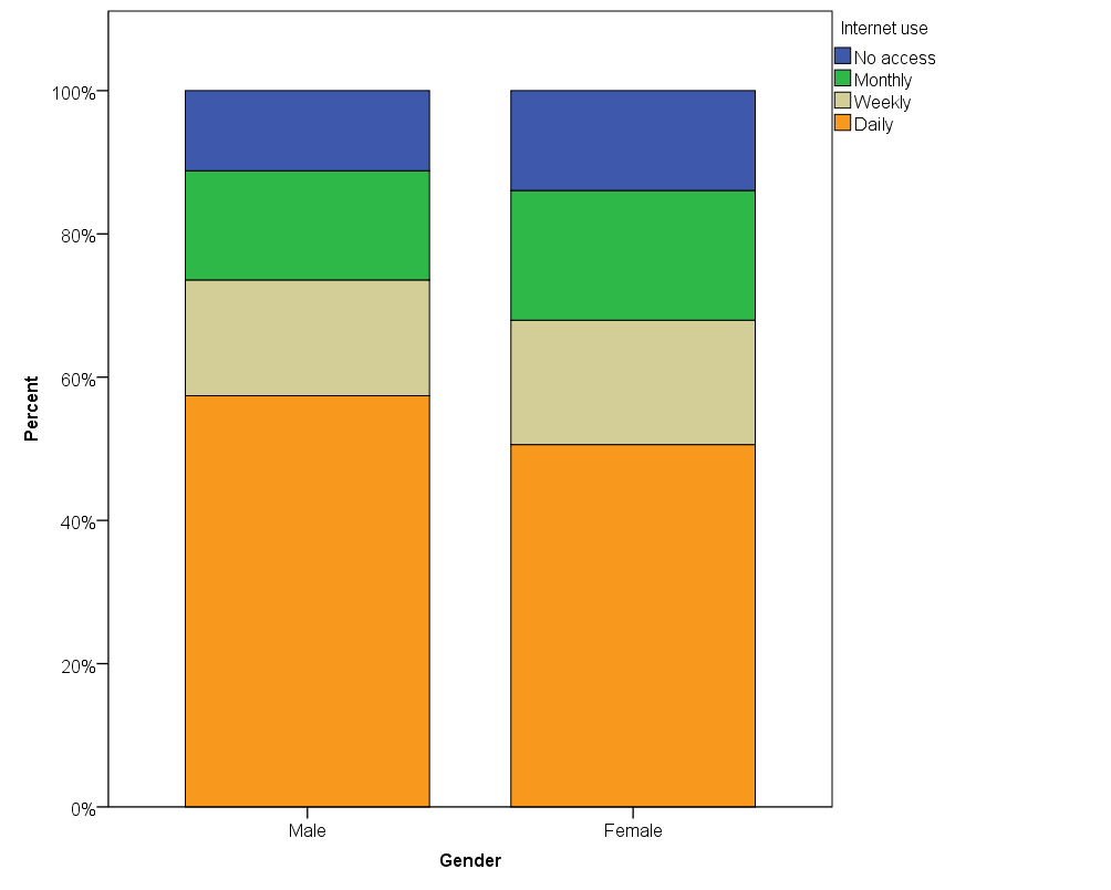
A scatterplot is the standard method for exploring the relationship between two variables, but it works only for numerical continuous variables. For exploring the relationships between two categorical variables we need a contingency table or a special kind of bar chart. A contingency table is a table with absolute or relative frequencies and it can be used for 2–3 categorical variables. It depicts the frequencies of one variable across all the classes of another variable. Usually of the interest are the relative frequencies (i.e. percentages), since the sample sizes of the classes that we are interested in comparing can vary.
An example will clarify this. Let us take “gender” as the first variable and “personal use of the Internet” as the second variable. Now, we are interested in finding out whether the values of males and females (that is, the classes of the first variable “gender”) vary similarly across the different values of the personal use of the Internet. To do this we need to use relative frequencies, as the absolute frequencies are not comparable due to different amounts of males and females in the sample. The relative frequencies are usually presented so that they are summed up at the bottom of the columns, i.e. for each of the classes individually that are compared together.

Relative frequencies can also be depicted visually by a bar stacked chart. In this case, bars represent different gender classes, and Internet use is presented as relative areas within the bars, summing up to 100% for each bar. On the basis of the table or the bar chart, we have good reason to suspect that there are slightly more daily Internet users in the male category than the female, and slightly more those who have no access at all among females. This relationship could, however, diminish or change if a third variable, such as different age groups, is introduced to the table. Therefore it is often not enough to only study the relationship between two variables, rather several variables together with different combinations should be explored. The results should also be tested statistically to verify that the observed differences are arguably more than just random variation, which we will discuss in Inferential statistics section.
There is a third form of visual presentation, the box-plot, that is useful when a categorical variable needs to be studied against a numerical variable. The box-plot has the categorical variable on the horizontal axis and the numerical variable on the vertical axis. Each category of the categorical variable gets its own box with two whiskers. The boxes and whiskers illustrate the distributions of each class of categorical variable across the values of the numerical variable. The ends of the whiskers represent maximum and minimum values, the stars and points are outliers, the box contains 50 % of all the observations, and the black line within the box is the median value. In the figure below salaries of males and females are explored by plotting the categorical gender variable against the continuous salary variable.
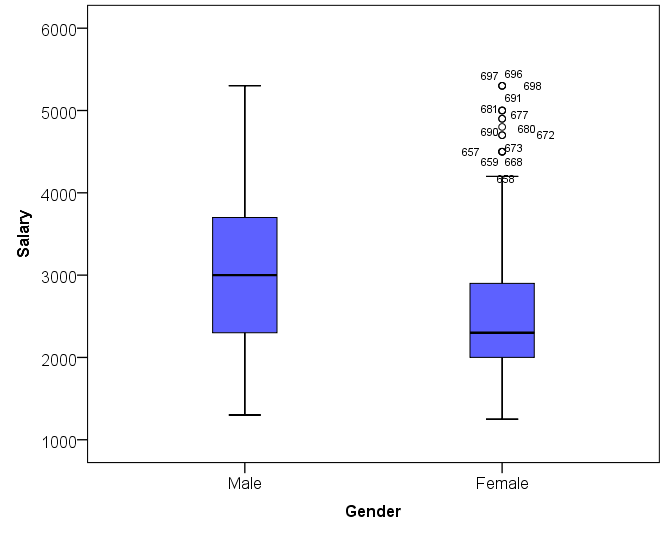
This plot tells us that the median salaries of males (3000 euros) are higher and that there is more dispersal in the salaries of males (the box including 50 % of the observations is taller). We can also spot numerous outliers (exceptional observations) in the high end of females.