In the Descriptive statistics section we used a scatter plot to draw two continuous variables, age and salary, against each other. On the basis of the picture we were not able to determine if there was any association between the variables. For studying the linear relationship between two continuous variables a measure called the Pearson product-moment correlation coefficient (“correlation” in short) can be used. It is a measure of a linear relationship, not a curvilinear one. It does not take a stand on any kind of causality (such as X is a cause of Y), but describes the strength of the association.
The symbol of the Pearson correlation is or r and in reality it is a standardized measure of covariance (“co-variation”). The standardized values can vary between -1 and +1, where 1 indicates perfect positive (linear) relationships, -1 a perfect negative (liner) relationship, and 0 stands for no correlation at all. For the correlation to be considered “weak” or “strong” depends on the study and data, but usually more than
0.3 to 0.5 is expected. For example, correlation between age and salary in our example is 0.124, which is, although statistically significant
, very weak.
The correlation coefficient is easily calculated by any statistical package, but the results are not meaningful unless there is a linear relationship between the variables. The distributions of the variables should also be approximately symmetrical for correlation to be meaningful. For example, the presence of outliers would severely harm the results of a correlation coefficient as seen in the classical example by Anscombe[1] in the figure below.
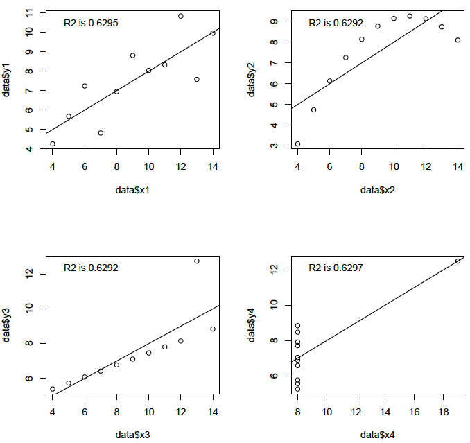
It is good to note how misleading correlation coefficients (or any other single statistics) can be. Therefore, graphical explorations are necessary. In the Anscombe’s quartet above the first plot shows the correlation as it should be, the second shows a curvilinear relationship, the third shows the effect of an outlier, and the fourth shows the effect of an extreme outlier. If the data is biased and the outliers are a necessary part of the data (not random errors), the Pearson correlation should not be used. In such cases, Spearman’s rank correlation can be used, which is a similar measure to the Pearson correlation, but is not influenced by the effect of outliers.
Linear regression
Once we have familiarized ourselves with the basic idea of correlation, it is time to move on to linear regression, which is a technique for modeling the relationship between two or more variables. The scatterplot in the figure below depicts the regression line that passes through the dots, representing the observations. This regression line is similar to a linear polynomial function that can be represented as a linear equation having a constant “a” (the intersection with Y-axis), the slope “b” (coefficient for defining how steep the line is), and the variables x and y, whose relationship the function describes. This type of equation for a linear line takes the following form: , and can be thought of as what goes in as x comes out as y. It is important to note that theoretically speaking we are not dealing with associations any more, but making a causal claim that from x follows y. When x changes, y changes in a way specified by the right side of the equation. In the language of regression analysis, x is called the independent variable (the one that is not influenced; also “predictor”) and y is called the dependent variable (the one that is dependent on x). The symbol for constant is
(“beta”) and for coefficient(s)
.
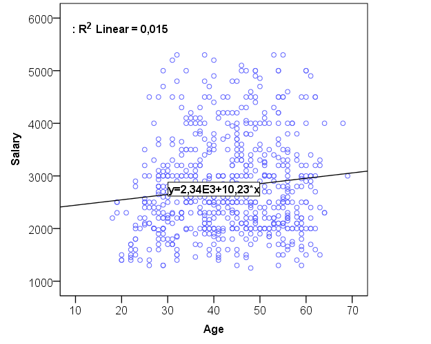
If you take a look at the plot in the figure above, age and salary are depicted as a linear line, and the equation describing the position and slope of the line is also labeled. In the equation y stands for “salary”, and x for “age”. The numbers 2340 and 10.23 are estimates for and
. The
in the top left of the plot is the coefficient of determination, which describes how well the line – the linear model – fits the data, i.e. how well the line accounts for the variation of the observations.
can be interpreted as a percentage. In this instance the model captures no more than 1.5% of the variation.
The equation can be written in the following way: . The constant
is 2340 and the coefficient
is 10.23. How to interpret the model? First, the coefficient is positive, so age has a positive effect on salary. Secondly, the constant (or intercept) is 2340. So if age is 0, the salary would be 2340 when
cancels out. The interesting part, the effect of the age on salary (read: the effect of x on y) is described by the coefficient
. It is interpreted in the following way: when x increases by 1 unit (which is 1 year in this case), y will increase by 10.23. So each time we get one year older, our salary increases by 10.23 euros according to the model.
The idea of a regression model is to predict the values of y on the basis of the values of one or more x variables. Let’s try to predict the salary for a 40-year-old person. We start by inserting 40 in place of x so that the right of the equation will be 2340+10.23*40, which yields 2749. This a very simple linear model. Considering the low coefficient of determination (98.5% was not explained), the next task of a researcher is to find better predictors, i.e. x-variables that can predict changes in y. The motive for using regression analysis is that it allows us to add as many x variables into the equation as needed. The regression analysis will account for them all together, considering their simultaneous effect on y. The motive for adding new predictors to the equation comes both from theoretical and statistical reasons, i.e. we know that x influences y under certain conditions and increases accordingly. Linear regression analysis also has some constraints, however. Most importantly, the dependent variable need to be continuous. Independent variable(s) need to be discrete/continuous or dichotomous. All variables need to be more or less normally distributed, and independent variables should not correlate strongly together (a condition called multicollinearity).
Let’s add two new variables into the regression equation. We introduce a new variable called “education”, which is dichotomous and hence can take two values: “1” standing for “person has a university/college degree” and “0” for “person does not have a university/college degree” (i.e. they have a degree lower than that or no degree at all). We are interested in testing the effect of a university/college degree on the predicted salary. The second new variable is “gender”, testing the effect of “being female” (=1) on the predicted salary. The regression equation is now
The output of the regression analysis is in the table below.
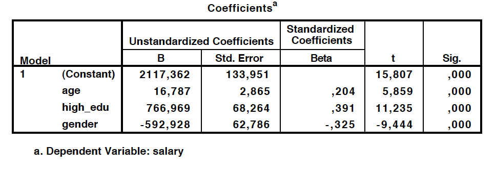
From the table we can see that the effect of age is 16.787, meaning that each year yields this much extra to the salary. The constant is now 2117.362, meaning that this is the value when both age, education, and gender are zero. The effect of education is that if a person has a college/university degree, 766.969 will be multiplied by 1, and hence added to the salary. The same goes if a person is female, but this time we subtract 592.928 from the salary. Let’s make the same prediction as above for a 40-year-old female with a college/university degree. The salary is now 2117.362 + 16.787*40 + 766.969*1 – 592.928*1 = 2962.883. Which one of the predictors is stronger? Beta values in the table are standardized values for B’s, making it possible to compare their effects on y. It seems to be that education is the strongest one, having almost twice as big an effect as age. t-tests at the right end of the table show whether the predictors are statistically significant in the model (p-values should be <0.05).
From the other output table below we can also see that increased from 1.5% to 24.8% (“adjusted
” accounts for the error caused by increasing the number of predictors), so it is a big change in the goodness of fit of the model. The standard error of estimate is 791.659, and it is a measure of error in the model. It can be interpreted as the average deviation of the predicted values (salaries given by the model) from the observed values (the observed salaries in the data).

The difference between observed and predicted values is called residual variation in regression analysis and it can be marked with e for “error”: . This means that y is equal to the model plus the rest of the variation of y that is not captured by the model. If we modify the equation slightly, we can say that
. Technically speaking, the goal of a regression analysis is to minimize the amount of errors. This happens usually by the procedure called least square estimation, which is done by finding such values for
and
that the sum of the squared differences between y and
become as small as possible.
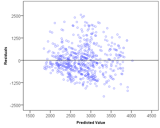
Finally, a researcher needs to assess how well the model actually fits to the data. This is typically done by examining the residual variance, i.e. the part of the variation that was not explained by the model. For this purpose a residual plot can be drawn. If the residual variance is normally distributed and varies in an unsystematic manner around the predicted values, we can state that the model is quite a good predictor of the values for y.
[1] Anscombe, F. J. (1973). Graphs in statistical analysis.The American Statistician, 27(1), 17-21.