I created this video out of a measurement session in my lab at University of Helsinki. Enjoy!
I created this video out of a measurement session in my lab at University of Helsinki. Enjoy!
Grayscale pictures are very relevant, even in these highly digital days. One reason is that in print media it is much cheaper to publish images in monochrome rather than in colour. Another reason is the human visual system where, roughly speaking, there is an own channel for luminance (think how hard it is to see in colour in low light conditions). That’s why it is natural for us to view and interpret grayscale images.
Furthermore, there is a highly developed aesthetic tradition for B&W photography and other monochrome art forms. There is a feeling of focus, or concentrating on the essential, which is particularly useful for visual communication of scientific results.
There are a few basic tricks for showing grayscale images optimally. The tricks are the same for printed media and digital screens, although optimal parameters vary depending on the platform. You should think of preparing monochrome images separately for conference talks and for printed articles.
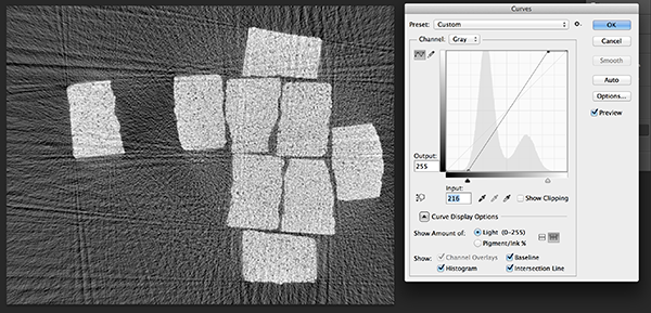
Let me first describe the basic tricks using Photoshop and then show how to do it in Matlab. My example image is this X-ray tomography image of a bunch of sugar cubes, computed from 120 projections by Aki Kallonen (University of Helsinki) using the classical Filtered Back-Projection algorithm:

While we can see the main features and many small details in the above image, there are several flaws in the presentation. There are no purely black or purely white pixels, and the overall contrast is very low.
Let us open the image in Photoshop and use the Curves tool.
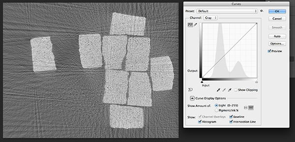
Now the histogram above shows quantitatively what we observed intuitively: the shades of gray are concentrated in the middle of the grayscale interval. Let us first correct the black end:
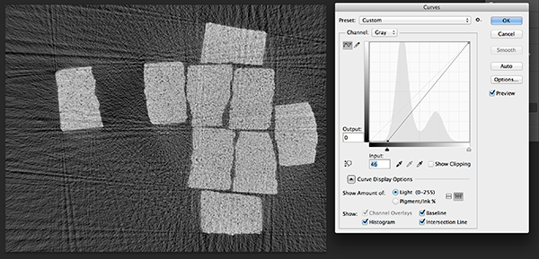
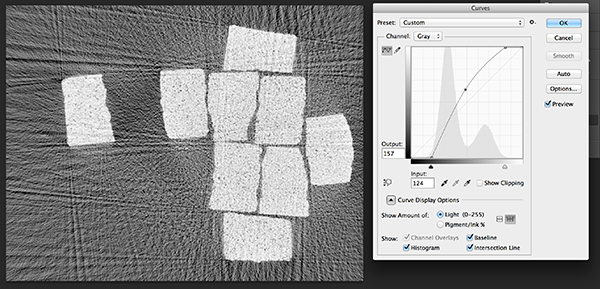
Now we see delightfully strong low-key tones. Let’s move on to correct the white end:
We see much improved contrast, and we are using effectively all of the dynamic range at our disposal. The following “gamma correction” is often useful for optimising the tones for human eyes:
Actually, the above picture looks like we have room for a bit stronger effect in the black end. Let’s move the black slider a bit further to the right:
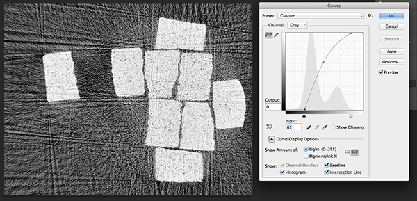
In my opinion, we have added a nice bit of punch to the image, and all the details are better seen. Please judge for yourself:
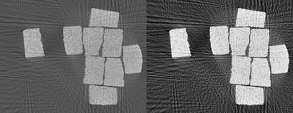
Regardless of whether you like the left or right version better above, you now have a small but effective toolkit for adjusting grayscale images as you want. Let’s see how to do it in Matlab, assuming that our monochrome image is a (double-valued) matrix called im.
Note that gamma correction values strictly between zero and one will lighten up the image, while values higher than one will make the image darker. (Why?) The following code does pretty much the same thing than Photoshop above:
im = im-min(im(:)); % Adjust minimum pixel value to be zero
im = im/max(im(:)); % Adjust maximum pixel value to be one
MIN = 0.33; % Use values greater than zero to ensure black pixels
MAX = 0.8; % Use values smaller than one to ensure white pixels
gam = 0.8; % Gamma correction parameter
imagesc(im.^gam,[MIN,MAX])
colormap gray
You can download the original image and a Matlab routine here: MatlabFiles.
Creating new mathematical algorithms can be fun and very rewarding. When all goes well, that is. Anyone who has taken a shot at mathematical programming knows how frustrating it is to debug programs crashing with obscure error messages or producing numerical garbage.
Here are a few tips for reducing the chance of introducing errors in mathematical code.
Basic Principle 0. Always, that is ALWAYS, write a comment before you write a line of code. Think about what you are about to do, formulate it in words, and write those words as a comment. Only then start writing the code module intended to implement your thought.
If you do not follow Basic Principle 0, you will not be able to figure out what your code is about after roughly two weeks of writing it. Then all that coding needs to be done again, wasting time.
Basic Principle 1. Start with the simplest possible situation, preferably one with known analytic solution. Make sure it works by testing it thoroughly; the best test is comparison between numerical and analytical values. In case there is no analytical solution, run the code with various resolution/accuracy parameters (such as N and N+1 and N+2). You should see convergence in the numerical results.
Basic Principle 2. Once you have something that solves a simplified sub-problem correctly, move towards the final complicated goal with as small verified steps as possible. In other words, modify the code the smallest amount possible that gives a testable result and then test it thoroughly.
Basic Principle 3. Doubt your code at all times. Test it repeatedly in different ways. Think of the code as a devious enemy trying to look OK most of the time but producing incorrect results when least expected.
With good luck, following Basic Principles 1, 2 and 3 will take to the goal of a correct algorithmic solution to a complicated problem. However, more often than not, you are in a situation where the code crashes or produces garbage and you have no idea why. In that case you should follow Basic Principle 4, which I actually learned from a Finnish athlete competing in orienteering at the national level.
Basic Principle 4. When you’re lost, go back to where you still knew where you were and go again from there. In less metaphorical terms: start over with a tested and trusted code for a simpler sub-problem.
I know that Basic Principle 4 sounds like a statement from the Master of the Obvious (a character in Dilbert comic strips). However, let me assure you that it is surprisingly difficult to remember and follow Basic Principle 4.
To enable Basic Principle 4, you should be able to easily go back to a previous phase in your project. This leads us to
Basic Principle 5. Keep old versions of your code.
For those of you using an automatic version control software, this is a no-brainer. However, I don’t use one and I do not know a single mathematician who does. So here is a practical advice for non-version-control-users. Develop the first generation of your code in a folder called Projectname/Matlab/v1/. Once the code is tested and trusted and it’s time to take the next step, create a copy of the above folder and name it Projectname/Matlab/v2/. Develop the next version there. In case you need to resort to Basic Principle 4, you just create a fresh copy of Projectname/Matlab/v1/ and go from there.
The last Basic Principle is related to mathematical modelling and problem solving involving real-world data.
Basic Principle 6. Start with simulated data and make sure that everything works in the simulated setting. Only after that move on to work with real data.
The rationale behind basic Principle 6 is this. Suppose you start directly working with real data. If all just works perfectly, you’re the luckiest scientist on Earth and all is fine. In the more probable scenario something does not work right away and the code needs to be debugged. How to find the problem?
Following Basic Principle 6 enables you to first find and root out bugs within the sealed world of computational models. Real data always poses surprising and difficult problems, and this way you can deal with them separately.
All technological gimmicks are allowed in today’s fierce scientific presentation arms race. Even videos! This is of course almost unheard of in the world of mathematicians who like to stick with blackboards and view OHP’s as useless snobbery. But the times, they are a-changin’, as some famous 1960’s guy put it.
It’s quite easy to create a pdf file with an embedded video file. To show you how, let me first construct a simple movie using Matlab:
% Number of frames
Nframes = 60;
% Define angles, one for each frame
phi = linspace(0,pi,Nframes);
% Construct 2D evaluation points
[x,y] = meshgrid(linspace(-2*pi,2*pi,256));
% Loop over angles
for iii = 1:Nframes
% Evaluate exponential function
plotfun = exp(i*(cos(phi(iii))*x+sin(phi(iii))*y));
% Plot imaginary part of the exponential (i.e. sine)
figure(1); clf
imagesc(real(plotfun))
% Axis settings
axis square
axis off
% save image to file in .png format.
eval([‘print -dpng sineframe’, num2str(iii,’%03d’), ‘.png’])
end
The line above with ‘%03d’ is formatting ensuring that each filename has the number in the form 001, 002, … as this is sometimes important for correct alphabetical order.
It is, of course, possible to use Matlab to create the video file. However, I prefer to use Photoshop Extended for that purpose. Regardless of the software, this is how the video looks like: sineframes
You can add the video to a beamer slide with the following LaTeX code:
\documentclass[graphics]{beamer}
\usepackage{movie15}
\begin{document}
\begin{frame}{This is a movie showing a rotating wave}
\begin{picture}(320,300)
\put(0,80){\includemovie[poster, text={\small(Loading sineframes.avi)}]{9cm}{6cm}{sineframes.avi}}
\put(90,260){Rotating sine}
\end{picture}
\end{frame}
\end{document}
Note that we use the picture environment for allowing precise positioning using coordinates. Here is the pdf file: Sinemovietalk
Now sometimes my computer refuses to show the movie in the pdf slide, especially when giving a talk in a conference room. I guess the communication between my computer and the projector has some problems, or the issue might be related to resolution settings. To avoid such problems I developed a low-tech but extremely robust way of showing videos using pdf files produced with LaTeX beamer. Namely, the video frames are simply slides in the presentation!
The above video has 60 frames, and it is quite typical for videos to have far more frames than that. It’s rather tedious to write the beamer frames by hand in such cases, so why don’t employ Matlab for that? The following lines output LaTeX code:
for iii = 1:Nframes
disp(‘\begin{frame}{}’)
disp(‘\begin{picture}(320,260)’)
disp([‘\put(-20,-30){\includegraphics[width=12.4cm]{sineframe’, num2str(iii,’%03d’), ‘.png}}’])
disp(‘\put(-19.8,244.4){\Large \bf This is a movie showing a rotating wave}’)
disp(‘\end{picture}’)
disp(‘\end{frame}’)
disp(‘ ‘)
end
Now copy and paste the above to Matlab, run it, and then copy and paste the output to a LaTeX file. The result looks like this (with many slides removed):
\documentclass[graphics]{beamer}
\begin{document}
\begin{frame}{}
\begin{picture}(320,260)
\put(-20,-30){\includegraphics[width=12.4cm]{sineframe001.png}}
\put(-19.8,244.4){\Large \bf This is a movie showing a rotating wave}
\end{picture}
\end{frame}
% TEXT REMOVED FOR BREVITY
\begin{frame}{}
\begin{picture}(320,260)
\put(-20,-30){\includegraphics[width=12.4cm]{sineframe060.png}}
\put(-19.8,244.4){\Large \bf This is a movie showing a rotating wave}
\end{picture}
\end{frame}
\end{document}
Here is the resulting talk, ready to be shown in any seminar room: Sinemovietalk_noanim
It is easy to become frustrated with the automatic layout of LaTeX when preparing talks using the beamer package. Namely, LaTeX places images in an often unpredictable way, and sometimes it would be important to keep two images on consecutive slides precisely overlapping.
However, you can now forget all such worries. Here is a trick for taking total control of your slide contents.
The trick is based on the cunning use of LaTeX’s picture environment. Every slide becomes a big picture, inside which you can place formulas, text, images or videos as you wish using coordinates.
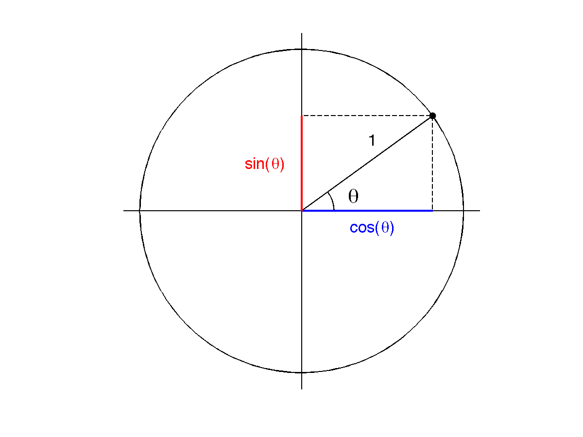
Let’s look at an example slide containing a title, an image and a text box. The image file is a modified version of the one created in https://blogs.helsinki.fi/smsiltan/?p=107
\documentclass[graphics]{beamer}
\begin{document}
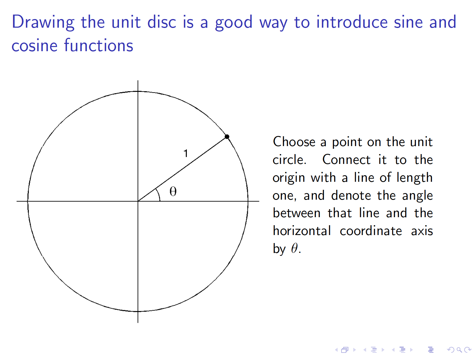
\begin{frame}{Drawing the unit disc is a good way to introduce sine and cosine functions}
\begin{picture}(320,250)
\put(-80,20){\includegraphics[height=8cm]{sincos2.png}}
\put(180,180){\begin{minipage}[t]{0.4\linewidth}
{Choose a point on the unit circle. Connect it to the origin with a line of length one, and denote the angle between that line and the horizontal coordinate axis by $\theta$.}
\end{minipage}}
\end{picture}
\end{frame}
\end{document}
Here is the resulting slide:

Now we want two consecutive slides with some new structure building into the image above.
\documentclass[graphics]{beamer}
\begin{document}
\begin{frame}{Drawing the unit disc is a good way to introduce sine and cosine functions}
\begin{picture}(320,250)
\put(-80,20){\includegraphics[height=8cm]{sincos2.png}}
\put(180,180){\begin{minipage}[t]{0.4\linewidth}
{Choose a point on the unit circle. Connect it to the origin with a line of length one, and denote the angle between that line and the horizontal coordinate axis by $\theta$.}
\end{minipage}}
\end{picture}
\end{frame}
\begin{frame}{Now sine and cosine of angle $\theta$ can be found as the $x$ and $y$ coordinates of the chosen point at the unit circle}
\begin{picture}(320,250)
\put(-80,20){\includegraphics[height=8cm]{sincos3.png}}
\put(180,180){\begin{minipage}[t]{0.4\linewidth}
{Try drawing a similar figure with larger values of $\theta$. What happens to sine and cosine when you complete a full circle? Can you see from the figure which one of the functions $\sin$ and $\cos$ is odd and which one is even?}
\end{minipage}}
\end{picture}
\end{frame}
\end{document}
The resulting two slides look like this:
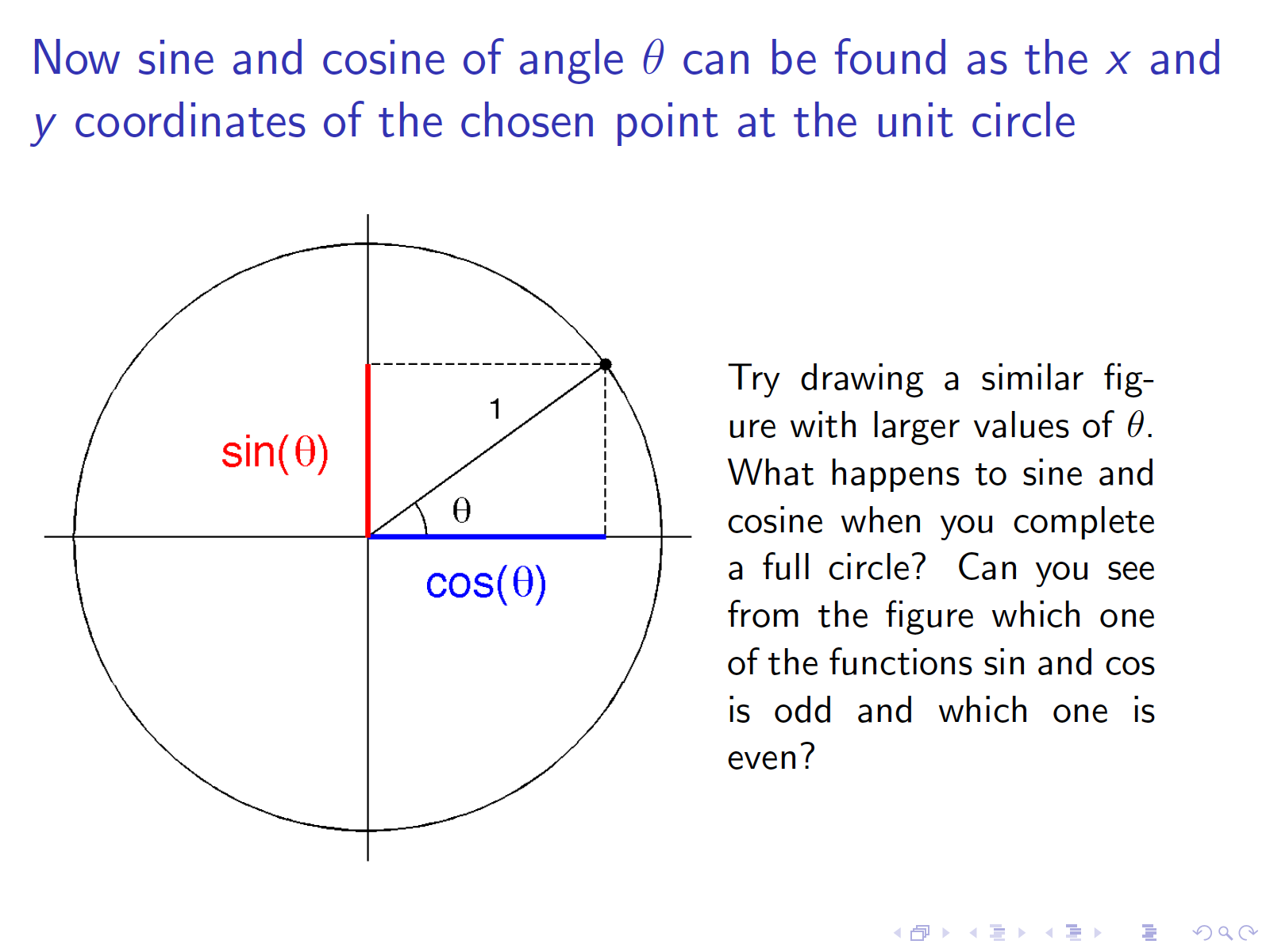
Note that there is no movement in the placement of the circle. The colored parts just appear on top of the previous image when the slide is changed.
In case you wonder why I didn’t use .eps files above, let me point out the following situation. As far as I know, in current LaTeX you need to choose one of the following option regarding image file types:
(1) All images in Encapsulated PostScript (.eps) format
(2) All images anything else than .eps.
Most presentations benefit from nice pictures that often come in other formats than .eps. It is easier to produce .png images from Matlab than to convert pixel images into .eps.
There is one remaining problem with the above approach. If the title of one page has more or less lines than another, the placement of the picture environment will change, and the overlapping of figures in consecutive slides will be lost. This can be overcome easily by adding an extra “ghost” line to a one-line title:
\begin{frame}{Too short title\\ \phantom{m}}
Articles and presentations often benefit from geometric illustrations. But how to draw them? There are of course many software options for creating vector graphics, but it is practical to use as few different tools as possible. That’s why I rely on the (rather restricted) LaTeX picture environment when possible, and use Matlab for more involved figures.
Here I show how to construct a simple geometric illustration of the sine and cosine functions using Matlab.
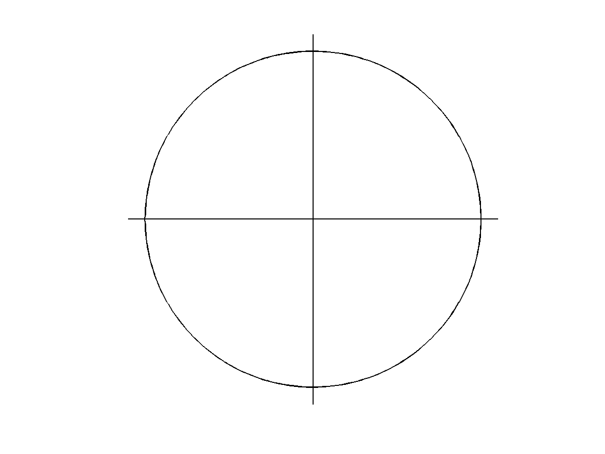
For starters, here is a Matlab code plotting the unit circle and coordinate axes. The axis equal command below is essential to make the circle look like a circle and not like an ellipse.
% Construct angular evaluations points
phi = linspace(0,2*pi,256);
% Create empty figure window
figure(1); clf
% Plot unit circle
plot(cos(phi),sin(phi),’k’,’linewidth’,1)
hold on
% Plot coordinate axes
plot([-1.1 1.1],[0 0],’k’,’linewidth’,1)
plot([0 0],[-1.1 1.1],’k’,’linewidth’,1)
% Axis settings
axis([-1.1 1.1 -1.1 1.1])
axis equal
axis off
Next we add a point on the unit circle and indicate the angle between the horizontal coordinate axis and the vector with base at the origin and tip at our example point. We call the angle theta. Also, we write the number 1 showing the radius of the unit circle. You can adjust the font size easily.
% Construct angular evaluations points
phi = linspace(0,2*pi,256);
% Create empty figure window
figure(1); clf
% Plot unit circle
plot(cos(phi),sin(phi),’k’,’linewidth’,1)
hold on
% Plot coordinate axes
plot([-1.1 1.1],[0 0],’k’,’linewidth’,1)
plot([0 0],[-1.1 1.1],’k’,’linewidth’,1)
% Choose angle for demonstrating sine and cosine
theta = pi/5;
R = .2;
plot([0 cos(theta)],[0 sin(theta)],’k’,’linewidth’,1)
plot(cos(theta),sin(theta),’k.’,’markersize’,16)
tmp = linspace(0,theta,64);
plot(R*cos(tmp),R*sin(tmp),’k’,’linewidth’,1)
text(1.5*R*cos(theta/2),1.5*R*sin(theta/2),’\theta’,’fontsize’,20)
text(3*R*cos(1.3*theta),3*R*sin(1.3*theta),’1′,’fontsize’,16)
% Axis settings
axis([-1.1 1.1 -1.1 1.1])
axis equal
axis off
% Save image to file
print -dpng sincos2.png
Finally, let’s add sine and cosine using some color.
% Construct angular evaluations points
phi = linspace(0,2*pi,256);
% Create empty figure window
figure(1); clf
% Plot unit circle
plot(cos(phi),sin(phi),’k’,’linewidth’,1)
hold on
% Plot coordinate axes
plot([-1.1 1.1],[0 0],’k’,’linewidth’,1)
plot([0 0],[-1.1 1.1],’k’,’linewidth’,1)
% Choose angle for demonstrating sine and cosine
theta = pi/5;
R = .2;
plot([0 cos(theta)],[0 sin(theta)],’k’,’linewidth’,1)
plot(cos(theta),sin(theta),’k.’,’markersize’,16)
tmp = linspace(0,theta,64);
plot(R*cos(tmp),R*sin(tmp),’k’,’linewidth’,1)
text(1.5*R*cos(theta/2),1.5*R*sin(theta/2),’\theta’,’fontsize’,20)
text(3*R*cos(1.3*theta),3*R*sin(1.3*theta),’1′,’fontsize’,16)
% Show sine and cosine
plot([cos(theta),cos(theta)],[0 sin(theta)],’k–‘,’linewidth’,1)
plot([0,cos(theta)],[0 0],’b’,’linewidth’,2)
plot([0,cos(theta)],[sin(theta) sin(theta)],’k–‘,’linewidth’,1)
plot([0,0],[0 sin(theta)],’r’,’linewidth’,2)
p1 = text(.3,-.1,’cos(\theta)’,’fontsize’,16);
set(p1,’color’,[0 0 1])
p2 = text(-.35,.5*sin(theta),’sin(\theta)’,’fontsize’,16)
set(p2,’color’,[1 0 0])
% Axis settings
axis([-1.1 1.1 -1.1 1.1])
axis equal
axis off
% Save image to file
print -dpng sincos3.png
The above color picture is fine for presentations. However, if it will be used in an article, it is better to remove the color and have all the lines and text in black. For this, change the ‘r’ and ‘b’ above into ‘k’. Also, the png file format is pixel-based which is not good for articles. Rather, we need vector graphics and encapsulated postscript (.eps) format. The print command above should be replaced by
print -deps sincos3.eps
(The above command will actually take care of the color issue since print -deps produces black and white images. When you need .eps files with color, use print -depsc.)
Let’s study one of the most common tasks in the visualization of applied mathematics: plotting a function on a real variable. Matlab’s default settings often need some tuning for a specific purpose.
The example is very simple: plot the sine function in the interval from zero to two pi. A straightforward Matlab code for doing this reads
x = linspace(0,2*pi);
plot(x,sin(x))

Now there is a lot more background structure in the plot than there is content relating to the actual sine function we want to illustrate. I’ll follow Edward Tufte’s advice and remove some ink that bears no data (by typing box off). Also, the natural limit for the horizontal axis is [0,2*pi] instead of Matlab’s default [0,7].
figure(2); clf
x = linspace(0,2*pi);
plot(x,sin(x))
xlim([0, 2*pi])
box off

There seems to be an odd cut in the maximum of the function because the image has been truncated too low. This can be fixed by extending the vertical axis limit slightly using the ylim command.
I find Matlab’s default blue plot color rather boring, so I’ll change it to red. Also, I plot the function with a thicker line to make it stand out of the background structure.
figure(3); clf
x = linspace(0,2*pi);
plot(x,sin(x),’r’,’linewidth’,2);
xlim([0, 2*pi])
ylim([-1, 1.02])
box off

Just for fun, I will change the plot color to something tailored. Here the RGB values are R=180, G=60 and B=0, but you can change it to any color of your liking. The separate xlim and ylim commands above can be combined into one axis command.
figure(4); clf
x = linspace(0,2*pi);
p = plot(x,sin(x),’linewidth’,2);
set(p,’color’,[242 69 0]/255)
axis([0, 2*pi, -1, 1.02])
box off

Next I modify the tick marks of both the horizontal and the vertical axes. Namely, the x-values 0,1,2,…,6 are not meaningful for the sine function. It is a better idea to mark the zeros and extrema of the function instead. Also, the vertical axes has unnecessarily many tick marks, so I reduce them a bit.
figure(5); clf
x = linspace(0,2*pi);
p = plot(x,sin(x),’linewidth’,2);
set(p,’color’,[242 69 0]/255)
set(gca,’xtick’,[0 pi/2 pi 3*pi/2 2*pi])
set(gca,’ytick’,[-1 -.5 0 .5 1])
axis([0 2*pi -1 1.02])
box off

Now it would be nice to call pi “![]() ” instead of “3.1416.” While LaTeX expressions such as “\pi” are functional in the titles of plots in Matlab, for example, they do not work in the tick marks. One way to remedy this is to use the font called “Symbol.”
” instead of “3.1416.” While LaTeX expressions such as “\pi” are functional in the titles of plots in Matlab, for example, they do not work in the tick marks. One way to remedy this is to use the font called “Symbol.”
Also, the font size used for the tick marks may be too small for, say, conference presentation slides viewed from a distance. We will enlarge the font.
figure(6); clf
x = linspace(0,2*pi);
p = plot(x,sin(x),’linewidth’,2);
set(p,’color’,[242 69 0]/255)
set(gca,’xtick’,[0 pi/2 pi 3*pi/2 2*pi])
set(gca,’xticklabel’,{‘0′,’p/2′,’p’,’3p/2′,’2p’},’fontname’,’symbol’,’fontsize’,16)
set(gca,’ytick’,[-1 -.5 0 .5 1])
set(gca,’yticklabel’,{‘-1′,”,’0′,”,’1′},’fontsize’,16)
axis([0 2*pi -1 1.02])
box off

Now the sine function plot shows the function itself as the main feature, and the supporting structure is tailored to this specific case.
Sometimes it is necessary to change the shape of the rectangle containing the plot. If you need a square, write axis square. If it is important to have the same scale in the horizontal and vertical axes, write axis equal. Here I show how to choose a 1:3 ratio between the vertical and horizontal axes:
figure(7); clf
x = linspace(0,2*pi);
p = plot(x,sin(x),’linewidth’,2);
set(p,’color’,[242 69 0]/255)
set(gca,’xtick’,[0 pi/2 pi 3*pi/2 2*pi])
set(gca,’xticklabel’,{‘0′,’p/2′,’p’,’3p/2′,’2p’},’fontname’,’symbol’,’fontsize’,16)
set(gca,’ytick’,[-1 -.5 0 .5 1])
set(gca,’yticklabel’,{‘-1′,”,’0′,”,’1′},’fontsize’,16)
axis([0 2*pi -1 1.02])
set(gca,’PlotBoxAspectRatio’,[3 1 1])
box off

You can now save the image in your favorite format with commands like
print -depsc sineplot.eps
print -dpng sineplot.png
I am often faced with the problem of showing an “original image” and a “reconstructed image,” which may have completely different dynamic ranges. Namely, when working with ill-posed inverse problems, unsuccessful reconstructions sometimes amplify measurement noise a lot. However, it would be important to make reliable comparisons at a glance to see what is correct in the reconstruction. I will present below one possible way to do so using Matlab.
For example, we want to show an original function f1, an unsuccessful reconstruction f2 and a better reconstruction f3. Further, assume that each of the above functions are defined in the unit disc, leading to the additional complication of showing the background in the image area outside the unit disc.
Let us construct the original function f1 in Matlab as follows:
Nt = 128;
t = linspace(-1,1,Nt);
[x1,x2] = meshgrid(t);
z = x1+i*x2;
udisc = abs(z)<1;
f1 = ones(size(x1));
f1(x1<0) = 2;
f1(~udisc) = NaN;
Note that the last command inserts Not-a-Numbers outside the unit disc, indicating that the function is defined only inside the disc. Here is a plot of f1 using the command imagesc:
figure(1);clf
imagesc(f1)
axis equal
axis off

The background NaN values are automatically shown using the color of the minimum value of the non-NaN matrix elements, and therefore the right half of the image is confusing. We will correct this later.
Now form the “unsuccessful reconstruction” f2 by adding huge random noise, and “better reconstruction” f3 by adding only a little noise:
f2 = f1 + 6*(abs(z)).^4.*randn(size(f1));
f3 = f1 + .1*randn(size(f1));
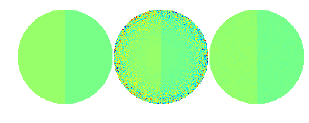
Replacing f1 in the above plot command by f2 and f3, respectively, produces these images:
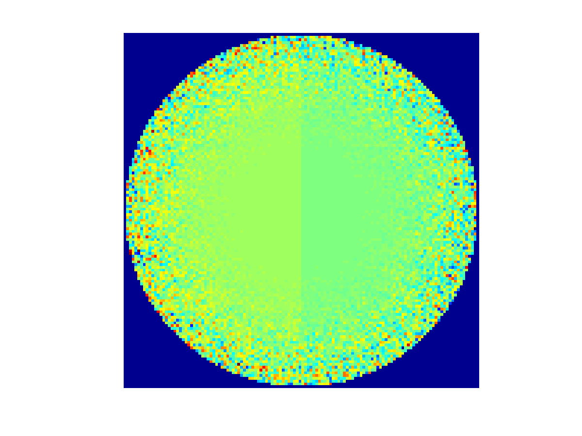
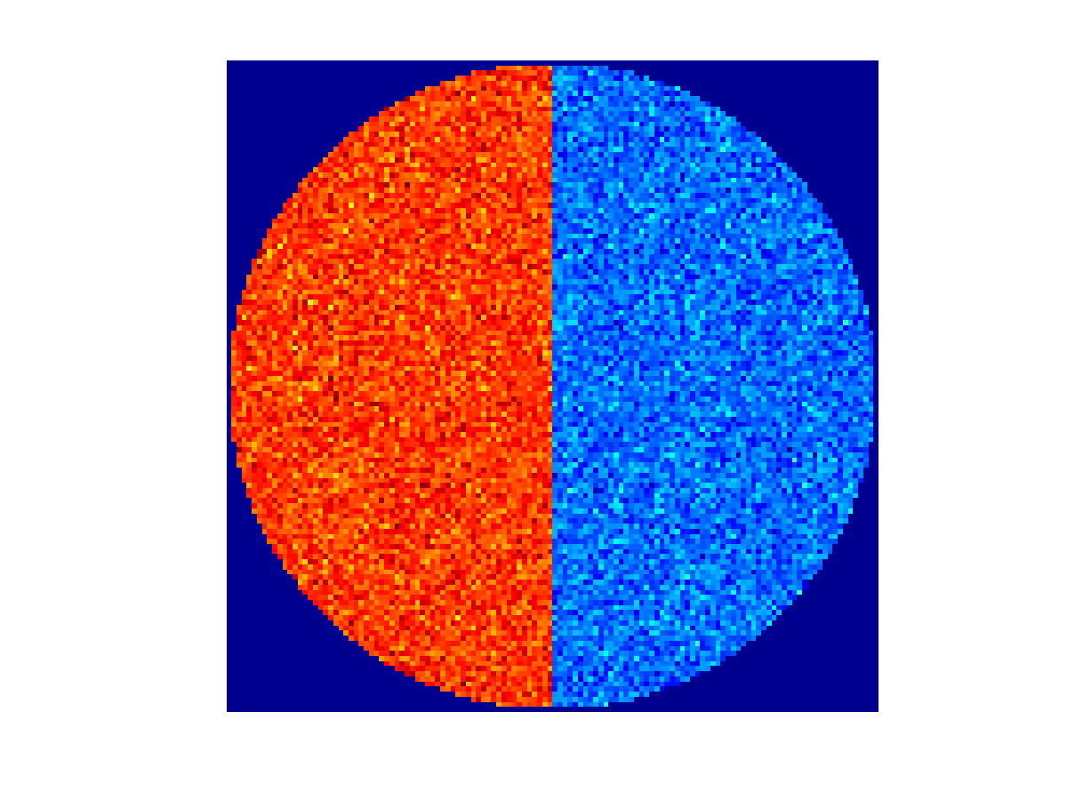
Now the problem with the three pictures above is that the colors do not correspond to the same function values. Matlab automatically uses the default colormap “jet” linearly adjusted between the minimum and maximum value appearing in the matrix.
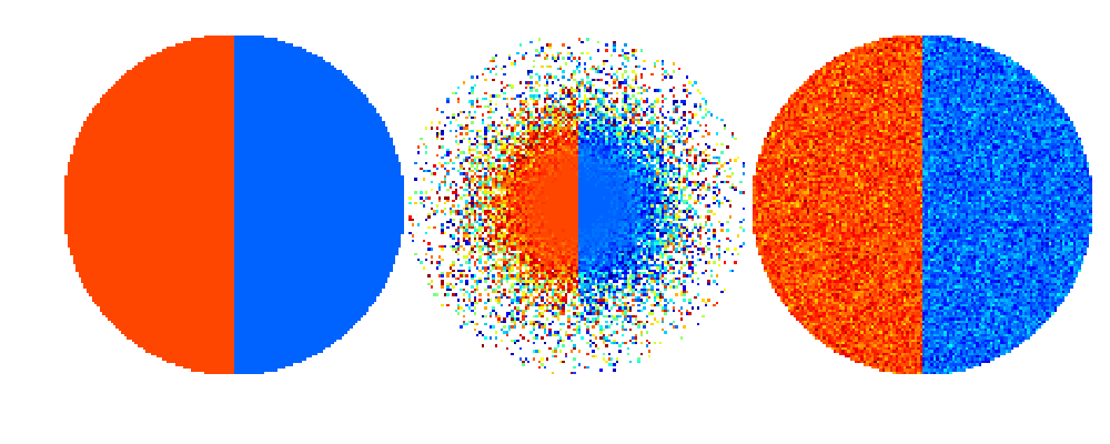
Now take a look at the three functions side by side. This should make the colors directly comparable between the images.
figure(4);clf
imagesc([f1,f2,f3])
axis equal
axis off
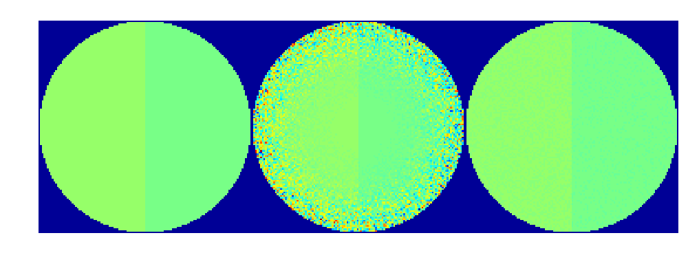
Now the colors are indeed comparable from one plot to another, but the result is not acceptable. The noise in the bad reconstruction (middle) ruins the colormap by stretching it to a too wide interval of values.
Before turning to the problem of comparing colors, let’s see how to change the background color to white. At this point we need to save our simulated data to a .mat file so that we can later load it fresh from disc.
save data z udisc f1 f2 f3
The trick to background coloring is based to adding pure white as an extra color to the bottom of the default colormap “jet” used above:
colormap jet
MAP = colormap;
M = size(MAP,1); % Number of rows in the colormap
bckgrnd = [1 1 1]; % Pure white color
MAP = [bckgrnd;MAP];
Now we insert a carefully chosen minimum value, instead of NaN, to the points outside the discs and repeat the above side-by-side plot command.
MIN = min(min([f1,f2,f3]));
MAX = max(max([f1,f2,f3]));
cstep = (MAX-MIN)/(M-1); % Step size in the colorscale from min to max
f1(~udisc) = MIN-cstep;
f2(~udisc) = MIN-cstep;
f3(~udisc) = MIN-cstep;
figure(5);clf
imagesc([f1,f2,f3])
axis equal
axis off
colormap(MAP)
Now let’s turn to the problem of bad contrast in the above comparison image. Assume that we are happy with the better reconstruction shown on the right. Then we might want to set the color scale ranging from the minimum value in f3 to the maximum value in f3.
Also, we reload the functions afresh as they were modified above.
colormap jet
MAP = colormap;
M = size(MAP,1);
bckgrnd = [1 1 1];
MAP = [bckgrnd;MAP];
load data z udisc f1 f2 f3
MIN = min(min([f1,f3])); % Note that f2 is omitted!
MAX = max(max([f1,f3])); % Note that f2 is omitted!
cstep = (MAX-MIN)/(M-1);
f1(~udisc) = MIN-cstep;
f2(~udisc) = MIN-cstep;
f3(~udisc) = MIN-cstep;
f2(f2<MIN) = MIN-cstep;
f2(f2>MAX) = MIN-cstep;
figure(6);clf
imagesc([f1,f2,f3])
axis equal
axis off
colormap(MAP)
Now we have good contrast, comparable colors, and out-of-range-values in f2 indicated by the white background color.
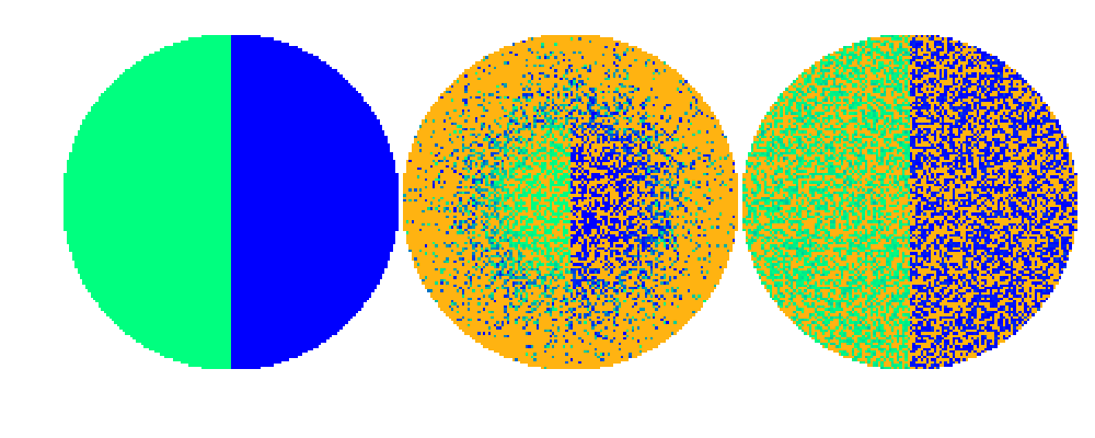
But assume that we want to see the errors, or out-of-range-values, clearly in both f2 and f3, and indicated by a different color than the background. This can be achieved by inserting two extra colors to the colormap as follows. For clarity, we use the “winter” colormap and indicate the errors as highly contrasting orange color.
colormap winter
MAP = colormap;
M = size(MAP,1); % Number of rows in the colormap
bckgrnd = [1 1 1]; % Pure white color
errcolor = [1 179/255 17/255]; % Error color is orange
load data z udisc f1 f2 f3
MIN = min(min(f1));
MAX = max(max(f1));
cstep = (MAX-MIN)/(M-1); % Step size in the colorscale from min to max
MAP = [errcolor;bckgrnd;MAP];
f2(f2<MIN) = MIN-2*cstep;
f2(f2>MAX) = MIN-2*cstep;
f3(f3<MIN) = MIN-2*cstep;
f3(f3>MAX) = MIN-2*cstep;
f1(~udisc) = MIN-cstep;
f2(~udisc) = MIN-cstep;
f3(~udisc) = MIN-cstep;
figure(7);clf
imagesc([f1,f2,f3])
axis equal
axis off
colormap(MAP)