Let’s study one of the most common tasks in the visualization of applied mathematics: plotting a function on a real variable. Matlab’s default settings often need some tuning for a specific purpose.
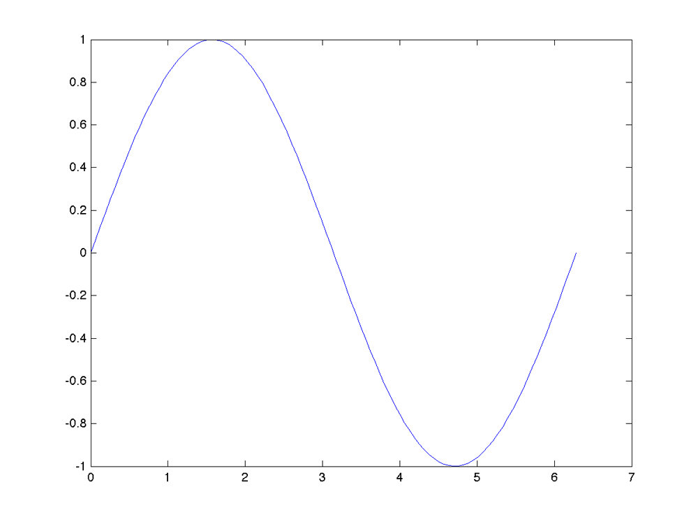
The example is very simple: plot the sine function in the interval from zero to two pi. A straightforward Matlab code for doing this reads
x = linspace(0,2*pi);
plot(x,sin(x))
Now there is a lot more background structure in the plot than there is content relating to the actual sine function we want to illustrate. I’ll follow Edward Tufte’s advice and remove some ink that bears no data (by typing box off). Also, the natural limit for the horizontal axis is [0,2*pi] instead of Matlab’s default [0,7].
figure(2); clf
x = linspace(0,2*pi);
plot(x,sin(x))
xlim([0, 2*pi])
box off
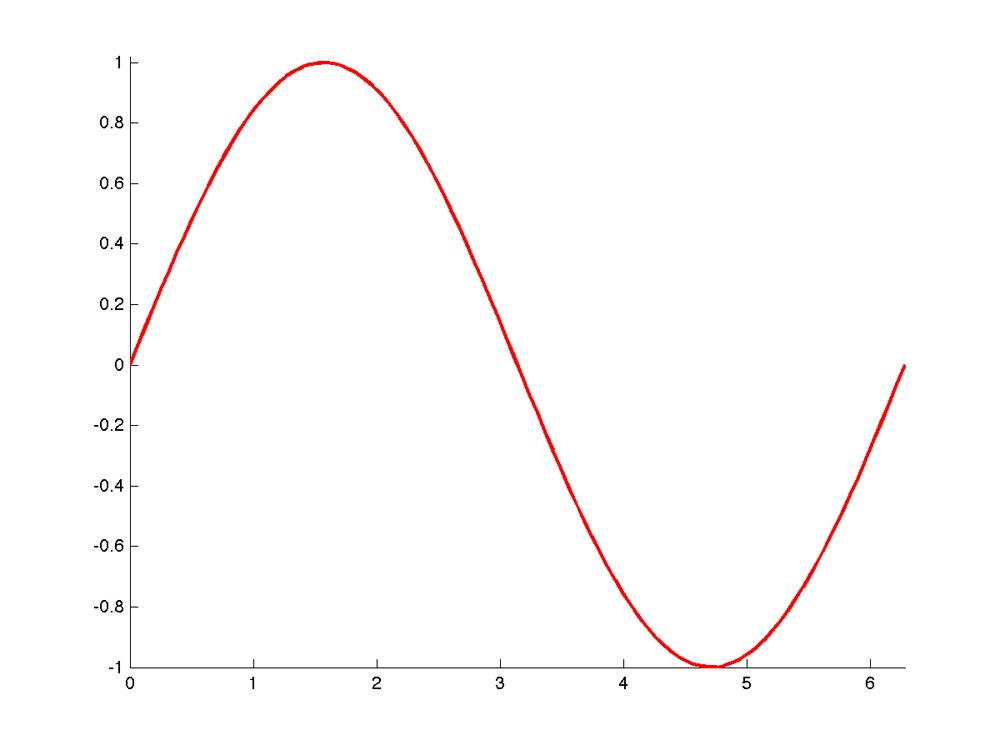
There seems to be an odd cut in the maximum of the function because the image has been truncated too low. This can be fixed by extending the vertical axis limit slightly using the ylim command.
I find Matlab’s default blue plot color rather boring, so I’ll change it to red. Also, I plot the function with a thicker line to make it stand out of the background structure.
figure(3); clf
x = linspace(0,2*pi);
plot(x,sin(x),’r’,’linewidth’,2);
xlim([0, 2*pi])
ylim([-1, 1.02])
box off
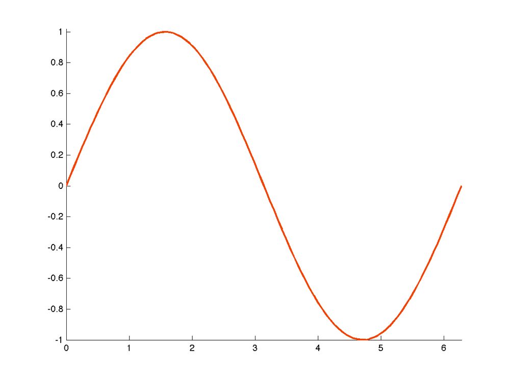
Just for fun, I will change the plot color to something tailored. Here the RGB values are R=180, G=60 and B=0, but you can change it to any color of your liking. The separate xlim and ylim commands above can be combined into one axis command.
figure(4); clf
x = linspace(0,2*pi);
p = plot(x,sin(x),’linewidth’,2);
set(p,’color’,[242 69 0]/255)
axis([0, 2*pi, -1, 1.02])
box off
Next I modify the tick marks of both the horizontal and the vertical axes. Namely, the x-values 0,1,2,…,6 are not meaningful for the sine function. It is a better idea to mark the zeros and extrema of the function instead. Also, the vertical axes has unnecessarily many tick marks, so I reduce them a bit.
figure(5); clf
x = linspace(0,2*pi);
p = plot(x,sin(x),’linewidth’,2);
set(p,’color’,[242 69 0]/255)
set(gca,’xtick’,[0 pi/2 pi 3*pi/2 2*pi])
set(gca,’ytick’,[-1 -.5 0 .5 1])
axis([0 2*pi -1 1.02])
box off
Now it would be nice to call pi “![]() ” instead of “3.1416.” While LaTeX expressions such as “\pi” are functional in the titles of plots in Matlab, for example, they do not work in the tick marks. One way to remedy this is to use the font called “Symbol.”
” instead of “3.1416.” While LaTeX expressions such as “\pi” are functional in the titles of plots in Matlab, for example, they do not work in the tick marks. One way to remedy this is to use the font called “Symbol.”
Also, the font size used for the tick marks may be too small for, say, conference presentation slides viewed from a distance. We will enlarge the font.
figure(6); clf
x = linspace(0,2*pi);
p = plot(x,sin(x),’linewidth’,2);
set(p,’color’,[242 69 0]/255)
set(gca,’xtick’,[0 pi/2 pi 3*pi/2 2*pi])
set(gca,’xticklabel’,{‘0′,’p/2′,’p’,’3p/2′,’2p’},’fontname’,’symbol’,’fontsize’,16)
set(gca,’ytick’,[-1 -.5 0 .5 1])
set(gca,’yticklabel’,{‘-1′,”,’0′,”,’1′},’fontsize’,16)
axis([0 2*pi -1 1.02])
box off
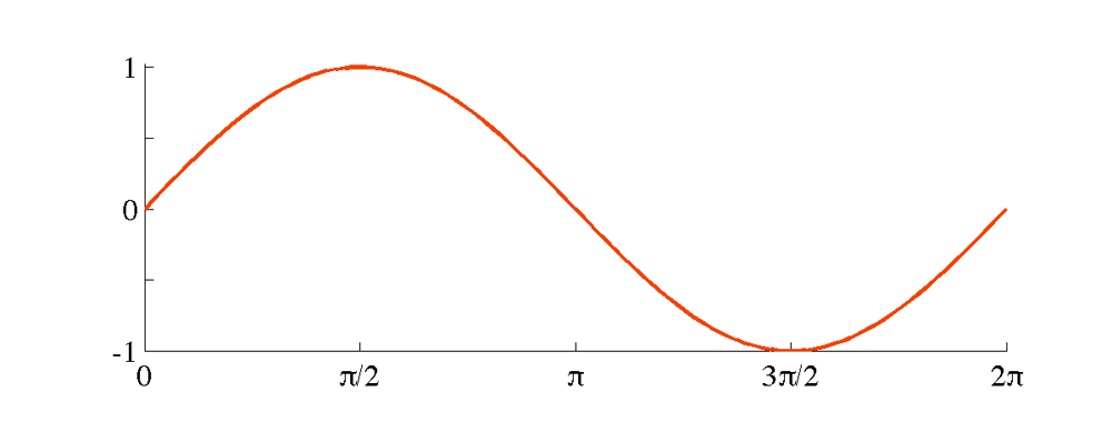
Now the sine function plot shows the function itself as the main feature, and the supporting structure is tailored to this specific case.
Sometimes it is necessary to change the shape of the rectangle containing the plot. If you need a square, write axis square. If it is important to have the same scale in the horizontal and vertical axes, write axis equal. Here I show how to choose a 1:3 ratio between the vertical and horizontal axes:
figure(7); clf
x = linspace(0,2*pi);
p = plot(x,sin(x),’linewidth’,2);
set(p,’color’,[242 69 0]/255)
set(gca,’xtick’,[0 pi/2 pi 3*pi/2 2*pi])
set(gca,’xticklabel’,{‘0′,’p/2′,’p’,’3p/2′,’2p’},’fontname’,’symbol’,’fontsize’,16)
set(gca,’ytick’,[-1 -.5 0 .5 1])
set(gca,’yticklabel’,{‘-1′,”,’0′,”,’1′},’fontsize’,16)
axis([0 2*pi -1 1.02])
set(gca,’PlotBoxAspectRatio’,[3 1 1])
box off
You can now save the image in your favorite format with commands like
print -depsc sineplot.eps
print -dpng sineplot.png


