This page is for illustrating what I’ve learned during the Carto GIS course in 2024. First there is an portfolio where I present the different maps I’ve made within the course. Secondly there is the final project where I create a narrative story using text and different kind of maps.
Portfolio
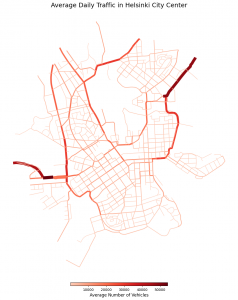
In the first exercise, I aimed to create a visually pleasing and a simple map using Python, focusing on making a visually pleasing map. The map utilized color and line width to represent traffic volumes in Helsinki. I used red to highlight most used roads. I had some challenges with the code, but I learned the importance of simplicity in making maps.
While I had some problems with Python creating visually pleasing maps, I decided to use Python for possible data analysis and QGIS for visualizations for the rest of the course. In the end I did not need much Python to complete the weekly exercises.
In the second exercise I created a map of global coal power plants and used different colors to visualize their power capacity which revealed some significant hotspots. In this exercise, I practiced using colors that are accessible for color-blind also.

The third week was especially interesting since we had a guest lecturer Franz Benjamin Mocnik from the university of Salzburg. He gave an inspiring lecture on how to tell stories using maps and introduced his map making framework which involves finding datasets, exploring various representations, and then refining the final map. However, this workflow can be quite time-consuming and may not always fit with modern project standards.
The lectures also highlighted when to use non-cartographic visualizations, such as weather data which is geospatial and time dependent. Static maps are effective for visualizing data at a single moment, but line or bar plots are better for showing how data has changed over time.
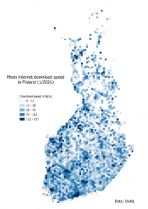
For the third week I created a hexbin map from internet speed data. The amount of data was so large that I had to clip the data using Finnish borders just because of computer performance issues. Then mmqgis plugin was used to create hexagons and I calculated the mean internet download speed inside each hexagon. Finally, I visualized the data classifying the speeds using natural breaks.
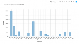
Throughout the exercises I had some technical challenges especially with the large datasets and different coordinate systems. In the fourth week’s exercise these issues were quite annoying since QGIS can show data with different coordinate reference systems simultaneously relatively well but when exporting some map into a html file all the data needs to be in the same coordinate reference system. Despite these hurdles I managed to create my first interactive map in QGIS but unfortunately had to publish my plot out of the flying squirrel data using just a screenshot of the plot. You can find my interactive map about flying squirrel sightings in Uusimaa here.
In summary, these exercises highlighted the balance between simplicity and informativeness in cartography. I tried different techniques and perspectives to create map and got some great new ideas visualizing different types of data.
Final project
In the final project I will explore the mammal sightings in Finland in different years. I will first describe the data and then explore different aspects of it showcasing the skills learned in during the course.
The data
The data used in the project is downloaded from the laji.fi service which is the data hub of Finnish Biodiversity Info Facility. The service openly available and using it it’s possible to explore all of the facility’s data for free. Some data is somewhat secured but most of it is available for everyone.
In laji.fi website it’s possible to for example explore different facts on plant and animal species and study the taxonomy of species as well as sightings of them on a daily basis.
The sightings data comes from multiple different sources such as datasets of different institutes, universities, organizations and private people. In total there are tens of different sources of these sightings which explain the daily number of sightings. There were 26 076 sightings saved in the service just between 9.-10.6.2024.
I started by narrowing my search in laji.fi to concern only mammals and I downloaded all the sightings and just sightings made in during 2000s. There were so many points in the data (278 000) so I narrowed down the data first to concern only sightings from 2023 and visualized the sightings using a heatmap.
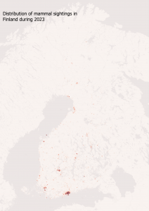
From the heatmap it’s possible to see that a lot of sightings are logged near the biggest cities in Finland (Helsinki, Turku, Tampere, Oulu etc…). If there wouldn’t be a context given to this map, it could just portray the distribution of population in Finland. In other words this kind of dataset that includes voluntary gathered data, has more data points in areas where there are more people, not more mammals. For example in the Helsinki city centre people have logged dozens of rabbit sightings as you can see below.
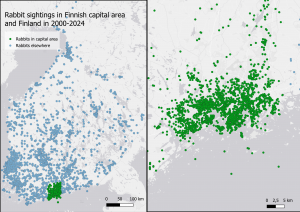
It’s not easy to see the difference of rabbit sightings between the whole country and the capital region but I still think that this map emphasizes the distortion between the number of sightings between a smaller area with higher density of people and whole country. In fact in these sightings there are both hares (rusakko) and rabbits. I also studied the difference between just rabbit sightings but there were only a few sightings in the rest of the Finland compared to the capital area where there were hundreds of sightings. So I thought the map above would make more sense since the amount of sightings does naturally not correlate with the the number of rabbits.
Carnivorans in Finland
Carnivorans are animals which primarily eat meat. In Finland there lives several different carnivorans like lynx, wolf, wolverine and bear. In this chapter I will explore how the sightings of these animals have developed over different periods of time. Let’s start with the most rarely seen animals of these, wolverine and lynx. In the map below you can see how wolverine and lynx sightings have developed yearly from 1950.
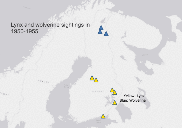
From the map you can see that both of these species have been spotted mainly in eastern Finland in early decades of the animation. Wolverine is spotted mainly in in the northern part of Finland where as lynxes have been spotted in southern part. However more lately there have been sightings in other parts of the Finland too. In this case I don’t think that both species have distributed in other parts of the country. Maybe it’s easier to save the info about these sightings using internet and everyone can submit information about their sightings to laji.fi. This makes it problematic to compare sightings between different decades too since there are so much more sightings logged in recent years as it’s possible to see from the animation.
Let’s see next if bear sightings also follow this same pattern. In the next map I show bear sightings in Finland by region and below that the same data using a plot.
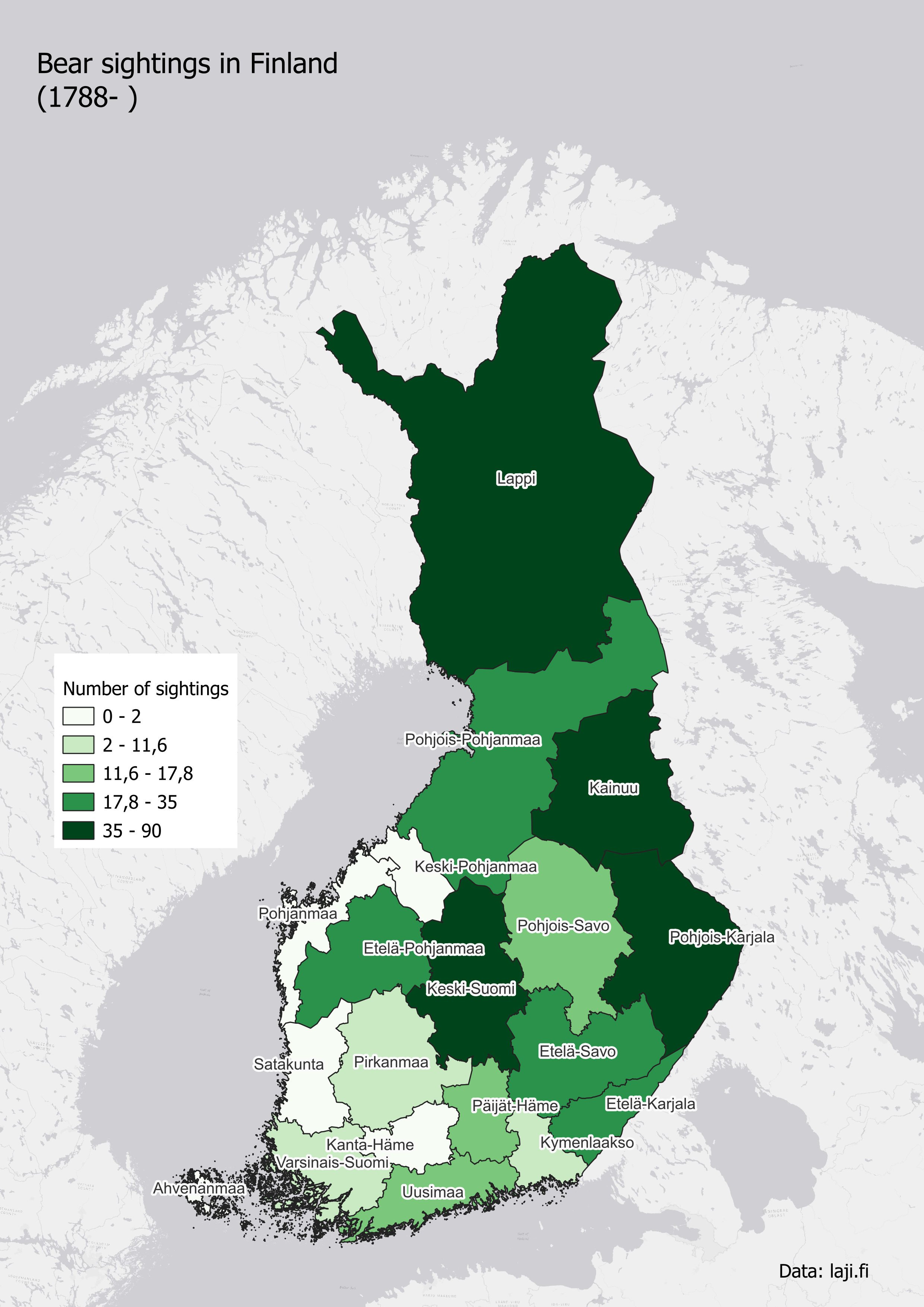
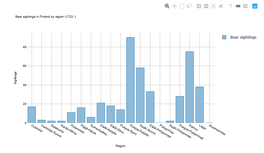
From the map and the plot it can be seen that most of the sightings are made in eastern/northern Finland. Here it’s interesting that the first sighting is logged already in 1788. Unfortunately there are not many historical sightings in the data so it’s not meaningful to make these kind of historical analysis. It’s although good to keep in mind that Lapland (Lappi) is bigger region than others so obviously there can be more sightings there. It’s also possible to see that in Uusimaa (where Helsinki is located) there is a little anomaly in bear sightings which again proves the point that the data is affected by the population density.
Conclusions
You can explore different animal sightings explored above using this interactive map:
https://eerotu.github.io/CartoGIS-2024/Final-project-interactive-map/index.html
In this little project I explored the datasets offered by Finnish Biodiversity Info facility. The aim was to show the sightings of a few mammals using different kind of map creating techniques and discuss the quality of the data. From the maps and plots in this project some negative things can be concluded.
Although it’s very cool that in Finland there is a service that gathers sightings from authoritatives and civilians together the data can lead a casual user into misconception. There are just a lot more sightings logged in areas with high population density.
Secondly, lot of the data is intentionally not accurate to protect the animals in concern. If the exact location of e.g. wolf and wolverine sightings would be shared publicly it could lead to poaching of these animals. You can see this anomaly in the interactive map because some of the data looks like it’s from a grid.
In conclusion the data from laji.fi can’t be used to visualize the distribution of species This can misleading for a casual user but for a more advanced user of the data the dataset can be an endless source of exploration.