My God! This was a troublesome week. The tasks themselves where simple enough but a whole lot of other problems arose. During the lesson I had the problem of not being able to correctly download the material. The large file with all the data would just read an error message. Fortunately I was able to download it on a different computer and then transfer it to my main computer through an external hard drive. An other even more enraging problem was that during the lesson I had saved all my projects separately so that I would be able to continue working on them after the lesson. However when opening them afterwards none of them were working properly! I had been very thorough with saving all scratch layers and everything, but somehow it had all disappeared. This left me unmotivated, but reading Annika Innanen’s blog (Innanen 2021) gave me the kick in the bum I needed. I would no longer sit and feel sorry for my self as she had struggled with the same issue and managed to come out on top. So would I.
So this week’s focus has been on raster material. Due to the nature of raster there are certain benefits as well as downsides compared to the earlier used vector format. Compared to the vector format raster is rather rigid only presenting data in a clear grid fashion. This makes everything kind of stale and not very natural. If you would try to counter this through upping the resolution (making the raster smaller) it leads to the data being very heavy and unwieldy. The benefits lie in that all raster (in the same grid) are all of equal size which opens up options not available in a vector based map. For example visualizing data absolutely and relatively simultaneously is not using vector maps but on a raster map this is completely possible due to all raster being of equal size. This is very helpful when wanting to convey as much information as densely as possible. An other clear benefit would be visualizing a gradually shifting phenomenon. As vector maps are founded on clearly defined points, lines and polygons it is hard to visualize this kind of phenomenon. On the other hand with raster, this is easy by just binding the data to the raster and assigning a set of colours.
During the lesson we visualized the amount of Swedish speaking Finns in the Greater Helsinki area through creating a grid covering the municipalities. When redoing this I instead chose to look at “Other languages”, that is other than Finnish or Swedish. This was a very similar process and the result looks familiar to other maps displaying the same information. As can be seen on picture 1. the map shows that most “Other languages” speakers can be found Helsinki and especially in eastern Helsinki. According to Venla Brenelius (Maa-106 2020) this is due to the area having comparatively large yet affordable housing which is often the go to option for the often larger and poorer immigrant families.
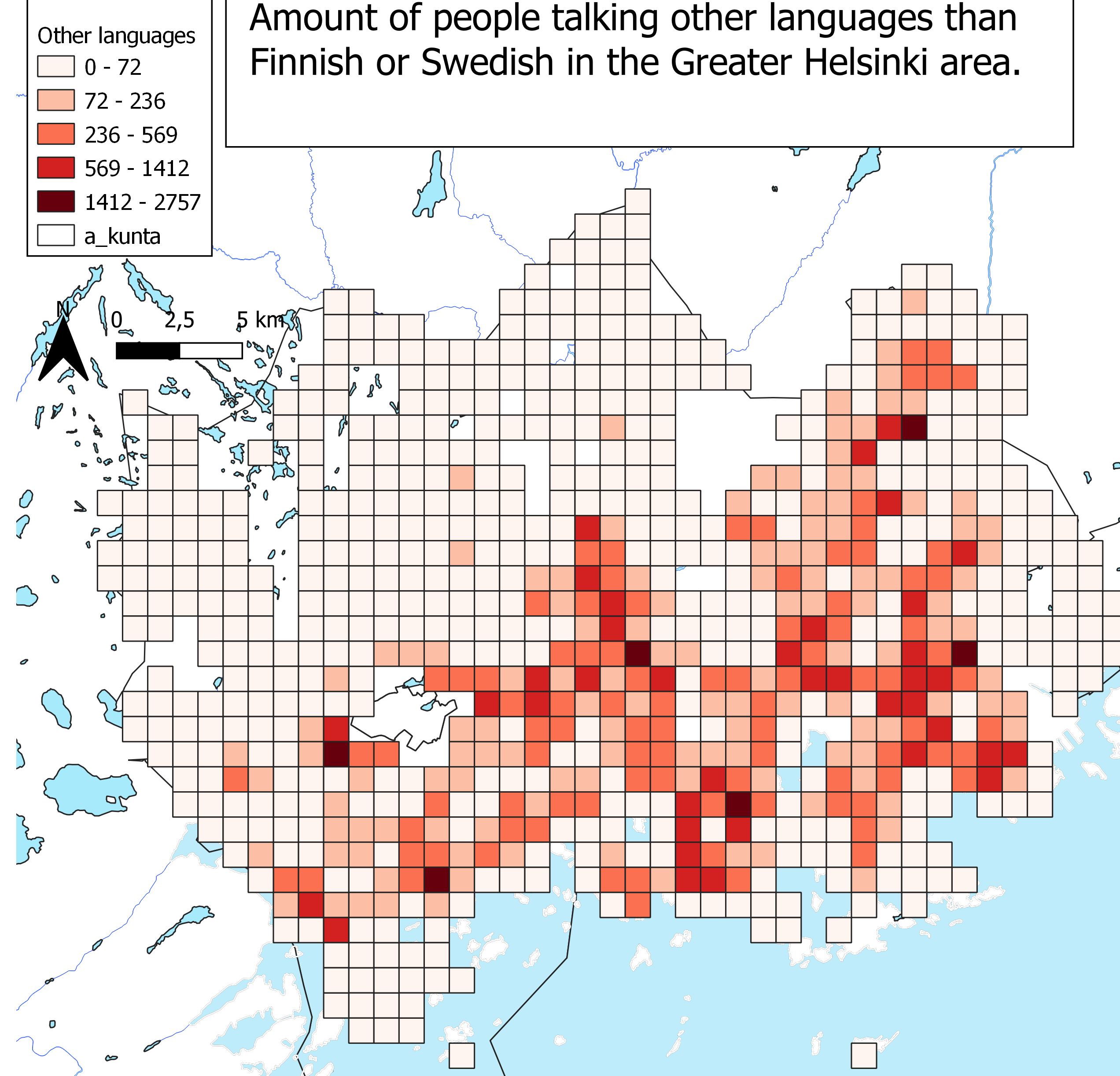
Picture 1. Map showing the amount of people speaking a language other than Finnish or Swedish in the Greater Helsinki area.
This kind of map still lacks in that it only tells us relative number relative to area. It doesn’t tell us about in this caseabout the relative amount of “other language”-speakers compared to the majority language speakers. Another problem with raster is that when dealing with the geographical distribution of a societal phenomena like language it’s often more intuitive to set the data along some preestablished lines; like administrative lines. This is because people already know these which makes it easier to grasp than a rigid raster grid.
Raster can though be used very widely and one example of that is how we used raster data to create a topographical map of Pornainen. I compared the map to other preexisting topographical maps of the same area and in my mind they were similar enough. Some small differences but nothing ground breaking. The preexisting maps where generally more detailed and reading Lotta Mattila’s blog (Mattila 2021) she seems to have come to a similar conclusion noting that the maps had differences in elevation curves but that the maps where different in other ways as well (“kartat ovat muutenkin erilaiset.”)
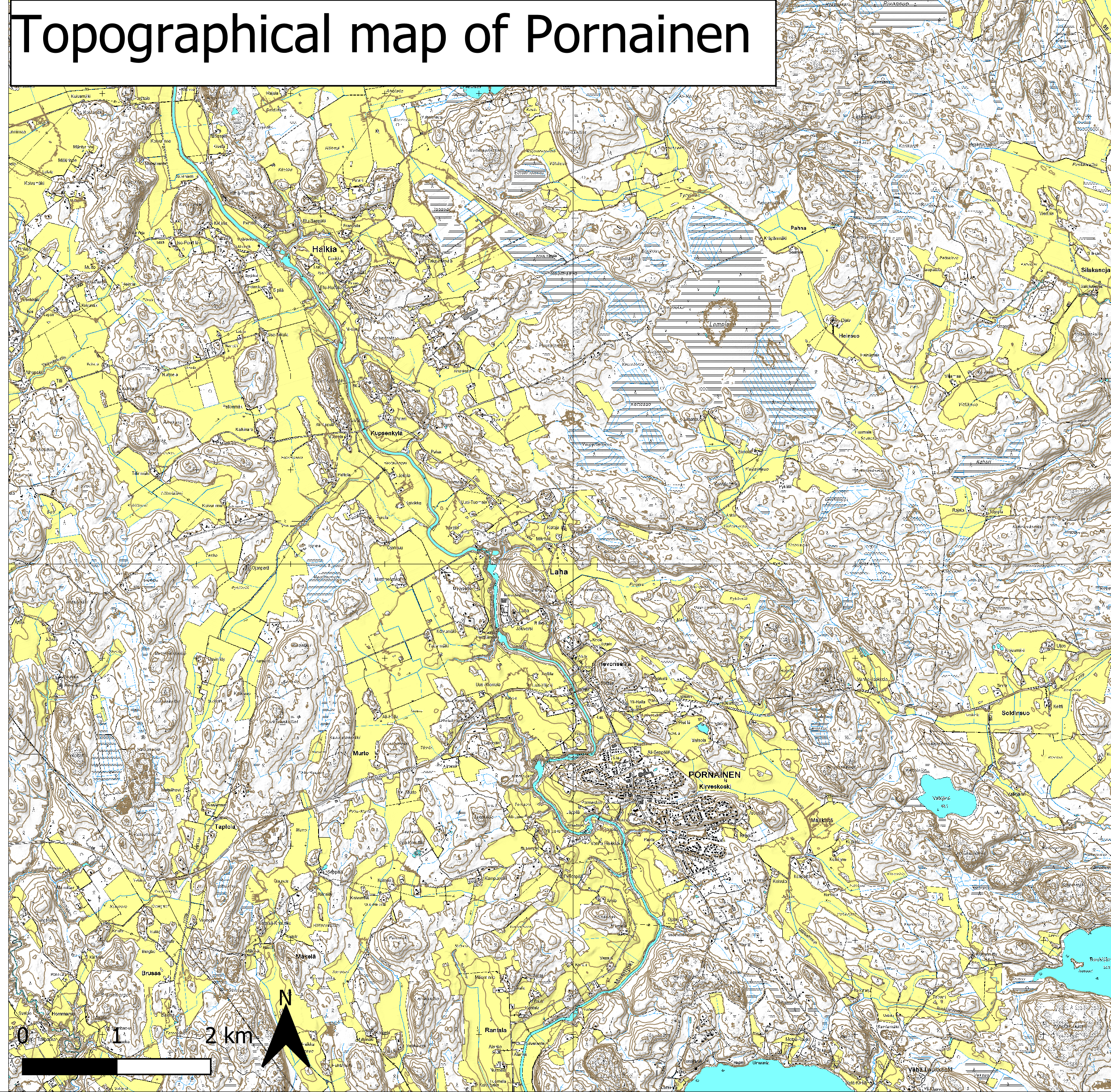
Picture 2. Topographical map of Pornainen.
I noted that one key thing to make the map look tidier was to make the lines displaying elevation really thin. There was a problem with this however. When zooming in the lines would then be too thin. Surely there is a function to relate the thickness or size of symbols to the level of detail?
At the end of the lesson we started to do some familiar digitalizing, this was in preparation for next weeks lesson. I wonder what may come?!
Till next week…
Alexander Engelhardt
Sources:
Innan A. (2021) Harjoitus 4: Väestöteemakartta ruutuaineistosta https://blogs.helsinki.fi/anninnan/
Mattila L. (2021) Ruututeemakartta https://blogs.helsinki.fi/lottmatt/2021/02/09/rasterikartat/