This week I yet again skipped the lesson, but this time it really bugs me. Had I known that we were supposed to go outside to create our own data I would absolutely have participated, but since I learned about it only after the lesson I sadly didn’t. I had checked the news page “uutiset” on our moodle but there wasn’t anything there so I thought everything would run as normal. Anyways I think this week’s exercises have been by far the most interesting yet! We have used interpolation methods as well as looked at certain hazards.
To begin with I want to repeat my humblest apologies for not participating and contributing to the Epicollect-data. I thank you who provided us with it so that we all could use it for our own assignments. So, the idea was we were going to interpolate ordinal data about safety, attractiveness and pleasantness and to then layer traffic roads and buildings on that to see if there are any correlations. Interpolation is a method in which for example with raster data where some of the raster lacks data but surrounding raster all have data assigned to them the value of the raster within is filled with the mean value of the surrounding raster. This is a method that is very widely used across many different fields and is by no means specific for GIS. For example, if you want to make a picture sharper one can use interpolation to imitate a higher pixel count than the picture originally had.
As I was saying, we looked at correlations between settlement and safety, attractiveness and pleasantness. One thing that struck me about the data was that it was very clustered. There was about seven clusters where all observations had been made. Six of these where within the Greater Helsinki region and one could be found in Nummela. General correlations that I could see was that heavy traffic correlated with less attractiveness and less pleasantness while green areas where seen as more attractive and more pleasant. When it comes to safety there where some food for thought in my opinion. For example, a few places in the park between Northern Haaga and Maunala was generally seen as safer than a larger highway nearby. I wonder if the observations would say the same if it was nighttime?
For my interpolations assignment I chose to focus on the attractiveness of the Viiki area. This area had a good varied set of observations for an interesting analysis. There is one major highway in the north and northwest, Lahdenväylä and then larger and smaller roads intersecting within the selected area. The general picture is that the highway and the largest roads holds the most negative numbers for attractiveness while observations made further from these places posts generally positive reviews. However, there are anomalies in the observations and the results can’t be described in as a single correlation, nor do I have the proper insight into what it was about these certain places that made them divert from the general rule. For that an interview style set of data would need to be included explaining the anomalies. The results of the interpolation method can be seen below in picture 1. Blue colours display maximum attractiveness, while green displays a bit less of that. Yellow displays places that are rather neutral while orange displays rather unattractive places. Red is the colour for maximum unattractiveness.

Picture 1. The map shows interpolated data about the attractiveness of certain places.
The other part of this lessons theme was to look at some data about earthquakes, volcanoes and craters from meteoroids and to visualize this through maps. This is an interesting hazard to look at because there is an overload of quite specific data from decades past. I downloaded data and then reformatted it in Excel so that QGIS could make sense of it. This wasn’t to difficult as we have done similar things earlier in the course. That’s a good feeling; being able to use something previously learned to make some parts of the exercise much easier!
Firstly, I made two maps displaying earthquakes with different magnitudes. Picture 2. displays all earthquakes between 1980 and 2021 with a magnitude above 5 on the Richter scale. I chose to further display the magnitude of each earthquake with a colour gradient shifting from blue for the lightest earthquakes to green and yellow for earthquakes with a magnitude of 6-8. Earthquakes with a magnitude over 8 are displayed as orange and over 9 gets the colour red. A problem that I encountered here was that the absolute most common “blue” earthquakes totally eclipsed the other colours making the map not very intuitive as it would seem there are no heavier earthquakes. This would especially be a problem as it is often the heaviest earthquakes that make the greatest impact on human settlement while lighter earthquakes seldom post any risk at all. I couldn’t find a function that would select in which order the observations where supposed to be shown so to get around this I made a second layer only containing earthquakes with a magnitude of 8 and higher and assigned the appropriate classification and colours to these. This way one can see the orange and red dots much clearer. Reading Ilari Leino’s blog (Leino 2021) I saw a different approach to visualizing the difference in magnitude. Rather than colour he used size. In my opinion this was better and more intuitive way to display the phenomenon. This can be seen in picture 2. To put even greater focus on the earthquakes with the highest magnitude I chose to quickly assemble a map focusing on only earthquakes with a magnitude of 8 and higher. With this limitation the number of earthquakes is in the tens instead of 10 000. This can be seen in picture 3.
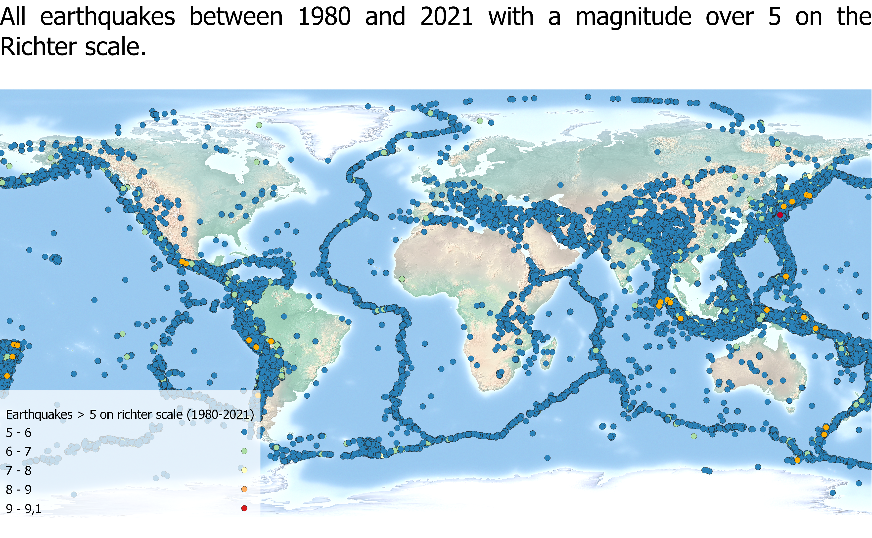
Picture 2. The map shows all earthquakes with a magnitude of 5 and up between 1980 and 2021.

Picture 3. The map shows all earthquakes with a magnitude of 8 and up between 1980 and 2021.
Next up I looked at volcanoes. In a similar process I downloaded data about the location of volcanoes and then layered this onto my pre-existing project about earthquakes. Although I already new that volcanoes and earthquakes often appear in the same regions it was interesting to see this on a map of your own making. The reason to this is of course that both earthquakes and volcanoes appear in seismically active zones – that is zones between tectonic plates. In picture 4. you can see the map I created. It visualizes earthquakes as black dots and volcanoes as red diamonds. I noticed that Sanna Janttunen (Janttunen 2021) had made a similar map comparing the location of volcanoes and earthquakes but she zoomed in on region of Central America. This map was much prettier and I think it was a good idea to look at a smaller region for this exercise.
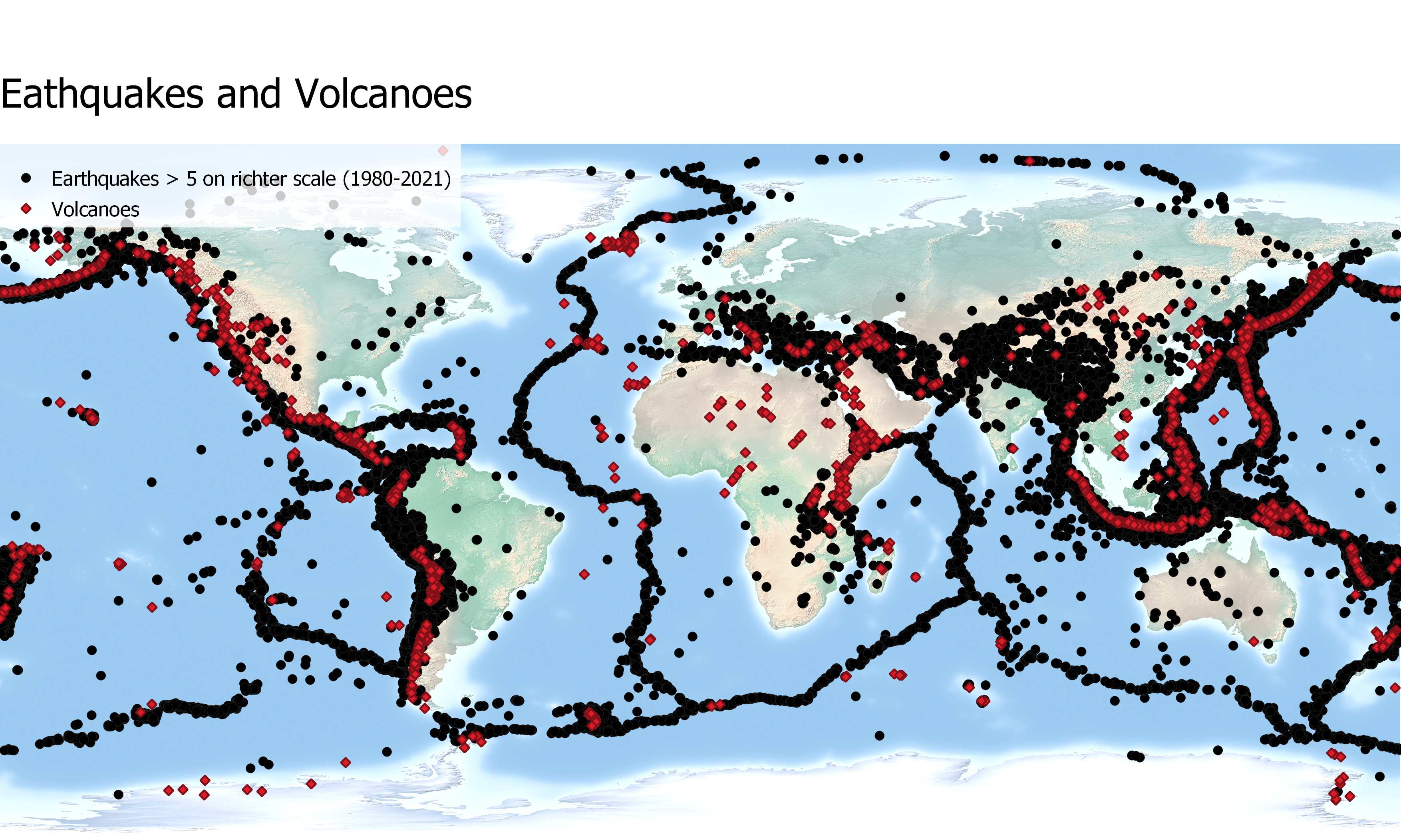
Picture 4. The picture shows earthquakes and volcanoes. As can be seen this mostly appear in the same regions.
So, by this time I thought I was pretty much done with the week’s exercises, but I decided to continue to play with the data. My idea was to somehow combine interpolation and earthquakes. After trying this I can say it isn’t advisable at the macro-scale we were at. Since earthquakes are largely concentrated to the border zones of tectonic plates there is really no point to looking at how interpolation affects this phenomenon. With this in mind I decided to instead make a clear example of how NOT to visualize something as this is also an important lesson to learn. Anyhow it was just interesting to examine how the interpolation tool functions and fun to look at the ridiculous results! Picture 5. displays interpolated data about the magnitude of earthquakes. This got me thinking though that surely there must be some use to interpolation conserning earthquakes and looking at a single earthquake the picture is very different. Often when measuring the impact of an earthquake there are certain specific stations at which the effect of the earthquake is measured. By using interpolation one can estimate the effect between the stations without actually measuring it for every single spot. It’s interesting to see that interpolation could be widely used at this scale while it is totally nonsensical at a global scale. Picture 6. shows a map which uses interpolation to estimate the impact of an earthquake in the different zones.
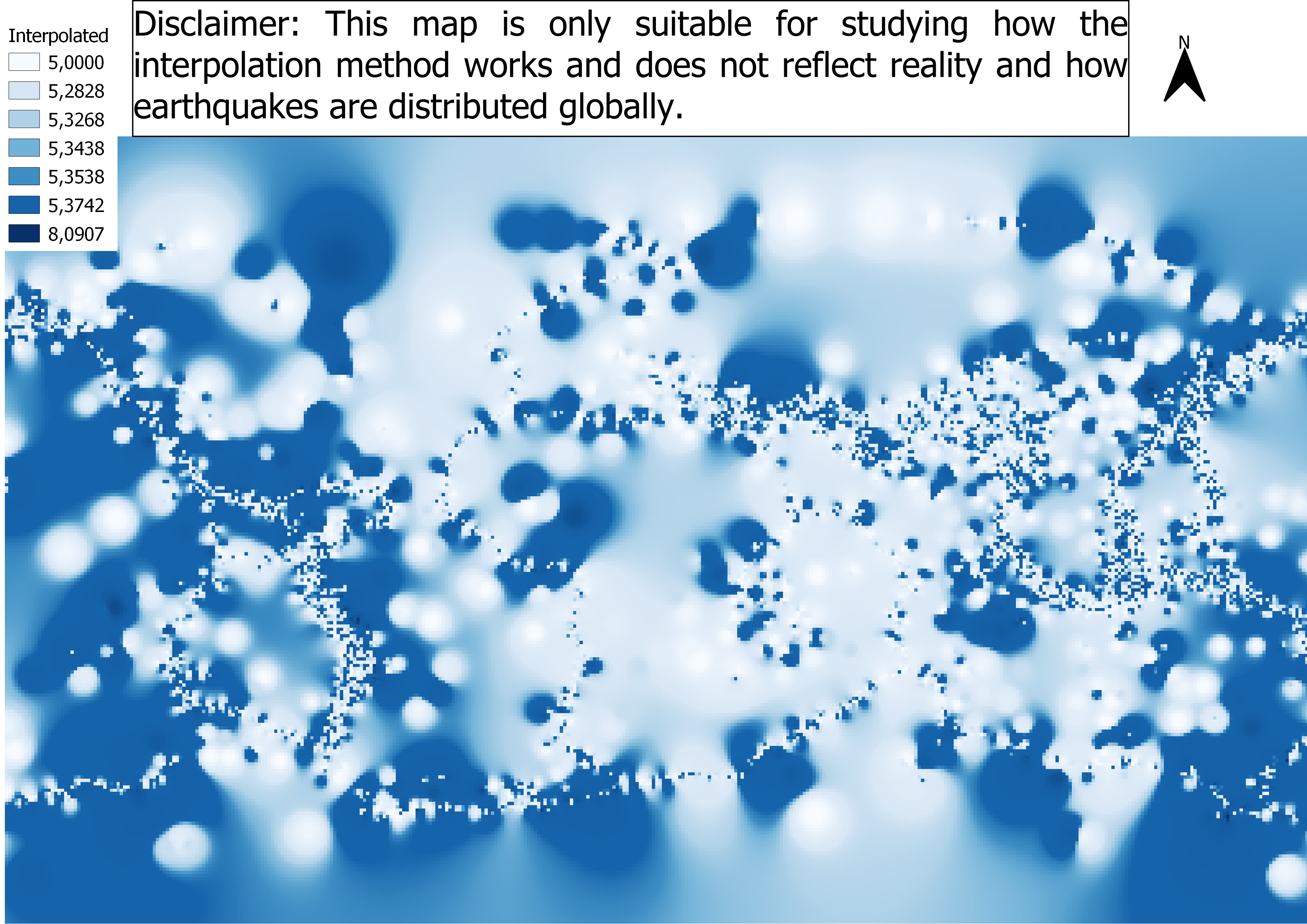
Picture 5. Interpolation of earthquakes with magnitude taken into consideration. Totally useless really. Still one can see resemblances of the borders of the tectonic plates.

Picture 6. The map shows a 3D interpolated model of seismological magnitude data for the Baradighi Tea Garden in the Himalayas. (Source: Biswas, Mery & Paul, Ankita. (2020).)
Sources:
Leino I. (2021) Kuudes kurssikerta. < https://blogs.helsinki.fi/ilarilei/ > 01.03.2021
Janttunen S. (2021) Hasardihommia < https://blogs.helsinki.fi/smjantun/ > 01.03.2021
Biswas, Mery & Paul, Ankita. (2020). Application of geomorphic indices to Address the foreland Himalayan tectonics and landform deformation- Matiali-Chalsa- Baradighi recess, West Bengal, India. Quaternary International. 10.1016/j.quaint.2020.12.012.