This week I continued with last weeks strategy of not participating in the live lesson. I enacted this plan with certainty, but my confidence turned into despair as couldn’t find the recording of this week’s lesson! Horrified I looked everywhere, reloading pages over and over again. Certain I had scoured everything, I thought that maybe Arttu hadn’t recorded this week’s lessons. I decided to ask the man himself and wrote him an email asking about the matter. In the mail I also gave some general feedback about distance learning and why I prefer certain aspects of it compared to traditional learning. I was prepared to wait at least a day for a reply but Arttu surprised me with an answer within minutes telling me that the recordings would be up soon enough. God bless the man! Rejoiced and rejuvenated I started working.
This week we moved outside the borders of our beloved homeland (Finland). The lesson focused on the African continent, looking at the areas of countries, internet use, natural resources and regional conflicts. We used a whole lot of new tools, ordering around data according to our need. Compared to the weeks before this week had some rather challenging tasks to complete and I must admit I didn’t understand all of my own actions at the moment of doing them. It was only after the lesson when I played around with the material that I got a better idea of what all the functions actually did. Combining, calculating and changing visuals I created a map of the African continent showing some natural resources and conflicts (see picture 1). I produced most of this map just following Arttu but examining the data further I find some irregularities. This must be of my own doing and I can’t seem to figure it out. For example, in the attribute table for the unique conflicts it says there has been 42 unique conflicts in Angola but as can be seen on the map there is only one dot. There where other problems as well. However, since I couldn’t solve the problem and this course is manly about the technique of map making I have decided to go forth anyways, demonstrating my idea rather than actual meaningful data.
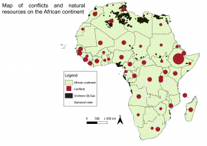
Picture 1. The map shows natural resources and conflicts. All conflicts of one year per country is shown as one dot. Additionally, the size of the dots is based on the total amounts of recorded conflicts during that year. (This is what the map should show according to the data, but it doesn’t).
On the map we can see diamond mines, onshore oil/gas drilling and the amount of conflicts in different countries. During the lesson we made a map that showed conflicts in different countries, combining all conflicts during the same year in to one dot. I thought this was a little too much generalization, so I decided to also take in to account the total numbers of conflicts as well. To do this I made the data “combining yearly conflicts” display the place and amount of the dots (It doesn’t work however) but the size of the dots were however decided by the total amount of conflicts in each country. To visualize it even better I decided to square all numbers so that there would be greater size differences between smaller and bigger conflicts.
The story of the African continent is a tragic one. Gaining independence from European powers hasn’t brought the desired outcome. Africa, probably the most resource dense of all continents hasn’t meant wealth for African people, rather it has brought continuous war and conflict. The term blood diamond describes a diamond or the diamond trade where the mining operations has been defined by military groups fighting for control over these mines and where the profits has been used to fuel further violence. The term conflict resource is a broader term for any resource that can be found in similar context. War over resources is however not the only reason behind the conflicts, rather ethnic and religious violence is common as well. This violence has often also been fueled by global superpowers like the USA and the Soviet Union during the cold war and.
Still to this day the USA continues to have a presence in many parts of Africa, both through direct military personal and through backing various local factions. This is according to Pentagon officials (Politco 2017). This so called “shadow war” has gone much under the radar and is based on the 2001 declaration of war against “terrorism”. The French also have a strong presence in former French African colonies basically maintaining their empire unofficially. This happens through both direct military presence but even more through economic soft power. Much of west- and central African nations have their currencies bound to the French central bank which gives Paris control to a large extent over the African economies. All the blame can’t be put on geopolitics and neocolonialism as most of the violence can be seen in civil war and civil unrest. Much has to do with resources and as Rasmus Sohlman states “kilpailu resursseista korreloi konfliktien sijainnin kanssa” conflicts correlates spatially with natural resources.
For homework we got to make a map over the drainage basins and river regimes in Finland (see picture 2). My end product turned out okay, but I found the process rather tedious and messy. As I hadn’t understood all of my own actions during the lesson, I hadn’t really learned them and had to go back many times to really understand what to do.
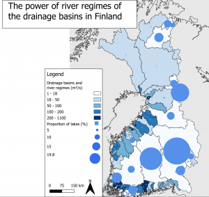
Picture 2. The map shows river regimes in the drainage basins of Finland and the proportion of lakes covering the land in Finland in each drainage basin.
I made this map mostly according to the instructions except for putting a little more emphasizing the portion of lakes by making the biggest dots even bigger. I did this through the same method which I used to make the dots for conflicts bigger on the map of Africa. It’s interesting to see that the strongest regimes can be found where there aren’t many lakes and vice versa where there are many (or larger) lakes the river regimes are generally weaker. The strongest regimes can be found at the coast in southern Finland and in the region of Ostrobothnia. This is probably due to these basins being much smaller, concentrating the amounts of water into fewer, bigger rivers. Looking at other people’s blogs I found that Sanna Janttunen made an interesting find in that the drainage basin of Jänisjoki overlaps with the geometry of Ladoga (Russia) (Janttunen 2021).
This week’s focus on Africa interested me to a much greater degree than the continuous focus on only Finland. I find geopolitics, conflicts and natural resources much more engaging than the river regimes of Finnish drainage basins. The tools we learned to use this week were harder to use, but also felt more useful and skillful than tools earlier in the course. I feel I need to have a further look on them to really grasp all the functions before next weeks lesson. The problems with visualizing the data bugs me as well and I need to examine that as well. Due to time constraints I had to except defeat on that front and write my blog about the incorrect map. I hope you can see past the obvious problems and focus on the idea rather than the actual data. When I have time, I will have an other look at it and update it to a correct version.
Alexander Engelhardt
Sources:
Janttunen. S. (2021) Sannan blogi. (06.02.2021)
https://blogs.helsinki.fi/smjantun/2021/02/03/veritimantteja-ja-keskivirtaamia/
Sohlman. R. (2021) RASMUKSEN GEM-KURSSIBLOGI. (06.02.2021)
https://blogs.helsinki.fi/sohlrasm/
Politico (2017) America’s shadow war in Africa (06.02.2021)
https://www.politico.com/story/2017/10/12/niger-shadow-war-africa-243695
Kaspian report (2019) How France maintains it’s grip on Africa – (06.02.2021)
https://www.youtube.com/watch?v=42_-ALNwpUo&t=617s&ab_channel=CaspianReport