Hello, I am Lynn an 8th grade student from the English school Helsinki and I am very interested in physics and mathematics. I had the opportunity to have a one week work practice program in the space physics research team at the university of Helsinki in spring of 2022.
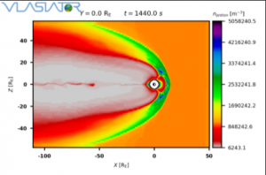
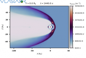
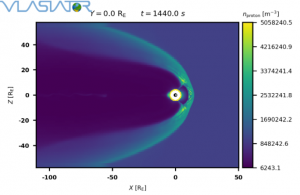
During this week I spent my time mainly learning about colormaps and their usage. I was also experimenting with code and a simulation from the Vlasiator group while trying to figure out which colormap is the best for research. I also got to attend a couple of meetings and lectures. I was also able to present my results in the group meeting.
To find out which colormap was best I went through all available colormaps and then created two opinion polls for others to vote on.
For the first one I was asking non-scientists to vote for the colormap that is most detailed and easiest to understand and with a majority of 66.6% nipy_spectral_r won.
The second opinion poll was focused on the most beautiful colormap and was shared with non-scientist and people from the space physics research team. This opinion poll had two winners: twilight and viridis.
Many people don’t think about choosing the right colormap and they just use the default versions, but there are several valid reasons for choosing a different colormap.
- Using colormaps like the popular default version jet can lead to lots of misunderstanding and misinterpretation. People often make assumptions about the meanings of the colours related to their darkness or brightness but when using jet, the brightest point would be Yellow. But in the case of jet, Yellow is in the centre of the colormap. So this can lead to a lot of confusion because people might assume differently.
- People with colour-vision deficiency (CVD) and people that are colour blind. While people with colorblindness are not too common, scientists should always try to make knowledge accessible and easy to understand for as many people as possible. There are two main colour maps made explicitly for people with colorblindness Cividis and Viridis; both colormaps avoid red-green and instead they use a blue-yellow combination and have a wide range in brightness.
- Different types of data have specifically designed colormaps, for example when presenting the depth of a body of water it is a smart idea to use the ocean colormap; this map is specifically designed to do exactly that, presenting a body of water. It uses colours that you would also see in real life which also makes it more relatable.
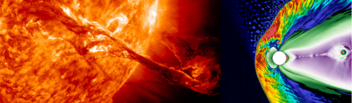
Aside from working with colormaps. I was also able to speak with different people in the space physics group.I was introduced to both groups that make up the space physics team. The solar physics group, which focuses on the part between the Sun and the Earth’s magnetosphere, and the Vlasiator group that is working on a simulation that shows the effects of Sun storms hitting the magnetosphere.
I really enjoyed the time I spent here, gained a lot of knowledge and I got to meet many fascinating people.