Lesson 5. All alone a Dog with out a bone

Lesson 5. All alone a Dog with out a bone

This week was another adventure and this time I was truly left to fend for myself. As I had managed quite fairly only watching the recorded lessons, I thought I’d continue with the same strategy. Why change something that isn’t broken? To my horror however the recordings hadn’t been uploaded to moodle. No matter – I continued only using the written guide and low and behold it turned out okay! It wasn’t as interesting and comprehensive as the lessons, but it turned out just fine this as well.

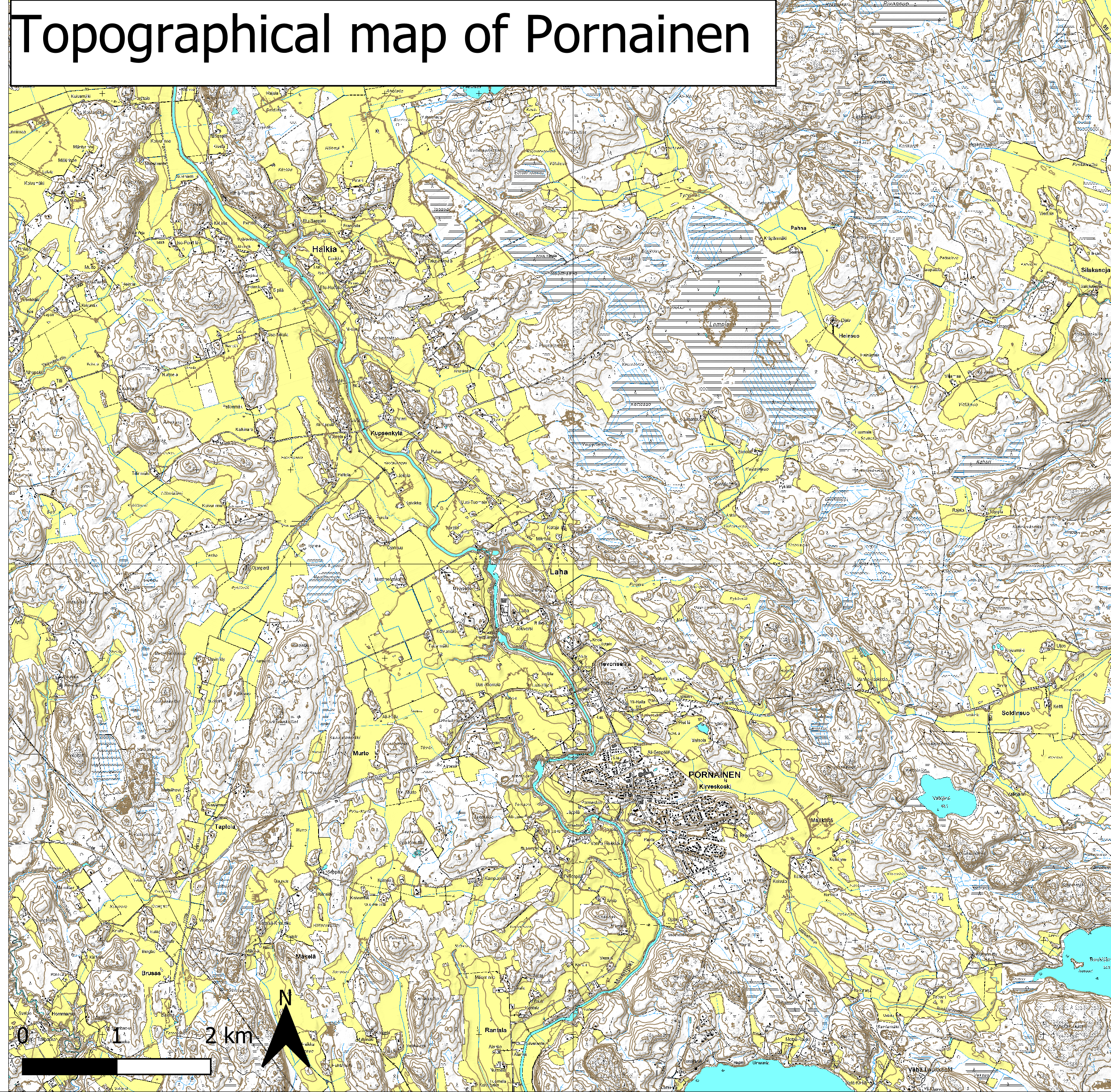
So, this week’s theme has been mathematical analysis and especially using the buffer zone tool. The buffer tool is used to examine a phenomenon within a buffer zone, this be a radius from a point, road or place. I applied this method to various tasks, counting residents living near roads leading to the town centre of Pornainen, inhabitants near airports and train/metro stations and school related data about inhabitants near schools. The focus of this week has been more on analysing data than on visualising it through maps and hence I have produced a set of tables and diagrams instead of a plethora of interesting and nice-looking maps.

Table 1. The table describes the amount of people within various radiuses from either Vantaa-Helsinki- or Malm’s Airport. It also displays how many are affected by high decibel values as a result from air traffic.

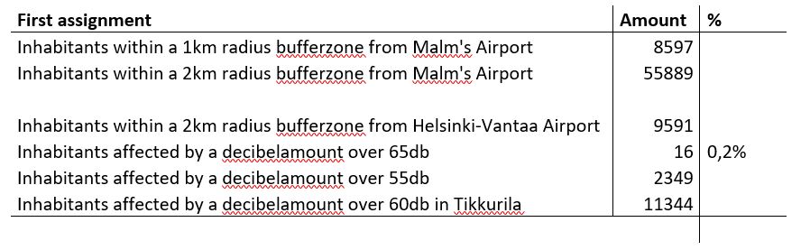
Looking at Henrietta Nyström’s (Nyström 2021) and Sanna Janttunen’s (Janttunen 2021) blogs I noticed that our numbers differ somewhat. Nyström seems to have noticed the same thing and figures it has to do with the specific tools and preferences that one has selected. This might very well be true.

Table 2. The table describes the amount of people inside a 500m radius of train stations as well as looking at the proportion of working aged people within this radius.

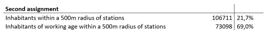
As can be seen from table 2. the vast majority of people living within a 500m radius of the a station belongs to the working age group. This is probably due to the ease of transport when using the metro or train. This is something that is very attractive to this particular age group. One should note that 69% seems very high, but this is due to the vast majority of people overall belong to this age group and hence this isn’t truly that high of a number. It would be interesting to look at the difference between the proportion of people within the working age group within and outside of the buffer zone. This number would surely be much lower, but there would probably still be variations although not as high as 69%.

Picture 1. The Diagram displays some numbers on the population in Vantaa.


Table 3. The table shows the amount of people living in urban/rural areas in Vantaa

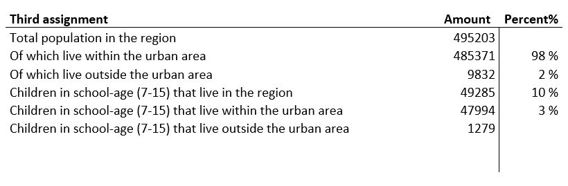
The next assignment concerns the population of Vantaa and if they live in urban or rural areas. The proportion of children in these areas is also looked at. As can be seen in the table the vast majority lives within urban areas and this counts for the children as well. The reason behind urban areas being so much more popular drives down to these having more services and better transport.

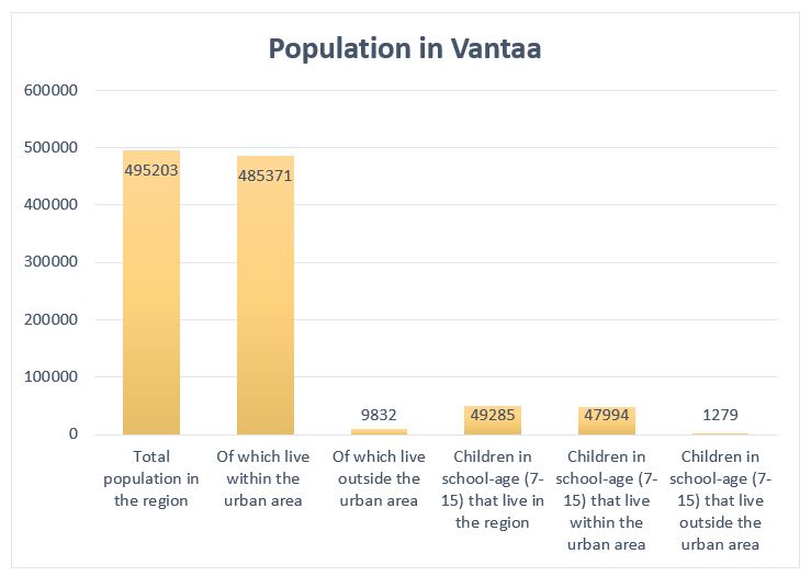
Picture 2. The diagram displays various numbers on the population of Vantaa.

For the last assignment this week wo got to choose between a set of exercises. I chose to use to buffer zone tool to look at amounts of children within a buffer zone of Helsinki Yhtenäiskoulu in Käpylä, Helsinki. To me this was by far the hardest of the exercises as I struggled both with data related parts as well as the technical side of things. Eventually I did succeed and below you can see in table 4. the new found data.

Table 4. The table shows residents and children within the

I couldn’t leave you without a weekly map now could I? so finally after completing these exercises I decided I wanted to visualize the last exercise as a map. I used a plug in called Quick map services to load the OSM Standard Map as the background map to load a preexisting map of Helsinki to my project and then layered upon in the borders of Helsinki Yhtenäiskoulu’s school district and dots for all households that have children within school age. The result is the following map:

Picture 3. The map shows the households with children within school age within the borders of the school district of Helsinki Yhtenäiskoulu.

Usually I have always had the recorded lessons as a detailed guide to the exercises, but this week was different. As I had missed the lesson and there was no recording I had to manage with only the written guide. In hopes of Arttu uploading the recorded lesson to moodle I procrastinated finishing this week’s exercises until today. Today though I had to make the executive decision of going forward on my own. It worked out fine. I still hope that the lessons will be recorded in the future. For it is the future or youtube will outperform universities in a few years. At least on flexibility and availability.

Cheers,

Alexander Engelhardt


Sources:
Janttunen S. (2021) Toisto on oppimisen äiti ja isä.
https://blogs.helsinki.fi/smjantun/
Nyström H. (2021) Kurssikerta 5: Buffereita ja tähänastisen osaamisen pohdintaa
https://blogs.helsinki.fi/nystrhen/

Lesson 4. Problems

My God! This was a troublesome week. The tasks themselves where simple enough but a whole lot of other problems arose. During the lesson I had the problem of not being able to correctly download the material. The large file with all the data would just read an error message. Fortunately I was able to download it on a different computer and then transfer it to my main computer through an external hard drive. An other even more enraging problem was that during the lesson I had saved all my projects separately so that I would be able to continue working on them after the lesson. However when opening them afterwards none of them were working properly! I had been very thorough with saving all scratch layers and everything, but somehow it had all disappeared. This left me unmotivated, but reading Annika Innanen’s blog (Innanen 2021) gave me the kick in the bum I needed. I would no longer sit and feel sorry for my self as she had struggled with the same issue and managed to come out on top. So would I.

So this week’s focus has been on raster material. Due to the nature of raster there are certain benefits as well as downsides compared to the earlier used vector format. Compared to the vector format raster is rather rigid only presenting data in a clear grid fashion. This makes everything kind of stale and not very natural. If you would try to counter this through upping the resolution (making the raster smaller) it leads to the data being very heavy and unwieldy. The benefits lie in that all raster (in the same grid) are all of equal size which opens up options not available in a vector based map. For example visualizing data absolutely and relatively simultaneously is not using vector maps but on a raster map this is completely possible due to all raster being of equal size. This is very helpful when wanting to convey as much information as densely as possible. An other clear benefit would be visualizing a gradually shifting phenomenon. As vector maps are founded on clearly defined points, lines and polygons it is hard to visualize this kind of phenomenon. On the other hand with raster, this is easy by just binding the data to the raster and assigning a set of colours.

During the lesson we visualized the amount of Swedish speaking Finns in the Greater Helsinki area through creating a grid covering the municipalities.  When redoing this I instead chose to look at “Other languages”, that is other than Finnish or Swedish. This was a very similar process and the result looks familiar to other maps displaying the same information. As can be seen on picture 1. the map shows that most “Other languages” speakers can be found Helsinki and especially in eastern Helsinki. According to Venla Brenelius (Maa-106 2020) this is due to the area having comparatively large yet affordable housing which is often the go to option for the often larger and poorer immigrant families.


Picture 1. Map showing the amount of people speaking a language other than Finnish or Swedish in the Greater Helsinki area.

This kind of map still lacks in that it only tells us relative number relative to area. It doesn’t tell us about in this caseabout the relative amount of “other language”-speakers compared to the majority language speakers. Another problem with raster is that when dealing with the geographical distribution of a societal phenomena like language it’s often more intuitive to set the data along some preestablished lines; like administrative lines. This is because people already know these which makes it easier to grasp than a rigid raster grid.

Raster can though be used very widely and one example of that is how we used raster data to create a topographical map of Pornainen. I compared the map to other preexisting topographical maps of the same area and in my mind they were similar enough. Some small differences but nothing ground breaking. The preexisting maps where generally more detailed and reading Lotta Mattila’s blog (Mattila 2021) she seems to have come to a similar conclusion noting that the maps had differences in elevation curves but that the maps where different in other ways as well (“kartat ovat muutenkin erilaiset.”)

Picture 2. Topographical map of Pornainen.

I noted that one key thing to make the map look tidier was to make the lines displaying elevation really thin. There was a problem with this however. When zooming in the lines would then be too thin. Surely there is a function to relate the thickness or size of symbols to the level of detail?

At the end of the lesson we started to do some familiar digitalizing, this was in preparation for next weeks lesson. I wonder what may come?!

Till next week…

Alexander Engelhardt


Sources:

Innan A. (2021) Harjoitus 4: Väestöteemakartta ruutuaineistosta https://blogs.helsinki.fi/anninnan/

Mattila L. (2021) Ruututeemakartta https://blogs.helsinki.fi/lottmatt/2021/02/09/rasterikartat/


Lesson 3. Blood Diamonds and River regimes

This week I continued with last weeks strategy of not participating in the live lesson. I enacted this plan with certainty, but my confidence turned into despair as couldn’t find the recording of this week’s lesson! Horrified I looked everywhere, reloading pages over and over again. Certain I had scoured everything, I thought that maybe Arttu hadn’t recorded this week’s lessons. I decided to ask the man himself and wrote him an email asking about the matter. In the mail I also gave some general feedback about distance learning and why I prefer certain aspects of it compared to traditional learning. I was prepared to wait at least a day for a reply but Arttu surprised me with an answer within minutes telling me that the recordings would be up soon enough. God bless the man! Rejoiced and rejuvenated I started working.

This week we moved outside the borders of our beloved homeland (Finland). The lesson focused on the African continent, looking at the areas of countries, internet use, natural resources and regional conflicts. We used a whole lot of new tools, ordering around data according to our need. Compared to the weeks before this week had some rather challenging tasks to complete and I must admit I didn’t understand all of my own actions at the moment of doing them. It was only after the lesson when I played around with the material that I got a better idea of what all the functions actually did. Combining, calculating and changing visuals I created a map of the African continent showing some natural resources and conflicts (see picture 1). I produced most of this map just following Arttu but examining the data further I find some irregularities. This must be of my own doing and I can’t seem to figure it out. For example, in the attribute table for the unique conflicts it says there has been 42 unique conflicts in Angola but as can be seen on the map there is only one dot. There where other problems as well. However, since I couldn’t solve the problem and this course is manly about the technique of map making I have decided to go forth anyways, demonstrating my idea rather than actual meaningful data.

Picture 1. The map shows natural resources and conflicts. All conflicts of one year per country is shown as one dot. Additionally, the size of the dots is based on the total amounts of recorded conflicts during that year. (This is what the map should show according to the data, but it doesn’t).

On the map we can see diamond mines, onshore oil/gas drilling and the amount of conflicts in different countries. During the lesson we made a map that showed conflicts in different countries, combining all conflicts during the same year in to one dot. I thought this was a little too much generalization, so I decided to also take in to account the total numbers of conflicts as well. To do this I made the data “combining yearly conflicts” display the place and amount of the dots (It doesn’t work however) but the size of the dots were however decided by the total amount of conflicts in each country. To visualize it even better I decided to square all numbers so that there would be greater size differences between smaller and bigger conflicts.

The story of the African continent is a tragic one. Gaining independence from European powers hasn’t brought the desired outcome. Africa, probably the most resource dense of all continents hasn’t meant wealth for African people, rather it has brought continuous war and conflict. The term blood diamond describes a diamond or the diamond trade where the mining operations has been defined by military groups fighting for control over these mines and where the profits has been used to fuel further violence. The term conflict resource is a broader term for any resource that can be found in similar context. War over resources is however not the only reason behind the conflicts, rather ethnic and religious violence is common as well. This violence has often also been fueled by global superpowers like the USA and the Soviet Union during the cold war and.

Still to this day the USA continues to have a presence in many parts of Africa, both through direct military personal and through backing various local factions. This is according to Pentagon officials (Politco 2017). This so called “shadow war” has gone much under the radar and is based on the 2001 declaration of war against “terrorism”. The French also have a strong presence in former French African colonies basically maintaining their empire unofficially. This happens through both direct military presence but even more through economic soft power. Much of west- and central African nations have their currencies bound to the French central bank which gives Paris control to a large extent over the African economies. All the blame can’t be put on geopolitics and neocolonialism as most of the violence can be seen in civil war and civil unrest. Much has to do with resources and as Rasmus Sohlman states “kilpailu resursseista korreloi konfliktien sijainnin kanssa” conflicts correlates spatially with natural resources.

For homework we got to make a map over the drainage basins and river regimes in Finland (see picture 2). My end product turned out okay, but I found the process rather tedious and messy. As I hadn’t understood all of my own actions during the lesson, I hadn’t really learned them and had to go back many times to really understand what to do.

Picture 2. The map shows river regimes in the drainage basins of Finland and the proportion of lakes covering the land in Finland in each drainage basin.

I made this map mostly according to the instructions except for putting a little more emphasizing the portion of lakes by making the biggest dots even bigger. I did this through the same method which I used to make the dots for conflicts bigger on the map of Africa. It’s interesting to see that the strongest regimes can be found where there aren’t many lakes and vice versa where there are many (or larger) lakes the river regimes are generally weaker. The strongest regimes can be found at the coast in southern Finland and in the region of Ostrobothnia. This is probably due to these basins being much smaller, concentrating the amounts of water into fewer, bigger rivers.  Looking at other people’s blogs I found that Sanna Janttunen made an interesting find in that the drainage basin of Jänisjoki overlaps with the geometry of Ladoga (Russia) (Janttunen 2021).

This week’s focus on Africa interested me to a much greater degree than the continuous focus on only Finland. I find geopolitics, conflicts and natural resources much more engaging than the river regimes of Finnish drainage basins. The tools we learned to use this week were harder to use, but also felt more useful and skillful than tools earlier in the course. I feel I need to have a further look on them to really grasp all the functions before next weeks lesson. The problems with visualizing the data bugs me as well and I need to examine that as well. Due to time constraints I had to except defeat on that front and write my blog about the incorrect map. I hope you can see past the obvious problems and focus on the idea rather than the actual data. When I have time, I will have an other look at it and update it to a correct version.


Alexander Engelhardt


Sources:

Janttunen. S. (2021) Sannan blogi. (06.02.2021)

https://blogs.helsinki.fi/smjantun/2021/02/03/veritimantteja-ja-keskivirtaamia/

Sohlman. R. (2021) RASMUKSEN GEM-KURSSIBLOGI. (06.02.2021)

https://blogs.helsinki.fi/sohlrasm/

Politico (2017) America’s shadow war in Africa (06.02.2021)

https://www.politico.com/story/2017/10/12/niger-shadow-war-africa-243695

Kaspian report (2019) How France maintains it’s grip on Africa – (06.02.2021)

https://www.youtube.com/watch?v=42_-ALNwpUo&t=617s&ab_channel=CaspianReport