
This week’s theme has been spatial statistics, focusing on spatial autocorrelation and spatial regression. The idea of the assignment was to observe the spatial autocorrelation’s statistical values and based on those values, draw an assumption of the analysis. I have used QGIS to prepare the data for the analysis, and then I used Geoda for the actual statistical analysis.
Spatial autocorrelation means measuring how one location and its spatial value is related and how similar it is to another location and its spatial value. Positive autocorrelation (+1) is defined as the clustering of the phenomena and their data points. This means that the same values cluster and form groupings. On the other hand, negative autocorrelation (-1) is defined as dispersal of the phenomena and their data points, meaning values are dispersed evenly without any clustering. Neutral autocorrelation (0) means a random distribution of the phenomena which indicates no correlation between the features. Spatial autocorrelation is based on Tobler’s first law of geography which states that “everything is related to everything else, but near things are more related than distant things.”. The statistical values the analysis calculates are a z-score and a p-value. These values indicate the statistical significance and whether the null hypothesis can be rejected or not. In spatial autocorrelation, the null hypothesis states that the values are spatially uncorrelated, meaning that the data and the phenomena are randomly distributed. When examining these values, one can determine if the null hypothesis is false or not.
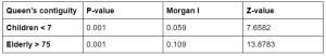
The first part of the assignment was to create a grid and add three columns to the attribute table, named clustered, dispersed, and random. Then I added the values, 5 and 200 to the grid that represented the pattern of the different autocorrelations. I then exported the grid to Geoda where I calculated Morgan’s I. To do a Morgan’s I calculation, the spatial weights have to be added to the layer. I created spatial weights with both rook’s and queen’s first contiguity. After this step, I was able to perform the Global Morgan’s I calculation which generated the z-value as well as the p-value of the autocorrelations.
Table 1. The table shows the p-value, Morgan’s I, standard deviation, mean, and z-value of the autocorrelations when using Rook’s contiguity.
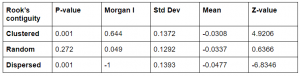
When using Rook’s contiguity, both clustered and dispersed columns had a p-value under 0.05 which means that they are statistically significant and that the null hypothesis can be rejected. While the random column had a non-significant p-value, meaning that the null hypothesis cannot be rejected. This was expected because random autocorrelation implies that there is not a correlation between the features. The z-values on the other hand varied a lot. Z-value is the standard deviation of a normal distribution. A very high or low z-value indicates that it is not likely that the feature of the pattern is distributed randomly, which is what the null hypothesis says. In summary, a high or low z-value in combination with a significant p-value, states that the null hypothesis can be rejected, and the distribution of the features is not random. By observing the values in table 1., one can draw the conclusion that clustered and dispersed columns are not randomly distributed, which is true.
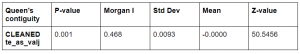
Table 2. The table shows the p-value, Morgan’s I, standard deviation, mean, and z-value of the autocorrelations when using Queens’s contiguity.
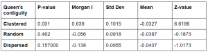
The statistical values changed when using Queen’s contiguity. The only column which was significant was the clustered one that had a p-value under 0.05. The z-values did also vary quite much but only the clustered z-value did indicate a rejected null hypothesis.
It is interesting how the values changed when changing contiguity, I am not completely sure why they changed but I guess it has something to do with the number of neighbors and grid cells that they calculated.
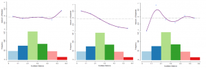
Picture 1. Three spatial correlograms. To the left: Random spatial correlogram. At the middle: Clustered spatial correlogram. To the right: Dispersed spatial correlogram
From the correlograms, it can be observed the pattern of the feature’s distributions. For example, the clustered spatial correlogram, clearly shows two clusters, one with a higher value and the other with a lower value.
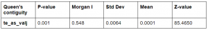
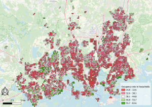
In the second assignment, the idea was to use this previous knowledge to do a statistical analysis of a real-world phenomenon. I did the analysis on the occupancy rate of households in the Helsinki region. First, I weighted the spatial weights with the queen’s first contiguity. I then calculated the global Moran’s I. The p-value of the data was below 0.05, meaning it is statistically significant as well as a high z-score which supports it. This means that the occupancy rate of households is not randomly distributed, instead they are clustered.
Table 3. The table shows the p-value, Morgan’s I, standard deviation, mean, and z-value of the autocorrelations when using Queens’s contiguity.
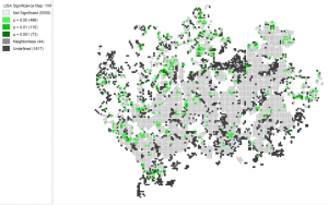
After calculating the global Moran’s I, I calculated the local Moran’s I which resulted in one significance map and one cluster map. From these maps, the phenomenon can be observed more easily, as it is more intuitive. On the significance map below, the four categories tell how significant the result is in the area in the analysis. So, the dark green areas on the map, have a high significance, meaning the results of these areas are close to the actuality. While the bright green areas on the map have a p-value just on the significance borderline, meaning the results of these areas are less trustworthy. The grey areas are not significant, meaning these areas are not to be trusted in the clustered map (picture 3).
Picture 2. Significance map of the occupancy rate of households in the Helsinki region. It was easier to interpret the map without any background map so I chose not to add one to my report.
The significance map is meant to be observed with the cluster map seen below. The clustered map shows the areas where there is a high and low occupancy rate relative to the number of inhabitants in a household. The red areas on the map, show locations where there is a high occupancy rate while the blue areas show where there is a low occupancy rate. The bright blue colour show outliers, which are locations where there is a low occupancy rate relative to the surrounding areas which have a high value and vice versa with the bright red category. The significance map tells which of these clustered areas are very significant and thus more trustworthy as well as which areas are less significant and trustworthy.
When observing the cluster map, there are certain areas where the result seems a bit inaccurate. For example, Suvisaaristo is a detached house area but according to the cluster map, there is a low occupancy rate which is inaccurate. While Westendi and Kauniainen have, according to the map, high occupancy rates which is accurate.
Picture 3. Cluster map of the occupancy rate of households in the Helsinki region. It was easier to interpret the map without any background map so I chose not to add one to my report.
Since there were some inaccuracies in the previous Moran’s I calculation, I had to trim certain values from the data in QGIS. I trimmed all the No data values as well as the cells that hadn’t any neighbors and then I calculate the Moran’s I again.
Table 4. The table shows the p-value, Morgan’s I, standard deviation, mean, and z-value of the autocorrelations when using Queens’s contiguity.
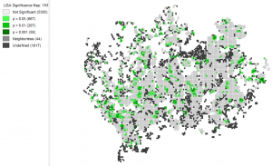
The p-value for the trimmed dataset was also significant with a p-value of 0.001 and a high z-score. So the null hypothesis could once again be rejected. When examining the new significance map which the latter analysis gave, it can be observed that the area that the map portrays is much smaller than in the previous analysis. The most significant areas are the Kallio district, Kauniainen municipality, and Westendi in Espoo as well as some other locations.
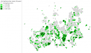
Picture 4. Significance map of the occupancy rate of households in the Helsinki region. It was easier to interpret the map without any background map so I chose not to add one to my report.
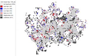
The cluster map has also changed a lot when using the trimmed dataset, it is more accurate than the previous cluster map. Now distinct neighborhoods can truly be observed and a clear pattern can be seen.
Picture 5. Cluster map of the occupancy rate of households in the Helsinki region. It was easier to interpret the map without any background map so I chose not to add one to my report.
The municipality, Kauniainen, is a former villa community with a higher than average square meter per capita, thus large houses are scattered around within the municipality borders. According to the cluster map, there is a high occupancy rate that fits in with the urban space of Kauniainen. The same goes for Westendi, which is also an area with large houses scattered around in a wider space. The district of Kallio has a low occupancy rate, meaning there are fewer square meters per capita and inhabitants live densely. This cluster result fits in with the urban space of Kallio as it has many one-room apartments because it has once been an important district for the working-class with cheap small apartments.
The map below visualizes the occupancy rate in the Helsinki region but is made in QGIS. The red areas have a lower occupancy rate while the green areas have a higher.
Picture 6. The map that shows the occupancy rate in the Helsinki region
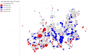
The third part of the assignment was to do yet another spatial autocorrelation analysis with another real-world problem. In this part, I used data columns of children under the age of 7 and elderly over the age of 75 to see if these age-groups cluster and if so, where. The idea was to do the analysis in percentage, and in that way acknowledge the proportional amount of the age group in the population.
In the earlier stages of the assignment, I had done several spatial autocorrelation analyses, so the concept was at this stage familiar. I started by writing my analysis plan that consisted of first; data trimming and calculation of new variables in the attribute table, then the global Moran’s I followed by the local Moran’s I calculations. I then analyzed my results and visualized maps. After all these stages, I could draw a conclusion.
I started by trimming the datasets with cells that had no No-data and cells that had no neighbors in QGIS instead of doing this at a later phase. I then calculated the proportion of children in the population as well as the elderly. I then added the values to new fields in the attribute table. I exported the managed data to Geoda where I did the actual analysis. I started by weighing the spatial weights of the variables with both queen’s and rook’s first contiguity. I then calculated the global Moran’s I and the results were expected. The p-value for both variables was under 0.05 when using both queen’s and rook’s contiguity and the z-score was also relatively high. This means that there is not a random distribution of children and elderly in the Helsinki region, they are either clustered or dispersed.
Table 5. The table shows the p-value, Morgan’s I, and z-value of the autocorrelations when using Rook’s contiguity.
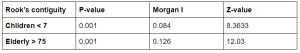
Table 6. The table shows the p-value, Morgan’s I, and z-value of the autocorrelations when using Queens’s contiguity.
I then calculated the local Morgan’s I with only the weighted queen’s contiguity for both variables. This analysis resulted in a significance map and a cluster map.
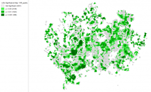
Picture 7. Significance map of the children’s proportion relative to the population in the Helsinki region.
Picture 8. Significance map of the elderlies proportion relative to the population in the Helsinki region.
These significance maps are a little unclear in my opinion because many pixels are undefined and only a very small proportion is significant, especially in the significance map portraying children’s proportion.
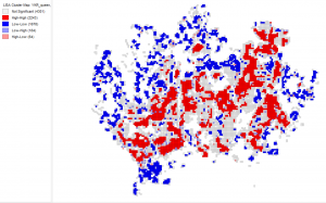
The cluster maps below, show the clustering of the age groups and where these clusters are located. Red areas show where there is a high amount of clustering of the given age group while blue areas show where there is a low amount of clustering. While the bright blue or bright red shows outliers which implicates locations, which have a different value than their surrounding areas.
Picture 9. Cluster map of the children’s proportion relative to the population in the Helsinki region.
When the cluster maps are examined, different patterns can be observed in the clusterings. Children’s proportion is lower inside the Helsinki municipality, especially in the Kallio district. In the previous task, the results indicated that there is an overall low occupancy rate in Kallio which seems to fit in with this result. There is a higher proportion of children in the Kauniainen, Espoo, and Vantaa municipality, especially in the west.
I chose to make a map of daycare centers of the data we used in the first week to see if there is a correlation between the clusters and daycare centers. There are many daycare centers in the center of Helsinki, but the children’s proportion is low in the cluster map there due to the otherwise high population. In Kauniainen and in Espoo there are many daycare centers that seem to correlate with the clusters as well as in Myyrmäki in Vantaa. Almost all daycare centers are located close to road networks. The same factor can be observed from the cluster map, where children’s proportion is higher closer to road networks.
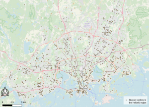
Picture 10. The map shows daycare centres in the Helsinki region
I did also make a map of the proportional distribution of children under the age of 7 in QGIS. This map also shows that there is a higher proportion of children in the population outside the Helsinki city center. That which this map adds to the analysis is that there is a very low percentage of children in the more rural places, towards north, northwest, and east. When observing the map of daycare centers, one can see that they decrease in that direction and that may be the reason for the low proportion of children in those areas.
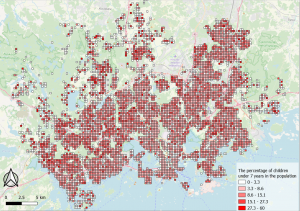
Picture 11. The map shows the percentage of children in the Helsinki region.
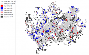
Picture 12. Cluster map of the elderlies proportion relative to the population in the Helsinki region.
The cluster map of elderlies’ proportion in the population shows clear clustering and areas where there is low clustering of elderly. According to the cluster map, elderlies are clustered for instance in Westendi, Kauniainen, Myyrmäki, Kumpula and Käpylä. What all these locations have in common is that they are near services but not in the CBD and that they are near green urban spaces. More rural places north and northwest has a lower clustering of elderlies. This pattern could also be seen with the proportional distribution of children. The reason for this is that there are fewer services in rural areas which affects the attractiveness negatively for families with children and the elderly who often are dependent on services. Even though clusterings are found both in children’s and elderlies distribution, elderlies cluster even more according to the results of the analysis.
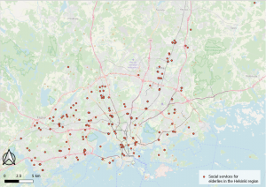
Picture 13. The Map shows all kinds of social services for the elderly.
I did also make a map that shows every social service for elderlies in the Helsinki region. When examining the cluster map, correlations can be seen with the distribution of social services for elderlies and their clustering. There is a clear correlation between the social services and the clustering’s which seems logical and expected.
I did a map of the phenomenon in QGIS which also supports the analysis made from the cluster map and the map that shows the distribution of social services for the elderly.
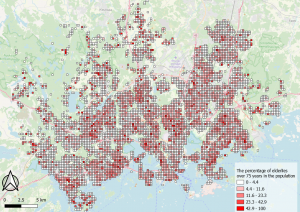
Picture 14. The map shows the percentage of elderly over 75 years in the Helsinki region.