
The sixth week’s theme has been cartographic visualization and interactive maps. It is paramount to visualize maps so that they represent the phenomenon and the result intuitively and correctly. Maps portray different real-world phenomena and can be used for decision-making and even misrepresent information; thus, it is of the uttermost importance that the visualization of the map is suitable for the phenomena. It is as important as any other process in the PPDAC model because ignorant individuals with no previous knowledge of the field can draw assumptions of a phenomenon solely based on how the phenomenon is visualized. So, it is crucial to visualize suitably. Also, when dealing with thematic maps, especially choropleth maps, the classification and the number of classes are very important to consider.
One of the first things to consider when visualizing a map is to answer the question, what is the purpose of this map, and who is the targeted audience? The purpose and the audience define how the map should be visualized. When those questions have been answered, the layout of the map can be defined. The clarity of a map is a key element to consider when visualizing it, it must be clear and understandable for the right audience. What is seen as clarity depends on the audience, if the desired target group is other GIS specialists, then some features on the map can be left undefined as it is expected that the target group has previous knowledge about the feature. While if the audience is newspaper readers, with no expert knowledge about the phenomenon, then the map must have extra clarity for those readers. Another important aspect of map visualization is the visual hierarchy of the different features and elements on the map. Visual hierarchy means that actively choosing which elements to put the most focus on in the visualization, thus which element communicates the main message the most. The balance of the map is also important to take into consideration, for example, how space is used on the map and how features are divided on the map. The balance will influence how well the reader will observe the map and its phenomena. The contrast in the map is also vital to create a visual hierarchy and make certain elements stand out more, though too much contrast can make the map unclear and messy. The visual unity and harmony of a map is also a key to consider as it affects the reader experience positively and makes the map more inviting and thus more effortlessly to read. There are also some technical aspects to consider, for example, on which platform will the map be published, will it be printed on paper, or stay digital. These aspects will affect, for example, the choice of colours and colour models.
This week’s assignment was to visualize three different maps of the same phenomenon, for three different purposes and thus different target audiences. The data which I visualized was daycare centers that are within risky air quality zones in the Helsinki region. I made one version of the map for a professional publication, one for a newspaper, and one interactive map. The idea of the assignment was to consider how to communicate the main message to the target groups and take into considerations all the elements that make up a good map.
The first map that I made was fictively intended to be published in a professional publication, so the target audience was experts in the field. The main message of the map was to report where these daycare centers are located and the reasons why they are within the poor air quality zone.
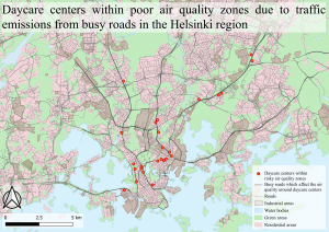
Picture 1. Map for an export report publication, it shows daycare centers in risky air quality zones.
Because of the main messages with the map, I decided to put the focus on the daycare centers’ location as well as the busy roads that affect the poor air quality through traffic emissions. I also chose to put rather much focus on the industrial areas on the map as they could potentially increase the amount of emissions in the area. I also focused on visualizing the green areas on the map as vegetation can decrease the amount of harmful emissions in the air. The residential areas are fairly highlighted on the map because those areas also get affected by the emissions. The less significant roads got less attention in the visualization as they don’t directly impact the problem.
I did not define for example, what vegetation the green areas possess since experts are the ones to observe the map, they probably have the knowledge of what kind of environment is typical in southern Finland and the green areas around Helsinki. In addition, the specific vegetation types are not directly relevant to this specific map, even though the vegetation types differ in the amount of emission they can absorb.
I chose earth-like colours to visualize the features on the map as it is pleasing for the eye and is a realistic colour scheme. The daycare centers are visualized with an orange dot inside a red circle to reinforce the message that they are in the risk zone and thus are visualized in typical warning colours.
When making a map for an export report it is first extremely important that all the data and that the analysis methods are correct as the map can be referenced in a report or paper. When visualizing it, it’s important to highlight the essential information of the map as well as cause-and-effect features.
The second map that I visualized was fictively intended to be published in a physical newspaper, so the targeted audience was regular people with no guaranteed knowledge about the phenomenon. This map’s main message was to inform which daycare centers are within the risky air quality zones and inform about the phenomenon as a concept. The reason for wanting to point out which specific daycare centers are within the poor air quality zone is to, for example, inform parents if their children’s daycare center is in a harmful location or not.
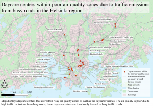
Picture 2. Map for a newspaper, it shows daycare centers in risky air quality zones.
Since the main message of the map was to inform which daycare centers are within the risky air quality zones, I decided to put the absolute most focus on the specific daycare centers’ and label their names as well as highlight the busy roads. The other features on the map remain muted since those features weren’t relevant for this targeted audience. In fact, I did combine the residential areas with the industrial areas and refer to them both as buildings for more clarity. The other features basically just created a background map which made the map easier to interpret and read.
When visualizing a map for a newspaper it is immensely important to make a clear map that is easily understood with no features undefined. The visual hierarchy is also very important to consider, as it helps the reader understand the most essential information on the map.
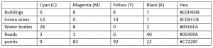
I chose the same earth-like colours as in the previous map for I think the colour scheme is intuitive and nice to look at. Since the map was visualized for a physical newspaper it meant that the map would be printed on paper. This implies consequences for the colours on the map as they use the RGB colour model and printers only print colours in the CMYK colour model. Because of this, I converted all the RGB colour codes to CMYK colour codes and added them to the table below so that the same colours would be achieved when printing the map.
Table 1. The table lists the CMYK colour codes converted from RGB colour codes.
The third map that I made was an interactive map that was fictively meant to be published on the newspaper’s website. This interactive map had the same target audience and message as the previous one but for online readers.
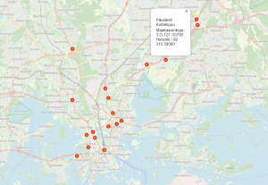
Picture 3. An interactive map for a newspaper website, it shows daycare centers in risky air quality zones.
On the interactive map, I used a pre-made background map and only added the daycare centers’ points to it. Any other features could have easily made the map messy as the purpose of the map is to click on the desired daycare centers and get information on it. In the pop-up window, on the map, I only chose the daycare center’s name and the address information to be visible because the other information in the attribute table was irrelevant for this specific map.
The Daycare centers had the same visualization as before to reinforce the message to the viewer. The background map, OMS Standard, displayed the names of all the districts in the Helsinki region as labels. By displaying the labels, it makes the map more clear and easier to navigate.
When making an interactive map it is important not to add too many features to it as it can easily become very messy when zooming in and out. Another important aspect in the making of interactive maps is that the georeferenced coordinates must be correct, otherwise when zooming in and out the points can shift location which makes the map inaccurate. This is of course very important for any map but especially with interactive ones when the viewer can zoom in very closely.
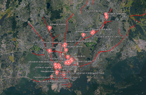
Picture 4. Screenshot of my interactive daycare centers points in Google Earth.
I also chose to export the daycare centers points and the busy roads as KML files to Google Earth and changed the pin to a daycare center symbol. It was fun to see my produced and visualized data on Google Earth and interactively examine the data with the 3D function.
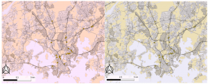
Picture 5. To the left: Map with a green colourblind lens, To the right: Map with a red colourblind lens
At the end of my visualizations, I exported my maps to the Coblis-website and made a test to see how colourblind individuals would experience my maps. I did the test twice, once with green as the colourblind colour and once with red as the colourblind colour and the results were startling. It was mostly the residential and green areas that were affected by the manipulation which was expected due to their colours on the maps. The green areas changed the most for red colourblinds and could even be misunderstood as fields. If these maps were to be published, I would have changed the colour of the green areas to be suitable for red colourblind individuals as well.
This was by far the most fun assignment that we have done during this course and it felt like I really learned something. I learned both technical aspects as well as how to visualize a map for different purposes. It is truly important to first answer the question what is the purpose of this map and who is the targeted audience? as I mentioned earlier. After those questions have been answered, then the visualization can be defined and proceeded.