Click to enlarge
Creator: Elias Willberg / Digital Geography Lab
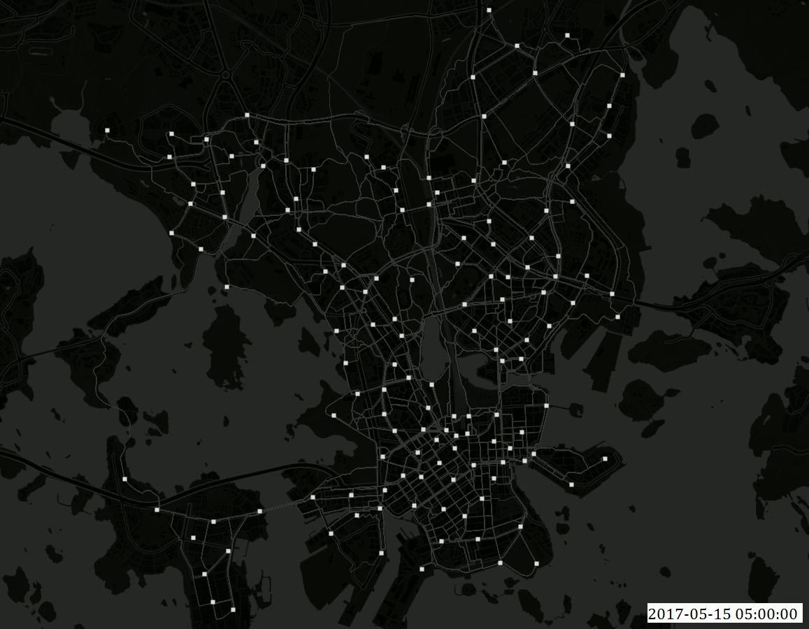
Description:
The visualization shows all the trips (n~7200) made by Helsinki bike-sharing system bikes on Monday 15.5.2017 . Because the data set does not contain GPS tracks but only the start and the destination points, the paths for each trip shown in the map are not the real ones but assumed using fastest routes . Based on the data set information however, the fastest route assumption is more or less valid especially during weekdays. White points are the city bike stations (n=140).
Data:
- The Helsinki city bike dataset for 2017 was provided by HSL and City Bike Finland to the Accessibility Research Group / Digital Geography Lab of the University of Helsinki. The dataset has not been published openly to this date.
- Background map: @OpenStreetMap Contributors @CARTO
About the visualization: The animation is done using QGIS time manager plugin.A big thank you also goes for these two excellent tutorials listed below that helped in making the animation:
- Geogiffery in a nutshell — introduction to QGIS Time Manager: Topi Tjukanov
-
Movement data in GIS 1-13 blog series: Anita Graser
Pingback: Who are using urban bikes in Helsinki? | Accessibility Research Group