Gulag Echoes in the “multicultural prison”: historical and geographical influences on the identity and politics of ethnic minority prisoners in the communist successor states of Russia and Europe
Why does the geography of Stalin’s Terror matter, and how do we study it?
BY DR. SOFIA GAVRILOVA
In a new blog post, geographer Dr Sofia Gavrilova explains the importance of studying the geography of Stalin’s Terror, and presents her innovative approach to the topic. Sofia Gavrilova has been collaborating with GULAGECHOES PI Judith Pallot for the past decade, mapping the GULAG and developing the on the gulagmaps.org website. Now her expertise in Geographic Information System (GIS) mapping is advancing the GULAGECHOES project. This blog post shows how she has mapped the ethnic deportations that began in the 1920s and culminated in the war-time deportations.
The Stalinist repressions and the Great Terror are usually compared with the ‘Archipelago’, following Alexander Solzhenitsyn’s famous metaphor. However, academic and popular knowledge of the spatial histories of the Soviet Repressions is still very limited. From the simple questions like ‘where did this happen’, to the more complex analysis of the environmental impact of the Soviet Terror and its influence on the (post-) Soviet geographical imagination and place identities, the detailed geography of the Soviet Repressions is yet to be written. Knowing where exactly the Soviet Terror was happening is the first and most important (and in many aspects is the most challenging) step in getting close to answering these questions.
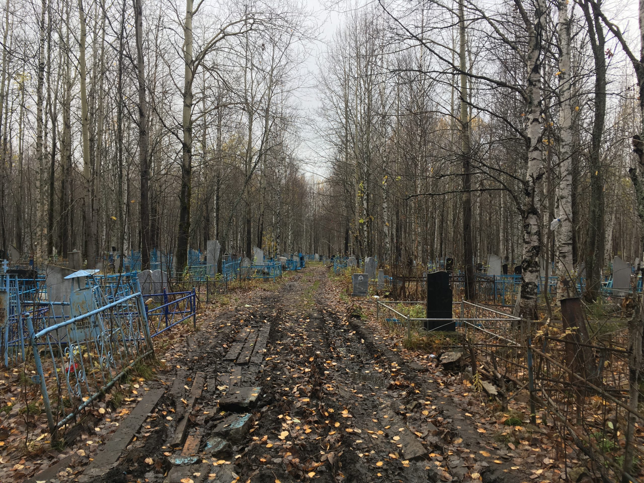
Img. 1. German cemetery. North of Perm region, 2016. Photo by S. Gavrilova
One of the main tools of geographical research is locating historical events by putting them on the map. Unfortunately, the vast majority of the archives on regional and local levels (which would allow large-scale mapping) is still classified, which slows down significantly the ability to map repressions[1]. That is why it is important not only to create visualizations of various forms, but also to produce georeferenced datasets that could be used by other scholars. The GulagEchoes project continues to unwrap the spatial history of the Soviet Repressions, as well as contemporary crime and punishment geography, by developing methods of putting various aspects of Soviet deportations on the map, and also by producing the datasets that the project will share after the data pass peer review. The first maps that have been produced during the projects are the maps of ethnic deportations (1920-1950). The data for this map was published by Russian historian Pavel Polyan in his book ‘Ne po svoey vole…’; some of the entries were further verified in the independent fund ‘Demokratia’ .
With ethnic deportations, as with any other topic put on the map, the first question that arises is ‘what do we want to show on the map?’ Is it the regions people have been deported from? The regions where people ended up? The campaigns? The routes from one region to another? The numbers of people that have been relocated? In his book, Pavel Polyan shows several maps himself, but showing ‘the generalized directions’ of the deportations; the GulagEchoes project aims to go beyond that and proposes several different approaches to mapping the Soviet deportations, starting with producing datasets and campaigns outlined by Pavel Polyan.
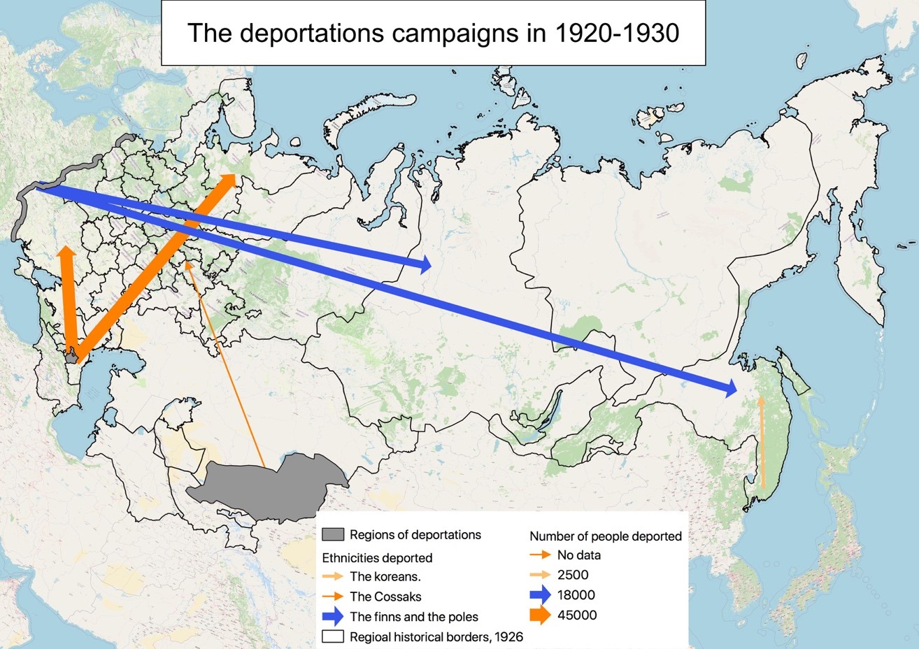
Img. 2. The deportation campaigns in 1920-1930
The main methodological problem of mapping the Soviet Repressions is the inconsistency of the spatial references in the archival records – the places of deportations are often quite well known (even the names of villages), but the details about the destination locations quite often remain very vague.
The datasets (in the most widespraed GIS ‘*shp’ format) have been designed to hold information both on the departure region and arrival regions, the number of people deported, their nationalities, and the dates of deportations as the main attributes. This information can be further used for the spatial analysis of the people’s distributions, put against the regional and local census, or can be used as the first step for further mapping on larger regional scales.
For this reason we have decided to map the deportations regions on the sub-regional level, outlining the 22-kilometer zones along the Western border as in the example above, where people were taken from. However, we have decided not to map the destination regions, as that would create the false impression that we know them on the sub-regional level.
Img. 3. The deportation campaigns in 1930-1940
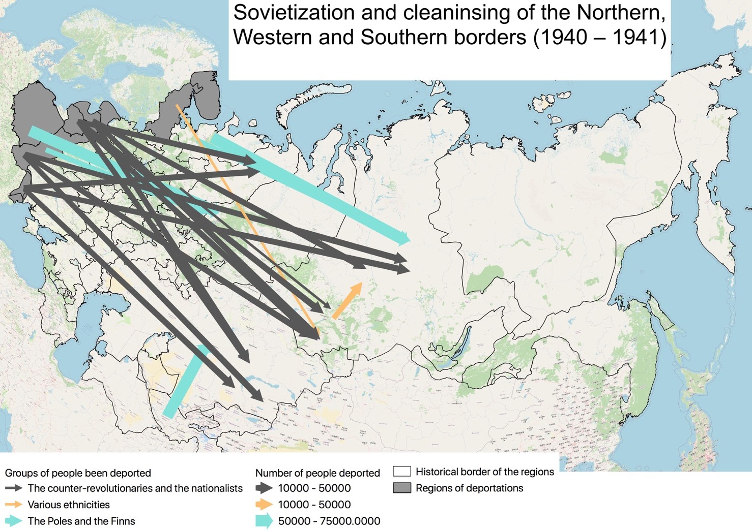
The deportations are grouped by the years when they occurred, and divided into the pre-1930 period and the 1930-1940 decade. The several massive deportation campaigns of the early war years 1940-1941 (the cleansing of Western, Northern, and Southern borders, img. 4) have been put together on a single map, which is followed by a map of the Southern border cleansing campaigns and the deportations of the Crimean Tatars (img. 5). Such a division allows us to keep the maps from being overloaded with information on one hand, but on the other to show several deportation campaigns simultaneously.
Img. 4. The deportation campaigns of 1940-1941
Img. 5. The deportation campaigns in 1941-1945
The only campaigns that stood out from this time series are the deportations of the Germans and the Finns (img. 6), which have been put on a separate map.
Img. 6. The preventive deportations of the Soviet Finns and Germans (1940-1941)
[1] However, some attempts to map various aspects of Soviet Repressions have been made by Judith Pallot and Sofia Gavrilova and are gathered on the gulagmaps.org website.